


Startup pitch deck raising money from investors powerpoint presentation slides





Try Before you Buy Download Free Sample Product
 Impress Your
 Audience
 100%
100% Editable
 Save Hours
 of Time


Download Startup Pitch Deck Raising Money From Investors Powerpoint Presentation Slides to create the perfect pitch deck for your new venture. Deliver a short but powerful introduction of your startup to the angel investors and venture capitalists. Introduce your startup using an elevator pitch template that is a short description of what value your company offers. Next, follow the 10 slides approach to create a crisp and effective startup pitch deck presentation. Start with the problem that the customers are facing. Exploit this market gap opportunity to present your unique solution. Tell investors the market size of your target audience to make them aware of the scope of your business and profitability it can generate for the stakeholders. The most important slide in your Startup Pitch Deck Raising Money From Investors PPT is the business model slide which shows how you are going to make money. Throw light on your expertise or competitive advantage that sets you apart from competitors. Use competitive analysis matrix and competitor positioning PPT templates along with sales and marketing plan to highlight your extensive market research and planning. Make the investors aware how much money you need to launch your startup successfully in the market and what dividends you are expecting in the short and long run. Create a convincing investor deck that fetches you the money you need to make your startup a commercial success.Inspire folks to be the best with our Startup Pitch Deck Raising Money From Investors Powerpoint Presentation Slides. Enable them to feel jubilant.
People who downloaded this PowerPoint presentation also viewed the following :
Content of this Powerpoint Presentation
Slide 1: This slide introduces StartUp Pitch Deck. State Company Name and get started.
Slide 2: This is an Agenda slide. State your agendas here.
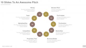
Slide 3: This is 10 Slides To An Awesome Pitch slide containing- Elevator Pitch, The Problem, Market Size, The Solution, Business Model, Proprietary Tech, Competition, Team, Marketing Plan, Money.
Slide 4: This slide is titled as TEASER SLIDE. You may change the content as per need.
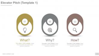
Slide 5: This slide presents the first template on Elevator Pitch.
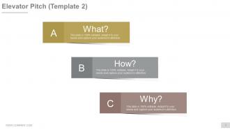
Slide 6: This slide presents the second template on Elevator Pitch.
Slide 7: This slide showcases the third template on Elevator Pitch.
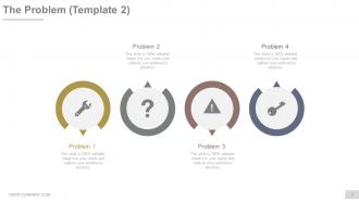
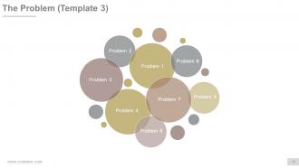
Slide 8: This is The Problem displaying slide. State aspects of business problems etc. here.
Slide 9: This is a second slide displaying The Problem.
Slide 10: This is a third slide displaying The Problem.
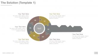
Slide 11: This is the first slide displaying The Solution.
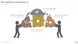
Slide 12: This is the second slide displaying The Solution.
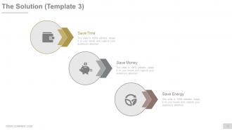
Slide 13: This is the third slide displaying The Solution such as- Save Time, Save Money, Save Energy.
Slide 14: This is a Product Demo slide. State product aspects here.
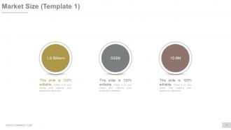
Slide 15: This is the first slide on Market Size.
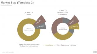
Slide 16: This is the second slide on Market Size showing- TAM, SAM, TARGET MARKET, TAM, SAM, Target Market, Advertisers, Event Organizers Mentors.
Slide 17: This is the third slide on Market Size.
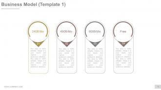
Slide 18: This is the first slide on Business Model. Show how your business model would look like, its functioning aspects etc.
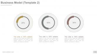
Slide 19: This is the second slide on Business Model. Show how your business model would look like, its functioning aspects etc.
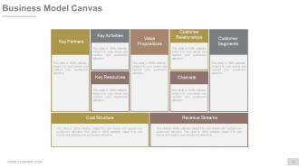
Slide 20: This slide presents a Business Model Canvas displaying- Key partners, Key Activities, Key resources, Customer Relationships, Channels, Customer segments, Cost structure, Revenue streams, Value Propositions.
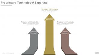
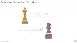
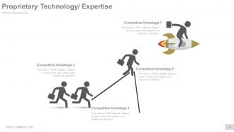
Slide 21: This slide presents Proprietary Technology/ Expertise with Competitive Advantages.
Slide 22: This slide presents Proprietary Technology/ Expertise with Competitive Advantages.
Slide 23: This slide presents Proprietary Technology/ Expertise with Competitive Advantages.
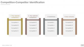
Slide 24: This is a Competition-Competitor Identification table showcasing- Substitutes, New entrants, Key national competitors, Key national competitors.
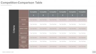
Slide 25: This slide presents Competition-Comparison Table showing- Criteria, Revenue, Profit, Market Share, Main Activity, Number Of Employee, Product Quality.
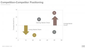
Slide 26: This is a Competition-Competitor Positioning slide showing- Average Market Growth, Company Growth (%), Gaining Market Share, Losing Market Share.
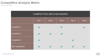
Slide 27: This slide showcases a Competitive Analysis Matrix.
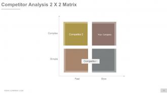
Slide 28: This slide showcases a Competitive Analysis 2 X 2 Matrix to compare your company with competitors.
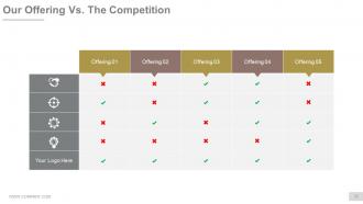
Slide 29: This is Our Offering Vs. The Competition table slide.
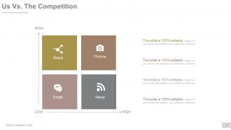
Slide 30: This slide shows Us Vs. The Competition in matrix form displaying- Share, Picture, Charts, News.
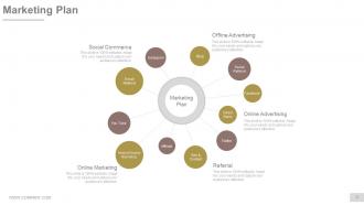
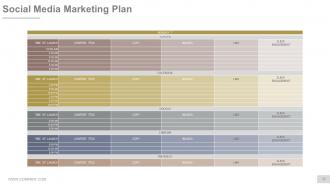
Slide 31: This slide presents Marketing Plan consisting of- Facebook, Social Referral, You Tube, Search Engine Marketing, Seo & Content, Instagram, Blog, Twitter, Email Referral, Affiliate, Direct Sales, Online Advertising, Offline Advertising, Social Commerce.
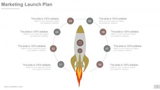
Slide 32: This slide showcases Marketing Launch Plan with a creative rocket launch imagery.
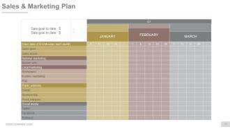
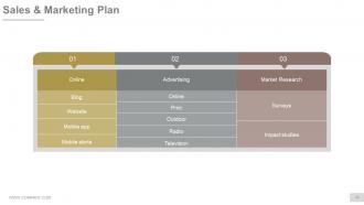
Slide 33: This is a Sales & Marketing Plan slide in tabular form.
Slide 34: This slide presents Sales & Marketing Plan with- Online, Market Research, Advertising.
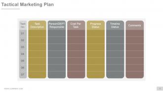
Slide 35: This slide presents Tactical Marketing Plan- Task Description, Person/DEPT Responsible, Progress Status, Cost Per Task, Timeline Status, Comments.
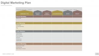
Slide 36: This slide presents Digital Marketing Plan showcasing- Projected coat to date, Actual coat to date.
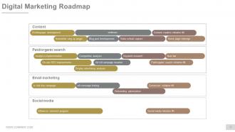
Slide 37: This slide showcases a Digital Marketing Roadmap displaying- whitepaper development, webinars, Content creation initiative, Video w/lead capture, Blog post developments, Newsletter sing up plugin, Home page redesign, Content, Analytics implementation, Competitive analysis, Keyword research, Ad roll campaign iteration, Display advertising analysis, On-site SEO improvements, New bar, Paid/organic search initiative, Paid/organic search, a/b message testing, In trial drip campaign, Email marketing, Conversion initiative, Onboarding optimization, Influencer outreach program, Social media, Social media initiative.
Slide 38: This slide presents a Social Media Marketing Plan.
Slide 39: This slide showcases Our Team showing- Geeks Entrepreneurs Sales as departmental segregation.
Slide 40: This is an Our team slide with name, designation and text boxes to state information.
Slide 41: This is a Team slide with name, designation and text boxes to state information.
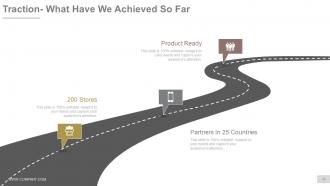
Slide 42: This slide shows Traction- What Have We Achieved So Far with- Partners, 200 Stores, Product Ready.
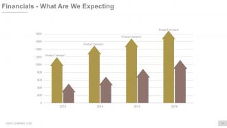
Slide 43: This slide showcases Financials- What Are We Expecting in graph form.
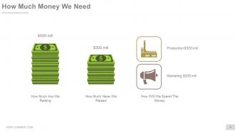
Slide 44: This slide shows How Much Money We Need with- How much are we raising? How much have we raised? How Will We Spend The Money?
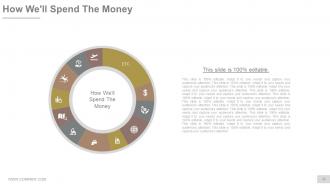
Slide 45: This slide presents How We'll Spend The Money. State future expenditure facts here.
Slide 46: This is a Client Testimonials slide with name, designation and text boxes to state information.
Slide 47: This is another Client Testimonials slide with name, designation and text boxes to state information.
Slide 48: This is also a Client Testimonials slide with name, designation and text boxes to state information.
Slide 49: This slide is titled Additional Slides to move forward. You ma alter/modify the slide content as per need.
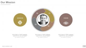
Slide 50: This is Our Mission slide with Vision and Goal. State them here.
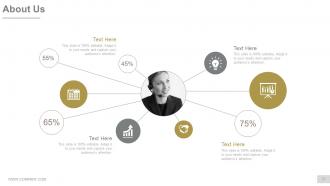
Slide 51: This is an About Us slide. Show company/team specifications etc. here
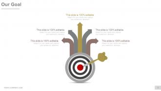
Slide 52: This is Our Goal slide. State them here.
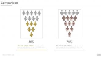
Slide 53: This slide showcases Comparison of two entities in male-female imagery form.
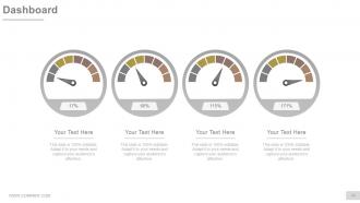
Slide 54: This slide presents Dashboard to present Kpis, metrics etc.
Slide 55: This is a Location slide of world map image to show global presence, growth etc.
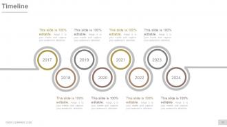
Slide 56: This is a Timeline slide. State milestones, highlights, evolution etc. here.
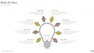
Slide 57: This is a Bulb or Idea image slide to state information, specifications etc.
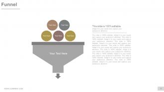
Slide 58: This is a Funnel image slide to show product/entity information, funneling aspects etc.
Slide 59: This is a Thank You slide with Email, Address# street number, city, state, Contact Numbers.
Startup pitch deck raising money from investors powerpoint presentation slides with all 59 slides:
Generate electricity with our Startup Pitch Deck Raising Money From Investors Powerpoint Presentation Slides. Light up the sky with your thoughts.










FAQs for Startup pitch deck raising money from investors
For your pitch deck, you'll want problem, solution, market size, business model, traction, team, financials, and funding ask. Don't make the mistake I see everywhere - jumping straight to your "brilliant" solution without explaining the problem first. Honestly, investors need to feel that pain point or they won't care. Each slide should focus on one thing. Visuals beat text walls every time. Practice your timing so the story flows naturally. 10-12 slides tops. Oh, and always end with clear next steps - like what you actually want from them.
Don't just stick your story on one slide - thread it through everything. Make the problem your villain, something people actually feel. Your solution becomes the hero moment. Real customer stories beat made-up personas every time, trust me on this. Traction slides? Those are your plot twists showing things are working. Team slide proves you're the right people to pull this off. Oh, and end with that vision slide - paint the future but keep it real, not some cheesy movie ending. The whole thing should flow like you're telling a friend about it.
Ugh okay so the worst thing you can do is cram everything onto each slide - investors literally can't read that tiny text. Tell a clear story instead of just dumping random facts everywhere. Don't waste forever explaining the problem either, VCs have seen it all before. They want to know what YOU'RE actually doing about it. Those generic "trillion dollar market" slides? Skip them unless they actually matter. Oh and practice out loud! I can't stress this enough - even amazing decks bomb if you're stumbling through your words. Keep it clean, tight story, and rehearse until you sound natural.
Dude, visuals are everything in pitch decks. Charts help investors instantly get your numbers instead of decoding paragraphs. Screenshots prove you actually built something real. I can't tell you how many text-heavy decks I've sat through - total snoozefest. Clean infographics break down complicated business models way better than bullet points ever could. Before/after shots? They hit different - investors can literally see the problem you're solving. Just don't go overboard with random graphics that don't add anything. Each visual should tell part of your story. Keep text minimal and let the visuals do the heavy lifting.
Look, market research isn't just some box to check off - it's what makes or breaks your whole pitch deck. Without real data, you're just guessing about whether people actually want what you're building. Talk to potential customers first (seriously, before you even start designing slides). This research proves your problem matters, shows investors the market's big enough, and backs up your competitive analysis. I've watched too many founders walk into meetings with zero customer validation. Investors smell that immediately and will tear apart every assumption you make. Short version: no research = no credibility.
Show 3-5 years of revenue, expenses, and those key metrics like customer acquisition cost. Make it realistic though - investors are so tired of seeing ridiculous hockey stick projections. Your assumptions matter way more than the actual numbers since that's what they'll tear apart in due diligence. Honestly, I'd throw in a few scenarios (conservative, optimistic, worst case) so you look like you've actually thought this through. The story behind your numbers is what sells them, not just rows in a spreadsheet. Start building these early so you're not scrambling to defend random assumptions when they grill you.
Look, investors basically want proof you're not just burning cash for fun. Pick 3-5 metrics that actually tell your story - MRR, CAC, LTV, whatever fits your business model. SaaS is totally different from marketplaces, obviously. Don't just dump random numbers though. Show the trends month-over-month and explain WHY things are moving. Like if your user growth spiked in March, what caused that? I've seen too many founders get completely destroyed in follow-ups because they couldn't back up their own data. Growth rates and retention are usually solid bets, but honestly just focus on what makes your business look legit and growing.
Dude, skip the whole "here's a problem that exists" thing. Investors already know problems exist everywhere. What they want to see is why YOU'RE gonna crush this particular problem when others can't. Lead with your unfair advantage - maybe it's some crazy tech you've built, exclusive deals you've locked down, or your team knows this space inside out. I've sat through way too many pitch decks that just list features like a grocery list. Show concrete proof people actually want this. Real customers paying real money beats those giant market size slides every time. Oh, and make it stick with specific examples, not generic fluff.
Keep it to 10-12 slides, trust me on this. I've sat through way too many bloated presentations that lost everyone around slide 15. Hit the basics - problem, solution, market size, how you make money, any traction you've got, your team, numbers, and what you're asking for. Each slide should be clean and focused since you'll probably only get a minute per slide anyway. Honestly, the whole point isn't cramming your life story in there. You just want them interested enough to schedule that follow-up meeting. Quality beats quantity every time, especially when investors are checking their phones by slide 20.
Dude, you gotta switch up your pitch depending who you're talking to. VCs are obsessed with huge markets and that hockey stick growth - they want to see you can scale massively. Angels though? They're basically betting on YOU as a person, so show early traction and why you won't screw this up. Corporate investors care about strategic fit - how do you make their existing business better? I literally keep different versions of my first few slides ready to swap out. The financials part is crucial here - angels want to see you'll actually make money while VCs just want those crazy growth projections. Do your homework on who's in the room first.
Clean, consistent design is everything - same fonts and colors throughout. Don't cram stuff onto slides (I swear some pitch decks look like data vomit). One main point per slide works best. White space actually helps people focus instead of getting overwhelmed. Your font needs to be readable from way back - learned that the hard way once. Use visuals that actually matter, not random stock photos. Oh, and keep your branding visible but not obnoxious. You want them remembering your company, not rolling their eyes at cheesy animations.
Your pitch deck lives or dies on that "before vs. after" moment. Paint the problem first - make it hurt a little. Then BAM, show exactly how you fix it. Honestly, saying you're "better" is useless since literally everyone claims that. Instead, focus on what becomes possible with your solution that wasn't before. Or what annoying thing you completely eliminate. Numbers are your friend here - like "cuts processing from 3 days down to 30 minutes." Investors need to instantly get why someone would actually pay for this transformation you're selling.
Dude, you gotta practice this thing out loud - standing up, timer going, the whole deal. Seriously, most people bomb on the transitions between slides, so nail those first. Record yourself on your phone because trust me, you don't hear half the "ums" you're making. Get some friends to watch who'll actually roast you a bit instead of just being nice. Oh and timing is everything - these things have hard cutoffs. I learned this the hard way but start practicing like a week out, not the night before when you're already stressed.
Definitely get your financial model ready - like a proper spreadsheet with revenue projections and assumptions. They always ask for that after pitching. Your one-pager is just your deck condensed down so they can remember you later. If you're tech, prep a demo they can actually play with. Honestly? The demo usually kills it way more than fancy slides. Oh and organize your cap table and legal stuff in a data room beforehand. Trust me, being ready with the follow-up materials before they even ask makes you look super prepared.
Honestly, monthly updates are the sweet spot. Whenever you hit a big milestone or your numbers shift significantly - new users, partnerships, revenue bumps - that's your cue to refresh everything. I've watched founders pitch with ancient metrics and it's just painful to witness. Your deck needs to match where you are right now, plus your 12-18 month roadmap. But don't just swap out numbers. Keep tweaking your story based on what actually lands with investors. Oh, and maintain a master version that you can customize for different pitch scenarios - saves you tons of time later.
-
Good research work and creative work done on every template.
-
Really like the color and design of the presentation.