


Timeline Ppt Images Gallery





Try Before you Buy Download Free Sample Product
 Impress Your
 Audience
 100%
100% Editable
 Save Hours
 of Time


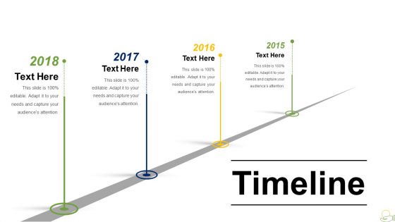
Timeline e roteiros são úteis para explicar as realizações, objetivos, metas e objetivos da empresa. Sua busca por uma excelente imagem gráfica de informação vetorial de uma linha do tempo ou roteiro de apresentação do PowerPoint termina aqui. Esta imagem com um design impressionante irá ajudá-lo a transmitir todas as informações. Ao mesmo tempo, aumentará o valor estético de sua apresentação. Os modelos de cronograma PPT são diagramas perfeitos para mostrar as realizações e marcos cobertos por sua organização. Compartilhe a jornada, a história e os planos futuros da empresa com este slide PPT sequenciado cronologicamente. O crescimento anual e as realizações podem ser bem exibidos pelo modelo de linha do tempo de estrada linear. Além disso, enfatize os projetos planejados para o futuro com este diagrama de cronograma atraente. Explique cada etapa do processo envolvido com facilidade. Esta imagem vetorial simples, mas impressionante, é adequada para um profissional que deseja se apresentar. Se você deseja exibir seu gráfico de carreira, realizações e realizações, este é o slide PPT mais adequado para você. O design pode ser utilizado em apresentações de negócios, apresentando-se como profissional, fazendo aulas de história, contando avanços tecnológicos e detalhando objetivos futuros. Faça com que esta apresentação de alta qualidade projete seu companheiro enquanto você toma o caminho para o sucesso. Nossa Timeline Ppt Images Gallery está otimista com você. Eles estão confiantes em investir em suas idéias.
People who downloaded this PowerPoint presentation also viewed the following :
Timeline Ppt Images Gallery com todos os 5 slides:
Suporta qualquer crítica com a nossa Galeria de Imagens Ppt da Linha do Tempo. Eles permitem que você crie uma estrutura robusta.
FAQs for Timeline
You'll need your project phases, key milestones, and realistic time estimates for each deliverable. Dependencies are honestly the hardest part - I always screw those up first try! Don't forget buffer time because something always goes wrong. Map out your critical path and mark review points. If you've got a team, show who's doing what. Oh, and be realistic with timing instead of wildly optimistic (learned that the hard way). I'd start by sketching everything roughly first, then dive into the details once you can see how it all connects.
Dude, visuals are everything for timelines - they keep people awake! Icons and colors help break up all that boring text nobody wants to read. I like using different colors for phases and icons for major milestones. Progress bars are clutch too since they show the flow. Honestly, connecting lines between events make everything clearer. You know how some presentations look like Excel threw up on a slide? Yeah, don't do that. Keep it clean but interesting - maybe throw in some images that actually support your story instead of random decoration. Your audience will remember way more.
Think about who you're showing this to first. Executives want the big picture - just hit the major milestones and keep it clean. Project teams need those detailed Gantt charts though, since they're actually doing the work and need to see how everything connects. Interactive timelines are pretty cool for stakeholder meetings where people want to click around and explore. I swear, most people just use whatever format they already know instead of thinking about their audience. Simple works for broad groups, detailed for the implementers. Oh, and definitely run it by someone else first - nothing worse than confusing people right off the bat.
Honestly, timelines are perfect for history stuff because they make those cause-and-effect connections super obvious. You can spot patterns way easier, plus compare what was happening in different places at the same time. Key turning points really pop out too. I always throw in some visual elements - maybe different colors for themes or add images if I'm feeling fancy. Makes everything less dry, you know? Just don't go overboard with events. Stick to maybe 5-7 major ones or people's eyes will glaze over. Trust me on that one.
So basically every industry tweaks timelines for their own thing. Education uses them for curriculum stuff or history lessons. Marketing tracks campaign launches and those big milestone moments. Healthcare gets wild with patient treatment plans - honestly those medication schedules are no joke! The trick is matching your timeline style to what actually matters for your audience. Are they caring about deadlines? Dependencies? Development stages? Don't just go with basic chronological order because it's easy. Pick whatever format actually supports the story you're trying to tell.
Canva's probably your best bet - crazy easy to use and they've got tons of professional timeline templates. Just drag and drop stuff around. If you want more control over every little detail, Adobe Illustrator is amazing but it'll take you forever to learn. PowerPoint works fine too, honestly. Most people already have it anyway. Oh, and Figma's pretty good if you're working with other people on the same project. I'd start with Canva since you can literally make something decent in like 20 minutes, then maybe try Illustrator later if you get into it.
Bold your key milestones and make dates super prominent - that's the stuff people actually care about. I made this mistake once where my timeline looked like a wall of text and everyone just stared at it confused lol. Keep descriptions short and group similar tasks together. Different colors for each workstream helps a ton. White space is your friend here - don't cram everything together or people's eyes will glaze over. Maybe throw in some icons if you're feeling fancy. Honestly, if someone can't grasp the main flow within 10 seconds, you've lost them.
Ugh, the worst thing you can do is cram everything in there - your timeline will look like a hot mess. Pick maybe 5-7 key moments max. Also, don't randomly jump from "Day 1" to "Year 3" without any logic, it's jarring as hell. Make sure people can actually see what's important first - use bigger fonts or bold for your main points. Oh and here's something I learned the hard way: check how it looks from across the room because tiny text = useless timeline. Start with what story you're trying to tell, then cherry-pick only the events that actually matter for that narrative.
Dude, interactive timelines are game-changers for engagement. People can actually explore stuff themselves instead of just sitting there while you click through slides. They'll zoom into whatever catches their eye or jump around to different time periods. Honestly, it's way better than those boring linear presentations we all hate sitting through. Try throwing in some clickable hotspots or let them control how fast things move. The difference is huge - like watching someone play a game versus actually playing it yourself. You'll notice people paying attention way more.
Okay so with timelines, contrasting colors are your best friend for separating different phases. Stick to like 2-3 main colors tops - warm ones (reds, oranges) are perfect for grabbing attention on critical stuff, while blues and greens work great for ongoing tasks. Those rainbow timelines people make? Absolute nightmare to read lol. You'll want a consistent palette so people can actually follow along. Oh and save accent colors for only your biggest deadlines - otherwise it gets messy fast. The whole point is guiding someone's eye through everything in the right order.
Think of milestones as mini-deadlines that save your sanity. You're not staring at one giant scary deadline anymore - instead you hit these smaller wins that actually feel good. They're perfect for catching problems early too, before everything goes sideways. Your boss (or whoever) can glance at them and instantly know if you're on track without needing a full status report. I always put them at obvious break points - like when you finish designing something and need approval before building it. Way less stressful than winging it, trust me.
Honestly, digital timelines are so much better for interactivity - you can throw in videos, clickable stuff, animations, whatever. Print ones have to be way more condensed since people can't just zoom around like on a screen. With digital, scrolling layouts work great and you gotta make sure they look decent on phones too. Print timelines though? They're actually pretty cool as big spreads where you see everything at once. Oh, and if you're doing both versions - start with digital first, then strip it down for print. Way easier than going the other direction, trust me.
Don't just list dates like a Wikipedia page lol. Pick the moments that actually changed everything - the big fights, breakthroughs, disasters. Tell it like you're gossiping: "So then THIS happened, which made her do THAT." Connect the dots between events. Show how one thing caused the next. Each timeline point should build drama, not just state facts. Honestly, most milestones are boring filler anyway. Focus on the turning points that shaped everything else. Practice by pretending you're catching a friend up on some crazy family drama - that's the energy you want.
Don't just dump dates and events on there - that's boring as hell. Add context about what else was happening in the world at the same time. Who were the key players? What motivated their decisions? I'm obsessed with those "meanwhile..." boxes that show parallel stuff going down. Throw in some good quotes or data that actually tells the story behind everything. Social and economic conditions matter too - they explain why people made certain choices. The whole point is helping people see not just what happened, but why it all connects and actually mattered in the bigger picture.
Honestly, just layer the info! Put your main dates and big milestones upfront, then hide the detailed stuff behind hover effects or clickable dots. I totally bombed this once and created this massive text wall - learned my lesson there lol. People need to see the big picture first, right? Then they can dig deeper if they want. Make your fonts bigger for major events, smaller for the little details. Simple colors work best, and don't be afraid of white space. Oh, and try squinting at it - if you can still follow the main story, you're golden.
-
Excellent design and quick turnaround.
-
Commendable slides with attractive designs. Extremely pleased with the fact that they are easy to modify. Great work!