


Workforce Diversity Dashboard Based On Gender And Ethnicity Diversity Management To Create Positive




Try Before you Buy Download Free Sample Product
 Impress Your
 Audience
 100%
100% Editable
 Save Hours
 of Time


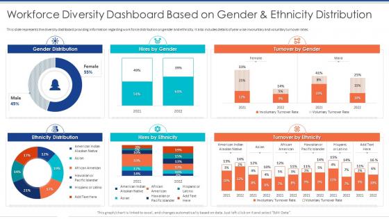
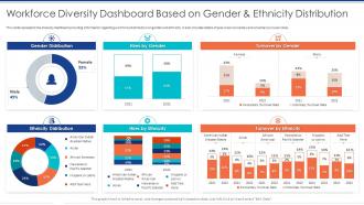
This slide represents the diversity dashboard providing information regarding work force distribution on gender and ethnicity. It also includes details of year wise involuntary and voluntary turnover rates.
People who downloaded this PowerPoint presentation also viewed the following :
Workforce Diversity Dashboard Based On Gender And Ethnicity Diversity Management To Create Positive with all 7 slides:
Use our Workforce Diversity Dashboard Based On Gender And Ethnicity Diversity Management To Create Positive to effectively help you save your valuable time. They are readymade to fit into any presentation structure.





FAQs for Workforce Diversity Dashboard Based On Gender And Ethnicity Diversity Management
Track representation across departments and leadership levels first - that's your foundation. Then dig into hiring, promotion, and retention rates by demographics. Pay equity is huge but honestly the data can be messy if your systems aren't clean. Employee engagement scores by group matter too, plus why people actually leave when they quit. Oh, and definitely include your candidate pool diversity - shows if your pipeline issues are internal or external. Start with these basics, then layer on more specific stuff once you see where the real gaps are.
Honestly, diversity dashboards are game-changers because they show you exactly which recruiting channels actually work vs the ones that just look good. Like, some of those "diverse" job boards are total duds - super eye-opening when you see the data! You can spot your biggest gaps and throw your budget there instead of everywhere. Plus it helps you figure out if your job descriptions are scaring people off or if certain universities/partnerships are worth it. I'd start with whatever demographic you're missing most and go from there. Way better than guessing.
Your leadership team will actually catch stuff they'd never see buried in Excel sheets. Charts make it super obvious where departments are crushing it versus where there are weird gaps. Plus you can connect the dots to real business metrics - I've seen companies track how diverse teams affect their bottom line and it's eye-opening. The visual thing also helps when you're trying to get buy-in from executives who don't want to dig through data. Track changes over months so you can spot trends. But here's the key part - don't just make pretty dashboards that nobody looks at. Schedule monthly reviews where leadership has to actually discuss what they're seeing and make changes based on it.
Monthly works best for most places, but quarterly's fine too if your numbers don't change much. I'd go with monthly since you'll spot trends faster - plus it keeps you on top of any weird hiring patterns. Some companies do weekly updates during big recruiting pushes, which honestly feels like overkill unless you're scaling super fast. Just pick whatever frequency makes sense and stick with it so people know when to expect updates. Oh, and definitely set a recurring reminder or you'll totally forget (speaking from experience lol). Start monthly and dial it back if it feels excessive.
So for your diversity dashboard - honestly, Power BI is probably your move if you're already in the Microsoft ecosystem. The integration just works without any headaches. Tableau's solid too and executives seem to love how the visualizations look. You could go crazy with Python or Looker but that feels like way more work than you need? Before you pick anything though, definitely figure out which metrics you actually want to track first. Then just see what connects easiest to whatever HRIS you're stuck with. Most companies overthink this stuff when the basics work fine.
Honestly, the worst part is when your data looks misleading - like you're killing it on diversity hires but people keep quitting, so your overall numbers still suck. Small teams are brutal too because one person leaving can make it look like a 20% nosedive. Different departments will have totally different baselines, which makes comparisons weird. Oh, and don't get me started on trying to compare senior roles to entry-level stuff. Focus on trends instead of just looking at one moment in time. Always dig into what's actually causing big changes before you panic.
Start with clean data - seriously, this is where most people mess up. Get your HR systems updated regularly and train managers on their part in keeping employee info accurate. I've watched so many dashboards crash and burn because everyone enters stuff differently or just... doesn't. Set up automated checks for duplicates, missing info, weird inconsistencies. Audit quarterly against your official records. Honestly, you need someone who actually owns data accuracy - make it their job, not just an afterthought. Train your team on standards and hold them accountable for following them.
Your diversity dashboard is only as good as what employees actually tell you. Survey them quarterly about real barriers they're facing - not just surface-level stuff. If people say the mentorship program sucks, that insight belongs on your dashboard alongside all the demographic numbers. Mix quantitative survey results with actual stories and feedback. Otherwise you're just tracking what HR thinks matters instead of what's genuinely helping (or hurting) your team. I've seen too many dashboards that look impressive but miss the mark completely because nobody asked employees what they needed tracked.
Honestly, the best way is tracking metrics before and after your sessions - stuff like promotion rates by demographics, retention numbers, engagement scores. Way easier than those awful quarterly spreadsheet deep-dives! Set realistic timeframes though, since culture shifts take forever. The dashboard thing is pretty clutch for spotting trends over time. If certain programs aren't working, just adjust your approach. Short bursts of data analysis beat guessing every time.
Look at three main things: retention rates by demographic, how fast underrepresented people get promoted, and inclusion survey scores. Your dashboard will pinpoint the exact problems - maybe women are bailing at mid-level or certain groups aren't moving up fast enough. Honestly, hiring diverse people is just step one these days. The real magic happens when you actually create spaces where everyone can grow and succeed. Find your biggest data gap first, then build specific programs around fixing that particular mess.
Honestly, benchmarking is a game-changer for diversity stuff. Without it, you're just guessing whether your 30% women in leadership is actually decent or pretty awful for your industry. I mean, context is everything, right? You can stack your numbers against what everyone else is doing, spot where you're crushing it or totally behind, and figure out realistic goals. Plus when your boss inevitably asks "so how're we doing?" you'll have real data instead of that awkward "um, fine I think?" moment. Industry associations usually have good benchmark data - oh, and those compensation surveys too. Start small though. Pick maybe 3-4 key metrics first, then build from there.
Set up automated alerts when your diversity numbers drop below target - can't let that stuff slip by unnoticed. Tie the dashboard directly to manager reviews and team scorecards so people actually care about the results. Monthly team meetings where they explain their numbers using the trend data work well too. Honestly, I've watched so many companies track this religiously but never connect it to real consequences, which is pretty much useless. Make the whole dashboard visible to leadership and have teams report progress in regular meetings. The transparency alone will push people to do better.
Pick one solid win metric first - like better retention numbers or hiring pipeline improvements. The dashboard's charts are perfect for those before/after stories leadership loves. Honestly, the boring process tweaks always work better than the fancy stuff nobody talks about. Export your trend data to build actual case studies around what moved things. Filter by department or time periods to see what worked where. I'd probably start small though - one clear success story hits harder than trying to showcase everything at once.
Start with basic trend analysis and heat maps - they're way easier than you'd think. Predictive modeling works great for spotting turnover patterns in different groups. I'd also run correlation analysis between your diversity numbers and things like promotion rates or satisfaction scores. Clustering helps you figure out which teams have similar diversity makeups. Oh, and cohort analysis is clutch for tracking how different groups move up in your company over time. Sentiment analysis on employee feedback gets really interesting when you break it down by demographics. Work your way up to the fancy ML stuff later.
Cultural stuff will totally mess with how people read your diversity data. Gender parity might look awesome to your US team, but your APAC folks could be like "we're still working on basic inclusion here." Some regions won't even collect certain demographic info, so you're comparing apples to oranges. Different places care about completely different diversity aspects too. Honestly, I'd add some cultural context right in the dashboard - maybe little notes explaining regional differences alongside the numbers. Otherwise people will draw the wrong conclusions from data that doesn't tell the whole story.
-
Love how there are no boring templates here! The design is fresh and creative, just the way I like it. Can't wait to edit and use them for my extended projects!
-
I want to express my gratitude to SlideTeam’s presentation design services team for helping me create the best presentation of my life!