


3 arrow shows percentage increase powerpoint slide show




Try Before you Buy Download Free Sample Product
 Impress Your
 Audience
 100%
100% Editable
 Save Hours
 of Time


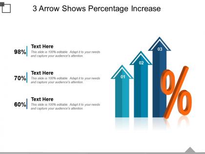
Get ready to make the best presentation about your growth rate by using our 3 arrow shows percentage increase PowerPoint slide show. By the use of this percentage increases PowerPoint slideshow you can show an increase in the business profits, losses, growth rate, marketing, production, finances, marketing, etc. The use of high resolution and premium quality slides while designing this three arrows PPT template model will help you raise the standard of your presentation. Also, this percentage changes business template has been designed showing three arrows pointing upwards and a percentage symbol along with editable text holders in the other corner. This 3 stage process PPT slideshow has been designed in such a manner that you will be able to save a lot of your time and energy as the slides used in it are predesigned and ready to use. So if you are ready to take advantage of the given characteristics of this set of slides download, edit and present it. Bring an end to jailbird existence with our 3 Arrow Shows Percentage Increase Powerpoint Slide Show. It enables you to counsel convicts.
People who downloaded this PowerPoint presentation also viewed the following :
3 arrow shows percentage increase powerpoint slide show with all 5 slides:
Create exuberance with our 3 Arrow Shows Percentage Increase Powerpoint Slide Show. Give cause for great celebration.
FAQs for 3 arrow shows percentage increase
Oh those! They're just upward arrows with percentages stuck on them - pretty straightforward visual for showing growth. I see them everywhere in presentations when people want to highlight good stuff like sales bumps or better user engagement. Honestly, they work because arrows are kind of impossible to ignore, and everyone immediately gets that up = good. Just make sure you're clear about timeframes - like "23% vs last quarter" - and maybe throw in the actual numbers too. Otherwise people might think a 50% increase sounds amazing when it's really just going from 2 to 3 users or whatever.
Make the percentage your biggest text - that's what people care about most. Put the original and final values somewhere clear, plus throw in the dollar difference (like "+$50") because honestly everyone wants to see the actual numbers anyway. Your arrow should go left to right, it just feels way more natural. Oh and don't forget a decent title with the timeframe if you've got one. I usually stick with simple colors but make sure there's enough contrast or nobody can read the damn thing. Keep it clean but make everything easy to spot at a glance.
Honestly, gradients work really well for this - start with blues for small increases and go toward reds for the big ones. That way you don't have to squint at every single number to figure out what's happening. I used to just throw random colors at these things and it looked terrible lol. Darker shades can also work if you want to keep it simple - just make the higher percentages darker. Most people already expect "hot" colors to mean bigger changes anyway, so why fight that? Just stay consistent with whatever you pick.
Honestly, just use Excel or Google Sheets - they're way better at this stuff than people think and you've probably got them already. PowerPoint's decent too if you need it to look nice for a presentation. Lucidchart is pretty solid but feels like overkill unless you're making tons of flowcharts. Canva works well for the design-y stuff, or there's Draw.io if you want something free (though the interface is kinda clunky). Whatever you pick, don't overthink it. A simple diagram that actually makes sense beats some overcomplicated thing every time.
So here's the thing - arrow diagrams are perfect when you just want to show one specific change between two numbers. Bar charts? They're awesome for comparing a bunch of different stuff. Line graphs show trends really well over time. But sometimes that's way too much info, you know? The arrow diagram cuts through all that clutter and makes your percentage increase super obvious. Honestly, I love how clean they look. You get that "before and after" moment with the arrow pointing exactly where you want people's eyes to go. Perfect when you need that one change to really stand out.
Honestly, arrow diagrams are clutch when you want to show something moving from point A to point B. Before/after stuff, quarterly changes, that kind of thing. They hit different than regular charts because people instantly get the direction and momentum - way more satisfying than staring at boring bar graphs, you know? Perfect for dashboards when you need quick visual punch. I'd use them when the percentage change matters more than the actual numbers. Your audience won't have to think twice about what's happening.
Honestly, the worst thing you can do is make confusing arrows that don't clearly show where you're going from A to B. Label everything - your starting value, ending value, and that percentage increase. I always double-check my math first because there's nothing worse than a beautiful diagram with wrong calculations lol. Don't cram everything into one messy diagram either. Keep it clean so people can actually follow what you're showing them. Oh, and definitely test it on someone else if you can - they'll spot stuff you missed.
Honestly, they're everywhere once you start noticing. Finance companies throw them in every client presentation - investment growth, market trends, that stuff. Retail uses them for sales spikes and seasonal data. Healthcare tracks patient outcomes and cost savings with them. Oh, and tech startups? They're absolutely obsessed - always flexing their user growth charts. Manufacturing loves showing productivity gains too. Next time you're in a quarterly meeting (ugh), count how many pop up. I swear you'll spot at least three in whatever PowerPoint deck they're showing.
Honestly, just treat your arrow diagram like you're telling a story. Start with the "before" situation - whatever problem or baseline you had. Then that arrow becomes the journey part where stuff actually happened. Maybe throw in little notes like "this is where we finally figured it out" or whatever the turning point was. The trick is connecting those numbers to real things people actually care about. I've definitely seen folks go overboard with weird metaphors though - like comparing sales growth to mountain climbing or something equally cringe. Wrap it up with where you ended up and what's next. Trust me, they'll remember the story way more than just "47% increase" floating there by itself.
Label those arrows with clear percentages - like "↑15%" or "+23% increase." Time periods go on your x-axis (months, quarters, whatever). Your y-axis needs actual units and scale because nobody wants to guess if you're talking about revenue or how many coffees the team drinks daily. I've seen so many charts where it's impossible to tell what's being measured! Avoid overlapping labels - they're annoying to read. Throw a quick title above each arrow explaining what you're tracking. Trust me, your audience will thank you for not making them decode your data like some weird puzzle.
Show your baseline first, then animate that arrow shooting up while the percentage counts from 0% to whatever your target is. Honestly, I'm obsessed with adding a little bounce when it hits the final number - way more satisfying. If you've got multiple arrows, don't reveal them all at once. Stagger them every 1-2 seconds instead. Speed matters too - go too fast and people blink and miss it, too slow and you'll lose them. Oh, and that bounce effect? Total game changer for making the whole thing feel more impactful.
Oh dude, context is everything! Corporate folks want those boring blues and grays - super clean and professional because executives lose their minds over messy data. But classrooms? Go wild with bright colors and fun visuals that actually help students get it. I honestly think the corporate obsession with citations is overkill sometimes, but they need every source documented. Students just need the lightbulb moment, you know? Short version: stuffy and precise for suits, colorful and approachable for students. Match your audience's vibe and you're golden.
Definitely add clear labels and make sure your arrows are thick enough - thin ones disappear on crappy projectors. Use high contrast colors but don't rely on color alone since some people can't distinguish them well. Throw in patterns or textures too. Always include the actual percentage numbers as text, not just buried in the visual part. Alt text for screen readers is clutch. For really complex stuff, add a short explanation underneath. Honestly, the more ways people can get the same info, the better. Nobody wants to squint at a diagram trying to figure out what the hell that pale yellow arrow means.
Honestly, just relate it to stuff they already know. Like if revenue went up 25%, tell them "we basically made an extra quarter on top of what we usually bring in." Way easier to grasp than just saying numbers. Visuals help a ton too - pie charts or those before/after bar things work way better than rattling off percentages. But here's the real thing: connect it to what actually matters to them. How does this bump affect their budget or day-to-day work? People need to see the real impact, not just abstract math. Make it something they can picture and feel.
Hover effects are clutch - show the actual calculations when people mouse over different parts. Clickable sections work great too for step-by-step breakdowns. Honestly, sliders are my favorite because watching percentages change in real-time is weirdly satisfying. Animated transitions where the arrow "grows" look pretty slick. Oh, and tooltips are super easy to start with if you're not sure where to begin. Build one thing first, see what people actually click on, then add more from there. Don't go overboard right away though.
-
Innovative and Colorful designs.
-
Out of the box and creative design.