


Achieving success template powerpoint presentation




Try Before you Buy Download Free Sample Product
 Impress Your
 Audience
 100%
100% Editable
 Save Hours
 of Time


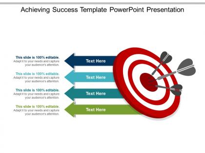
With this readily available achieving success template PowerPoint presentation, you can certainly inspire your audience to succeed as well. This high-definition presentation has been drafted by our experts to bring forth the fact that in order to be successful, you have to find the right key and that success only comes to those who are ready to strive for excellence. Making use of this illustration you can certainly inspire your audience to succeed as well. Since it is a universal topic, professionals belonging to every domain can use these steps to success PPT presentation graphic. If you are guiding counselors or motivational speakers or project managers or HR professional then this target and success step PowerPoint infographic is a must have slide template for you. Being company owners or HR professionals you can make use of it to draft inspiring slideshows for employee motivation while motivational speakers and counselors can use it to guide their audience to succeed. You can always customize the slide layout in relevance to your audience, thus helping your audience focus on the key factors for being successful. Curiosity about your ideas begins to grow due to our Achieving Success Template Powerpoint Presentation. It will draw in the disinterested.
People who downloaded this PowerPoint presentation also viewed the following :
Achieving success template powerpoint presentation with all 5 slides:
Highlight aspects that could be improved with our Achieving Success Template Powerpoint Presentation. It helps focus on the infrastructure.
FAQs for Achieving success
Okay so for a solid presentation template, you'll need the basics first - title slide and an agenda so people aren't totally lost. Then set up consistent layouts for your main content (trust me, this saves hours later). Make spots for visuals and data, plus a strong ending slide. Oh and throw in a Q&A placeholder too. The formatting consistency thing is huge - same fonts, colors, all that. I'd definitely test it with real content first though, because what looks good empty might be a disaster with actual text.
Honestly, templates work because people crave predictability - they want to know what's coming next. But here's the thing: you can't just slap together any old structure and call it good. Break your content into bite-sized pieces that actually make sense for your audience's attention span. I always map out how long people will realistically stay focused (spoiler: not very long). Keep your visual elements consistent so it feels familiar, but leave plenty of space for your actual personality to come through. That's where the magic happens - when structure meets your unique voice.
Ugh, the worst thing you can do is cram everything onto one slide - instant audience killer. Tiny fonts are terrible too. Oh and those crazy busy backgrounds with like 5 clashing colors? Hard pass. I swear people think more animations = better presentation, but it's the opposite. Don't box yourself into some super rigid template either - you'll need flexibility for different topics. White space is your friend! Stick with consistent fonts and definitely test it on an actual projector first. Trust me, nothing's worse than showing up and your slides look like garbage on the big screen.
Dude, colors and fonts can totally make or break your presentation. I've watched people bomb because they used some horrific neon green on blue combo - like, come on. High contrast is your friend here. Keep it simple with maybe 2-3 colors max, nothing crazy. Font-wise, go clean and readable. Save the fancy cursive stuff for... I dunno, maybe nowhere? Haha. But seriously, test your slides from way back in the room. You'd be surprised how tiny text gets when you're actually presenting. The whole thing falls apart if people can't read it.
Dude, storytelling changes everything. People remember stories way better than boring data - like, you probably still know fairy tales from when you were five but can't remember what happened in yesterday's Zoom call, right? Stories give people something to actually grab onto mentally. Plus they make complicated stuff way easier to follow. I always tell people to think of their presentation like a mini story - you've got your problem, then what happened, then how it got solved. Honestly, it just makes everything more interesting and people actually pay attention instead of checking their phones.
Templates work best when you totally customize them for your crowd. B2B sales teams need stuff about revenue and client numbers. Creative agencies? More like project deadlines and brand metrics. Keep the main structure but swap in the right jargon and KPIs that actually mean something to your team. Generic templates are honestly the worst - nobody cares about "boost performance by X%." I always start with what's driving people crazy at work, then build backwards. Makes it feel like actual help instead of just another thing to fill out. Way better results that way.
Honestly, just go with PowerPoint or Google Slides first - everyone already knows them and they work fine. Canva's where it gets fun though, their templates are actually gorgeous and you don't need to be a designer. If your team's already using something, start there. Adobe InDesign is powerful but kinda overkill unless you're doing fancy stuff. Oh, and Figma's cool too since multiple people can work on it at once. I'd probably mess around with Canva after you get comfortable with the basics - it'll make your presentations look way more professional without much effort.
Honestly, visuals make such a huge difference in presentations. Charts and graphs are your best friend for backing up data - way more convincing than just throwing numbers at people. I always add little icons next to bullet points because it makes everything easier to scan. Photos or illustrations that actually connect to your message work great too. Oh, and screenshots are clutch if you're walking through any kind of process. Just don't go crazy with decorative stuff that doesn't add value. Keep your colors and style consistent so it doesn't look like a mess. Start with your three biggest points and find visuals for those first.
Dude, layout makes or breaks everything. I can't tell you how many good ideas I've seen crash because the organization was all over the place. You want people following your train of thought, not getting lost three paragraphs in. Start with your most important stuff first - map out those key points by priority. Then build each section so it flows into the next one. Consistent headings help too. Think of it like... you're walking someone through your brain, step by step. If they can scan and immediately find what they need? You've nailed it.
Honestly, templates are lifesavers. Why stare at a blank page when someone already figured out what works? You'll hit the ground running instead of wasting hours on structure. Plus you won't forget crucial stuff that actually converts. I used to think starting from scratch was more "creative" but... eh, mostly you just end up copying what's already proven anyway. The real magic happens when you take that template and make it yours - swap out examples, adjust the tone, whatever fits your thing. Trust me, use it as your base then customize the hell out of it.
Honestly, go way bigger on fonts - like 24pt minimum because everyone's squinting at tiny screens. High contrast colors are your friend since webcams totally butcher anything subtle. Keep it clean with tons of white space. Busy slides look terrible on phones, and trust me, half your audience will be on mobile anyway. More transition slides help too - people get lost easier virtually. Oh, and definitely test how it looks on your phone first! I'd make a backup version with even bigger text just in case the original feels too small. Interactive stuff like polls work great for keeping people engaged.
Honestly, the biggest thing is making sure everyone knows who owns what version - you don't want five people editing the same doc at once, trust me on that one. Add clear comment sections and make your placeholders super obvious so people actually know what to fill in. I'd throw in some progress tracking too so nobody's wondering what's been done already. Oh, and put the role-specific instructions right in the template itself. Saves so many "wait, what am I supposed to do here?" questions. Get these basics down and you'll avoid all those annoying "which version are we using?" texts later.
Honestly, templates are lifesavers for organizing your data visually. Bold headers and consistent colors will guide people to what matters most. But here's where everyone messes up - they try to shove everything onto one slide. Don't do that! Break your complex stats into smaller pieces instead. I always use the same layout pattern throughout because it keeps things clean. Your audience shouldn't be squinting trying to figure out what they're looking at. Stick with one template for the whole presentation too - switching around just looks messy and unprofessional.
Honestly, minimalism is huge right now - clean layouts with way more white space instead of cramming everything onto one slide. Bold typography is everywhere too. Dark mode templates are super popular (my eyes are so grateful during long meeting days lol). Most people are viewing presentations on phones now so everything's getting optimized for mobile. Interactive elements and data viz tools are getting really sophisticated. Oh and there's been this big push for accessibility - better contrast, readable fonts, that stuff. You should definitely check out newer template libraries because the old PowerPoint defaults were honestly painful to look at.
Honestly, feedback and analytics are total game-changers for templates. They show you what actually works instead of what you *think* works. Track which slides grab attention, where people zone out, design elements that help or confuse viewers. I've watched templates completely flip after getting real user data - it's wild how wrong our assumptions can be sometimes. Collect both the numbers (time per slide, clicks) and actual comments from presenters plus audiences. Start simple though - just add feedback forms to your template library and ask presenters what clicked after their presentations.
-
Very unique, user-friendly presentation interface.
-
Understandable and informative presentation.