

 0 Comment
 Customer Reviews

Ever thought if your ongoing project really makes a difference in the business growth? And what if you could see its overall impact live? Well, an impact dashboard can make this possible. It brings your work to life on screen and shows the results in a structured way. And you no longer have to wait for end-of-month reports. With real-time analytics dashboards, you see where your work is doing well and where it is not.
You can take a look at our Impact Report Templates With Samples and Examples.
Also, reporting tools like KPI Tracking and Data Visualization can help you understand numbers in seconds. And with a strong performance dashboard, your team can monitor the impact metrics on a regular basis and fix issues early. You also measure user engagement and explore smart data insights in a clear and simple manner. So, if you implement a solid dashboard design in your project operations, you can build strong business intelligence and support faster data analysis.
Now, to make these complicated data clear and show their impact, try using our ready-made impact dashboard templates from SlideTeam. These documents can save you a lot of time and help outline project results in a concise format. So, whether you are tracking performance, reporting to your stakeholders, or sharing insights with your team, our PPT designs can make it simple.
With these templates, you can illustrate real-time analytics in clear graphic formats. You can make performance metrics and summary details easy to understand for your team members. In this way, you can improve visual reporting and clean presentation, ensuring everyone is on the same page. These documents also help in deep impact assessment during meetings and support better decision-making.
Now, let us explore our Top 10 Impact Dashboard Templates with Examples and Samples.
Template 1: Transformational Impact Of AI On Hospital Dashboards PPT Template
AI improves faster/better decision-making, reduces errors, and increases patient outcomes by turning raw health data into smart insights. And when you integrate AI with hospital dashboards, you can easily track patient care, staff work, and hospital performance. Dashboards can show the right alerts at the right time, as well as update records and give suggestions in real-time. So, use the following template and explore the impact of AI in different hospital dashboards. It illustrates data integration in hospital dashboards, real-time data analytics through AI insights, workflow automation, etc. It also shows the challenges of AI implementation, AI learning algorithms and models, case studies, etc.
[product_image id=1416336]
Template 2: Impact Analysis Powerpoint PPT Template Bundles
Impact Analysis usually means checking how a change, project, or decision affects an organization and its people. It can help you see both good and bad outcomes of any action before it happens. To get some idea of the concept, include this template in your list and present your data. Here, you can show impact analysis for relevant metrics and avoid risks by spotting problems early. You can break down complex changes into simple slides and support better team decisions with facts, not guesses. Get the template now and share results with your team leaders, business owners, and clients.
[product_image id=515716]
Template 3: Impact Summary Powerpoint PPT Template Bundles
An Impact Summary is basically a short report that gives an overview of the results of a particular operation. It can help others quickly understand how effective your project, business, or idea has been. So, add this complete template to your list and make the summary details easy to read and understand. It shows impact summaries for sales and marketing campaigns, project operations, policy implementation, IT training, etc. It also displays the impact of the latest technologies on your business. Get the template now and guide your team to stay focused on the required details.
[product_image id=699853]
Template 4: Real Time Dashboard for Change Impact Assessment
A dashboard is basically a visual reporting tool that can track how changes are affecting your project, business, or team. It gives a clear picture of what is working and what needs attention. So, add this colorful template to your bundle and describe the business change impact assessment metrics dashboard. It displays metrics for impacted organizations and groups, impacted users, impacted jobs, etc. With this format, you can monitor the important metrics and spot issues before they grow into something major. So, download the template now and show clear visuals. You can use this layout to help your team understand the real impact of any change.

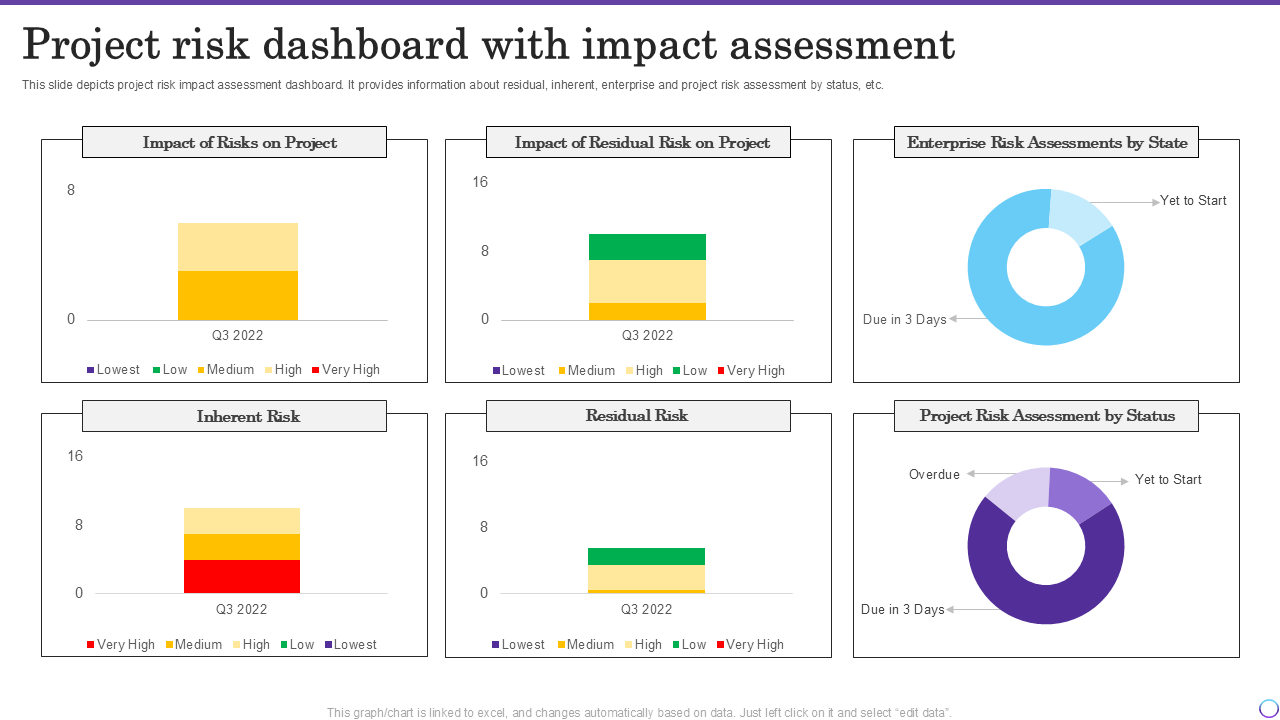
Template 5: Project Risk Dashboard with Impact Assessment PPT Template
A Project Risk Dashboard with Impact Assessment is a visual tool that helps teams track project risks and their possible effects. It shows where things might go wrong and how much impact those risks can have on your project goals, timelines, and total costs. You can use the following template to depict your risk impact assessment dashboard. It shows information about residual, inherent, enterprise, and project risk assessment by status, state, etc. Based on your needs, you can modify the document and add important elements as you see fit. Get it now!
Template 6: Change Management Impact Measurement Dashboard PPT Template
The following slide shows a dashboard that can be used by organizations to track the effectiveness or impact of any change. It includes key performance indicators such as impacted groups, impacted individuals, etc. You can use the edit feature and make necessary modifications to this document. This structure can help you check if new changes are improving work or causing problems. Now, click on the link below and get the template right away!

Template 7: Impact Analysis by Technology Usage Dashboard PPT Template
You can add this PowerPoint template to your list and evaluate the influence of technology adoption. This dashboard can guide you with strategic decisions for better operational efficiency and competitive advantage. It shows which tools or software help your team work better or faster. Also, you can compare usage across teams to see what works best and what does not. In simple words, you can give a clear picture of how tech is helping or hurting business goals. So, get the template by clicking on the download link. Make sure you cover everything important and prepare a smart report that supports better decision making.

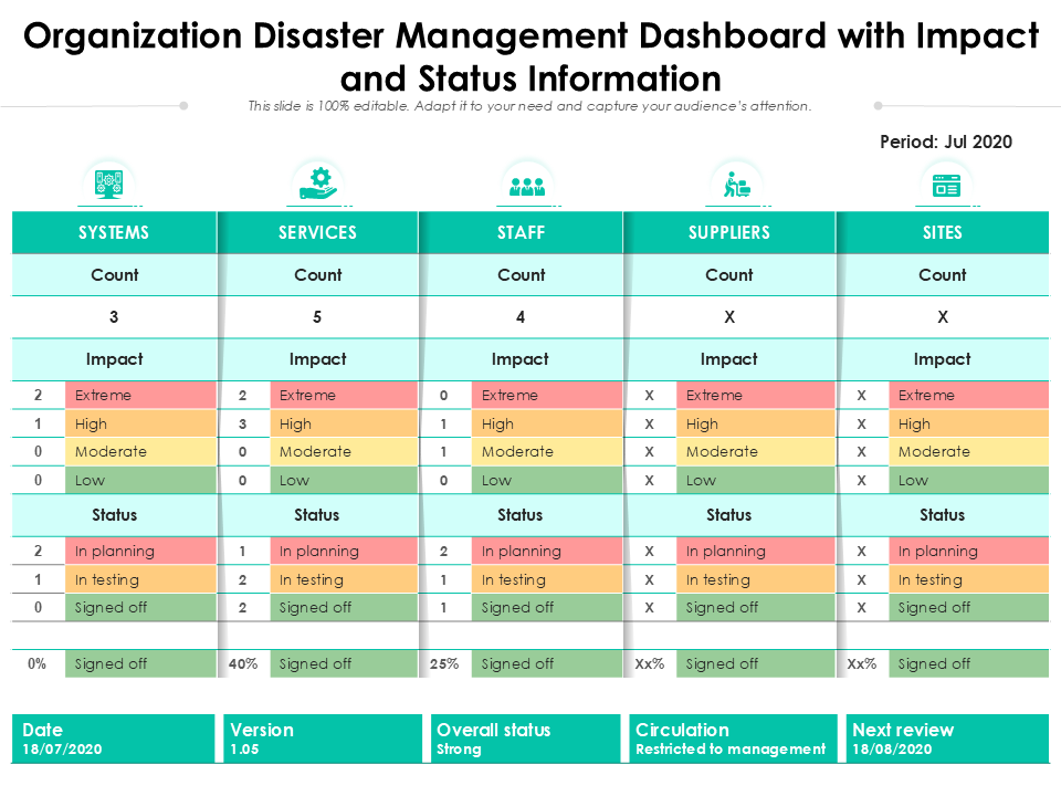
Template 8: Organization Disaster Management Dashboard with Impact and Status Information PPT Template
A Disaster Management Dashboard illustrates live updates about risks, damage, safety, and team actions during disasters. It can help your leaders make fast, smart decisions during emergencies by showing impact and status in one place. You can check out this template and see how you can share important details with teams, boards, and safety experts. Here, you can discuss the impact and status of risks related to systems, services, staff, suppliers, sites, etc. Get the template and reap its benefits!
Template 9: Impact Dashboard For Manufacturing RPA And Hyper Automation PPT Template
An Impact Dashboard can tell how well your automated systems are working. It can monitor robot performance, process changes, and time savings in one place. So, use the following template and provide an overview of the impact of RPA and Hyperautomation on manufacturing. It highlights data for plant productivity, machine productivity, production rate, operators available, etc. With this format, you can also track daily machine tasks, errors, and improvements in real time. So, download it right away and present task updates and impact!

Template 10: Regenerative Design Dashboard for Environmental Impact Monitoring PPT Template
This dashboard can explain how eco-friendly a project is. It can make complex climate data easy to see and understand using simple visuals. So, consider this attractive template as an option and show the implementation of regenerative practices for successful transformation towards sustainability. It includes metrics such as the number of new transitions, woody tree count, total trees planted, average tree diversity, carbon impact, etc. Download the template from the link and describe your findings with your team, clients, and board. It can help people understand green goals without heavy words or reports.

Conclusion
An Impact Dashboard is more than just a reporting screen; it outlines and simplifies project results in a structured way. It helps teams understand the overall work clearly and quickly. Instead of waiting for reports, you can get live updates with visuals, and that makes more sense. Also, by using smart KPI reporting tools, you can stay on top of your desired goals and spot gaps early.
And you can use our templates if you want to save your time and make the data work for you. These slides are designed to make your project reports look more clear and professional. Also, they are totally customizable, so you can make necessary changes and give your data the clarity it deserves. Now, download the templates and see how these layouts help your work speak for itself.
PS: Also, check out our Infographic Dashboard Templates with Samples and Examples.
Impact Dashboard Templates FAQs
What types of impact metrics are displayed?
Impact dashboards can show important metrics such as goals reached, funds raised, test results, risks, tasks completed, etc. They also track user engagement, cost-effectiveness, and efficiency of project activities. For social projects, these can include education levels, health outcomes, or environmental changes. And, based on your business goals, you can add relevant metrics and help teams see if they’re on track.
How is performance tracked across different impact areas?
- To track performance, you must set clear goals and monitor impact metrics.
- You can use dashboards to measure project results regularly.
- These reporting tools can help you compare current data with past performance and identify improvements or gaps. In this way, you can track progress in real-time.
How is social or environmental impact visualized?
You can use charts, graphs, icons, and color-coded scales. Note that bar graphs show comparisons, and pie charts show parts of a whole. And the icons and colors make reports easier to read. Also, companies use tools like Tableau or Power BI to prepare reports and help people clearly see the value of social or environmental efforts.