

 0 Comment
 Customer Reviews

Have you ever been solicited with a request to complete a brief survey, maybe by a stranger on the street or via an online popup?
You may have come across viral interview clips in which people are interviewed on popular social issues. The questions themselves are straightforward on the surface. But when people's answers are aggregated, they form a massive dataset, able to reveal trends, shape opinions, and guide significant decisions.
But here's the catch:
More than 60% of data in surveys goes unutilized or unidentified just because it isn't displayed properly.
Surprising? Raw data, however rich, is as good as its presentation. Without form or visualization, even the most insightful survey findings tend to be read or, worse, not read at all.
That is where survey result dashboards fill in.
A lot of companies use dashboards that show survey results to show trends, track satisfaction over time, identify priority areas, and share insights across teams. Some examples of these companies are Amazon, Zomato/Swiggy, and Netflix.
A few tools and platforms excel at developing real-time survey dashboards, each with distinct strengths for various requirements, whether you need ease of use, deep customization, or integration with new web frameworks.
Template 1: Survey Results Dashboard on Coronavirus Recovery Rates
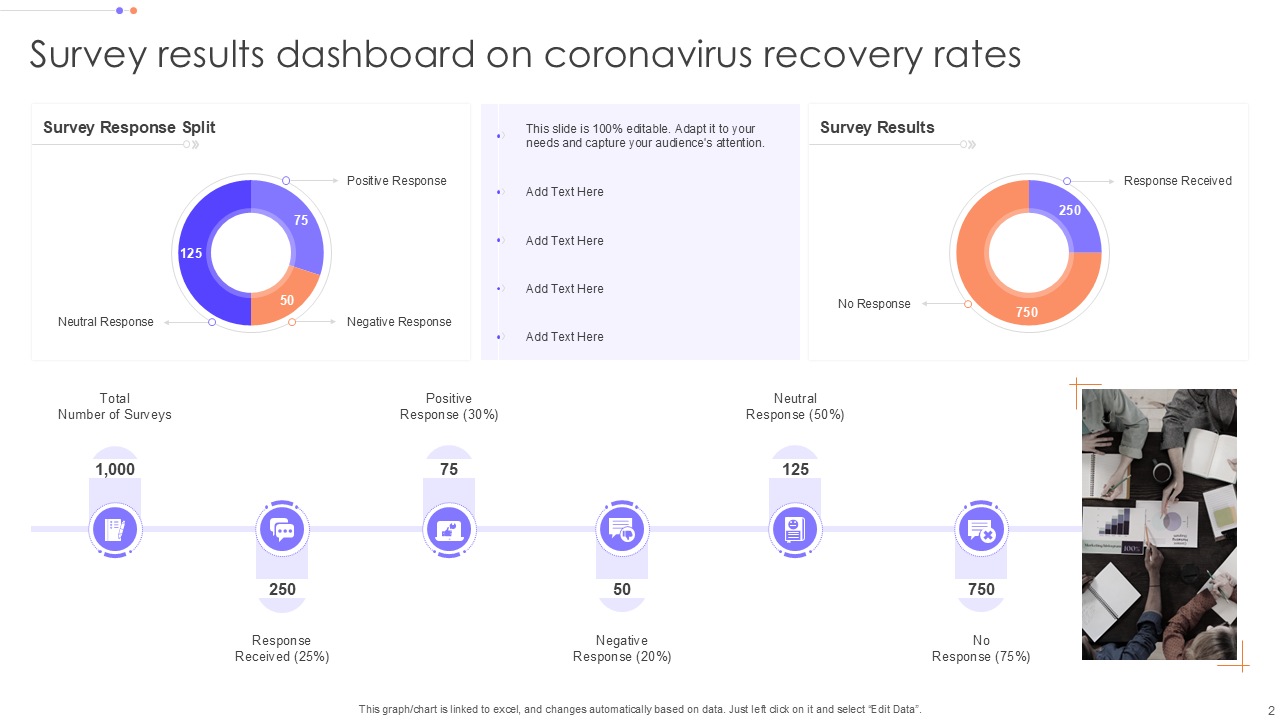
This survey results dashboard provides a concise divide between survey responses and result analysis. It brings forth principal insights like the total number of surveys completed and the percentage of positive, neutral, and other responses, which help visualize public feedback efficiently.
The primary purpose of this dashboard is to track recovery speed for those who have been infected with coronavirus, providing meaningful data for awareness, healthcare planning, and informed decision-making. Grab the presentation today!
Template 2: Dashboard for Product Campaign Survey Results
Would you like to track the performance of your product during a campaign?
Download this PPT template in order to know the product campaign survey results. This response analysis dashboard precisely demonstrates the statistics regarding the specific product in percentage to make observations and represent your product campaign survey results clearly.
Furthermore, this response analysis dashboard gives prominence to the most important metrics, like the percentage of future buyers who are interested, awareness about the campaign among the audience, and general customer sentiment towards the product.
This template not only assists you in analyzing how well your campaign is connecting with your audience at large but also helps in greater customer engagement and better product performance insights all at one glance.

Template 3: Survey Results Dashboard with Company’s Net Promoter Score
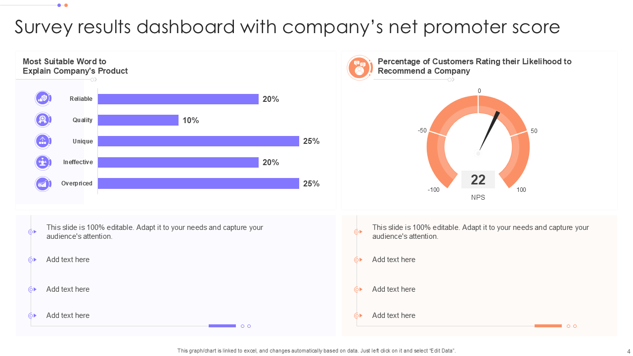
This PPT framework exhibits survey results, including the net promoter (NPS) score of the company. With this survey outcome dashboard, you can deep dive into various informative aspects about the product itself. It explores the most suitable words customers use to describe your product and shows the percentage of respondents likely to recommend your company.
Moreover, the slide helps you understand customer perception, brand loyalty, and overall satisfaction levels. It's an essential tool for tracking brand health and aligning your strategy with customer expectations. Download now!
Template 4: Immigration Stats Dashboard from Survey Results
This PPT layout offers an interactive survey report named "Immigration Stats Dashboard for Survey Results." The data visualization panel is split into two parts: attitude towards immigration and respondent profile.
Also, the presentation offers valuable assistance to the decision-makers, researchers, or presenters who wish to examine public opinion and base conclusions on facts. Grab this sentiment analysis dashboard today!

Template 5: Customer Experience Dashboard Created Through Survey Results
Are you actually working hard to upgrade your product within the market?
The only option to enter into the competitive market is to take customer feedback by conducting surveys to upgrade better and keep your heads high. This customer feedback dashboard is segmented into six parts, showing survey results collected from 10,000 participants to measure overall satisfaction and performance across various touchpoints.
The donut chart illustrates customer satisfaction rate with subparameters—somewhat satisfied, neutral, very dissatisfied, etc. The Net Promoter Score (NPS) is 75, which is a high probability of customers recommending the company. It illustrates the agent's performance over the past year with the agent's name and average score. Access it today to enjoy the advantages of this presentation!

Template 6: Dashboard Survey Results Report for Mobile Operating System
Stay updated on your mobile operating system using our survey performance dashboard template. This slide serves as an insights visualization tool that provides a recap of survey findings on users' favorite mobile operating systems.
To the left, a bar graph and donut chart exhibit the preferences of the customer. Survey metrics appear to the right. Among 500 people who began taking the survey, 300 of them finished it, representing a 75% completion rate, while 200 of them gave up.
Moreover, 600 surveys were audited, and an average of 5 minutes was required to fill out the survey. As a whole, this summary slide of survey data shows a clear graphical summary of user preference and survey performance metrics. Download now!

Template 7: Survey Results Analytics Dashboard on Personal Finances
If you are looking for a dashboard to monitor the personal finance record, this PPT template is your ideal guide. Offering a dashboard that displays survey statistics concerned with money management and savings improvement. The presentation highlights key areas like personal financial security, general happiness based on one's financial status, and prevalent issues experienced while attempting to save.
Moreover, the Poll Results Visualizer gives a snapshot of the stress levels triggered by money issues. In all, this slide gives you an all-around overview to understand and manage your own personal financial health. Get it now!

Template 8: Survey Results Dashboard on Organization Performance and Development
This presentation template offers findings collected through the survey aimed at assessing how the organization is doing and evolving over time. This PPT template offers a snapshot of stakeholders' and employees' opinions about the main areas of performance in the organization. It enables the leadership to get an instant grasp of strengths, weaknesses, and areas of improvement. Download this survey outcome dashboard now!

Template 9: Employee Survey Result Analysis Dashboard
For examining and presenting employee sentiment, satisfaction, engagement, and work-related feedback in an organized, easy-to-grasp manner, this template has been created. This real-time survey dashboard consolidates feedback gathered from employees via surveys.
Moreover, it provides a clear, fact-based picture of how employees perceive aspects of their workplace experience. Grab it now!

Template 10: Product Target Market Research Survey Result Reporting Dashboard
Ever meet the ideal customer base of your product?
This PPT template summarizes important findings from a market research survey with the objective of identifying the most suitable customer base for your product. It assists firms in streamlining their marketing, product development, and sales activities based on real consumer data.
This slide helps to define and validate your target market with data. It helps to reduce future risk by understanding customer wants and needs before you improve a product. Get access today!

Final Thought
Surveys ensure that individual opinions are amplified, but dashboards give them power. Without effective visualization, even highly significant survey findings can be overlooked.
Using our well-designed survey results dashboard, however, you can clean raw responses to convert them into actionable insights that guide decision-making, stimulate innovation, and drive alignment within teams throughout the organization.
Regardless of whether you're measuring employee satisfaction, tracking customer sentiment, or analyzing market trends, with the right dashboard, your information works for you, not against you.
PS: Check out our blog on the Top 10 Stats Dashboard Templates with Samples and Examples to simplify data interpretation and enhance your presentations.
Survey Result Dashboard PPT FAQs:
What are the survey results?
Survey results are a strong means of examining data through statistics. They are aggregated replies from people via focused questions, used to interpret how people believe, feel, or act.
How do you show survey results?
We can display survey data in different interactive ways based on data types you have gathered. The most popular ones are- tables, bar charts, line graphs, infographics, pie charts, word clouds, etc.
How to write a survey results report?
A survey results report is a report that displays the results of a survey in a clear and well-organized fashion. It usually starts with an introduction that describes the reason for the survey, who the survey participants were, and when and how the survey was taken.
This is followed by an overview of main findings that present the most significant findings, like percentages or trends. The report then has full results for each question, usually presenting the results using charts, tables, or graphs to make it easy to follow.