

 0 Comment
 Customer Reviews

Did you know that before launching the iPhone or Mac, the brand Apple creates sales forecasts with the help of market research and anticipated demand? After these products are launched in the market, the company then tracks the actual sales data and compares it against these forecasts. This process is helpful because it helps a brand like Apple conduct efficient operations, make informed decisions that drive growth and profitability, and thus maintain its leadership position in the technology market.
These forecasts and actual sales comparison can be a boon for your company as well as it helps in financial planning, risk mitigation and growth of your company. You can create detailed analysis forecasts of your projected sales of products and services over a month or year. Once the actual sales are recorded, you can then see how well your product or service did, and how much work is required.
This leads to better decision making where you can work on adjusting your price points, promote advertising, and improve marketing skills for products that did not achieve the projected sales. You can even compare your employees’ sales performance to see whether they are meeting their targets or need more help. This promotes more efficient resource utilisation and enhances team skills and productivity.
To help you in this process, you can use these readymade templates that help you edit and add data in graph charts and text boxes. Such standardised templates help you track the forecasts vs actual sales for each product, service, department, employee, and time period.
Each of these PPT templates is 100% customizable and editable. You get both structures in the form of content-ready slides, and the editing capability means the presentation can be easily tailored to specific audience profiles.
You can also add these Sales Performance Evaluation templates and Sales Chart Templates to your sales analysis.
Get your sales numbers in order with these templates!
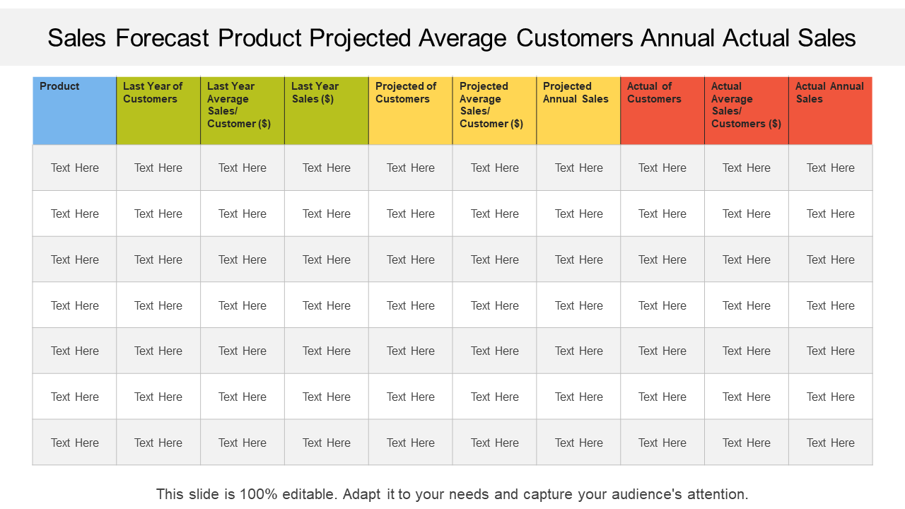
Template 1: Sales forecast product projected average customers' annual actual sales
To improve your budgeting and inventory management, you need to track the projected and actual status of your products and services. To simplify this process, here is a readymade slide for you that helps you list your product or service, last year’s customers, last year’s average sales/customer, and last year’s annual sales. You can then create a projection of the customers you expect to sell that product or service to this year, the projected average sales/customer, and the projected annual sales. There are also rows that help you write down the actual customers, actual average sales/customer, and the actual annual sales.
Template 2: Comparison of sales with forecast and actual
One of the best ways to compare forecasted sales and actual sales is by using a bar graph chart. This slide helps you do just that by using different bar graphs to highlight the forecast and actual sales, side by side, for each of your products or services. You can also edit the column that lists the quantity sold, total sales, and forecast sales. This will help you understand which products and services matched up to their projections and which didn’t. With these figures, you can increase your sales tactics for products that don’t match their expected sales.

Template 3: Actual vs forecasted sales revenue evolution graph
You can use our slide to show the growth of sales revenue over a year. In this, you can see the actual sales revenue and the forecasted sales revenue. The bottom line shows the months of the year, and the y-axis shows the amount of sales revenue of your products. In this particular slide, your company is making more money than it expected. This can help you analyze your sales projections and see if you are making more or less than expected.

Template 4: Graph represents forecast and actual sales
To get a trend comparison of your sales forecasts and actual sales, you can use this creative template. In this slide, the graph shows a comparison of sales forecasts and actual sales over a five-year period, likely from 2016 to 2020. There are sales forecasts that predict the number of sales the company is expected to make each year. The second line is the actual sales, which is the actual amount of sales the company made during each year. Using this bar graph, you can edit your data to see how well your products and services are doing.

Download now for enhanced efficiency!
Template 5: Forecasted and actual sales productivity dashboard
To document your sales forecast and actual sales productivity, use our dashboard. You can use this template to compare the sales your company expected to make to how much you actually made. In this template, you can list several details such as the bookings, the total forecast, open opportunities, booked to date vs. goal, bookings as % of goal value, the number of deals, deals that you sold this month vs. 100 goals, and booked this quarter. With this dashboard, you can see whether your company is on track to meet its sales goals for the month.

Template 6: Forecasted vs actual sales resource budget planning
This slide is a table that compares forecasted sales and actual sales for different products and expenses. It is a resource planner that can help you achieve the sales you desire while reducing the selling cost. The main things listed in the table are sales by model, cost of goods sold, and sales, as well as general and administrative (SG&A) costs. With this slide, you can keep track of your budget, actual sales, budgeted sales, and variance sales and see how close you came to your budget or forecast.

Start your business journey to success!
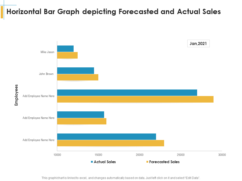
Template 7: Horizontal bar graph depicting forecasted and actual sales
To help you review your sales performance, you can use this creative slide that has a horizontal bar graph that depicts forecasted and actual sales. With this, you can compare the performance of your employees over a month. It compares how much sales each representative was expected to make (forecast) with how much they actually made (actual sales). The left side of the graph shows the names of the sales representatives. The bottom axis shows the amount in sales, likely in dollars. This can help you see which employees are meeting sales expectations and which ones need more help.
Access your essential template instantly
Conclusion
Thus, these templates are important for your business so that you can plan your future. With these creative slides that are filled with bar graphs and text boxes, you can use research to predict how much you might sell and thus also see how you can reach your goals. This way, you can also make adjustments in pricing or marketing if you are not meeting your sales goals. Your business can also use this information to make better choices about staffing, resources, and even product development.
PS: Add these sales analysis templates to your presentation.