


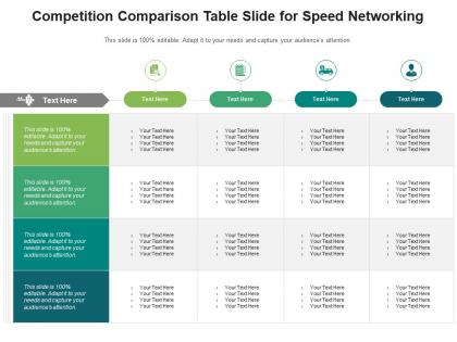
Competition comparison table slide for speed networking infographic template




Try Before you Buy Download Free Sample Product
 Impress Your
 Audience
 100%
100% Editable
 Save Hours
 of Time


Our Competition Comparison Table Slide For Speed Networking Infographic Template are topically designed to provide an attractive backdrop to any subject. Use them to look like a presentation pro.
People who downloaded this PowerPoint presentation also viewed the following :
Competition comparison table slide for speed networking infographic template with all 2 slides:
Use our Competition Comparison Table Slide For Speed Networking Infographic Template to effectively help you save your valuable time. They are readymade to fit into any presentation structure.
FAQs for Competition comparison table slide for speed
Definitely include pricing tiers and main features - that's the bread and butter stuff. Target audience matters too, plus pros/cons for each option. Oh, and don't forget support options and what integrations they offer. User ratings are gold if you can find legit ones. Keep it scannable though. People just skim these things. Use checkmarks or simple yes/no instead of paragraphs nobody reads. Also make sure you're actually comparing similar tools - don't throw some $50k enterprise thing next to a basic $10/month option. One trick: stick your solution in the middle column. People naturally use that as their reference point when comparing everything else.
Honestly, visuals are a game-changer for comp tables. Color coding is your best friend - green for winners, red for losers, that kind of thing. Makes patterns pop instantly. Icons work super well for yes/no stuff or ratings too. I used to go crazy with colors (still do sometimes), but less is more here. You can throw mini charts right in the cells for performance data without making it messy. The whole point? Turn complicated comparisons into something people can digest in like 5 seconds instead of staring at boring text forever.
Market share and revenue growth are your bread and butter - track those first. Customer acquisition costs matter too, plus their pricing strategy if you can get that info. Product features and customer satisfaction? Sometimes those beat financials, especially if you're in a space where quality trumps everything else. Marketing spend is worth watching, and honestly their distribution channels tell you a lot about where they're headed. Oh, and competitive advantages - like what makes them actually different. Start there, then add maybe 2-3 things specific to your industry that really count.
Okay so first thing - actually research what your top competitors offer instead of guessing. I see people mess this up all the time. List out your features, then figure out where you're genuinely better. Maybe it's pricing, maybe you've got some unique feature they don't, or your support doesn't suck like theirs does. Don't be shy about your strengths! Most businesses undersell themselves hard. Pick 2-3 things where you really shine and make those pop in your comparison table. Bold text, checkmarks, whatever - just make it obvious where you win. People scan these things quickly anyway.
Honestly, the worst thing you can do is cherry-pick metrics that make you look amazing while conveniently ignoring where competitors crush you. Stakeholders will call you out fast. Also make sure your competitor data isn't ancient - I cringe when I see pricing from like 6 months ago in these things. Don't cram 15 competitors with 20 random features either, nobody's reading that mess. Focus on actual differentiators instead of boring stuff everyone does identically. Oh and definitely keep updating it regularly, because presenting stale intel to leadership is just embarrassing.
So basically, you make this table to see what your competition's doing - their pricing, features, all that stuff. Helps you find gaps where they're sucking so you can swoop in. I'd start with like 3-5 main competitors and just map out their strengths. You'll spot your own weak points too, which honestly can be more valuable than finding theirs. Keep it fresh though - updating every few months or you're working with garbage data. It's pretty much your industry cheat sheet for figuring out where to put your energy and how to position yourself.
Oh yeah, you can totally tailor these to whatever industry you're in. SaaS folks usually go with features, pricing, integrations - that kind of stuff. Retail's more about price, quality ratings, reviews. B2B services? They love showing off case studies and client testimonials (honestly gets a bit repetitive sometimes). Healthcare needs certifications and compliance info, restaurants compare food types and atmosphere. The trick is figuring out what 3-5 things your customers actually stress about when they're deciding. Then just build your table around those specific points. Works way better than throwing everything at them.
Dude, your audience is literally the foundation of your whole comparison table. Think about it - enterprise buyers care about security and scalability, while small businesses just want something cheap and simple. You can't throw a $50 tool next to Salesforce if you're targeting mom-and-pop shops, ya know? Define your target first, then pick competitors that actually make sense. The language changes too - technical jargon for IT folks, plain English for everyone else. Honestly, I've seen so many tables that miss this completely and they're just... useless. Focus on what your specific audience actually gives a damn about.
Honestly, visuals are a game changer for comparison tables. Color coding and progress bars let people see performance differences instantly instead of digging through boring rows of numbers. Heat maps are clutch - they'll show you top competitors vs. the duds right away. I'm a big fan of charts too since they reveal patterns that totally get lost in regular tables. The whole point is making complex data feel obvious, you know? Add icons or whatever visual tricks help people process info faster. Way better than forcing users to decode a wall of text and figure out who's actually winning.
Stick to 5-7 competitors tops in your table. More than that and people just zone out completely. Trust me, I've watched executives' eyes glaze over at tables with like 15 different options - they're basically useless. You want 8-12 features that actually matter to your audience, not every bell and whistle you can think of. Focus on the ones stealing your customers and budget. If you're dying to include more competitors, just make a separate "runner-ups" section or whatever. The goal is showing you know the landscape without putting people to sleep.
Check out their websites and pricing pages first - that's where the good stuff is. LinkedIn shows team size and who they're hiring. SimilarWeb gives you their traffic data, which is honestly pretty revealing about how they're doing. G2 and Capterra reviews are gold mines since customers complain about everything there. Sign up for their free trials and newsletters too - you get to see exactly how they talk to prospects. Oh, and set up Google Alerts so you don't miss when they launch something new. SEMrush is useful for seeing what keywords they're targeting if that matters for your thing.
For qualitative stuff like customer service, I'd go with rating scales or simple categories. Stars work great - just stick with 1-5 consistently. You could also do "Excellent/Good/Fair/Poor" or short descriptions like "24/7 chat" vs "phone only." Whatever you pick, don't mix systems within the same category. That gets messy fast. Actually survey real customers or hit up review sites instead of guessing - you'll get way better data that way. I learned that the hard way on a project last year.
Honestly, I'd do monthly updates bare minimum - quarterly works better though since you won't burn out your team. Pick your top 3-5 competitors, don't try tracking literally everyone (learned that the hard way). Set actual calendar reminders or you'll totally forget. Have one person own it, not the whole team - otherwise it becomes nobody's job. Track pricing shifts, new features, that kind of stuff. Oh and actually share the updates with sales and product people afterward. There's nothing worse than spending hours on a comparison table that just sits there unused.
Testimonials make your comparison table way more believable honestly. Real quotes from actual users show you didn't just make everything up. Like when someone says "We tried Competitor X for 3 months and their support was awful" - that's gold. Way better than you just claiming it's bad, you know? Names and companies help too if you can get them. Actually, I saw one comparison where they had a CEO quote about saving 30% on costs after switching tools. Made me trust the whole thing more. Short version: real people saying real stuff beats your opinion every time.
Honestly, I'd just start with whatever your team already uses daily. Airtable's my go-to though - way more flexible than basic spreadsheets. You can mix different data types without things getting messy. Notion works great too if you're already living in there. Google Sheets is fine for simple stuff, and literally everyone knows how to use it. Excel's powerful but feels kinda outdated for this? Here's what I'd do: grab 3-5 main competitors, pick your most important features to compare, make a basic template. You can always add more later. I've seen people overthink this and never actually finish the thing.
-
Unique research projects to present in meeting.
-
Use of icon with content is very relateable, informative and appealing.
-
Great quality slides in rapid time.
-
Use of icon with content is very relateable, informative and appealing.