


Executive Summary Powerpoint-Präsentationsfolien






Try Before you Buy Download Free Sample Product
 Impress Your
 Audience
 100%
100% Editable
 Save Hours
 of Time


Wenn Sie ein Hauptredner sind und Ihrem Publikum eine geschäftsorientierte Rede präsentieren möchten, laden Sie unsere Executive Summary PowerPoint-Präsentationsfolien herunter, die Ihnen eine Komplettlösung bietet. Diese Executive Summary PPT-Folie wurde von unserem Team entworfen und verfügt über verschiedene Bilder und Formen, um Ihre Unternehmenszusammenfassung auf tadellose Weise anzusprechen. In dieser Präsentations-Slideshow können Sie viele Aspekte Ihres Unternehmens zusammenfassen, wie z. B. einzigartige Partnerschaften, Kunden und Vorteile, neue Technologiepläne und Upgrades sowie Ihre Investitionsvorschläge. Mit Hilfe dieser Executive Summary Präsentation können Sie zusammenfassen, was Sie tun, was sind die wichtigsten Unterscheidungsmerkmale, welche verschiedenen Problembereiche werden von Ihrem Unternehmen, Ihrem Zielmarkt, Ihren Geschäftsplänen und Ihren Geschäftszielen für die nächsten 3 bis 5 Jahre. Wenn Sie also versuchen, die Aufmerksamkeit von Banken, Risikokapitalgebern oder Angel-Investoren auf sich zu ziehen, ist diese Präsentationsvorlage das perfekte Design, um Ihre Leser oder Zuhörer zu faszinieren. Gourmets erfreuen sich an gastronomischem Können. Unternehmer freuen sich über die Exzellenz unserer Powerpoint-Präsentationsfolien für die Executive Summary.
People who downloaded this PowerPoint presentation also viewed the following :
Inhalt dieser Powerpoint-Präsentation
Folie 1 : Dies ist eine Einführungsfolie für ZUSAMMENFASSUNG. Geben Sie Ihren Firmennamen an und beginnen Sie.
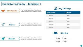
Folie 2 : Dies ist die erste Vorlage für eine Executive Summary mit Einführung, Vision, Mission, Schlüsselangeboten (Service, Detail), Kundenkreis (Logo).
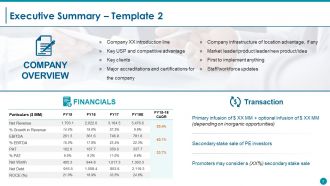
Folie 3 : Dies ist die zweite Folie mit der Zusammenfassung des Unternehmens mit Unternehmensübersicht: (Unternehmen XX Einführungslinie, Schlüssel-USP und Wettbewerbsvorteil, Schlüsselkunden, Wichtige Akkreditierungen und Zertifizierungen für das Unternehmen, Unternehmensinfrastruktur des Standortvorteils, falls vorhanden, Marktführer/ Produktführer/neues Produkt/Idee, Erster, der etwas implementiert hat, Mitarbeiter/Mitarbeiter-Updates), Transaktion: {(Veranstalter können einen (XX%) sekundären Anteilsverkauf in Betracht ziehen, primäre Infusion + optionale Infusion (abhängig von anorganischen Gelegenheiten), sekundärer Anteilsverkauf von PE-Investoren). und Finanzen (Umsatz, EBITDA usw.)}
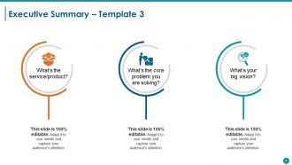
Folie 4 : Dies ist die dritte Folie mit einer Zusammenfassung der Zusammenfassung mit den folgenden Überschriften: a: Was ist der Service/das Produkt? b: Was ist das Kernproblem, das Sie lösen? c: Was ist Ihre große Vision? Verwenden Sie diese Überschriften, um Ihre Fragen zu beantworten.
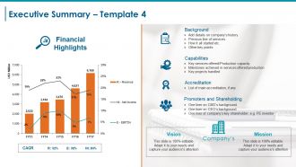
Folie 5 : Dies ist die vierte Folie, die eine Zusammenfassung der Zusammenfassung mit der Vision und Mission des Unternehmens zeigt. Es zeigt auch das Diagramm mit den Finanzhighlights mit CAGR (Umsatz, EBITDA, Nettoeinkommen) an. Andere Unterüberschriften umfassen: Hintergrund (Details zur Unternehmensgeschichte hinzufügen, frühere Dienstleistungen, wie alles begann usw. Weitere wichtige Punkte). Akkreditierung (Liste der Hauptakkreditierungen, falls vorhanden Fähigkeiten (Schlüsseldienste angeboten/Produktionskapazität Meilensteine in angebotenen Diensten/Produktion bearbeitete Schlüsselprojekte) (Promotoren und Beteiligungen Ein Liner zum Hintergrund von CMD Ein Liner zum Hintergrund des CEO Ein Liner des Hauptaktionärs des Unternehmens; zB PE-Investor).
Folie 6 : Diese Folie zeigt unsere Vision und Mission. Geben Sie hier Ihre Vision und Mission an.
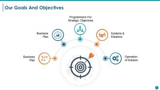
Folie 7 : Diese Folie stellt unsere Ziele und Ziele vor. Es kann durch die folgenden Überschriften angezeigt werden – Systeme & Lösungen, Betrieb der Lösung, Programmierer für strategische Ziele, Geschäftsplan, Geschäftsplan. Geben Sie sie mit Hilfe dieser Unterüberschriften an.
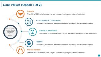
Folie 8 : Diese Folie präsentiert die Kernwerte des Unternehmens/der Organisation. Einige Beispiele sind - Integrität, Streben nach Exzellenz, Verantwortlichkeit und Zusammenarbeit, Leidenschaft, gegenseitiger Respekt.
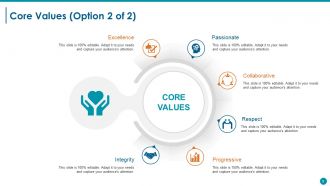
Folie 9 : Dies ist eine weitere Folie zu den Grundwerten mit Beispielen wie Zusammenarbeit, Leidenschaft, Exzellenz, Integrität, Fortschritt, Respekt.
Folie 10 : Dies ist eine Kaffeepause-Folie zum Anhalten. Sie können den Inhalt nach Bedarf ändern/modifizieren.
Folie 11 : Diese Folie trägt den Titel Charts & Graphs, um fortzufahren.
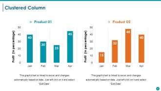
Folie 12 : Diese Folie zeigt ein gruppiertes Säulendiagramm, um zwei Produkte im Vergleich zu zeigen.
Folie 13 : Diese Folie zeigt ein Radardiagramm für zwei zu vergleichende Produkte/Unternehmen.
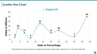
Folie 14 : Dies ist eine Streuliniendiagramm-Folie, um den Produkt-/Entitätsvergleich, die Spezifikationen usw. anzuzeigen.
Folie 15 : Diese Folie trägt den Titel Zusätzliche Folien, um vorwärts zu gehen. Sie können den Inhalt nach Bedarf ändern/modifizieren.
Folie 16 : Diese Folie zeigt unsere Mission. Geben Sie es hier an.
Folie 17 : Diese Folie präsentiert unserem Team Textfelder und passende Bilder. Geben Sie hier etwas über Ihr Team an.
Folie 18 : Diese Folie präsentiert Unser Ziel mit Symbolbildern. Geben Sie hier Ihre Ziele an.
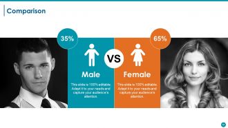
Folie 19 : Diese Folie zeigt einen Vergleich in Bezug auf männlich und weiblich.
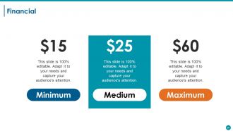
Folie 20 : Diese Folie zeigt den Aspekt der Finanzergebnisse mit Textfeldern. Geben Sie sie hier an.
Folie 21 : Dies ist eine Zitate-Folie. Geben Sie Highlights, Spezifikationen, Botschaften, Überzeugungen usw. per Zitat hier an. Sie können den Inhalt nach Bedarf ändern/modifizieren.
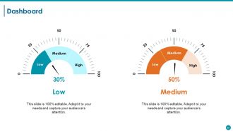
Folie 22 : Diese Folie zeigt das Dashboard mit Dashboard-Bild und Textfeldern zur Angabe von KPIs, Metriken usw.
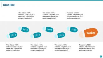
Folie 23 : Dies ist eine Timeline-Folie, die Entwicklung, Wachstum, Meilensteine usw. zeigt.
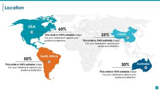
Folie 24 : Dies ist eine Standortfolie des Weltkartenbilds, um die globale Präsenz, das Wachstum usw.
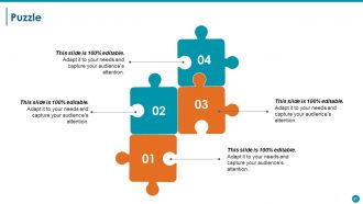
Folie 25 : Dies ist eine Puzzle-Bildfolie zur Anzeige von Informationen, Spezifikationen usw.
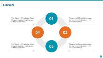
Folie 26 : Dies ist eine kreisförmige Bildfolie zur Anzeige von Informationen, Spezifikationen usw. 3
Folie 27 : Dies ist eine Unser Ziel-Folie. Geben Sie hier Ihre Ziele, Wünsche und Ziele an.
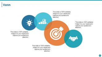
Folie 28 : Dies ist eine Venn-Diagramm-Bildfolie zur Anzeige von Informationen, Spezifikationen usw.
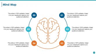
Folie 29 : Dies ist eine Mindmap-Bildfolie zur Anzeige von Informationen, Spezifikationen usw.
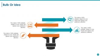
Folie 30 : Dies ist eine Glühbirnen- oder Ideenfolie. Präsentieren Sie alle neuen Informationen, Daten hier.
Folie 31 : Dies ist eine Dankeschön-Folie mit Adresse # Hausnummer, Stadt, Bundesland, Kontaktnummern, E-Mail-Adresse, die eingegeben und angezeigt werden soll.
Ausführungszusammenfassung Powerpoint-Präsentationsfolien mit allen 31 Folien:
Fördern Sie die kontinuierliche Generierung von Ideen mit unseren Executive Summary Powerpoint-Präsentationsfolien. Es wird zum Zufluss beitragen.












FAQs for Executive Summary
So for your exec summary slide, lead with the problem, your solution, and what it means for the business. Honestly, I'd put the biggest win right at the top - these meetings are brutal and people zone out fast. Also throw in next steps or whatever decisions they need to make. Bullet points are your friend here, not paragraphs. I always do this test: if someone walked in late and only caught this slide, would they still get it? Oh, and don't overthink the design - just make sure it's not a wall of text.
Honestly, charts and graphs are your best friend here - way better than drowning executives in paragraphs of numbers. They're already swamped, so make it visual. Throw in some icons for your key recommendations, maybe use color to highlight the big wins. But don't go overboard with it (I've seen presentations that looked like a rainbow exploded). The trick is doing a quick "glance test" - can someone walking by your laptop screen get the gist in like 10 seconds? If not, you need fewer elements. Short sentences work. So do slightly longer ones that actually flow together naturally.
Okay so biggest thing - don't dump everything into your exec summary slides. Hit the main points only. Skip the boring "Executive Summary" title too, nobody cares. Make sure someone could forward just those slides and they'd actually make sense on their own. Lead with your big recommendation right away instead of burying it somewhere random. Short bullet points work best since execs skim everything anyway. Honestly, I've seen so many people mess this up by overthinking it. Quick test: would this slide deck make sense to someone who wasn't even in the room? If not, you're probably missing something important.
Honestly, it all comes down to speaking their language. When I'm talking to executives, I start with revenue impact and big picture strategy stuff. Board members? They're obsessed with risk and staying ahead of competitors. But here's the thing - you've gotta do your research first. Like, actually know who you're talking to before you walk in there. Same facts, totally different angle depending on the room. Tech teams want all the nitty-gritty details while investors just care about market size. Always open with whatever keeps them up at night, then back it up with numbers.
Dude, you've got to tell a story with your exec summary. Nobody wants to read a boring data dump. Start with the problem you're facing, then walk them through what you figured out, and boom - here's where we go next. It's like explaining drama to a friend, except your job depends on it lol. The story structure helps those crazy busy execs actually remember your points later. Makes your recommendations feel obvious instead of random. Trust me, they'll follow along way better when there's an actual narrative instead of just bullet points and charts.
Honestly, charts and graphs are game-changers for exec summaries. Nobody wants to dig through walls of text to find the important stuff. A quick bar chart showing quarterly growth? Way more powerful than burying that info in some random paragraph. Plus visuals naturally draw the eye to what actually matters on your slides. I always pick my top three data points first, then figure out the cleanest way to show them - sometimes I overthink it and go too fancy when simple works better. The goal is letting executives spot patterns and comparisons instantly instead of making them work for it.
One page max for your exec summary - treat it like your elevator pitch but in slide form. Hit them with 3-5 bullet points covering your main findings or recommendations. Each bullet = one sentence, not a novel. The whole slide should take 30-60 seconds to read because execs are busy as hell. Save the deep dive stuff for appendix slides. Here's the thing - if someone only saw this one slide, would they actually get why your work matters? That's your test. Give them the "so what" right up front, and honestly, most of the time that's all they'll remember anyway.
Go for like 70% visuals, 30% text on those exec summary slides. Charts and graphs should carry most of the weight - not paragraphs of bullet points. I swear, half the presentations I see look like someone copy-pasted from a Word doc and slapped a random chart on there. Keep your text super tight. Just key phrases, not full sentences. Your visuals and words need to work as a team, not fight each other for space. Here's my test: can someone get your main point in 10 seconds? If not, you've got too much text and not enough visual punch.
Dude, go with boring fonts like Arial or Calibri - trust me on this. Make your text huge, like 24pt minimum, because half these people are squinting from the back of the room. Headers? Go even bigger, 36pt easy. I once watched a whole room struggle to read tiny text and it was painful. High contrast is clutch - dark text, light background. Don't get cute with it. Oh, and here's the thing everyone screws up: cramming everything on one slide. White space isn't wasted space, it's what makes people actually want to read your stuff instead of zoning out.
Keep your executive summary looking exactly like the rest of your deck - same fonts, colors, all that visual stuff. Don't switch up your tone either. If you've been data-focused and analytical throughout, don't randomly get all flowery in the summary (honestly, this drives me crazy when I see it). Pull the same key phrases from your main slides. Structure it following your presentation's flow too. Oh, and do the summary dead last after everything else is done - way easier to match everything when it's already finalized. Trust me on this one.
Honestly, just stick with PowerPoint for exec stuff - those C-suite people expect it and it won't randomly break in corporate settings. Google Slides is clutch for team projects since everyone can jump in and edit together. Oh, and Canva? Total game changer if you suck at design like I do. Keynote looks amazing but good luck opening it on a PC (learned that the hard way). Don't get obsessed with animations though. Focus on your actual message first, then make it pretty. Grab a clean template and nail your story - the fancy stuff can wait.
Okay so feedback is literally your lifeline for exec summary slides. Don't just ask "thoughts?" though - that gets you nowhere. Be specific: "Is my main point clear?" or "What part feels cluttered?" Way better responses that way. Fix clarity issues first, then worry about how it looks. If three people say the same thing is confusing, listen to them! Oh and here's a trick I learned - test your updated slide with someone fresh who didn't see the original. They'll catch stuff you missed. Short sentences work. But mix them up with longer ones so it doesn't sound robotic.
Honestly, keep it simple - hit the problem, your solution, and actual numbers for business impact. Don't just regurgitate your whole presentation (I see this mistake constantly). You want someone to finish reading and think "okay, I need to hear more about this." Lead with your most surprising stat or biggest win. Visuals over text every time. Also super important - always end with clear next steps. The whole thing should tell a story in like 30 seconds max. Think of it as a teaser trailer, not the full movie. Your exec summary should create curiosity, not satisfy it completely.
Oh totally, culture makes a huge difference with exec slides. Japanese audiences want way more context and softer messaging - they don't love the direct approach. Germans? Complete opposite - hit them with data and get straight to the point. Colors are weirdly important too (red = bad luck in some places, good fortune in others). Americans usually want those quick bullet points they can scan fast. But honestly, other cultures expect you to actually explain things properly. I always stalk the audience beforehand - sounds creepy but you've gotta know their style before you build anything.
Honestly, just break everything into bullet points or lists - way easier to scan. Put your big conclusion right at the top too. Use bigger fonts for the important stuff, smaller for details. Ditch the corporate speak for normal words people actually use. White space is clutch here, don't pack everything together like you're running out of room. Maybe throw in some simple icons if it makes sense? Oh and definitely test it on someone who wasn't involved - if they look confused, you've got more work to do.
-
amazing
-
Really like the color and design of the presentation.
-
Really like the color and design of the presentation.