

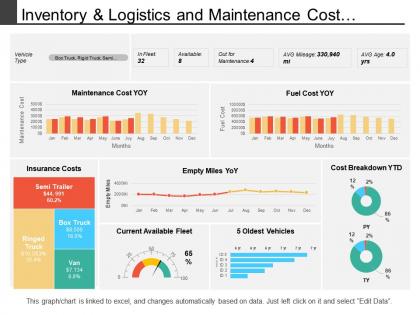
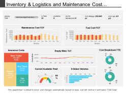
Inventory and logistics and maintenance cost dashboard




Try Before you Buy Download Free Sample Product
 Impress Your
 Audience
 100%
100% Editable
 Save Hours
 of Time


Our Inventory And Logistics And Maintenance Cost Dashboard ensure you have extra time. They create a cushion for you.
People who downloaded this PowerPoint presentation also viewed the following :
Inventory and logistics and maintenance cost dashboard with all 6 slides:
Ensure intensity of focus with our Inventory And Logistics And Maintenance Cost Dashboard. Don't allow distractions to intrude.
FAQs for Inventory and logistics and
Pick metrics that actually connect to your business goals - conversion rates, revenue, engagement, whatever matters for your specific thing. Honestly, dashboard overload is such a pain, so stick to maybe 5-7 key ones max. Nobody wants to decode 47 different charts just to figure out what's happening. Make them visually clear with good context like time comparisons. Try to include one leading indicator that'll give you a heads up about future performance. I'd start by thinking about what decisions you need this dashboard to help with, then build from there. Way easier than just throwing random metrics at it.
Honestly, dashboards are game-changers for making sense of your data mess. You'll spot trends and problems instantly instead of drowning in spreadsheets for hours. Think of it like getting the highlights reel instead of watching the full boring game. Real-time KPIs keep everyone on the same page, which is clutch for team alignment. Plus you can compare performance across departments and catch issues before they blow up. My advice? Don't go crazy building everything at once - just start with your most critical metrics and expand from there.
Start with the "5-second rule" - people should get your main insights immediately. Put your most important stuff top-left since that's where everyone looks first. Honestly, I'd stick to maybe 5-7 key metrics max. Too many dashboards look like someone threw data at a wall and hoped it stuck! Your colors and fonts need to match throughout. Make sure the data actually updates when it's supposed to (sounds obvious but you'd be shocked). Oh, and always show context - date ranges, benchmarks, that kind of thing. Test it with real users first because what makes sense to you might be totally confusing to them.
Dude, interactive dashboards are seriously a game changer. Instead of people just staring at boring static charts, they can actually click around and explore stuff themselves. Filters and drill-downs let them find exactly what they're looking for without getting buried in data overload. Honestly, I think tooltips on hover are underrated - such a simple thing but makes everything feel more responsive. Users love feeling like they're in control rather than just being fed information. My advice? Start with basic filters first, then see what people actually use before going crazy with fancy features.
Oh man, color psychology is everything when it comes to dashboards. Red for warnings or bad trends, green for good stuff, blue for general info since people trust it. Gray works for neutral data that's just sitting there. I swear I've worked with dashboards where they used weird colors and nobody could tell what was urgent anymore - like using orange for critical alerts? Why would you do that? Anyway, stick to what people already expect and definitely test it out. Short sentences hit different than long ones that flow naturally. You'll save yourself so many headaches if you just pick an intentional palette from the start.
Honestly, just think about what each group actually needs to do their job. Your CEO doesn't care about individual ticket numbers - they want the big picture stuff they can scan in 30 seconds. But your support manager? They absolutely need those granular details to fix problems. Middle management sits in this weird spot where they need enough data to catch issues but not so much they're overwhelmed. I always tell people to work backwards - ask each team what decisions they're making every day, then build dashboards around that. Makes way more sense than dumping everything on everyone.
For dynamic dashboards, I'd go with Tableau, Power BI, or Looker Studio first. Tableau's crazy powerful but takes time to learn. Power BI works great if you're already using Microsoft stuff. Looker Studio is free and handles web analytics really well - can't beat that price point. If you're more technical, Streamlit with Python or R Shiny let you build whatever you want. Honestly though, I'd figure out what data sources you're working with first. That'll probably decide which tool makes the most sense anyway.
Start by cleaning your data before it even hits the dashboard - validate inputs for duplicates, missing stuff, and weird outliers. Trust me, I once had a sales dashboard claiming we sold negative inventory. Not fun explaining that one! Do monthly audits where you cross-check dashboard numbers against your source systems. Document how your data transforms from raw to final display too. Honestly, this transparency thing is huge with stakeholders. They get way less suspicious when they can actually trace where numbers come from. Also automate those validation checks - you don't want to be manually catching errors forever.
Honestly, keep it simple with bar charts, line graphs, and heat maps - they're solid workhorses that don't confuse people. Scatter plots are clutch for showing correlations. Pie charts? They look nice but they're pretty useless for anything complex (sorry pie chart fans). Tables work when users need exact numbers they can dig into. Match your viz to whatever story the data's telling. Oh, and test stuff with actual users first - I've seen too many "clever" dashboards that nobody could figure out. Add fancy features only if they actually help people decide things faster.
So basically, real-time data turns your dashboard into this live feed instead of just looking at old numbers from yesterday. You'll catch problems right when they happen - sales spikes, website crashes, whatever. Honestly, it's pretty addictive once you start using it. Instead of making decisions on stale data, you're working with what's actually happening now. The trick is figuring out what really needs those instant updates vs stuff that's fine being refreshed once a day (not everything needs to be real-time, despite what some people think).
Don't cram everything onto one screen - that's the classic mistake everyone makes. People think more data automatically means better, but it just creates chaos. Focus on what your users actually need to decide stuff. Tiny fonts are annoying, and horizontal scrolling? Pure evil. I learned this the hard way on my first project. Test with real people early because what clicks for you won't make sense to them. Color schemes matter more than you'd think. Start simple, then add features only when there's a real reason. Your future self will thank you.
Honestly, just ask people what sucks about your dashboard - they'll tell you! Set up feedback loops through surveys or casual check-ins with stakeholders. People are way more honest than you'd think. Prioritize based on how often you hear the same complaints and whether it's actually breaking their workflow. Monthly reviews work well for me. Make small tweaks instead of rebuilding everything from scratch (learned that the hard way). Test changes with users again before rolling out. Oh, and usability tests are gold if you can swing them.
So basically, it comes down to who's using it and when. Operational dashboards are for day-to-day stuff - like monitoring website crashes, daily sales, customer tickets. Strategic ones are more for the higher-ups looking at quarterly trends and long-term patterns. I've seen too many teams mess this up by shoving everything together. Big mistake. Your ops dashboard needs constant updates and alerts that actually matter right now. Strategic dashboards? They're about spotting what's happening over months, not minutes. Figure out which one you actually need first, then build from there. Don't try to be everything to everyone.
Dude, mobile optimization is a game changer. Your team can actually use the dashboard when they're out of the office instead of being stuck at their desks. The layouts adjust to smaller screens properly, buttons are big enough to tap without fat-fingering everything. Load times are way faster too, which matters since mobile connections can be trash. Oh and the swipe gestures? So much better than scrolling forever. You get readable text, simpler navigation, plus it works offline when you hit those dead zones (happens more than you'd think). Basically your team can make decisions from anywhere instead of waiting to get back to their laptops.
Honestly, dashboards are game-changers for this exact problem. No more of those painful meetings where everyone's arguing about different numbers. Your teams can finally see the same real-time data and stop working against each other. I'd set up different views for each department – sales sees their stuff, marketing sees theirs, but everyone can peek at how they're affecting other teams. The best part? It makes people way more accountable when everything's visible. Nobody wants to be the team dragging down the company metrics, you know? Start small though – just pick the KPIs that overlap between departments first.
No Reviews