


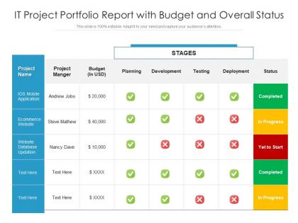
It project portfolio report with budget and overall status




Try Before you Buy Download Free Sample Product
 Impress Your
 Audience
 100%
100% Editable
 Save Hours
 of Time


Our IT Project Portfolio Report With Budget And Overall Status are topically designed to provide an attractive backdrop to any subject. Use them to look like a presentation pro.
People who downloaded this PowerPoint presentation also viewed the following :
It project portfolio report with budget and overall status with all 2 slides:
Use our IT Project Portfolio Report With Budget And Overall Status to effectively help you save your valuable time. They are readymade to fit into any presentation structure.

FAQs for It project portfolio report with budget
Okay so you definitely need project status updates, budget tracking, and timeline stuff. Risk assessments are huge - seriously, just having all your risks in one spot instead of buried in different spreadsheets is worth it alone. ROI metrics and milestone tracking are obvious ones. Dependencies between projects matter more than people think. Stakeholder impact analysis too, plus any capacity issues your teams are dealing with. Oh and resource allocation across everything. Bottom line: leadership needs to see what's working, what's broken, and where they gotta make calls about moving resources around.
Basically, you want to connect every IT project to actual business goals your executives care about - revenue, cost savings, customer happiness, that stuff. Use the exact same language they use in the strategic plan so everyone's speaking the same language. When budget season rolls around (ugh), you'll have solid proof that IT isn't just burning money on random tech projects. Create that direct line between what you're building and what leadership wants to achieve. Trust me, projects that look disconnected from business goals get axed first. Make it super obvious how each project moves the needle on something that matters to the C-suite.
Honestly, I'd start with just the basics - budget variance and whether you're hitting deadlines. ROI matters too but executives get obsessed with that one anyway. Track scope creep because it'll kill you if you don't watch it. Defect rates and stakeholder satisfaction are solid delivery metrics. Resource utilization is tricky though - nobody wants burned out teams or people twiddling their thumbs. Business value realization is the golden metric since that's what leadership actually cares about at the end of the day. Don't go crazy with too many at first, maybe 5-6 max until you get into a groove.
So risk assessments are basically our way of figuring out which projects might crash and burn. Each project gets scored on stuff like how complicated the tech is, whether we actually have the people to do it, and if stakeholders are on board. High-risk stuff gets way more scrutiny before we approve it - makes sense, right? The goal is balancing your whole portfolio so you're not doing all crazy experimental projects or all boring safe ones. Oh, and check section 3 of your dashboard - there's a risk matrix that shows how everything compares.
Look, stakeholder feedback is what makes or breaks your IT portfolio report. Business leaders, users, and tech teams tell you which projects actually matter versus which ones are money pits. Without their input, you're just making fancy charts nobody cares about. Their feedback shows resource conflicts and validates if projects are working. Plus they'll flag stuff you haven't thought of yet - which happens more than you'd think. Don't wait until the end to collect this input though. Get it throughout the whole cycle, otherwise decisions get made without you.
Honestly, visuals are a game changer for portfolio reports. Nobody wants to stare at endless spreadsheets - trust me on that one. Gantt charts work great for timelines, heat maps show risk levels instantly, and dashboards track your budget stuff. I've watched executives completely zone out during text-heavy presentations, but add some color-coded status lights? Suddenly they're paying attention. Charts help you catch patterns fast too. Like when the same projects keep missing deadlines or your team's spread way too thin. Start simple with red/yellow/green indicators, then build up based on what people actually ask about.
Oh man, you're gonna hate the data format nightmare - every team does their own thing. Project managers are drowning already so good luck getting updates on time. And don't even get me started on resource tracking... it's like herding cats with everyone using different spreadsheets that never sync up. Defining consistent metrics across different IT projects? Yeah, that's fun too. Plus stakeholders all want their data presented differently, which honestly makes me want to scream sometimes. Start with standard templates from day one and automate whatever you can. Trust me on this one.
Honestly, I'd go with a numbered list or maybe one of those color-coded charts - red/yellow/green for high/medium/low priority stuff. Make sure you show your actual criteria too (ROI, strategic fit, whatever you used). The key thing is explaining WHY each project ended up where it did. Trust me, stakeholders who weren't in those planning meetings will definitely ask. Oh, and throw in a basic timeline so people know when each tier starts up. Otherwise you'll get a million "when does this kick off?" questions later.
Pick one day each week (or every other week if you're not swamped) and make that your portfolio day - seriously, don't budge on this. Get your project managers on auto-reminders and give them simple templates so they're all speaking the same language. The moment you overcomplicate things, people just... stop doing it. Pull data straight from whatever PM tools you're already using instead of making people type everything twice - nobody has time for that. Oh, and definitely put one person in charge of actually reviewing everything and chasing down the slackers. Trust me, without someone owning it, the whole thing falls apart fast.
Look, that IT Project Portfolio Report is gonna save your sanity. Pull it before your next planning meeting - it shows exactly where your budget and people are going. You'll spot those annoying overlaps (like when half your projects need the same database guy). Plus you can see which initiatives are just burning money without much payoff. Honestly, I've seen teams cancel underperforming projects based on this data and suddenly have breathing room again. The bottlenecks become super obvious too. Just run the report and make your resource decisions based on actual numbers instead of guessing.
Honestly, update that portfolio report right when scope changes hit - don't wait around for the regular cycle. I've watched way too many projects crash and burn because nobody tracked scope creep properly. Document what the original scope was, what's shifting, and why the business is pushing for it. Also throw in how this messes with your resources, timeline, and budget so the higher-ups actually get what's happening. Trust me, being upfront about changes beats trying to quietly absorb them and pray nobody asks questions later. That never works out.
Honestly, start with whatever BI tool you've already got - Power BI or Tableau work great for this stuff. They'll pull from multiple sources and update dashboards automatically. If you're stuck in Microsoft land, Project Online integrates pretty well (though the UI is kinda meh). Python's where it gets interesting though - you can write scripts with Pandas to grab data from different tools and spit out reports without any manual work. Most project management platforms like Jira and Azure DevOps have decent APIs that make the data extraction pretty painless. I'd probably just go with your existing license first since that's the fastest route to getting something useful up and running.
Look at your old project data like a cheat sheet for picking winners. Check which projects actually hit their goals vs the disasters that ate budget for breakfast. Timeline delays, cost blowouts, real business impact - all that stuff reveals patterns you can't ignore. Cloud migrations in your org might always run 30% over (classic), or maybe that one vendor just sucks consistently. Honestly, scoring new proposals gets so much easier when you're not just guessing or bowing to whoever yells loudest. Data beats politics every time.
Talk to stakeholders before you even start writing - find out what they actually care about. ROI, beating competitors, avoiding disasters, whatever keeps them up at night. Then build your whole report around that stuff. Don't dump a finished report on them like "surprise!" Instead, share early drafts and get their input. I swear, half the reports I've seen crash and burn because they felt like they came out of nowhere. Skip the tech speak too - use their words. Oh, and definitely grab coffee with the big decision makers beforehand to handle any pushback privately.
Here's what's worked for me - set up your portfolio report with separate sections for quick wins and bigger strategic stuff. Timeline views are clutch here, showing 6-month projects next to your longer ones. Leadership loves seeing you're not just jumping around randomly. Weight your scoring so it captures both immediate needs and future payoff. Track different metrics too - quick cost cuts versus building new capabilities down the road. Oh, and don't bury this balance thing - call it out right in your exec summary. Makes a huge difference when they can actually see you've thought it through.
-
Helpful product design for delivering presentation.