


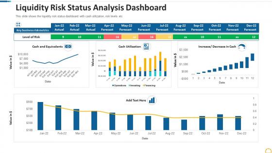
Liquidity risk status analysis dashboard




Try Before you Buy Download Free Sample Product
 Impress Your
 Audience
 100%
100% Editable
 Save Hours
 of Time


Our Liquidity Risk Status Analysis Dashboard are topically designed to provide an attractive backdrop to any subject. Use them to look like a presentation pro.
People who downloaded this PowerPoint presentation also viewed the following :
Liquidity risk status analysis dashboard with all 10 slides:
Use our Liquidity Risk Status Analysis Dashboard to effectively help you save your valuable time. They are readymade to fit into any presentation structure.








FAQs for Liquidity risk
Start with cash position and available credit lines - that's your bread and butter. LCR is crucial, plus net stable funding ratio if you're dealing with banking regs. Days cash on hand too. Honestly, concentration risk by funding source is where most people get burned. Stress testing scenarios are a must - run different market conditions and see how long your runway lasts. I'd track deposit outflow rates and credit line utilization as early warning signs. Oh, and whatever specific nightmare scenarios your CFO obsesses over? Build dashboards around those first.
Honestly, these dashboards are game changers for regulatory stuff. Real-time tracking of your LCR and NSFR ratios without all the manual spreadsheet nonsense. Automated alerts hit you before you're even close to trouble - I'd set them around 80-85% of minimums so you're not scrambling last minute. Regulators eat up the audit trails and historical data it spits out during exams. Way better than trying to explain why you don't have proper documentation (learned that one the hard way). Shows you're actually on top of liquidity management instead of just going through the motions.
Honestly, the biggest thing is catching liquidity problems before they blow up in your face. Real-time viz shows you cash flow patterns and funding gaps as they're happening - not from yesterday's stale reports. Way easier selling your story to the C-suite with live charts too, versus those boring spreadsheets nobody wants to look at. During market chaos, you'll make decisions faster since you're not sitting around waiting for data to refresh. Oh, and definitely set up alerts for your key metrics so the system does the watching while you handle the bigger fires.
Daily updates are pretty much the minimum - honestly I do mine twice a day now. Morning before markets open, then again around lunch. Once you get in the habit it's not a big deal. Liquidity moves fast so you really don't want yesterday's numbers when you're making decisions. Try setting up automated data pulls if you can swing it, saves tons of time. Then just eyeball everything for anything weird. If you're dealing with sketchy positions or tight conditions, intraday updates are clutch. My old boss was obsessed with this stuff and it actually saved us a few times.
Numbers tell you what's happening, but qualitative data explains the why behind your liquidity picture. Client relationships, market vibes, how solid your operations actually are - this stuff matters even though it's harder to measure. I'd set up regular interviews and market check-ins to capture it systematically. Short sentences work here. Your dashboard needs both sides of the story because honestly? The cleanest spreadsheet can miss massive risks if you're not reading between the lines. Management quality alone can make or break liquidity scenarios that look identical on paper.
Look, historical data turns your liquidity predictions from wild guesses into something you can actually trust. Your dashboard picks up on cash flow patterns and seasonal stuff that you'd totally miss otherwise - honestly, it's pretty crazy what it catches. Past stress events are goldmines for this. You want like 3-5 years of solid data if you can swing it. The algorithms spot recurring behaviors and warning signs way before liquidity crunches hit. Just make sure your data feeds aren't a mess first, or you'll get garbage predictions.
Honestly, start by figuring out what data sources you're working with first. Tableau and Power BI are solid choices if you need real-time feeds and can handle complex calculations. Moody's RiskIntegrity or SAS are worth it if budget isn't tight. I've actually seen some surprisingly good dashboards built in Excel with VBA, but that gets ugly quick when you're pulling from multiple sources. The trick is finding something that plays nice with your treasury systems and market data feeds automatically. Oh, and whatever you pick needs to actually integrate with your existing portfolio tools or you'll hate yourself later.
Look, first figure out what actually drives liquidity in your industry. Manufacturing companies don't need the same stuff banks track, you know? Retail has those crazy seasonal swings, while financial services obsess over regulatory ratios. Once you nail down your specific risk drivers, set up alerts around those patterns - not some generic metrics that just look fancy. Honestly, most dashboards show way too much useless data. Configure yours to flag the things that'll genuinely mess with your cash flow. Focus on what matters for making real decisions.
Biggest mistake? Cramming way too many metrics on one screen - users just get overwhelmed. Skip the static historical data too, you need real-time feeds since liquidity disappears fast. Most people obsess over current ratios but totally ignore stress testing scenarios, which is honestly backwards. And don't go crazy with red/green alerts everywhere - creates alert fatigue real quick. Keep your main liquidity metrics upfront, refresh data frequently. Always throw in some forward-looking scenarios with your current positions. Oh, and make sure it doesn't look like a damn Christmas tree when you're done.
So stress testing basically shows you what happens to your liquidity when everything goes wrong. Think deposit runs, credit lines getting maxed out, markets totally freezing up - all that fun stuff. Your dashboard will overlay these nightmare scenarios on top of your current position, usually with those red/yellow/green warning lights. You can see how your buffers hold up against the stressed requirements. Oh, and definitely keep running fresh scenarios - I learned the hard way that month-old stress tests are basically worthless when you actually need them. It's like having a weather forecast from last week.
Put your most important stuff - cash position, funding gaps - right at the top where you can't miss it. Red for bad, yellow for "heads up." Don't turn it into a spreadsheet nightmare (I've seen some truly awful ones). You want the main story to jump out immediately. Show trends, not just today's numbers - way more useful. Set up alerts so you're not glued to the screen all day. Save the detailed breakdowns for when you actually need to dig deeper, but honestly? Most of the time you just want to know if everything's okay at first glance.
Build tabs or dropdowns right into your dashboard for different stress scenarios - "market crisis," "deposit run," whatever fits your bank. The naming does get pretty dramatic lol. Each tab should auto-recalculate cash flows and survival timelines based on your pre-set assumptions. Making it interactive is clutch so you can flip between scenarios during meetings without awkward pauses. Start with maybe 3-5 scenarios your risk committee actually gives a shit about. You can always add more weird edge cases later, but honestly those core ones will do most of the heavy lifting.
Your dashboard's worthless if people can't actually use it when things go sideways. During a liquidity crisis, nobody has time to figure out confusing charts or hunt for basic info. Make the interface dead simple - clear labels, intuitive navigation, different views for different roles. Traders need different data than executives, obviously. Test it with real users constantly and fix whatever's bugging them. I've seen too many fancy dashboards become expensive paperweights because they're a pain to navigate. Quick interpretation saves you when markets get weird.
Liquidity gaps are basically the foundation for your whole dashboard since they show your weak spots across time periods. Color-coded heat maps work great here - or waterfall charts that make cash flow mismatches super obvious. Don't overwhelm people with tiny charts everywhere though. Let users start with high-level summaries, then drill into specific buckets and funding sources when they need details. Oh, and definitely build in scenario toggles since these gaps shift constantly when markets get weird. I'd honestly start by figuring out which gaps your stakeholders actually care about most.
Your executives want the big picture stuff that screams "pay attention now." Start with liquidity coverage ratio, net stable funding ratio, and cash runway - those three tell you everything fast. Deposit concentration by customer is huge too, plus funding source diversification. Trust me, that's what actually stresses out CFOs at 2am. Throw in stress test results and anything showing how close you are to regulatory limits. Keep the main dashboard to maybe 5-7 metrics tops - nobody wants to scroll through endless ratios. Just make sure they can click deeper if needed.
-
Visually stunning presentation, love the content.
-
Very well designed and informative templates.
-
Thanks for all your great templates they have saved me lots of time and accelerate my presentations. Great product, keep them up!
-
Great quality product.
-
Best Representation of topics, really appreciable.