


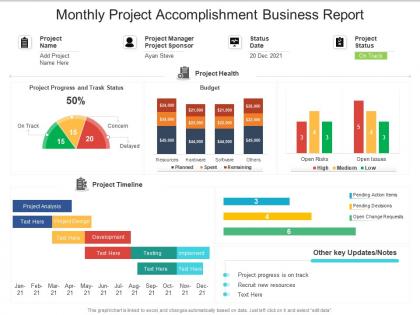
Monthly project accomplishment business report




Try Before you Buy Download Free Sample Product
 Impress Your
 Audience
 100%
100% Editable
 Save Hours
 of Time


Our Monthly Project Accomplishment Business Report are topically designed to provide an attractive backdrop to any subject. Use them to look like a presentation pro.
People who downloaded this PowerPoint presentation also viewed the following :
Monthly project accomplishment business report with all 2 slides:
Use our Monthly Project Accomplishment Business Report to effectively help you save your valuable time. They are readymade to fit into any presentation structure.
FAQs for Monthly project
Focus on what actually moves the needle for your business. Revenue, profit margins, customer acquisition costs - the basics. If you've got subscriptions, track monthly recurring revenue too. Cash flow is critical though, seriously can't stress this enough. I've watched profitable businesses crash because they ran out of cash. Conversion rates and customer retention matter for operations. Add any industry-specific stuff your investors or board actually care about. But don't track everything - maybe 5-7 metrics max that would genuinely make you panic and pivot if they tanked.
Bar charts work great for comparisons, line graphs for showing stuff over time. Pie charts? Only use them when you're actually showing parts of a whole - honestly, most people mess this up. Keep your colors consistent and make sure people can read your fonts from way back. Oh, and don't just throw random charts everywhere hoping something sticks. You want to tell a story first, then pick visuals that back up what you're saying. Start with your main point, not the other way around.
Ugh, the worst thing you can do is data dump everything onto leadership. They'll zone out instantly. Start with what actually moves the needle for them, not every single metric you tracked. Another big one - don't make it all backwards-looking. Honestly? Executives care way more about trends and what's happening next than rehashing last month's numbers. Oh, and definitely explain any weird spikes or dips in the data. Raw numbers without context just confuse people more. Keep it tight, focus on the future, and always end with what you think they should do next.
Honestly, storytelling is what makes your monthly reports actually stick. Like instead of just throwing "sales dropped 15%" at people, walk them through what happened - maybe a competitor swooped in right when your biggest client was deciding. People zone out during slide decks full of charts (been there). But frame those numbers around a real narrative? Suddenly everyone's paying attention. I always do setup, conflict, resolution for each section - works way better than just data dumping. Your stakeholders will actually care about fixing things when they understand the story behind the mess.
Know your audience first - seriously, this makes or breaks everything. Are you writing for executives who just want the big picture? Or managers tracking their team's numbers? I've watched so many people create these generic reports that nobody actually uses. Pretty frustrating. Figure out who's reading it, then decide which metrics matter most to them. Short and sweet for busy C-suite folks. More detail for department heads. Your audience literally determines how much data to include and how you'll present it. Don't even touch the spreadsheets until you know exactly who you're writing for.
Honestly, most people track way too much stuff that doesn't actually matter. Pick like 5-7 metrics that tie directly to your big goals and ignore the rest. If customer retention is what you're after, then churn rates and satisfaction scores should be front and center in your monthly reports. Everything else? Probably just noise. Create a simple template where you have to explain why each number connects to your annual objectives - it'll force you to be picky about what makes the cut. I've seen teams get completely buried under mountains of data they never use. Short version: be ruthless about what you include.
Dude, there's tons of ways to automate this stuff. Tableau and Power BI are solid if you want fancy dashboards that pull from everywhere. Google Data Studio works too. But honestly? Start with Excel or Sheets - set up templates with formulas and pivot tables that auto-refresh. I can't tell you how many people I know who still copy-paste numbers for hours when they could just build one good spreadsheet. If you need something beefier later, check out Looker or write some Python scripts. Whatever platform your data's already in, that's probably your easiest starting point.
Dude, those monthly reports are actually gold mines if you stop treating them like homework. Look at your revenue, expenses, and whatever KPIs matter most - that's where the real patterns show up. I used to hate doing this stuff, but now I can spot problems before they blow up and figure out what's actually moving the needle. Short bursts work better than marathon sessions, trust me. Share the big wins and red flags with your team so everyone knows what we're focusing on next month. It's like having a crystal ball, but with spreadsheets.
Trend analysis basically tells the story behind your numbers - shows if things are improving, declining, or just stuck. Like instead of "we hit $50K this month," you'd catch patterns like steady growth or those annoying seasonal drops. Honestly, most businesses totally ignore this stuff which is crazy to me. You need at least 3-6 months of data to see real patterns though. Pick maybe 3-5 key metrics and track them consistently. Trust me, you'll start spotting warning signs way earlier. It's probably one of the most useful things you can add to monthly reports.
Don't just dump all your qualitative stuff in one section - mix it right into your data. Like when you show that 15% retention drop, throw in some actual customer quotes about why they bounced right after. People remember stories way better than random numbers floating around. I usually do bullet points for the best quotes or those little callout boxes. Sometimes I just write a quick line explaining what's behind each big metric. Honestly, it's the difference between people glazing over at your presentation vs actually getting why the numbers matter.
Honestly, just go with a dashboard approach - put your key numbers right at the top where people can actually see them. Revenue, expenses, margins, cash flow. Charts work way better than endless rows of data because let's be real, nobody has time for that. I'd add a quick paragraph explaining any weird variances or big wins. Keep the whole thing under 3 pages max. Oh, and once you find a format that works? Stick with it every month so people know where to look for stuff. Makes everyone's life easier.
So first, grab some solid benchmark data from trade associations or sites like IBISWorld - yeah, it costs money but whatever, it's useful. Then pick maybe 3-4 metrics that actually matter for your business (revenue growth, profit margins, that stuff) instead of going crazy tracking everything. I just use a basic spreadsheet to compare my monthly numbers against industry standards. Makes it super easy to catch trends early. Oh and don't stress about having perfect data right away - you can always refine as you go.
Honestly, collaboration tools are a game changer for monthly reports. Set up a shared Google Sheet or Asana project where people can drop their numbers directly instead of you hunting everyone down over email (seriously, the worst part of reporting). Slack channels work great too - you get real-time updates and can bounce drafts back and forth without the email chaos. Version control is actually clutch here, no more "final_report_v7_ACTUAL_FINAL.xlsx" nonsense. Just create a dedicated space for next month's report and you'll see how much less stressful it gets. Way better than the usual scramble.
Just be straight up about problems in your reports - it actually builds way more trust than trying to hide stuff. Pair every issue with your plan to fix it though. I swear, managers who bury bad news in fancy corporate speak just look worse in the end. Give them the real numbers showing impact, explain what went wrong if you know, and lay out your next steps with actual dates. Your boss wants to see you're handling it, not pretending everything's fine. Own the mess but show you're already fixing it.
Honestly, adding forecasts to your monthly reports is a game-changer. Your boss will love that you're thinking ahead instead of just rehashing old news. You'll catch cash flow problems early – way better than scrambling later when things go sideways. It helps everyone make smarter decisions too since they can see what's coming next quarter. The accountability part is huge because you're basically putting your money where your mouth is with predictions. I'd start small though, maybe just revenue and your main KPIs. Don't overcomplicate it right out the gate.
-
Illustrative design with editable content. Exceptional value for money. Highly pleased with the product.
-
Awesomely designed templates, Easy to understand.
-
Awesomely designed templates, Easy to understand.
-
Unique design & color.
-
Best way of representation of the topic.