


Okr dashboard with departmental progress




Try Before you Buy Download Free Sample Product
 Impress Your
 Audience
 100%
100% Editable
 Save Hours
 of Time


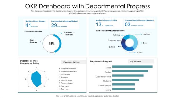
This slide shows the dashboard that depicts number of open reviews, participants in review, independent OKRs, progress update, submitted reviews, percentage of OKR distribution, department-wise competency rating, etc.
People who downloaded this PowerPoint presentation also viewed the following :
Okr dashboard with departmental progress with all 2 slides:
Use our OKR Dashboard With Departmental Progress to effectively help you save your valuable time. They are readymade to fit into any presentation structure.
FAQs for Okr dashboard
Track progress percentages and completion rates for each key result - that's your bread and butter. Confidence levels matter too since they show if people actually think they'll hit their targets. I'd also add cycle trends and blocker tracking, though honestly most teams skip this part and then panic when deadlines hit. Make sure you've got owner names and update timestamps so you can tell who's keeping their stuff current (and who isn't). Oh, and keep it stupidly simple. If it's too complex, people won't use it and you'll end up with another dead dashboard collecting digital dust.
Honestly, visuals just make everything click faster. Your brain's wired to process images way quicker than hunting through spreadsheet rows - trust me on this. Color-coded charts let you see at a glance which OKRs are crushing it (green), need attention (yellow), or are totally falling behind (red). It's like... you wouldn't read a weather forecast when you could just look out the window, right? Plus charts reveal patterns across different teams that you'd completely miss otherwise. Start simple though - progress bars and those traffic light indicators work best since everyone gets them immediately.
Weekly updates are the bare minimum - honestly, daily is way better if your team moves fast. I'm a Friday afternoon person myself, but pick whatever works and actually stick to it. Start with the progress percentages, then throw in some quick notes about what's blocking you or going well. Bullet points are totally fine, don't get fancy with it. The whole thing falls apart if your data gets stale though. People will just stop looking at it entirely, which defeats the point. Set a calendar reminder and treat it like you would any other meeting you can't skip.
Honestly, OKR dashboards are game-changers for team collaboration. Everyone can finally see what others are working on instead of constantly wondering if marketing's priorities align with yours. Dependencies become super obvious, and you'll spot where coordination is actually needed. The cool part? Teams start jumping into each other's progress updates, offering help when someone hits a roadblock. I've seen it work really well when teams do regular dashboard check-ins - otherwise it just becomes another reporting tool that collects digital dust. Plus shared key results make cross-team work way less chaotic.
Yeah, most of the big tools play nice with OKR dashboards - Salesforce, HubSpot, Jira, Google Analytics, Slack. Project management stuff like Asana works too. Honestly, the main thing is not having to update everything manually because we both know that never happens consistently lol. I'd start with your CRM and analytics tools since their data is usually the cleanest. Oh, and don't go crazy connecting everything at once - figure out what metrics you actually need first, then maybe pick 2-3 key integrations. Less headache that way.
Honestly, visual connections are your best friend here - use colors or lines to show how individual OKRs connect to team goals, then up to company stuff. Makes it super clear without having to think too hard about it. A dependency view is clutch too, so you can actually see if someone's work feeds into the team objective (which doesn't always happen, let's be real). Everyone should be able to trace their daily grind back to the big picture. Oh, and do quarterly check-ins where teams walk through these connections - things drift way more than you'd expect.
Don't cram everything onto one screen - learned that the hard way. Track what actually moves the needle, not vanity metrics that just look impressive. The worst dashboards I've seen? They're like airplane cockpits where nobody knows what button does what. Keep colors simple and consistent. Test with real users first - seriously, this saves so much headache later. Stick to 3-5 key metrics per goal, max. Make sure your update frequency is realistic too. Most importantly, the data should actually help people make decisions, not just exist for show.
So basically, OKR dashboards put everyone's goals out in the open - no more mystery about what people are actually doing. You can see your coworkers' progress AND leadership's priorities, which honestly cuts through so much office BS. Real-time updates are clutch because you spot issues early instead of that end-of-quarter panic we all know too well. The visibility thing works both ways though - keeps everyone accountable. I'd say just make sure the whole team can access it and bring it up in your regular meetings. Game changer for transparency.
Honestly, just stick with progress bars and percentage charts - they're clutch for seeing where you actually stand. Traffic lights (red/yellow/green) work great too when you're scanning multiple goals quickly. Line graphs are my go-to for spotting trends, like whether you're gaining momentum or totally stalling out. Don't overthink it with fancy visualizations that need explaining. Keep it simple - maybe 2-3 types max. Your dashboard should make sense instantly. Nobody wants to decode some complex chart when they're just trying to figure out if they're winning or not.
Honestly, most OKR dashboards are dead zones because they're just static number displays. Add comment sections and weekly check-in prompts to yours - make it actually interactive. I'd throw in some reflection questions too, like "what's blocking you?" or spots where people can flag wins. The automated reminder thing works well for bi-weekly updates. Oh, and this is crucial - you've gotta actually do something with the feedback you collect. People will totally ghost the whole system if they think you're just collecting data for no reason. Short version: don't let it become another forgotten corporate tool gathering digital dust.
Honestly, mobile access is a game-changer for OKR dashboards. Your team can update stuff during their commute or check metrics between meetings instead of being stuck at their desk all day. Remote folks especially love this since they're not chained to their laptop just to participate. Plus when you're in those random hallway conversations about progress, someone can literally pull up the data right there. The trick though? Don't just shrink your desktop version and call it mobile-friendly - that's the worst. Make sure it actually works on a phone screen or people won't bother using it.
Honestly, OKR dashboards are pretty motivating because you literally watch your progress happen in real time - there's something satisfying about seeing those numbers climb. Everyone can see everyone else's metrics too, so there's this natural peer pressure thing going on. Nobody wants to be stuck with all the red indicators while their teammates are crushing it. The visual aspect hits different than just reading reports or whatever. You get that little dopamine boost when things move in the right direction. Plus you'll catch problems way faster instead of waiting months to realize you're totally off course.
Think of color coding like traffic lights for your OKRs - red means you're behind or at risk, yellow needs attention, green's on track. Super helpful when you're scanning dashboards because you don't have to read through all the detailed metrics first. Just spot the colors and boom, you know where problems are. During leadership meetings it's honestly a lifesaver for quick progress updates. Oh and make sure everyone uses the same color scheme across teams - learned that one the hard way when marketing's "yellow" meant something totally different than engineering's. Keeps things way less confusing.
Your historical OKR data is basically a cheat sheet for future goal-setting. Check completion rates first - which goals did your team crush vs. which ones were pipe dreams? Most teams I know keep setting the same impossible targets until they actually look back at what happened. Seasonal stuff matters too, like Q4 being crazy busy for everyone. The trick is being honest about your team's actual capacity instead of just hoping for the best. Trust me, realistic goals that you hit feel way better than ambitious ones that flop.
Just ask each group what they actually want to see instead of guessing. Executives care about big picture stuff - progress toward major goals, not daily minutiae. Team leads need the nitty-gritty for their people, like specific OKRs and what's blocking them. Individual contributors want their personal stuff plus how it ties to company objectives. Role-based permissions will auto-filter everything, but let people customize their own widgets too. Honestly, most dashboard projects fail because nobody bothers asking users what they'd realistically check. Start simple with three templates and build from there.
-
Great product with effective design. Helped a lot in our corporate presentations. Easy to edit and stunning visuals.
-
Really like the color and design of the presentation.
-
Use of different colors is good. It's simple and attractive.
-
Professional and unique presentations.
-
Content of slide is easy to understand and edit.