


Procurement suppliers quality delivery and utilization dashboard




Try Before you Buy Download Free Sample Product
 Impress Your
 Audience
 100%
100% Editable
 Save Hours
 of Time


Initiate action to control the degree of damage with our Procurement Suppliers Quality Delivery And Utilization Dashboard. It helps cater for calamities.
People who downloaded this PowerPoint presentation also viewed the following :
Content of this Powerpoint Presentation
Description:
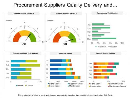
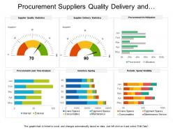
The image displays a PowerPoint slide titled "Procurement Suppliers Quality Delivery and..." which showcases various charts related to supply chain management. Here's a breakdown of each chart and text element:
1. Supplier Quality Statistics:
A gauge chart indicating a supplier quality score of 70, suggesting a measurement of the suppliers' performance against set quality criteria.
2. Supplier Delivery Statistics:
Another gauge chart, but this time reflecting a supplier delivery score of 90, which is likely evaluating the timeliness and reliability of supplier deliveries.
3. Procurement vs Utilization:
A set of bar charts for each month comparing procurement volumes against utilization, providing insights into supply-demand alignment.
4. Procurement Lead Time Analysis:
Horizontal bar charts for different months comparing internal and external procurement lead times, illustrating efficiency in the procurement process.
5. Inventory Ageing:
Stacked horizontal bar charts that break down inventory by category based on how long items have been in stock, identifying potential overstock or stockouts.
6. Periodic Spend Visibility:
Stacked horizontal bar charts showing monthly spend in different categories, such as crane spares, equipment spares, consumables, and maintenance services, which help in tracking expenditure.
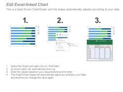
7. A note at the bottom clarifies that the graphs and charts are linked to an Excel spreadsheet and can be edited directly.
Use Cases:
Here are seven industries where these slides could be used, along with potential use cases:
1. Manufacturing:
Use: To evaluate and improve supplier relationships and inventory management
Presenter: Supply Chain Manager
Audience: Operations Team
2. Retail:
Use: To analyze inventory turnover and spending patterns
Presenter: Inventory Analyst
Audience: Category Managers
3. Healthcare:
Use: For managing medical supplies quality and delivery for better hospital efficiency
Presenter: Procurement Officer
Audience: Hospital Administration
4. Automotive:
Use: To track component quality and delivery times from suppliers
Presenter: Quality Assurance Supervisor
Audience: Production and Supply Chain Staff
5. Technology:
Use: Assessment of hardware procurement and utilization for IT projects
Presenter: IT Procurement Manager
Audience: Chief Technology Officer and IT Team
6. Construction:
Use: To manage procurement of construction materials and control spending
Presenter: Construction Procurement Manager
Audience: Project Managers and Contractors
7. Logistics:
Use: For monitoring delivery performance of outsourced services and internal fleet
Presenter: Logistics Coordinator
Audience: Distribution Partners and Management Team
Procurement suppliers quality delivery and utilization dashboard with all 6 slides:
Inform folks about jobs with our Procurement Suppliers Quality Delivery And Utilization Dashboard. Increase chances of finding employment.

FAQs for Procurement suppliers quality delivery
Focus on what actually moves the needle - cost savings, supplier performance, and contract compliance are your bread and butter. Purchase order cycle times matter too. Spend analysis by category is clutch for seeing where money's bleeding out. I'd definitely track delivery rates and budget variance. Oh, and supplier diversity plus risk indicators - supply chain disasters are brutal when they hit. Honestly though, don't go overboard with metrics. Maybe 6-8 solid ones that tie to your goals? More than that and you're just drowning in data nobody actually uses.
So basically, these dashboards show you exactly where your money's going in real-time - spending patterns, how vendors are performing, contract stuff. Way better than drowning in Excel hell all day! You'll catch things like buying the same stuff twice or paying way too much for suppliers. The cool part is spotting trends you'd totally miss otherwise, like seasonal pricing or volume discounts you're not using. Oh, and definitely start with wherever you spend the most money first. That's where you'll see the biggest impact on your budget.
Bar charts are your best friend for comparing suppliers and spend categories - everyone gets them instantly. Heat maps are clutch for showing where money's going across departments (seriously underused IMO). Line charts work perfectly when you need to track stuff over time like savings or order volumes. Skip pie charts unless it's budget breakdowns, and even then keep it basic. Those big KPI number cards are great for grabbing attention on key metrics. Honestly though, just think about what questions your team bugs you about most and pick whatever visualization answers those quickest.
Here's my take: real-time data basically turns your procurement dashboard into something you'll actually use for decisions. When you spot budget overruns or supplier delays as they're happening, you can jump on problems before they get messy. It's honestly like getting instant bank alerts instead of checking your balance monthly - saves you from nasty surprises. Having current data also gives you way more negotiating power with suppliers (they can't argue with fresh numbers). Oh, and definitely set up automated alerts for your key stuff. Otherwise you'll just end up staring at screens all day trying to catch issues manually.
Look, supplier tracking is what makes or breaks your procurement dashboard. You'll see which vendors actually show up on time versus the ones constantly making excuses. Real-time data on delivery rates, quality scores, cost compliance - all right there. Honestly beats the old days of finding out about problems when it's too late to fix anything. Compare suppliers head-to-head and you'll know who deserves contract renewals. My advice? Start with your top 3-5 critical suppliers first. Don't try to track everyone at once or you'll go crazy.
So these dashboards basically show you what's happening with your purchasing stuff in real-time. No more digging through endless spreadsheets, thank god. You can see vendor certs, contract renewals, budget tracking - all on one screen. They'll ping you when suppliers haven't sent required docs or if spending looks weird. Honestly, the auto-alerts for contract expirations are a lifesaver. Set those up for compliance deadlines too. It catches things like transactions that skip your approval process. Way better than manually tracking everything and inevitably missing something important.
Honestly, the worst part is your data being a complete mess - scattered everywhere, inconsistent formats, half the fields empty. Makes building anything useful super frustrating. Then you've got procurement people who don't want another tool to learn when they're already drowning in work. KPIs are tricky too because leadership wants different metrics than what actually helps day-to-day decisions. I'd probably start with just one data source that's actually clean and find a couple people who are genuinely excited about it. Way easier than trying to fix everything at once and getting everyone on board from day one.
So basically, companies just focus their dashboards on whatever keeps them up at night. Healthcare tracks supplier compliance and when stuff expires - makes sense since nobody wants expired meds. Manufacturing is all about supply chain risks and delivery timing. Construction dashboards? Total mess honestly, but they need to track project costs and material price swings. Retail cares about seasonal trends and how fast inventory moves. My advice? Figure out your top 3-4 procurement headaches first, then build your dashboard around those specific problems. Way easier than trying to track everything.
Honestly, I'd go with Power BI first - especially if you're already using Microsoft stuff. It connects super easily with Excel and won't break the bank. Tableau's visualization game is strong but wow, the licensing costs add up quick (learned that the hard way at my last job). Qlik Sense is decent for self-service stuff too. If you want something more procurement-focused, SAP Ariba and Oracle have their own dashboard tools baked in. But really? Start with whatever talks to your ERP system without a fight. Makes life so much easier.
Honestly, procurement dashboards are game-changers for making better sourcing calls. Instead of drowning in endless spreadsheets (ugh), you'll see spending patterns and top suppliers at a glance. Real-time tracking of supplier performance and contract stuff is huge. I'd definitely set up alerts for contract renewals and price changes - being proactive beats scrambling last minute. You can actually show leadership real ROI numbers from your strategic moves, which feels pretty satisfying. The visual analytics make it super easy to spot consolidation opportunities too.
Honestly, connecting your procurement dashboard to other BI tools is a game changer. You'll see how your purchasing decisions actually affect the whole business - like how spend connects to financial performance, inventory, supplier quality, all that stuff. The patterns you catch are way better than just looking at procurement alone. Your executives will thank you too since they won't have to jump between five different dashboards anymore (which is annoying as hell). But the real benefit? Way faster decisions because you can instantly see how procurement choices impact business results. I'd start with your biggest data sources first, then build out from there.
Honestly, user feedback is what makes the difference between a dashboard people actually use and one that just looks nice but collects dust. Your buyers and finance folks will tell you straight up which metrics matter and which ones are just fluff. They'll also call out when your navigation sucks or when you've buried the stuff they need most. Regular check-ins work best - surveys, quick testing sessions, even just grabbing coffee and asking what's annoying them. Oh, and they always suggest features you'd never think of yourself. Make complaining easy for them, then actually fix the problems they mention.
Start with what procurement people actually need - spend analysis, supplier performance, contract status. The basics, you know? Don't cram everything on one screen because honestly, most dashboards I've seen are just pretty disasters. Real-time data updates are crucial, and you'll want filters so they can sort by supplier or category. Oh, and skip trying to impress executives with flashy stuff. Your end users will hate it. Test with actual procurement staff first - they always spot the annoying things you miss. Simple beats fancy every single time.
Weekly updates are your sweet spot, though daily's better if you're dealing with tons of transactions. Your spend data and supplier metrics change constantly - month-old info is basically useless. I've watched teams make terrible calls because their dashboard was ancient. Daily feels excessive for most places, but weekly hits that perfect balance. Oh, and definitely automate the data feeds if you can swing it. Nobody wants to manually update spreadsheets every week. Just make sure you're timestamping everything so people know what they're looking at isn't from last quarter.
Dude, you'll thank me later for this. Procurement emergencies never wait for you to be at your desk - I've had suppliers blow up my phone during vacation more times than I can count. Your dashboard needs to work perfectly on mobile because you'll be approving purchases from airport lounges, checking budgets between meetings, and dealing with supplier drama while stuck in traffic. Short sentences save lives here. Test it on your actual phone regularly - nothing worse than trying to approve something urgent and the buttons don't even work. Trust me, catching budget issues early beats explaining overruns to your boss later.
No Reviews