


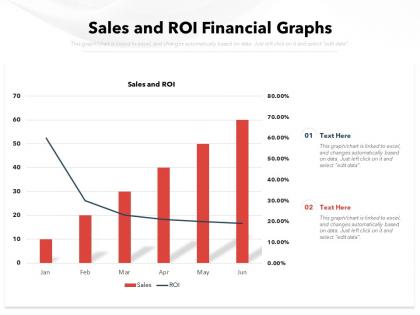
Sales and roi financial graphs


Try Before you Buy Download Free Sample Product
 Impress Your
 Audience
Editable
of Time


Our Sales And ROI Financial Graphs are topically designed to provide an attractive backdrop to any subject. Use them to look like a presentation pro.
People who downloaded this PowerPoint presentation also viewed the following :
Sales and roi financial graphs with all 2 slides:
Use our Sales And ROI Financial Graphs to effectively help you save your valuable time. They are readymade to fit into any presentation structure.

FAQs for Sales and
Definitely include revenue, total sales costs, and your actual ROI percentage - those are non-negotiable. Lead conversion rates and customer acquisition costs are super helpful too since they show what's actually working. Oh, and make sure your time periods are crystal clear because nobody wants to guess if you're looking at monthly vs quarterly data. Pipeline value and deal velocity matter if you've got longer sales cycles. Honestly, the whole point is making it obvious at a glance whether you're making money or just throwing cash into a black hole. Context is everything here.
Honestly, ROI graphs are game-changers - they turn those nightmare spreadsheets into something you can actually understand at a glance. Instead of squinting at endless rows trying to figure out what's working, you'll instantly see which campaigns are crushing it and which ones are just eating your budget. When I present to my boss, showing a clean graph beats rambling about numbers any day. You can spot the patterns fast and pivot your strategy without second-guessing yourself. Oh, and it's way easier to justify doubling down on what's actually driving revenue. Trust me, once you start visualizing your ROI data, you'll wonder why you waited so long.
Honestly, the worst mistake is cherry-picking timeframes to make your numbers look amazing. Don't start your y-axis anywhere but zero either - I've seen people do this and it's so obvious. Compare like with like across campaigns, and keep your attribution windows the same throughout. Too many data points on one chart just confuses everyone. Oh, and remember stuff like seasonality can totally mess with your results if you don't mention it. Pro tip: show your graphs to someone else first. If they squint at it for more than 3 seconds, you need to simplify.
Honestly, Sales ROI graphs are like having a magic 8-ball but way more reliable. Plot your data over 6-12 months and you'll start seeing the real patterns. Maybe your returns keep climbing, or there's this weird seasonal thing happening - I always get surprised by Q4 spikes. The cool part? You can figure out which marketing channels actually work instead of just guessing. Those trend lines help you throw money at the right stuff and stop wasting budget on campaigns that suck. It's basically using your past wins to predict what'll work next time.
Timeframes totally make or break your Sales ROI analysis. Monthly views are great for catching immediate wins from campaigns. But you'll miss the bigger patterns if that's all you check. Quarterly and yearly data shows the real sustainable trends - especially important since most sales cycles aren't just 30 days anyway. Here's what I'd do: set up dashboards showing 30-day, 90-day, and 12-month ROI together. A campaign might tank short-term but crush it over three months. Honestly, most people get this wrong because they only look at one timeframe and panic.
Multi-year line graphs are your best bet here. Plot like 2-3 years of monthly ROI data on the same chart - different colors for each year works well. That way you can actually see if your December spike happens every year or if it was just a weird one-off thing. Single-year data is honestly pretty useless for spotting patterns. I mean, how would you know if that summer dip is normal or not? Throw in some trend lines too if the data looks noisy. Just grab your last three years of monthly numbers and get them visualized together.
Honestly, Excel's probably your best bet to start - everyone knows it and it handles ROI stuff just fine. Tableau makes crazy impressive dashboards if you need to wow executives or whatever. Power BI's solid too, especially if you're already using Microsoft for everything else. Oh, and Google Data Studio is decent for quick team stuff. I'd just go with whatever your team actually knows how to use first. You can always switch later if you need something fancier. No point picking the "perfect" tool if nobody wants to learn it, you know?
ROI graphs are basically your sales scoreboard - they show which channels actually make money vs. just drain your budget. Look for the steep upward lines or consistently high percentages, those are your winners. Way easier than drowning in spreadsheet data, honestly. Check if the performance holds up over different time periods too, because sometimes you get lucky streaks that don't last. When you're figuring out where to spend next quarter, just throw more money at whatever's been consistently crushing it on these graphs. Pretty straightforward once you get the hang of reading them.
Honestly, executives are obsessed with those red/yellow/green traffic light systems - lean into that. Clean bar charts work best, and don't cram everything into one messy view. Show trends over time but always include your targets so people can actually tell if you're crushing it or not. Put the big headline number right in your title. Oh, and have a one-sentence takeaway ready about what needs to happen next, because someone will definitely ask. Keep your time periods consistent too - jumping between months and quarters just confuses people.
Yeah totally! Just plot all your campaigns on one ROI graph - each one gets its own line or bar so you can see which ones actually made money. Make sure you're using the same metrics though (same timeframes, cost calculations, all that) or you'll be comparing totally different things. I've seen companies mess this up way too often, honestly. Short campaigns always look better than long ones if you're not careful. Once you have it set up, look for patterns - maybe your holiday campaigns crush it, or maybe social media beats email every time. Then just shift your budget toward whatever's working.
Honestly, color coding your Sales ROI graphs will save you so much time. Red for losses, green for wins, yellow for break-even - way easier than staring at spreadsheets all day. Your brain just gets it instantly. I learned this the hard way after presenting boring black-and-white charts to my boss once (awkward). Now I stick to the same colors across all reports so my team doesn't get confused. Makes presentations look way more professional too. Set up a standard palette and you'll wonder why you didn't do this sooner.
Honestly, ROI graphs are like your secret weapon with leadership. They show exactly which investments actually moved the needle on revenue. Way better than walking in empty-handed asking for budget increases, you know? Hard numbers beat vague promises every time. You can literally point to where you hired more reps or bought new tools and show the revenue spike that followed. Makes it so much easier to argue for headcount or better CRM systems. Just make sure you include time periods so they can see the whole story unfold - executives eat that progression stuff up.
Honestly, just go with line graphs for ROI trends - they're perfect for spotting changes over time. Bar charts are solid too when you're looking at quarters or yearly comparisons. Skip pie charts though, they're useless for time stuff. Oh, and throw a trendline on there to show where things are headed overall. One thing that bugs me is when people mess up their time intervals, so keep those consistent on your x-axis. Label everything clearly so your team doesn't have to guess what they're looking at. Makes the whole story way clearer.
Honestly, it's all about timing. B2B deals drag on forever - like 6-18 months - so your ROI graphs need way longer timeframes. B2C happens fast, usually days or weeks. Different metrics too. With B2B you're tracking pipeline value and lead scoring stuff. B2C is more straightforward - conversion rates, acquisition costs, transaction volumes. Way easier to read those patterns. The B2B graphs always look messy because of those crazy lag times. But B2C? You can actually see what's working pretty quickly. First thing - figure out your time horizon. That'll basically decide how you set up everything else.
Dude, real-time data is a game changer for ROI tracking. You're seeing what's actually happening right now instead of stale numbers from weeks ago. If your campaign's bombing, you'll know today - not when you're doing quarterly reviews and it's way too late. I used to obsess over my dashboard constantly (probably still do tbh). The accuracy boost is huge though. No more making decisions on old info that doesn't reflect reality. Just set up some alerts so you're not glued to the screen 24/7. Trust me, once you go real-time you can't go back to those laggy monthly reports.
No Reviews