


Tools Of Quality Control Powerpoint Presentation Slides




Try Before you Buy Download Free Sample Product
 Impress Your
 Audience
 100%
100% Editable
 Save Hours
 of Time


Solve critical quality related issues using Tools Of Quality Control PowerPoint Presentation Slides. Incorporate this professionally designed tools of quality control PPT slideshow and apply these quality check tools from product development phase till delivery. This content-ready QC tools PowerPoint complete deck has pareto chart, flow chart, control chart, fishbone diagram to troubleshoot quality problems. Monitor the overall operation with the help of these important tools. Use scatter diagrams, graphs and check sheet for the continuous process improvement. Determine the bottlenecks in the processes and put those issues in a spotlight using this ready-to-use quality check tools PPT deck. Make improvements in the process with the help of QC tools PPT templates. Download these ready-made tools of quality control PowerPoint presentation templates to identify the breakdowns, loopholes, roadblocks and improve those using these essential quality control tools.Bring down fences with our Tools Of Quality Control Powerpoint Presentation Slides. Encourage the entry of a fresh idea.
People who downloaded this PowerPoint presentation also viewed the following :
Content of this Powerpoint Presentation
Slide 1: This slides introduces Tools of Quality Control. State Your Company Name and get started.
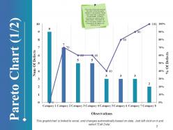
Slide 2: This Pareto Chart slide is one of the most common tool used in ensuring quality standard in the products. Pareto chart would help in indicating the percentage of defects occurred over a period of few observations. This would be help in estimating whether over a time period the defects are reducing or not.
Slide 3: This is also a Pareto chart and is a variation of slide 2.
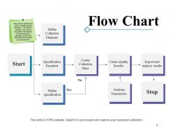
Slide 4: Flow chart is another tool used to maintain quality standards. This helps in creating a flow for the activities to be followed. This slide showcases a Flow Chart with Yes-No parameters for the following points- Define Collection Elements, Specification Required, Define specification, Create Collection Plans, Create Quality Results, Report and analyze results, Perform Transaction.
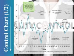
Slide 5: This is a Control Chart slide to show state of control. The points shown are- Abnormal Variation due to Assignable Sources, Upper Control Limit (UCL), Lower Control Limit (LCL), Abnormal Variation due to Assignable Sources, Out-of-control Point (Special Cause), Normal Variation due to Chance, Process Average (or target value). This is one of the most common tool used in ensuring quality standard of the products. Control chart would show a process over a specific time period and will help in identifying the trends, shifts and patterns.
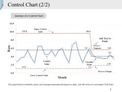
Slide 6: This is another variation of Control Chart with the following points- Anatomy of a Control Chart, Process Change, Lower Control Limit, Center Line, Unstable Trend, Upper Control Limit, Process Segment.
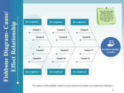
Slide 7: This slide showcases Fishbone diagram with description details.
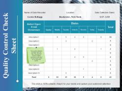
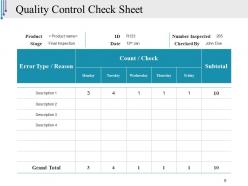
Slide 8: This is a Quality Control Check Sheet table slide highlighting the defects found and their count. This would help in estimating the numbers of defects occurring on a daily basis so that corrective actions can be implemented instantly. The main sub headings include- Name of Date Recorder, Location, Data Collection Dates.
Slide 9: This slide presents Quality Control Check Sheet showing- Product name, ID, Date, Number Inspected, Checked By with Grand Total.
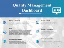
Slide 10: This slide presents a Quality Management Dashboard with the following sub headings- 1: Purpose & Overview (Provide an overview of the process you plan to employ to manage quality, describing the items below at a high level. Include a problem definition or statement & any relevant background information). 2: Metrics & Tools (This section describe the product project & process metrics that will be captured & monitored for the project & any tool that will be used to do so). 3: Scope (This section references any standards & guidelines that will de used on the project, & addresses how compliance with these standards & guidelines will be determined & to which project deliverable they will apply. The project deliverables are then evaluated against these criteria before they are formally approved). 4: Review & Audit Plan (This section specifies the schedule, resources & methods & procedures to be used in conducting project reviews & audits). 5: Roles & Responsibilities (Describe who will be involved in the quality management process . What roles & teams are required? Are meetings required? If so, how often?). 6: Corrective Action Plan (Provide a high level of description of planed procedure used to prevent track & resolve problems & issues identified in project processes detected in QA reviews of the project or previous similar project. Use an error report form).
Slide 11: This Coffee Break icon slide is for display purposes to proceed forward.
Slide 12: This is Tools Of Quality Control icon slide.
Slide 13: This slids is titled Charts & Graphs to proceed forward.
Slide 14: This slide presents a Column Chart for two products' comparison.
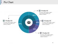
Slide 15: This is a Pie Chart slide for showing/comparing different entities, products.
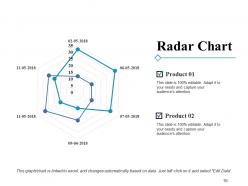
Slide 16: This slide presents a Radar Chart for product comparison.
Slide 17: This slide is titled Additional Slides to move forward.
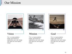
Slide 18: This is Our Mission slide with Vision, Mission, Goal and respective imagery.
Slide 19: This is an About Us showing Values Client, Preferred By Many and Target Audiences.
Slide 20: This slide presents Our Team with name and designation.
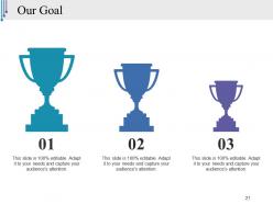
Slide 21: This is an Our Goal slide. State your goals here.
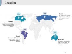
Slide 22: This is a Location slide with World Map to specify company/product specifications.
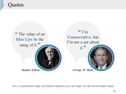
Slide 23: This is a Quotes slides. Put information, specification, highlights etc. here.
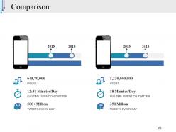
Slide 24: This is a Comparison slide for showing users, time spent and numbers for a particular company on the web.
Slide 25: This is a Magnifying Glass to display information, specifications etc.
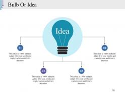
Slide 26: This is a Bulb Or Idea slide to showcase anything innovative or out of the box ideas.
Slide 27: This is a Thank You slide with Address # street number, city, state, Contact Numbers, Email Address.
Tools Of Quality Control Powerpoint Presentation Slides with all 27 slides:
Felicitate consistent achievers with our Tools Of Quality Control Powerpoint Presentation Slides. Ensure they get due accolades.







FAQs for Tools Of Quality Control
Start with control charts and check sheets - those two will get you the most value right away. Fishbone diagrams are clutch when you're really trying to figure out what went wrong. Pareto charts help you focus on the stuff that actually moves the needle instead of getting distracted by every tiny problem. Most places I've seen use histograms for data distribution and scatter plots for seeing how variables relate. Honestly, control charts might seem boring at first but they're everywhere for a reason. Check sheets are just good for collecting data without missing anything important.
SPC charts are like having a radar system for your production line. They catch problems brewing before they actually hit you. Instead of just checking finished stuff, you're watching the process itself change over time. When things start drifting outside normal ranges, boom - you get the heads up. Honestly, the tricky part isn't understanding them, it's getting people to actually DO something when the charts start screaming. You'll see patterns and weird shifts that would've turned into defects later. Just make sure you set them up on the processes that really matter, not everything under the sun.
So basically, you draw out what looks like a fish skeleton with your main problem as the "head." Then you create branches for different categories - people, processes, materials, environment, whatever makes sense. Here's the thing though: it stops your team from just throwing out random guesses. Instead, you're methodically working through each branch and brainstorming what could go wrong in that area. I've seen teams discover causes they never would've thought of otherwise. Just make sure you define the actual problem first (sounds obvious but trust me). Then go wild brainstorming on each branch.
So a Control Plan is basically your quality roadmap - tells you what to check, when to check it, and what to do when things go sideways. Honestly, it seems like busy work at first but you'll thank yourself later when you catch problems before they hit customers. It covers your critical control points, how you'll measure stuff, and your response plan for each process step. My old boss used to say it's only as good as the team actually using it (not just filing it away somewhere). Oh and definitely update it whenever you change your process - nothing worse than following outdated procedures.
So you know how 80% of problems usually come from like 20% of causes? That's the Pareto thing and it's super helpful for quality stuff. I've been using it forever - saves so much time honestly. Instead of chasing every little issue, just grab your defect data and rank what's causing the most trouble. Focus on those top 3-4 culprits first. You'll be amazed how much better things get when you stop trying to fix everything at once. Way more efficient than the scattered approach most people take.
Dude, checklists are seriously underrated in QA. They stop you from forgetting stupid stuff and keep everyone on the same page - which is clutch when you've got multiple people testing. New hires love them too since they don't have to guess what to do next. Oh, and they save your ass during audits because you can actually prove what got checked. I always tell people to start with whatever process breaks the most often. You'll be surprised how much smoother things run once you've got the basics written down somewhere.
Dude, histograms are seriously underrated. They show you how your data spreads out - like where most values cluster and if anything's way off. Super quick way to see if you're hitting your targets or if there's weird stuff happening. Normal bell curve? Multiple humps? Skewed to one side? You'll spot it right away instead of just staring at boring averages. I probably use them more than I should, but honestly they make problems so obvious. Next time you've got measurements or defect counts, just toss them in a histogram first. Way better starting point than anything else.
Look, FMEA is basically your early warning system - catches stuff before it blows up in production. Yeah, filling out those spreadsheets is kind of a pain, but it makes your team actually think through what could go wrong. You'll rank problems by how bad they are, how likely, and whether you'd even notice them happening. Honestly, I've seen teams skip this step and then spend months putting out fires later. The sweet spot is doing it right after you nail down your initial design. That's when you can still change things without it costing a fortune. Way better than scrambling to fix things downstream.
So scatter plots are pretty straightforward - you just throw one variable on each axis and see what happens with the dots. If they're going up from left to right, that's positive correlation (both things increase together). Going down means negative correlation. Honestly, they're way better than staring at endless spreadsheet rows trying to spot patterns. When the dots are all over the place randomly, there's probably no relationship. Tighter clusters mean stronger correlation. Perfect for catching cause-and-effect stuff you'd totally miss otherwise.
Look, audits help you figure out where you're screwing up versus where you should be. They dig into why problems happen instead of just what's going wrong - way more useful than slapping fixes on symptoms. What people don't realize is they also show you what's actually working well. I mean, we're always so focused on disasters we miss the good stuff. The key is using those findings to update your processes and training. Oh, and don't forget to follow up on fixes - I've seen so many companies do audits then let corrective actions die in some spreadsheet somewhere.
Look at defect rates and first-pass yield - those are your bread and butter. Customer complaints tell you what's actually getting out the door, and cycle times show if you're moving fast enough. Supplier quality scores matter too, especially if you're dealing with outside vendors regularly. Cost of poor quality is honestly my favorite metric because finance suddenly cares about quality when you put dollar signs on it. Don't just take snapshots either. Track trends so you catch problems early instead of playing cleanup. Start there and see what else your team needs.
So process mapping is basically like getting a bird's eye view of all your workflows - you'll catch bottlenecks and redundancies that are invisible when you're just grinding through daily tasks. Visualizing each step shows you exactly where defects pop up and which handoffs create delays. Honestly, there's always way more broken stuff than you'd expect. Once you map it out, you can cut unnecessary steps and add quality checks where they actually matter. Oh, and definitely start with your worst process first - that's where you'll see the biggest wins right away.
So the 5 Whys is basically just asking "why" five times to get past the obvious stuff. Like if a machine breaks, don't just fix it - ask why it broke, then why that happened, then why that happened. You keep going deeper until you hit the real problem. Sometimes it's three whys, sometimes seven, whatever works. My old boss was obsessed with this method and honestly? It actually stops you from wasting time on band-aid fixes. Instead of jumping straight to solutions, you'll find the thing that's actually causing your headaches. Super basic but it works way better than you'd think.
So Lean Six Sigma is pretty solid for fixing quality issues - it's not just random troubleshooting like most places do. DMAIC methodology keeps you organized: Define, Measure, Analyze, Improve, Control. Honestly, the structure alone saves so much time. You'll get statistical tools like control charts that catch problems early, before they cost you big money. The lean side cuts waste while six sigma pushes defects down to almost nothing. My advice? Map out your current quality processes first and find where you're bleeding the most. Oh, and don't try to fix everything at once - that never works.
Honestly, just grab some checklists and maybe sketch out your processes first - no need for expensive software yet. Figure out what's driving you crazy most. Customer complaints? Defective products? I'd tackle that one thing hard before moving on. You know what kills me? Watching small businesses try to fix everything at once and completely overwhelm their people. Pick maybe two tools max, train everyone properly (and I mean actually train them, not just hand out a manual), then make sure they're using the stuff daily. The real trick is getting your whole team to care about quality, not just you.
-
The content is very helpful from business point of view.
-
Great designs, Easily Editable.