


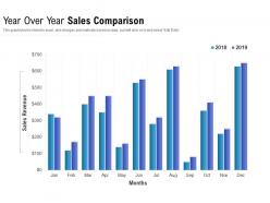
Year over year sales comparison





Try Before you Buy Download Free Sample Product
 Impress Your
 Audience
 100%
100% Editable
 Save Hours
 of Time


Our Year Over Year Sales Comparison are explicit and effective. They combine clarity and concise expression.
People who downloaded this PowerPoint presentation also viewed the following :
Year over year sales comparison with all 2 slides:
Give your audience a fulfilling experience. They will find our Year Over Year Sales Comparison elevating.
FAQs for Year over
Start with revenue and growth rate - that's your foundation. Customer acquisition cost versus lifetime value tells you if you're burning cash or actually building something. I'd track conversion rates and average deal size too, plus how long your sales cycles are running. Break it all down quarterly and by product so you can catch patterns early. Win/loss ratios by territory are gold for spotting what's working. Honestly, profit margins matter more than most people think. Once you nail these basics, you can always dive deeper into whatever's looking sketchy.
Oh man, seasonal stuff will mess with your head if you don't watch out. That Q4 spike? Probably just people buying holiday gifts, not your brilliant new campaign. Compare the same periods year-over-year instead of going quarter by quarter - way more accurate. I got burned by this exact thing last year, thought I was crushing it in December lol. Multiple years of data will show you what's actually seasonal patterns vs real growth. Either strip out the seasonal effects beforehand or just be super clear about them when you present your results.
Honestly, demographics are everything when you're trying to figure out sales patterns. Different age groups buy at totally different times - like millennials go crazy during holiday season while boomers are way more steady throughout the year. Income levels matter too obviously. Geographic stuff shows you seasonal trends that might surprise you. I'd start by breaking down your top products by age and location first, then see what jumps out. You won't catch these patterns if you're just looking at overall numbers. Oh and don't forget income brackets - that's where you'll see the real spending differences.
Dude, line charts are your best friend for showing sales trends over time. Bar charts work great too when you're comparing different quarters or products. Don't even think about pie charts - they make sales data look confusing as hell. Stick with your company colors and throw actual dollar amounts on everything so people know what they're looking at. Oh, and don't cram too much on one slide or you'll lose everyone. I always make one overview chart first, then keep detailed quarterly breakdowns handy. Trust me, someone always wants to dig deeper during Q&A.
Honestly, the biggest mistake is just staring at raw numbers without any context. Seasonality will screw you over every time - holidays, market shifts, product changes throughout the year. Revenue looks shiny but profits tell the real story, and so many people miss that. When you're comparing different periods, make sure it actually makes sense to compare them. Oh and always ask "why" when something jumps around weirdly in your data. Break it down by product or region first - that's where you'll actually see what's happening instead of just guessing.
So first thing - calculate percentage change between years. Take this year's sales minus last year's, divide by last year's, multiply by 100. Pretty straightforward stuff. But don't just look at raw percentages because one weird month can throw everything off. I'd check trends over like 3-5 years instead to see what's actually happening. Break it down by product lines or regions too since your totals might be hiding some important patterns. Oh and set up a basic dashboard so you're not doing this math every single quarter - trust me on that one.
Honestly, just start with Excel or Google Sheets - they're still amazing for pivot tables and basic number stuff. Your CRM like Salesforce probably has decent reporting built in already, so check that first before spending money. Tableau and Power BI are worth it if you need fancy dashboards that'll impress the bosses (and trust me, they love pretty charts). Google Analytics works too depending on how you sell. Power BI's gotten way better lately, by the way. Don't overthink it - use what you've got access to first, then upgrade if you actually need more firepower.
Breaking down sales by category is honestly a game-changer - you'll quickly see which product lines are making you the most money. Seasonal stuff becomes super obvious too (holiday decorations always explode in Q4, duh). But here's what's really useful: spotting those underperforming categories that need help. Customer preferences shift more than you'd think, so tracking this monthly helps you catch trends early. I learned this the hard way when I kept ordering what I *thought* should sell instead of what actually moves. Smart inventory allocation follows the data, not your gut feelings. Same goes for where you spend marketing dollars.
Look, competitive analysis basically shows you whether your sales numbers are actually impressive or if everyone just had a good year. That Q3 slump you're worried about? Maybe your whole industry tanked then - not just you. I swear, putting your results next to competitors' completely changes how you see things. You'll catch trends you totally missed before. Plus you can figure out where you're getting crushed versus where you're actually stealing market share. It's wild how much context matters when you're trying to make sense of yearly performance.
Ugh, platform algorithm changes are the worst - they'll destroy your visibility literally overnight. Pull your platform analytics with your sales data first so you can see what's actually happening. Online seasonality is weird too, totally different from regular retail patterns. Track commission fees and ad costs separately since they hit different than physical store expenses. Customer acquisition costs matter big time, especially with digital marketing spend. I got burned on this last quarter! Oh and segment everything by traffic source and device type. Trust me on this one.
Yeah, the economy totally screws with your sales patterns. Strong economy? People spend more, businesses invest - your numbers go up. Recession hits and everyone gets scared, stops buying stuff. Makes sense really. Interest rates are huge too since they control how expensive loans are for everyone. I'd say track things like GDP and unemployment alongside your sales data - that way you're not always playing catch-up when trends shift. Though honestly, sometimes the economy does weird stuff that doesn't follow the textbook. But mostly it's pretty predictable once you start watching those indicators.
Lead with your biggest insights right away. Charts and graphs are your friend here - nobody wants to stare at spreadsheets. Talk about trends and what actually caused changes, not just raw numbers. Keep it short though, like 10-15 minutes tops. I learned this the hard way when I watched people's eyes glaze over during a 30-minute data dump. Connect everything back to how it affects the business. What should we do differently next year? Give them specific recommendations and clear action items so they don't just nod and forget about it afterward.
So basically you'll want to match up your feedback data with sales numbers by quarter and product. Pull all the sentiment scores and complaints, then see where they line up with revenue dips. It's honestly wild how obvious the patterns become - like customers bitching about a feature in Q2, then boom, sales tank in Q3. I'd definitely weight feedback from your big spenders more heavily though. Oh and segment everything by customer value first. Creates a simple dashboard showing both metrics together and you'll start seeing the connections right away. Trust me, the correlation is usually pretty clear once you map it out.
Your sales forecast is basically the blueprint for everything next year. Budget, hiring, inventory - it all stems from those numbers. Here's the thing though: get too optimistic and you'll blow through cash on staff you don't need (learned this the hard way). Go too conservative? You might miss out on growth or be scrambling to hire when things pick up. I always tell people to build in wiggle room because you'll definitely need to adjust as the year goes on. The forecast becomes your strategic foundation, but don't treat it like it's set in stone.
Check your sales data for weird gaps - like customers buying one thing but ignoring stuff that obviously goes with it. Geographic regions are gold mines too, especially when you're bombing in areas that should perform like your good markets. I'm weirdly obsessed with seasonal patterns because most people totally miss those timing opportunities. Churn data shows you exactly where people bail and why. Oh, and compare your numbers against what competitors are doing to find those empty spaces nobody's filling. Honestly just pick your biggest gap and test a small campaign first.
No Reviews