


Annual report design process powerpoint presentation with slides




Try Before you Buy Download Free Sample Product
 Impress Your
 Audience
 100%
100% Editable
 Save Hours
 of Time


Wish to get better with your next annual report design process complete PowerPoint show? No problem! Just download our readymade business annual report PPT model to effectively make mark. With support of this PPT example you can cast spotlight on your company’s previous years operations so as to strengthen relationships with partners and investors. Furthermore, our presentation deck helps to portray a transparent concise view of company’s resources, finances and future plans to build credibility among customers. Additionally, with help of this pictorial show you can make a visual communication underlining your company’s major accomplishments as well as can also effectively indicate the anticipated roadblocks. To keep the audience on edge our visual demonstration comprises of PowerPoint templates like financial highlights, sales highlights, profit after tax pat, net fixed asset turnover, market cap and many more. All in all, a must download for company directors, policy analysts, finance managers and auditors. So, now you have an ideal PPT sample to portray a report on business. Just roll up your sleeves to craft something awesome. Convince folks to act with greater commitment with our annual report ppt With Slides. Improve their degree of dedication.
People who downloaded this PowerPoint presentation also viewed the following :
Content of this Powerpoint Presentation
Slide 1: This slide showcases Annual Report Design Process. State Your Company Name and get started.
Slide 2: This is an Agenda slide. State your agendas here.
Slide 3: This is an About Us slide. State your position, facts, team/company specifications or anything business here.
Slide 4: This is an About Our Company slide. State your position, facts, team/company specifications or anything business here.
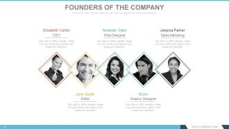
Slide 5: This slide showcases Founders Of The Company to state names, designation and respective image to go with.
Slide 6: This slide presents Our CEO’S Message. State any such message etc. here.
Slide 7: This slide also presents Our CEO’S Message. State any such message etc. here.
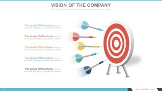
Slide 8: This is Our Vision slide. State the Vision of the company here.
Slide 9: This is Our Vision slide. State the Vision of the company here.
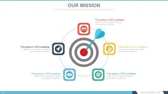
Slide 10: This is Our Mission slide. State the Mision of the company here.
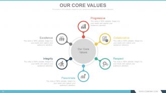
Slide 11: This slide shows Our Core Values. Some examples given are- Progressive, Collaborative, Respect, Passionate, Integrity, Excellence.
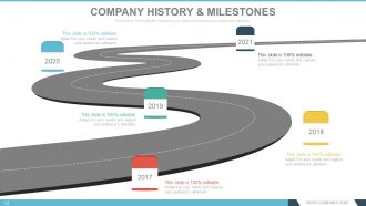
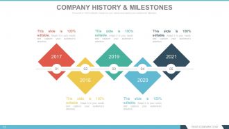
Slide 12: This slide presents Company History & Milestones in roadmap image.
Slide 13: This slide presents Company History & Milestones to be presented with icons and text boxes.
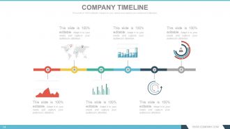
Slide 14: This slide presents Company Timeline to be presented with icons, graphs and text boxes etc.
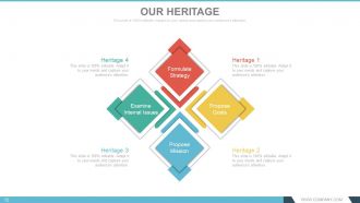
Slide 15: This slide showcases Our Heritage of the company to be shown.
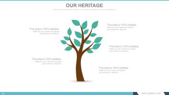
Slide 16: This slide showcases Our Heritage of the company to be shown.
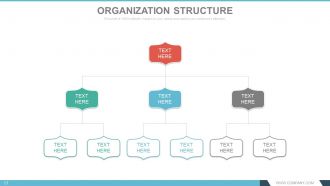
Slide 17: This slide displays the Organization Structure of the company to be presented.
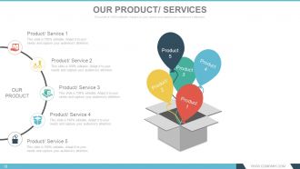
Slide 18: This slide presents Our Products/ Services to state specifications of Product/ Service.
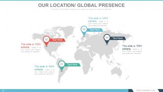
Slide 19: This slide shows Our Location/ Global Presence on world map image.
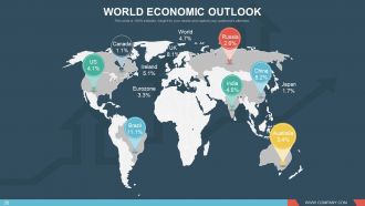
Slide 20: This slide shows World Economic Outlook with a world map image.
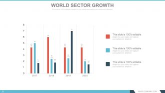
Slide 21: This slide presents World Sector Growth in bar graph form.
Slide 22: This slide displays Achievements with imagery and text boxes to go with.
Slide 23: This slide displays Achievements with different imagery and text boxes to go with.
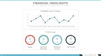
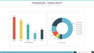
Slide 24: This slide shows Financial Highlights in Line graph form and metric scale for- Profit & Loss, Sales, Operating Expenses, Operating Income, Net Income and Profitability .
Slide 25: This slide presents Financial Highlights. State financial aspects here.
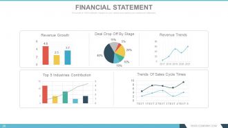
Slide 26: This slide shows a Financial Statement with the following subheadings- Revenue Trends, Revenue Growth, Deal Drop Off By Stage, Trends Of Sales Cycle Times, Top 5 Industries Contribution.
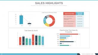
Slide 27: This slide shows Sales Highlights in different graphs form with the following points- Opportunities Total Sales By Probability, Total Sales By Month- Won : Lost Lead Sources Revenue Share.
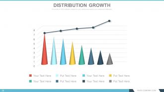
Slide 28: This slide shows Distribution Growth in a creative graph form.
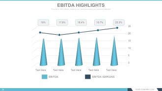
Slide 29: This slide showcases EBITDA Highlights in graph form.
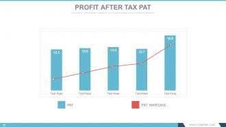
Slide 30: This slide presents Profit After Tax PAT in graph form.
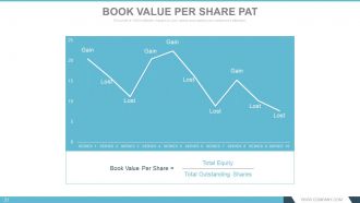
Slide 31: This slide shows Book Value Per Share PAT in line graph form in terms of- Lost and Gain.
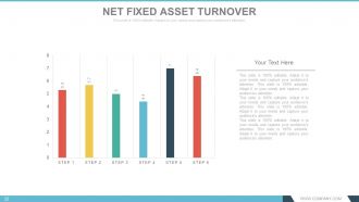
Slide 32: This slide shows Net Fixed Asset Turnover in graph form.
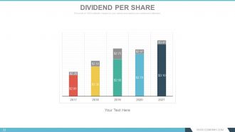
Slide 33: This slide shows Dividend Per Share in bar graph form.
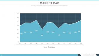
Slide 34: This slide shows Market Cap in graph form.
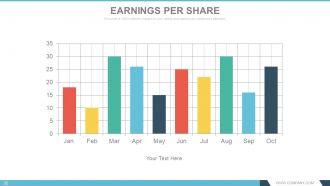
Slide 35: This slide showcases Earnings Per Share in graph form.
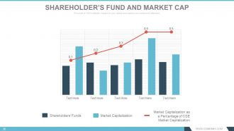
Slide 36: This slide presents Shareholder’s Fund And Market Cap in line graph and bar graph form displaying the following content- Market Capitalization as a Percentage of CSE Market Capitalization, Market Capitalization, Shareholders’ Funds.
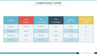
Slide 37: This slide showcases a Campaigns Done table.
Slide 38: This slide shows Campaign Report in tabular form.
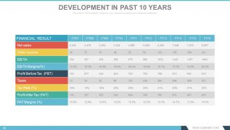
Slide 39: This slide showcases Development In Past 10 Years in tabular form.
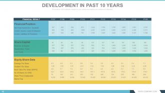
Slide 40: This slide also showcases Development In Past 10 Years in tabular form.
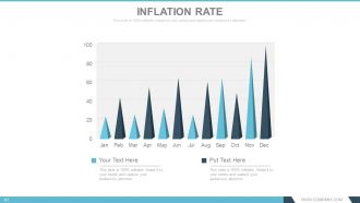
Slide 41: This slide shows Inflation Rate in graph form.
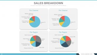
Slide 42: This slide presents Sales Breakdown divided into Per Channel and Per Region.
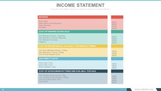
Slide 43: This slide presents Income Statement table.
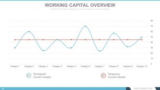
Slide 44: This slide shows Working Capital Overview in scatter graph form with- Temporary Current Assets, Permanent Current Assets as marking points.
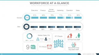
Slide 45: This slide presents Workforce At A Glance containing the following points- Executive, Finance, Human Resource, Marketing, Sales, Operation, Women, Part-Time Staff, Full-Time Equivalent Staff, People, Hours, Median Salary For, Women, Men.
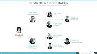
Slide 46: This slide presents Department Information as hierarchy image with names to display.
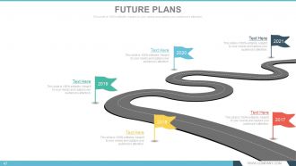
Slide 47: This slide presents Future Plans to be shown on a roadmap.
Slide 48: This slide showcases Our Team specifications with name, designation and image boxes.
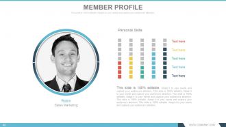
Slide 49: This slide presents a Member Profile with name, skills etc.
Slide 50: This slide is titled Additional Slides to proceed forward. You can change the slide content as per need.
Slide 51: This is an Our Goal slide. State goals etc. here.
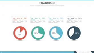
Slide 52: This is a Financial Score table slide. State financial aspects here.
Slide 53: This is a Quotes slide to convey company messages, beliefs etc. You can change the slide content as per need.
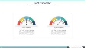
Slide 54: This is a Dashboard slide to show kpis, metrics etc.
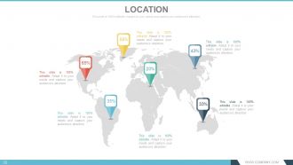
Slide 55: This is a Location slide of world map image to show global presence, growth etc.
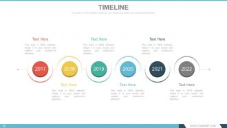
Slide 56: This is a Timeline slide to present growth, journey, milestones etc.
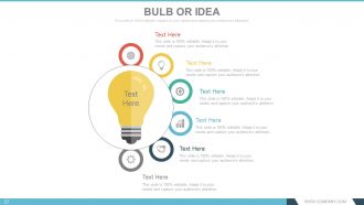
Slide 57: This is a Bulb Or Idea slide to show innovative aspects, ideas, information etc.
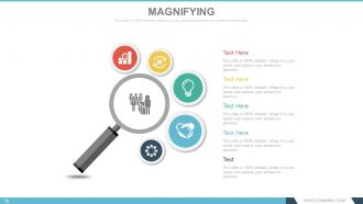
Slide 58: This slide shows a Magnifying glass image with text boxes. State information etc. here.
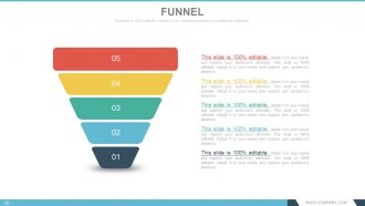
Slide 59: This slide displays a Funnel image. State information, funneling aspects etc. here.
Slide 60: This is a Thank You slide with Address# street number, city, state, Contact Numbers, Email Address.
Annual report design process powerpoint presentation with slides with all 60 slides:
Establish your claim to being innovative with our Annual Report Design Process Complete Powerpoint Deck With Slides. Highlight your individual ingenuity.




FAQs for Annual report design process powerpoint
Start with your financial highlights - those key numbers need to jump off the page with good design and maybe some color. Charts and infographics are your best friend here because, let's be real, nobody wants to stare at endless spreadsheets. Include your full financial statements but break them up visually. Add sections for management discussion, business overview, and governance stuff - that's what gives context to all those numbers. Oh, and create a clear hierarchy so people can either skim quickly or dig deeper if they want. Most readers just want to find their info fast and bounce.
Your audience is everything when it comes to design decisions. Institutional investors? Go with clean layouts, tons of data charts, and those boring-but-reliable colors that say "we won't lose your money." General public though - that's where you can actually have fun with infographics and bold colors. I've watched reports totally bomb because they got this wrong. Even your fonts matter here. White space, image style, all of it should match what clicks with your specific readers. Honestly, sketch out some audience personas first - it'll save you from redesigning everything later when nobody gets it.
Clean, minimal design with tons of white space is everything right now - makes all that financial data way easier to read. Interactive elements are perfect for digital versions. Bold fonts look great but don't go crazy or you'll annoy everyone. Oh and you basically have to mention sustainability somewhere these days, it's like required or whatever. Data visualization should actually be interesting, not those same boring pie charts everyone uses. Modular layouts work across both print and digital. Check out what the big players did last year for inspiration, then make it your own.
Honestly, infographics are amazing for this stuff. Your stakeholders won't zone out when they see charts and timelines instead of massive data dumps. Visual stuff just clicks faster in people's brains - way better than making them trudge through paragraphs of numbers. I'd focus on your key data points first, then figure out what format works best. Could be process flows, icon stats, whatever makes sense. Oh and definitely loop in your design team early because they'll have ideas you haven't thought of. Trust me, anything beats those brutal spreadsheet walls of text.
Font choice is everything in annual reports - it literally sets the tone before people read anything. Go serif for that trustworthy, established vibe or sans-serif if you want modern/innovative. I swear I've seen reports where Comic Sans would've looked more professional than whatever disaster they chose! Hierarchy matters too. Keep it to 2-3 fonts max, make your headings super clear, and actually test how it reads at different sizes. Spacing and consistency show you care about details. Stakeholders judge your whole company on this stuff, even if they don't realize it.
You definitely want high contrast - dark text on light backgrounds or the opposite. Blues and greens are solid choices since they scream "trustworthy" (which is what finance people love). Warmer colors can make you look more innovative, but honestly? Don't go overboard with bright stuff or people won't focus on your actual numbers. Stick with 2-3 colors max that match your brand. Here's a trick - print some pages in grayscale first to see if your layout still makes sense without the color helping out.
Your visuals need to actually tell your story, not just take up space. Skip the generic stock photos - seriously, we've all seen enough fake handshakes to last a lifetime. Use real photos of your actual team and products instead. Keep your photography style consistent so everything feels cohesive. Simple illustrations work best, especially when you're dealing with complex data. Oh, and don't forget about resolution - you'll want 300 DPI minimum for anything that's going to print. Colors can look totally different in print vs digital, so test both formats before you finalize anything.
Okay so first thing - make a brand guide doc before you even touch the design stuff. Colors, fonts, spacing rules, all that. Then build templates for different sections (like financials vs regular content) so nobody can mess with your fonts randomly. Honestly, the biggest mistake I see is people treating each section like its own thing instead of one story. Oh and definitely do check-ins while you're designing - trust me, finding brand problems at the end is absolutely brutal. Way easier to catch that stuff early when you can actually fix it without wanting to cry.
InDesign is definitely what you want for annual reports. It's made for big multi-page documents and won't crash on you like other programs (cough, Publisher). You'll probably need Photoshop too for photos and Illustrator for charts. Budget tight? Canva Pro has some solid templates now, though you can't customize as much. Oh, and Figma's great if your whole team needs to comment and review stuff together. Honestly, just go with InDesign if you can swing it - yeah there's a learning curve but it's worth it when you're wrestling with 50 pages of financial data.
Build this stuff in from the start - trust me, going back to fix it later is a nightmare. Use high contrast colors and readable fonts (12pt minimum). Alt text is huge for screen readers, but people skip it constantly. Tag your PDF properly so assistive tech can actually navigate it. Honestly, I'd throw in some alternative formats too - HTML versions, large print, whatever works. The hierarchy thing with headings and white space makes a massive difference. Oh, and test with real accessibility tools before you call it done. Saves so much frustration later.
Dude, white space is a game changer for annual reports. Dense financial data becomes way more digestible when you're not cramming everything together. I learned this the hard way on my first corporate project - total disaster! Give your key metrics breathing room and use generous margins between sections. The reader's eye will thank you. Plus it makes your brand look more premium and trustworthy, which investors eat up. Try doubling the white space around your most important numbers first. You'll be shocked how much cleaner it looks. Short sections work better than walls of text too.
Think magazine layout - you need breathing room around your financial stuff or people's eyes will glaze over. I'd do story, then data, then story again. Works every time. Break it up with employee spotlights or customer wins so the heavy numbers don't feel like homework. White space is your friend here. The financial parts should look clean and authoritative but not scary, you know? Then sprinkle in the human stories that actually explain why those numbers exist. It's kinda like... making vegetables taste good by mixing them with the good stuff.
Honestly, most annual reports are boring as hell, so track if people actually read through each section or just skim. Time spent reading and download rates are solid metrics. Check readability scores too - nobody wants to decode corporate jargon. Mobile responsiveness matters since everyone's reading on their phones these days. Send feedback surveys to investors and board members asking what was clear vs confusing. Oh, and set these benchmarks before you design anything! I learned that the hard way when we had to scramble after printing. Simple surveys work better than complex analytics sometimes.
Build feedback checkpoints into your main phases - concept, draft, final. Don't send people the whole report though, they'll skim at best. Break it into sections for review. Google Docs commenting works great, or Figma if you're fancy. Short calls beat email every time - you actually hear what's bugging them. Oh, and set hard deadlines for feedback or you'll be waiting forever. I learned this the annoying way. People will drag their feet otherwise, then you're scrambling last minute to incorporate their thoughts.
Oh man, cramming way too much text on each page is the worst mistake I see. Tiny fonts are brutal too - like, who thought 8-point was readable? Pick 2-3 fonts max and actually stick with them. Photo quality matters more than people think, and clashing colors just look sloppy. Don't bury your important financial stuff in huge paragraphs either - charts work so much better. Navigation's gotta be simple or people will just give up. Honestly, a clean grid system from the start saves you tons of headaches later.
-
Visually stunning presentation, love the content.
-
Great designs, really helpful.