


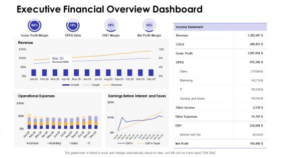
Executive financial overview dashboard snapshot by function




Try Before you Buy Download Free Sample Product
 Impress Your
 Audience
 100%
100% Editable
 Save Hours
 of Time


Our Executive Financial Overview Dashboard Snapshot By Function are topically designed to provide an attractive backdrop to any subject. Use them to look like a presentation pro.
People who downloaded this PowerPoint presentation also viewed the following :
Executive financial overview dashboard snapshot by function with all 7 slides:
Use our Executive Financial Overview Dashboard Snapshot By Function to effectively help you save your valuable time. They are readymade to fit into any presentation structure.





FAQs for Executive financial overview dashboard snapshot
Focus on what execs actually care about - revenue trends, profit margins, and cash flow first. Those are must-haves. Add operating expenses, customer acquisition costs, and debt-to-equity ratios. Pipeline metrics or burn rate work great if you're growing fast. Here's the thing though - keep it stupid simple. Nobody wants to scroll through tons of charts. Six to eight key metrics max, and they should tell your whole financial story. Oh, and set up auto-updates so you're not stuck pulling data manually every month like some kind of spreadsheet zombie.
Honestly, good data viz is what saves your financial dashboard from being a total mess. Instead of making execs squint at endless spreadsheet rows, you can throw in some clean charts and graphs so they actually get what's happening. Heat maps? Total lifesaver for showing how different regions or departments are doing. I'd definitely add some interactive stuff too - lets them dig deeper without cluttering everything upfront. The trick is matching the right visual to each metric. Pick your most important KPIs and make simple charts that tell the story right away. Trust me, they'll thank you for it.
Focus on what your execs actually care about - revenue, margins, cash flow, those big strategic KPIs. Don't cram everything onto one screen though. Like 5-7 key visuals max on the main dashboard. Trust me, cluttered dashboards are the worst. Make stuff clickable so they can dig deeper when they want to. Oh, and use consistent colors and add trend lines that match however your leadership thinks about time periods (monthly, quarterly, whatever). Definitely test it with real users first - I learned this the hard way. Their feedback will save you so many headaches later.
Honestly, I'd go with daily updates for most exec dashboards. Weekly can work if your business isn't super fast-moving, but it feels risky these days - like you're missing too much between check-ins. Monthly? Way too slow unless you're only tracking big-picture strategy stuff. Match it to how often you're actually making decisions, you know? If leadership meets weekly to review numbers, then weekly updates are fine. But if you need to move fast on budgets or react to market changes, daily is a must. I always tell people to start with daily and then dial it back if you realize you're not using the data that much.
Honestly, I'd stick with the big three: Tableau, Power BI, or Qlik Sense. If you're already using Microsoft stuff, Power BI is a no-brainer - integrates perfectly with Excel and won't cost you a fortune. Tableau's visualizations are incredible but man, the pricing can get brutal quickly. Qlik Sense works great if your execs actually want to poke around in the data themselves (some do, some definitely don't). My vote? Start with Power BI. It's affordable and handles most financial stuff without any headaches.
So basically, an Executive Financial Dashboard shows you all your key numbers - revenue, cash flow, profit margins - in real time. Super handy for making big decisions without digging through a million spreadsheets (been there, done that). You'll spot trends and weird outliers fast, which helps with forecasting and pivoting when needed. Historical data is clutch for seeing seasonal patterns. Honestly, the best part is having everything in one place during those intense planning meetings. Start with your 5-7 most critical metrics first, then expand from there.
Dude, you absolutely need real-time data for your dashboard. Financial stuff changes constantly - like, every few minutes sometimes. Using old numbers is basically worthless when you're trying to make quick decisions. Your cash flow and revenue metrics have to show what's happening RIGHT now, not last week's snapshot. Otherwise you might miss something important or make a call based on outdated info. Set up automatic data feeds so you don't have to manually update everything (trust me, that gets old fast). The lag time between real events and dashboard updates can actually cost you money if you're not careful.
Set up automated validation rules everywhere data enters your system - like security checkpoints but for numbers. Start with reconciling your source systems to catch problems early. Cross-check related metrics against each other too. Honestly, I've watched so many dashboards completely fall apart because people skip this part! Build alerts for weird variances and create an approval process for manual changes. Oh, and schedule regular audits where you trace key numbers back to source documents. Sounds boring as hell, but catching errors before they reach the CEO's dashboard beats explaining them later.
Ugh, the worst thing people do is cram way too much stuff on one screen. Makes my eyes hurt just looking at it. Also, they pick metrics that sound cool but are totally useless - like showing revenue when execs actually need to see cash flow data. Another thing: terrible color choices everywhere. Seriously, why do people make dashboards that are impossible to read quickly? Before you build anything, figure out what decisions this thing needs to help with. Then work backwards. Don't make people dig around trying to find the actual story in all that data - it should be obvious at first glance.
Honestly, just create different views for each group - it's way easier than trying to make one dashboard work for everyone. Executives want the big picture stuff like revenue trends and margins. Department heads need their budget details and headcount numbers. Sales teams obviously care about pipeline and commissions (they'll bug you constantly if those aren't front and center). Operations people focus on cash flow and where money's going. Most tools let you set permissions so people don't see irrelevant data. Really though, just ask each team what decisions they're actually making day-to-day, then build around that.
Dude, mobile access is clutch for executives who aren't desk warriors. Pull up revenue numbers mid-client meeting? Done. KPI alerts while you're traveling? Yep. The best part is making decisions without racing back to your office computer. During team meetings, you can literally show data on your phone right there. Oh, and don't sleep on tablet optimization – honestly way better for dashboards than squinting at your phone screen. Budget variance alerts hitting your phone instantly? That's when you know you've got it dialed in.
Honestly, just start with one good forecasting model and build it right into your dashboard widgets - revenue projections, cash flow stuff, budget variance predictions. Tools like Tableau and Power BI have ML built in now which is pretty sweet compared to the Excel hell we used to deal with. Focus on what execs actually want to see: quarterly performance forecasts, market trend predictions, risk indicators. Keep the visuals clean though - nobody wants to decode some complicated algorithm nonsense. Oh, and don't try to do everything at once. Pick one solid model that works and expand later.
Honestly, cash flow is everything - if you can't pay bills next week, nothing else matters. Track revenue growth too since that shows if you're actually moving forward. Profit margins tell you whether your pricing makes sense or if you're just bleeding money. Burn rate's huge if you're scaling up. Customer acquisition cost is another one I'd watch closely. But here's the thing - don't go crazy with like 20 different metrics. I learned that the hard way. Pick maybe 5-7 max and set them to update automatically. You want to spot problems fast, not drown in spreadsheets.
Okay so basically you want your dashboard to tell a story, not just vomit numbers everywhere. Like, show people WHY revenue dropped in Q3 (seasonal stuff) or connect those higher costs to actual strategy moves you made. Charts and color coding help because honestly, most people's eyes glaze over in budget meetings anyway. The trick is arranging everything so it flows - start with the problem, walk through what's happening, then boom, here's what we need to fix. That way executives actually know what they're supposed to DO instead of just nodding and hoping the meeting ends soon.
So basically, it comes down to who's looking at the thing. Executive dashboards are for the big picture stuff - cash flow, budget vs actual, company performance metrics. Way cleaner looking too. Operational ones? Total opposite. They're packed with nitty-gritty details your finance team actually needs - AP aging, daily transactions, variance breakdowns. Honestly feels overwhelming sometimes but that's the point. The exec version helps leadership make strategic calls. The operational one helps your analysts spot problems and fix them fast. Before you build either, just figure out who's gonna use it and what they're trying to decide.
-
Unique research projects to present in meeting.
-
Excellent work done on template design and graphics.
-
Great product with effective design. Helped a lot in our corporate presentations. Easy to edit and stunning visuals.
-
Best way of representation of the topic.
-
Perfect template with attractive color combination.