


Improving hospital management system hospital performance dashboard




Try Before you Buy Download Free Sample Product
 Impress Your
 Audience
 100%
100% Editable
 Save Hours
 of Time


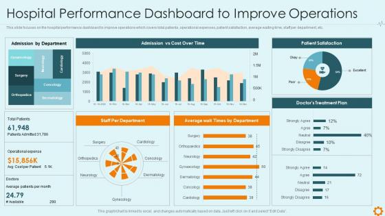
This slide focuses on the hospital performance dashboard to improve operations which covers total patients, operational expenses, patient satisfaction, average waiting time, staff per department, etc.
People who downloaded this PowerPoint presentation also viewed the following :
Improving hospital management system hospital performance dashboard with all 7 slides:
Use our Improving Hospital Management System Hospital Performance Dashboard to effectively help you save your valuable time. They are readymade to fit into any presentation structure.





FAQs for Improving hospital management system
For your hospital dashboard, start with the basics - patient safety stuff like infection rates, readmissions, and mortality. Those are absolutely critical. Then throw in operational metrics: bed occupancy, length of stay, ER wait times. Financial ones matter too (leadership obsesses over these) - revenue per patient, cost per case, payout ratios. Patient satisfaction scores and staff turnover are huge since they affect everything else. Oh, and keep it to like 8-12 KPIs total. More than that and people's eyes just glaze over when they look at it.
Honestly, data visualization is a game changer for hospital stuff. Those endless spreadsheets with readmission rates? Turn them into charts and dashboards that actually make sense. Heat maps show struggling departments instantly - beats staring at numbers for hours. I'd start with maybe 3-5 key metrics first though, don't go crazy trying to visualize everything at once. Color coding and trend lines help you catch patterns way faster. Real-time updates are clutch too. It's like finally having glasses when you didn't realize you needed them, you know?
Yeah, patient satisfaction scores carry serious weight - like 25-30% of your performance eval. HCAHPS surveys cover the usual stuff: how staff communicated, pain management, cleanliness, discharge process. Here's the kicker though - these scores directly mess with your reimbursement since CMS links payments to patient experience. Super annoying when you know your clinical work is solid but satisfaction numbers tank anyway. My advice? Keep an eye on your unit's monthly trends. Catch problems early before they wreck your ratings. It's just how the game works now, unfortunately.
Live dashboards are honestly a game-changer for tracking bed counts, patient flow, and staffing in real time. No more finding out about problems hours after they started. During those crazy shift changes, your charge nurses can instantly see which units are getting slammed and move people around. The trick is setting up alerts for stuff that actually matters - not just random metrics that look impressive but don't help anyone. Make sure it works on phones too, because nobody's chained to their desk. Oh, and don't go overboard with notifications or people will just ignore them all.
Start with your EHR - that's got all the clinical stuff like readmissions and length of stay. Financial systems come next for cost and revenue data. HCAHPS scores are annoying but necessary for patient satisfaction metrics. HR systems give you staffing ratios and turnover numbers, which honestly can be pretty eye-opening. You'll also need quality reporting databases and infection control data. The biggest thing? Automate those data feeds wherever you can. Trust me, manually updating dashboards every week will make you want to quit.
Daily updates work best for the critical stuff - patient flow, staffing, that kind of thing. Weekly's fine for financial metrics since they don't change as fast anyway. Honestly, I've watched so many dashboards turn into expensive screensavers because nobody bothers updating them regularly. Your team needs to see current data or they'll just ignore it completely. Set up automated pulls if you can - manually updating spreadsheets every week gets old real quick. Match how often you update to how fast things actually change and how much your people rely on that data for decisions.
Ugh, data silos are gonna be your worst enemy - nothing talks to each other so you're constantly chasing down messy info. Clinical staff will hate you at first because it's just another thing to click through when they're already buried in screens. Honestly, half the metrics everyone wants to track are total fluff anyway. Focus on stuff that actually helps patients, not numbers that just look impressive in meetings. Oh, and don't try to roll this out hospital-wide right away. Pick one department, prove it works, then slowly expand. Trust me on that one.
Dude, predictive analytics is where dashboards get actually useful. No more just staring at last month's patient satisfaction scores - you'll get heads up when next week looks sketchy. Think forecasting bed shortages, flagging readmission risks, spotting staffing gaps days early. Way better than scrambling when you're already short nurses, right? Instead you're like "oh, Tuesday's gonna be rough, better call in extra help." Honestly feels like having a crystal ball sometimes. Start with whatever's driving you crazy day-to-day and see if you can predict it 1-2 days out.
Honestly, start with what your users actually need to see - don't just dump every possible metric on there. Put the critical stuff up front like patient safety scores or bed capacity. Use colors that make sense (yeah, red = bad, green = good - revolutionary, right?). Let department heads dig into their own data without clicking through a maze. But here's the thing - test it with real people early. I've seen so many dashboards that seemed logical to the designer but were total garbage for someone trying to check numbers during a hectic morning shift change. What clicks for you at your desk might be confusing as hell for them.
Honestly, dashboards are a game-changer for this stuff. They pull industry data right next to your hospital's numbers, so you can instantly see how you stack up on readmission rates, patient satisfaction, length of stay - all that critical stuff. What I love is the color coding (green/yellow/red) because you can spot problems at a glance. You can drill down by department too, which is clutch for finding exactly where things are going sideways. Then just use those insights to figure out what to fix first and track if you're actually making progress. Way better than spreadsheets, trust me.
Honestly, track five main things for efficiency. Bed turnover and length of stay tell you if patient flow is working. Staff ratios and overtime hours show if you're burning people out - which sucks for everyone. ER wait times matter big time since nobody wants angry patients leaving bad reviews. Operating room usage rates are huge too. Don't forget discharge delays, they mess everything up. The trick isn't perfecting one metric but balancing them all. Set up alerts when things get wonky so you can jump on problems fast.
Just ask each team what they actually need to see daily - like their top 3-5 decisions. Executives want the big picture stuff (patient satisfaction, financials). Department heads need operational data like bed counts and staffing. Nurses? They just want real-time patient flow - trust me, they couldn't care less about quarterly budgets. Create different views with permissions so people only see what matters to them. Otherwise you'll drown everyone in useless info. Start with those key decisions each group makes, then build dashboards around that. Way more effective than throwing everything at everyone.
Honestly, regulatory stuff is what makes or breaks your dashboard design. You're stuck tracking CMS quality measures, Joint Commission standards, all that state reporting nonsense - there's literally no choice. Map those out first because auditors will tear you apart if the data's wrong or hard to find. The annoying thing is you can't just slap them onto whatever dashboard you already built. Start with those requirements, then figure out where your actual day-to-day KPIs fit around them. Trust me, doing it backwards is a nightmare.
So basically you get this real-time view of where your resources are actually going vs where you need them. Like you'll instantly see if ICU is slammed at 90% but surgical beds are just sitting there empty. Or which departments are burning through supplies way too fast. Honestly changed everything for our daily resource meetings - we stopped making decisions based on hunches and started using actual data for staffing moves and equipment transfers. Oh and budget stuff too obviously. I'd start by figuring out your biggest headaches first, then make sure the dashboard tracks those specific things.
Tableau and Power BI are your best bets here - they both play nice with healthcare data and won't fight with your existing hospital systems. Power BI's probably where I'd start since it won't destroy your budget. Epic does have reporting stuff built in, but honestly? It's pretty meh compared to the real BI tools. Qlik Sense is decent too if your team wants to dig into data themselves without always bugging IT. Just make sure whatever you pick connects easily to your EMR and financial systems. Nobody wants that integration nightmare. Start small with a pilot project first.
-
Very unique, user-friendly presentation interface.
-
Visually stunning presentation, love the content.