


Kpi Dashboard Of Innovation Project Management




Try Before you Buy Download Free Sample Product
 Impress Your
 Audience
 100%
100% Editable
 Save Hours
 of Time


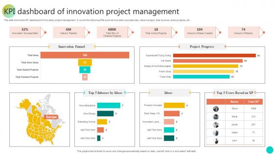
This slide shows the KPI dashboard of innovation project management. It covers the following KPIs such as innovation success rate, value in project, total revenue, active projects, etc.
People who downloaded this PowerPoint presentation also viewed the following :
Kpi Dashboard Of Innovation Project Management with all 7 slides:
Use our Kpi Dashboard Of Innovation Project Management to effectively help you save your valuable time. They are readymade to fit into any presentation structure.
-
Kpi Dashboard Of Innovation Project Management
-

Kpi Dashboard Of Innovation Project Management
-

Kpi Dashboard Of Innovation Project Management
-

Kpi Dashboard Of Innovation Project Management
-

Kpi Dashboard Of Innovation Project Management
-

Kpi Dashboard Of Innovation Project Management
-

Kpi Dashboard Of Innovation Project Management
FAQs for Kpi Dashboard Of
Okay so you'll want four main things: KPIs that actually mean something (not just vanity metrics), data that's current and clean, visuals where you can spot trends instantly, and good filtering so you can dig deeper. Start with your top 3-5 metrics first - seriously, don't try to track everything at once. I've seen so many dashboards that look amazing but are completely useless for making real decisions. Keep it simple enough that someone new can understand it in like 30 seconds max. Oh and make sure the metrics connect to decisions you're actually making, not just numbers that look impressive.
Start with what actually matters for your business goals, then pick metrics that connect to those. Like if you're worried about keeping customers, focus on churn rate and satisfaction scores - not random stuff like page views. Most tools let you drag widgets around and set alerts when numbers hit certain levels (honestly kind of fun to mess with). Time periods are easy to adjust too. The trick is working backwards from your goals to figure out what data will actually help you decide things better.
Honestly, data visualization is what makes KPI dashboards actually worth looking at. Nobody wants to stare at endless spreadsheet rows - your brain just glazes over. Charts and graphs let you spot patterns instantly. Red/green indicators? You immediately know what's broken. Trend lines show problems before they explode in your face, which is clutch. The trick is matching the right visual to each KPI. Bar charts work great for comparing stuff, line graphs for tracking changes over time. Gauges are perfect when you're hitting specific targets. Makes the whole thing way less painful to use daily.
Monthly reviews are usually a good starting point, but it really depends on what you're tracking. Sales numbers? Check those daily. Big picture strategy stuff can wait for quarterly check-ins. I've watched teams drive themselves crazy staring at dashboards every hour when nothing's gonna change that fast anyway. Match your review schedule to how quickly you can actually do something about the data - no point obsessing over daily numbers if you can only pivot monthly. Start monthly and see how it feels for your team's workflow.
Match each team's KPIs to what they actually control - sales should track conversion rates, ops can focus on efficiency stuff. Keep it to 3-5 metrics max or people just tune out (seriously, some dashboards look absolutely insane). The metrics have to be things teams can actually influence, otherwise what's the point? Get the actual teams involved in picking these since they know what matters day-to-day way better than leadership thinks they do. Oh, and review quarterly to ditch anything that isn't changing how people work.
Honestly, real-time integration is a game changer - no more constantly hitting refresh on your reports. Your dashboard just pulls everything automatically, so you can catch problems right when they happen instead of days later. We've all made dumb decisions because our data was outdated (I'm definitely guilty of this). Takes away that tedious spreadsheet updating too. I'd start with whatever metrics change most often - those are your biggest pain points anyway. Skip the stuff that barely moves and focus on what actually matters for quick decisions.
Don't cram everything onto one screen - I see this mistake constantly. Focus on maybe 5-7 metrics that actually tie to your business goals. Skip the vanity stuff that looks cool but won't help you make real decisions. Like, do you really need 12 different engagement metrics? Probably not. Make sure your data's accurate and updates often enough to matter. Visual hierarchy matters too - if every number screams for attention, none of them will get it. Always ask yourself "okay, so what am I supposed to do with this info?" before adding anything new.
Honestly, interactive dashboards are game-changers because people can actually dig into the data instead of just looking at boring static charts. Click to drill down, filter by your team, hover for details - suddenly everyone's exploring instead of glazing over. I mean, who has time for endless spreadsheets anymore? Simple filters and hover effects will get way more people actually using the thing. When users can click and see the "why" behind weird numbers, they're hooked. Trust me, start basic and you'll see adoption rates jump immediately. It's like turning a museum display into something people want to play with.
Okay so for KPI dashboards - Tableau and Power BI are probably your best bet if you don't mind learning something new. They're pretty powerful once you get the hang of it. Google Data Studio is actually decent and free, especially if you're already using Google stuff. I mean, Excel works too but it's kind of clunky for anything real-time. Oh and there's Klipfolio or Geckoboard if you want something simpler to use. Really depends on where your data lives and how fancy you need it. I'd just grab a free trial of Power BI first - see if it clicks for you.
Honestly, KPI dashboards are a game-changer because you can see what's actually going on with your business in real time. No more waiting around for monthly reports or digging through endless spreadsheets - I used to waste so much time on that. All your important stuff (revenue, customer numbers, whatever) shows up in one spot. Trends jump out at you visually, so you'll catch problems way earlier. Plus you can tell which projects are actually working vs just burning money. Set it to update automatically and check weekly. Way better than making decisions based on hunches.
So financial KPIs are all about the money stuff - revenue, profit margins, cash flow, ROI. Operations dashboards? Totally different beast. You want productivity metrics, quality scores, cycle times, how well you're using resources. I've seen this mistake way too many times and it creates such a headache. Financial ones tell you if you're actually making money. Operational dashboards show whether you're running things efficiently or not. Match it to who's looking at it - executives care about the financial picture, but your ops team needs to spot performance issues and bottlenecks. Just ask yourself who's using this thing and what they need to decide.
Honestly, having KPI dashboards on your phone is such a lifesaver. I can't tell you how many times I've been stuck in some boring meeting and needed to check our numbers real quick. Your field teams can pull up data without lugging laptops around, and you can actually read everything properly on smaller screens now. Touch navigation is way faster than clicking around on desktop too. Oh, and those push alerts? Total game changer when metrics go sideways. I'd say figure out which KPIs your team absolutely needs when they're out and about - start there.
Yeah, this stuff totally depends on your industry and where you're working. Manufacturing teams care about OEE and efficiency metrics. SaaS companies? They're all about MRR and churn rates - makes sense. I found out the cultural piece matters way more than I expected when we rolled dashboards out globally. Some cultures want detailed data stories, others prefer clean minimal displays. Also, collective vs individual metrics can be huge depending on the region. Honestly, just research what your specific audience actually cares about first. Otherwise you'll build something that looks great but sits there collecting digital dust.
Get your team involved from the start - seriously, don't just surprise them with some dashboard they never asked for. Let them pick the KPIs that actually help their daily work. Train everyone properly because people hate using stuff they don't get. When the dashboard solves a real problem, make a big deal about it publicly. Start simple too - you can add fancy features later once they're hooked. Oh, and make sure it answers questions they're already asking anyway. That's honestly the biggest thing. People won't touch it if it feels irrelevant to what they're doing.
Honestly, just check if people are actually logging in regularly - that's your first clue. See which KPIs they click on most and survey them about whether they're making better decisions with the data. Response times to issues should improve if it's working. I'd also track whether your key metrics are trending up over time. The fancy visualizations mean nothing if nobody's using them, you know? Quarterly reviews help figure out what's clicking with users and what needs fixing. Oh, and monitor engagement patterns - some dashboards look great but end up being total ghost towns.
-
If you have visited their site and failed to find the products, try reaching the customer service because it will be the case that you didn't use the search bar well.
-
“Excellent service from the customer support team when I wanted a slide that was a bit different from those on their standard menu. Super helpful.”