

Market potential bubbles market growth bubble chart ppt summary




Try Before you Buy Download Free Sample Product
 Impress Your
 Audience
 100%
100% Editable
 Save Hours
 of Time


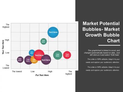
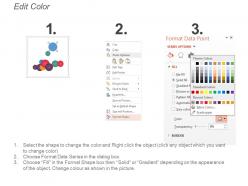
As a Marketing Manager, you have to plan the perfect marketing strategy for achieving high sales and profits for your business organization. Market potential analysis is a key component for laying down an ideal plan and with the help of this Market Potential Bubbles Market Growth Bubble Chart PPT Summary, you can present your ideas well. This SWOT analysis template aids you to cover all the parameters of the analysis like market size, market trends, market growth rate, market opportunity, market profitability and distribution channels. Through this marketing strategy slide you can present a documented investigation of the market which can be implemented to take all major decisions with respect to the workings of the company like inventory, purchase, workforce expansion, purchase of equipment and promotions. The potential demand for a product or service in a particular market can be analysed through this market research slide. You can calculate the total market potential in terms of units or money. This template can be downloaded easily at the click of a button! Generate some buzz with our Market Potential Bubbles Market Growth Bubble Chart Ppt Summary. Your ideas will make you the talk of the town.
People who downloaded this PowerPoint presentation also viewed the following :
Market potential bubbles market growth bubble chart ppt summary with all 5 slides:
Our Market Potential Bubbles Market Growth Bubble Chart Ppt Summary make the event a happening one. They generate a lot of activity.

FAQs for Market potential bubbles market growth bubble
So bubble charts have four main parts - bubble size shows market size/revenue, x-axis is growth rate, y-axis is your market share or competitive position, and colors separate different categories. The magic happens when you spot bubbles in the upper right corner - that's where high growth meets strong position. Size matters too because honestly, what's the point of chasing a tiny market even if it's growing fast? You can scan it super quickly to figure out which opportunities are actually worth your time and budget.
Bubble charts are perfect for this - plot market size on the x-axis, growth rate on the y-axis, and make bubble size show your competitive position or whatever investment you'd need. Upper right is your goldmine - big markets with high growth. Honestly, it's probably the fastest way I've found to spot patterns and weird outliers. Just map out your current products or potential markets, then go after the biggest bubbles with the best growth rates first. You'll see the opportunities jump out at you immediately.
Bloomberg and Yahoo Finance are your best bets for financial data. Government stuff like Census Bureau helps with the bigger economic picture. Industry reports from McKinsey or IBD work great too - though they can get pricey. Oh, and definitely grab competitor info from their annual reports. Statista's decent for market research if you have access. Here's what I'd actually do though: pick 2-3 solid sources instead of going crazy with data collection. Trust me, matching up timeframes between different sources will drive you nuts. Better to have clean, consistent data than a massive mess you can't use.
So bubble size usually means market cap or revenue - bigger bubble, bigger company. Pretty straightforward. Colors show performance stuff like growth or profit margins. Green typically means they're crushing it, red means... not so much. The x and y axes plot two other things, maybe market share vs growth rate or whatever makes sense for your data. Honestly, I always look at the biggest bubbles first - those are your major players. Then scan for color patterns to see who's actually performing well. You can spot market trends super quickly this way. Hot sectors, dominant companies, potential opportunities - it all jumps out at you visually.
Tech, pharma, and consumer goods companies get crazy value from these charts. You'll spot your cash cows instantly vs. stuff that needs more funding or should just be killed off. Healthcare companies are obsessed with using them for drug pipelines - makes sense with all those moving pieces. Retail does category management with them too. The visual thing is clutch when you're presenting to executives who want the whole story in like 30 seconds. Honestly, start with your messiest, most complex portfolio first. That's where you'll actually notice a difference.
Honestly, those bubble charts are pretty clutch for spotting opportunities. You get market size, growth rate, and competitive position all in one view - makes it way easier to see which markets are actually worth your time. The sweet spot is obviously high growth with competition you can handle. Resource allocation becomes so much clearer too. You can finally see where to go all-in versus where you're probably just throwing money away. Leadership loves the visual aspect, which is a nice bonus I guess. Update yours every quarter and use it for portfolio decisions. Really helps guide those investment conversations.
Don't get fooled by just looking at bubble size - figure out what it actually means first. The scaling can be weird too, making tiny differences look huge or major gaps seem small. Overlapping bubbles are honestly the most annoying part because they hide stuff you'd totally miss otherwise. I always end up clicking through every single data point instead of just eyeballing it. Your brain automatically goes to the big flashy bubbles, but usually the interesting patterns are hiding in those little clusters tucked away in the corners. Trust me on that one.
So bubble charts are basically regular graphs but way more useful. You get three variables instead of just two - x-axis, y-axis, plus the bubble size shows a third metric. Like you could do market size vs growth rate, then make bubble size = your potential revenue or whatever. Game changer honestly, because normally you'd need multiple charts or have to pick just two things to compare. With bubbles you can spot the sweet spots super fast - way better than staring at endless spreadsheet rows. I use them for market opportunities all the time now, makes patterns jump out immediately.
Tableau and Power BI are probably your best bet - both crush it for interactive dashboards and make the bubble sizing super intuitive. Excel works fine too if that's what you're used to, just more tedious to set up. D3.js gives you crazy customization but honestly feels like overkill unless you're doing something really niche or have solid coding chops. I've actually seen people create solid bubble charts in all these tools. Oh, and whatever your team's already using? Start there. You'll save yourself way more headaches working with familiar software than learning something from scratch, even if it's technically "better."
Totally! Bubble charts work great for this stuff. Plot your competitors using market share vs growth rate, then make the bubble size represent revenue or whatever matters most. You'll get this awesome overview where you can instantly spot who's killing it versus who's stuck in the mud. Honestly, it beats staring at spreadsheets all day. The visual makes it super obvious who the market leaders are, which companies are growing fast, and who might be worth acquiring. Just don't use old data or you're gonna get a weird picture of what's actually happening.
Pick metrics that actually make sense for decisions. X-axis should be competitive stuff - market share or revenue growth work great. Y-axis is market attractiveness, like total market size or how fast it's growing. Bubble size = your company's footprint there. Honestly? Most people get way too clever with this and pick metrics that sound impressive but are useless. I'd rather see something simple that works. Oh, and definitely test it with someone else first - if they can't spot which markets need attention within like 10 seconds, your metrics probably suck.
Honestly, demographics are everything for bubble charts - they help you break down your market data properly. Don't just throw all your numbers together like I see so many people do. Use age groups, income, or location as your bubble categories. That way you'll actually see how different customer segments are performing. Maybe bubble size shows market size while colors show different demographic groups? You'll spot which segments are crushing it vs the ones that are... well, not. Oh and your stakeholders will actually care about the insights instead of glazing over. Trust me on this one.
Bubble charts work great with line graphs if you want to show how things change over time. You could also throw in some heat maps for location stuff. Dashboard layouts are clutch - put your main bubble chart next to bar charts that break down categories, or add scatter plots to dig into specific relationships. Honestly though, don't go crazy adding every chart type you can think of. Start with your bubble chart, then add one more visual at a time. Each one should tell a different piece of the story without making people's heads spin. There's definitely a sweet spot where everything just clicks.
Tracking bubble charts over time shows you some crazy patterns. Markets that grow steadily vs ones just having their fifteen minutes of fame. Bubbles expanding consistently usually mean sustainable growth. The ones that blow up fast then deflate? Yeah, those are sketchy. Position changes show competitive stuff happening while size tells you about actual market expansion. I swear it's like watching your industry in slow-mo. Oh and flying-under-the-radar markets with steady momentum are gold mines. Track competitors quarterly - you'll predict moves before they happen.
So bubble charts are perfect for this - plot market size vs growth rate, then make bubble size your revenue potential or whatever. When you see those big bubbles hanging out in the "large market but slow growth" corner, boom - that's saturation territory. Honestly, I think of it like a nightclub at 2am. Place is packed but the energy's dead, you know? Short bursts make it super clear where things are getting stale. Then you can actually do something useful - jump into emerging segments before everyone else piles in and ruins the party.
-
Nice and innovative design.
-
Qualitative and comprehensive slides.