


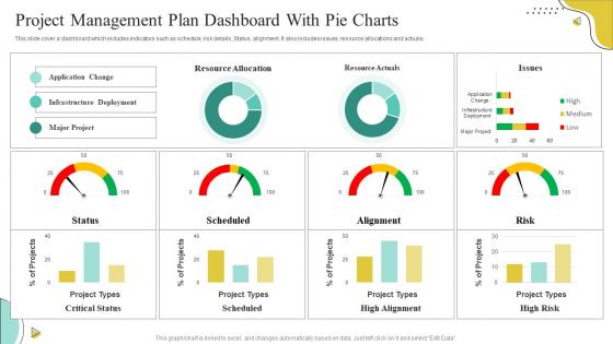
Project Management Plan Dashboard With Pie Charts




Try Before you Buy Download Free Sample Product
 Impress Your
 Audience
 100%
100% Editable
 Save Hours
 of Time


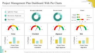
This slide cover a dashboard which includes indicators such as schedule, risk details, Status, alignment. It also includes issues, resource allocations and actuals.
People who downloaded this PowerPoint presentation also viewed the following :
Project Management Plan Dashboard With Pie Charts with all 7 slides:
Use our Project Management Plan Dashboard With Pie Charts to effectively help you save your valuable time. They are readymade to fit into any presentation structure.





FAQs for Project Management Plan Dashboard
You'll want project timelines, budget tracking, and task status as your core stuff. Team workload distribution helps too. Throw in some risk indicators and whatever KPIs matter for your specific project. But honestly? Most dashboards I've seen become total information dumps with pretty charts nobody looks at. Focus on what people actually check - progress vs deadlines, how fast you're burning budget, and any blockers needing immediate fixes. Those are the real essentials. Start simple with just those basics. You can always build out more views later once you see what the team actually uses day-to-day.
Honestly, visual dashboards are game changers for project management. You'll spot problems way faster than scrolling through endless spreadsheets. Behind schedule? Budget getting tight? It jumps right out at you. Plus stakeholders actually pay attention when you show them a clean chart instead of dumping a novel-length report on them (learned that the hard way). Simple stuff works best - I'd start with timeline progress and budget burn rate charts. Takes like 10 minutes to set up but saves hours every week. The patterns become super obvious once everything's visual.
Honestly, just track three main things: timeline/milestones, budget burn rate, and how fast your team's actually getting stuff done. Those will tell you everything you need to know. Risk indicators are clutch too - can't tell you how many times they've warned me before everything went to hell. Resource allocation's another lifesaver. Quality stuff matters but don't go crazy adding every metric under the sun to your dashboard. You'll just overwhelm everyone. Get your team using these basics first, then you can get fancy with it later. Oh, and make sure whatever you pick is actually actionable - half the dashboards I see are just pretty charts that don't help anyone make decisions.
So basically you'll want to slice your dashboard differently for each group. Executives just want the big picture - budget burn, timeline stuff, major risks. Team leads need the granular details like task completion and where things are getting stuck (honestly they live for that operational data). Clients? Keep it simple - just show milestone progress and deliverables. They really don't need to see your internal chaos. Most tools let you save these as custom views anyway. Oh, and definitely ask each person what they actually use the data for first - saves you from building dashboards nobody checks.
Honestly, if you're just getting started, Asana or Monday.com are probably your best bet - they've got dashboards built right in. ClickUp's solid too but can feel overwhelming at first. Want something totally custom? Notion and Airtable let you build whatever you want, though you'll spend way more time setting them up initially. I've actually seen people do crazy things with just Trello and some Power-Ups. If your team's already on Microsoft or Google stuff, their project tools work better than you'd expect. My advice? Start simple with what everyone already knows, then get fancier later if you need to.
Dude, real-time integration completely changes your dashboard game. No more waiting around for weekly updates or manually entering stuff. You'll see task progress, who's swamped, and budget issues the second they happen. Honestly beats the hell out of those static reports we used to stare at. When deadlines start sliding or someone's drowning in work, you catch it before it spirals. The trick is hooking it up to whatever tools your team actually uses daily—Slack, Trello, whatever. Then data just flows automatically without anyone having to remember to update anything.
Oh man, accessibility can make or break your dashboard. I've watched teams build gorgeous interfaces that nobody could actually use - like tiny fonts or those red/green indicators that colorblind people can't tell apart. Pretty frustrating honestly. Make sure you've got good color contrast and keyboard navigation for people who don't use mice. Screen readers need to work too. Test your fonts at different sizes, label everything clearly, and run one of those accessibility audit tools on whatever you've built so far. Trust me, it's way easier to fix this stuff early.
Definitely set up monthly check-ins with your team to see what's actually useful anymore. Week 1 metrics are totally different from week 10 stuff. I've watched so many dashboards turn into these sad collections of charts nobody looks at - honestly such a waste. If stakeholders aren't asking about certain widgets in meetings, just get rid of them. When project phases change or new risks pop up, that's when you add fresh KPIs. Really think of it more like updating your phone apps than building some permanent monument. Oh, and watch what people actually click on versus what just sits there looking pretty.
Ugh, don't try cramming everything onto one screen - seriously, it's tempting but you'll just confuse everyone. Focus on your main users instead of trying to please literally everyone. Those flashy animations that serve zero purpose? Skip them completely. I've seen so many dashboards fail because people track metrics just because they're convenient, not meaningful. Honestly, pick 3-5 KPIs that actually matter and call it a day. Test it with real people first though - you'd be surprised what doesn't make sense to anyone else. Your team will love having something clean they can actually use.
Honestly, dashboards are lifesavers for this stuff. You'll have one place where everyone can see project status, deadlines, who's doing what - no more digging through email chains or wondering if Sarah ever finished that thing. The real-time updates mean you can spot bottlenecks before they become disasters. Plus way fewer "hey what's the status on..." meetings, which is reason enough right there. Just make sure yours has clear ownership labels and status indicators that don't require a PhD to understand. Trust me, it cuts down on so much back-and-forth nonsense.
Honestly, dashboards are perfect for catching problems before they blow up your project. Set up alerts for budget issues, delays, bottlenecks - whatever could mess things up. The visual part is huge because you'll spot patterns way faster than scrolling through endless spreadsheets (which nobody wants to do). You can actually track if your fixes are working too. Oh, and definitely automate notifications for your main risk stuff. Trust me, you don't want to be checking that manually all day.
Honestly, it really depends on what industry you're in. Construction dashboards are all about safety metrics and tracking milestones - delays are crazy expensive there. Healthcare ones focus on patient outcomes and compliance stuff (which sounds like a nightmare tbh). Software teams obsess over sprint burndowns and bug tracking. Manufacturing? They need production schedules and supply chain visibility. The trick is figuring out what metrics actually matter for your specific situation. Don't just grab some random template online.
Ugh, I totally feel you on this one. First thing - get everyone on the same page about how to enter data. Status updates, hours, milestones, whatever. Document it all because people will forget otherwise. We had a complete disaster when half our team was doing things differently and our dashboard looked insane. Do weekly check-ins to catch mistakes before they spiral. Oh, and definitely limit editing permissions - trust me on this. Random people making "helpful" changes will ruin everything. The trick is making data entry feel automatic, not like extra homework nobody wants to do.
Your dashboard's historical data is perfect for post-project reviews. Compare what actually went down versus your original timeline and budget - way easier than trying to remember details from months ago! Look at those resource allocation charts to see exactly where things went off track or exceeded expectations. The cool thing is you'll start noticing patterns across projects, like always underestimating QA time or how Sarah consistently delivers ahead of schedule. Export the key visuals for your lessons learned docs and use them to make your future estimates way more realistic.
Honestly, mobile access is a game changer for project dashboards. Your team can stay updated without being stuck at their computers all day. Quick approvals during lunch? Done. Catching problems early while you're out? Easy. Though half the time these "mobile-friendly" dashboards are just shrunken desktop versions that make you want to throw your phone. Look for ones with actual responsive design - buttons you can tap without zooming in like you're 90. Real-time notifications are clutch too. Nobody works from one spot anymore, so why should your project management?
-
The templates are the best in class. Very clear and innovative graphics! I am excited to explore and download more presentations.
-
If you are looking for satisfactory PowerPoint services, SlideTeam is your go-to place. I am fully contented with their research and development team.