


Project portfolio status cost and performance dashboards snapshot





Try Before you Buy Download Free Sample Product
 Impress Your
 Audience
 100%
100% Editable
 Save Hours
 of Time


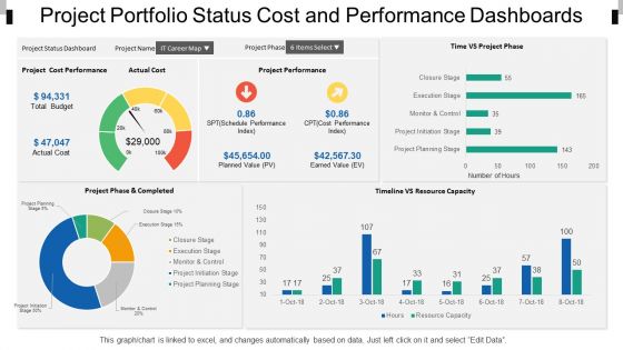
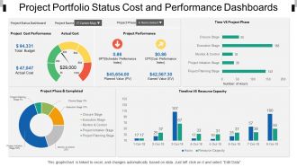
Delighted to show you a refreshing way to present your company's status cost and performance through a PowerPoint design. Decorate your recipe with our, project portfolio status cost and performance dashboards and improve its flavor. This performance dashboard template holds the concept of economic growth, including business icons in this PPT slide helps us to display difficult corporate financial data to a clear and understandable form and making it more engaging and surely acceptable. Performance indicators are shown here with bar graphs, pie charts and comparison charts. Growth chart allows you to show data in a precise way with the help of chart template and ensure easy depiction of abundant data and link among different segments of data. Download and get ready for a perfect experience with your economics sale presentations. You use visual aid to stimulate the interest of your audience, help them understand complex data and keep their attention. However, it has to be done right and we do it right with our Project Portfolio Status Cost And Performance Dashboards
People who downloaded this PowerPoint presentation also viewed the following :
Project portfolio status cost and performance dashboards snapshot with all 6 slides:
Our Project Portfolio Status Cost And Performance Dashboards Snapshot are old hands at it. They encompass the experience of ages.
FAQs for Project portfolio status cost and
Focus on the metrics that actually matter for portfolio health. Project progress bars and budget tracking are obvious ones. Resource utilization rates help too - plus timeline stuff so you know if things are falling behind. Definitely include risk indicators because surprises suck. ROI metrics are huge for showing business value, and milestone completion rates give you the bigger picture. Oh, and capacity planning data - otherwise you'll overcommit your teams constantly. Keep it clean though, maybe 6-8 KPIs max. Any more than that and people just tune out the whole dashboard.
Honestly, visuals are a game-changer for project stuff. Nobody wants to dig through endless spreadsheets when a simple chart shows you what's actually happening. Your brain just processes pictures way faster than rows of numbers - it's wild how obvious problems become when you see them in a timeline or color-coded dashboard. Plus your stakeholders won't glaze over during updates. They'll actually get what you're showing them without you having to explain every detail. Resource charts, progress bars, those little red/yellow/green indicators - they tell the whole story instantly. Way better than making people decode a bunch of text.
Stick to 7 metrics max - any more and people's eyes just glaze over. Project health, budget vs actual, timeline, resource allocation are your must-haves. Color coding is clutch (red/yellow/green, though honestly everyone has opinions about whether orange belongs). Put the critical stuff where they'll see it first, then let them dig deeper if needed. Here's the thing - great dashboards tell you the story immediately. Like, you should know if you're screwed or celebrating within 5 seconds of looking at it. Test with real users first though. They'll spot weird stuff you'd never catch.
Dude, real-time data is a total game changer for portfolio decisions. Instead of finding out about budget disasters weeks later, you catch problems as they're happening. Quick pivots become possible - move resources around, axe projects that aren't working, jump on new opportunities. I used to hate those quarterly reviews where we'd discover everything was already screwed. Now you can actually do something about issues while there's still time. Just set up alerts for the stuff that matters most or you'll go crazy watching dashboards all day.
Your dashboard is only as good as the feedback you get from people who'll actually use it. Seriously, I've watched so many beautiful dashboards collect digital dust because no one bothered asking users what they needed. Get regular input through surveys or quick one-on-ones - find out which metrics they care about and how they want to see the data. Maybe throw in some review sessions too. Your stakeholders know what's missing better than you do. Think of it like a product that keeps evolving. Otherwise you're just making pretty charts that nobody opens.
So first figure out what metrics your stakeholders actually care about - that's your starting point. Healthcare folks need compliance timelines and patient safety data, manufacturing needs production milestones and quality checkpoints. Most dashboard tools these days are pretty flexible, you can customize fields, tweak templates, set up alerts. Integration with your existing software (ERP, regulatory databases) is usually doable too. I'd honestly just start simple and build from there. The key is making it tell your industry's specific story instead of some generic dashboard that doesn't mean anything to anyone.
Honestly, the worst part is dealing with messy data from systems that hate each other. Think Excel files where everyone formats dates differently - total nightmare. Getting people to actually use the dashboard consistently? Good luck with that one. You'll spend way too much time arguing about which metrics actually matter vs the vanity stuff that looks pretty but tells you nothing. Leadership always has opinions about what "healthy" means for projects. My advice? Map out your data sources first before you get fancy with anything else. And nail down those KPI definitions early or you'll be rebuilding everything later.
Okay so first thing - get everyone using the same data entry templates and reporting on the same schedule. Otherwise you're screwed from the start. Set up validation rules in whatever dashboard you're using so it catches mistakes automatically. Trust me, our Q3 was a total disaster because we skipped this step! Each PM needs to know their exact metrics and deadlines. I do quick spot-checks weekly on random projects to catch weird stuff. Honestly the whole system only works if it's dead simple - people won't follow complicated processes no matter how much you bug them about it.
Honestly, dashboards are game-changers for this stuff. Everyone sees the exact same project status, so no more of those awkward "wait, what?" moments in meetings. Set up alerts for when milestones hit or budgets get wonky - way better than finding out through panicked emails later. Non-tech people love them because they're visual instead of boring spreadsheets (thank god). Most tools let stakeholders comment right on specific tasks too. Oh, and try doing weekly dashboard check-ins where people can actually ask questions instead of that endless email back-and-forth. Saves everyone's sanity.
Honestly, I'd go with Power BI or Tableau if you don't mind the learning curve - they're pretty much built for this kind of stuff. Smartsheet and Monday.com are way more user-friendly though, plus they do project management too which is nice. Excel works for simple portfolios but gets annoying fast once your data gets complicated (learned that the hard way). Klipfolio's solid too if you just want dashboards. I'd figure out what metrics you actually need first, then pick whatever makes those easiest to show your stakeholders. Makes the whole decision way simpler.
Honestly, these dashboards are game-changers for resource management. You can see at a glance who's drowning in work and who's twiddling their thumbs. No more guessing where your budget's going or which projects are about to implode. I'd start tracking utilization rates and timelines all in one place - saves so much headache later. The real magic happens when you spot problems early and can shuffle people around before everything goes sideways. Plus you'll actually know where your team's skills are being wasted, which drives me crazy when it happens.
Honestly, having everything in one spot is a game changer. No more hunting through random spreadsheets for budget info or timeline updates - trust me, I used to waste so much time on that. Your team actually knows what's happening since they're all seeing the same data. Plus when your boss asks for an update, you're not frantically pulling numbers together last minute (the worst feeling). You'll catch problems way earlier too. The best part? You can actually back up your decisions with real data instead of just winging it. Oh, and set up some alerts so nothing falls through the cracks.
Honestly, historical data is your best friend for this stuff. Pull like 6-12 months of past project info and see where things went sideways - budget overruns, timeline issues, resource problems. I always compare similar projects before starting new ones because why repeat the same disasters, right? Track actual vs planned dates and cost variances in your dashboard. You'll start noticing which types of projects always run late or cost way more than expected. Oh, and don't just look at the failures - successful projects have patterns too. Use all that to set way more realistic expectations going forward.
Honestly, just keep it simple - show only what people actually check every day. Don't turn it into a rainbow explosion with tons of data everywhere (I've seen some real disasters lol). Test it with the actual users first instead of guessing what they want. Colors should stay consistent, labels need to be super clear. Add filters so they can narrow things down by project or date. Oh and make sure it doesn't look terrible on phones since everyone's always checking stuff on mobile now. The biggest thing though? Get feedback and keep tweaking it based on how people really use it.
Honestly, I'd go with weekly updates if you can manage it. Daily is even better but that's probably overkill unless things are moving super fast. Here's the thing - if your data gets stale, people stop trusting your dashboard and then what's the point? Most teams I know do weekly because it hits that sweet spot between staying current and not driving everyone crazy. Monthly is way too slow unless your projects barely move (which, let's be real, some do). Oh and definitely try to automate the data feeds - manually updating these things will burn you out fast. Just pick something your team can stick with long-term.
No Reviews