


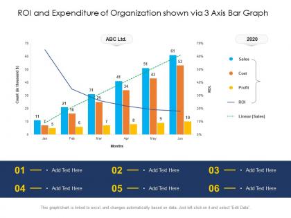
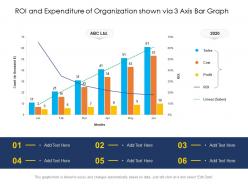
Roi and expenditure of organization shown via 3 axis bar graph


Try Before you Buy Download Free Sample Product
 Impress Your
 Audience
Editable
of Time


Our ROI And Expenditure Of Organization Shown Via 3 Axis Bar Graph are topically designed to provide an attractive backdrop to any subject. Use them to look like a presentation pro.
People who downloaded this PowerPoint presentation also viewed the following :
Roi and expenditure of organization shown via 3 axis bar graph with all 2 slides:
Use our ROI And Expenditure Of Organization Shown Via 3 Axis Bar Graph to effectively help you save your valuable time. They are readymade to fit into any presentation structure.
FAQs for Roi and expenditure of organization shown via 3
So for your ROI bar graph, start with clean financial data - that's honestly half the battle right there. Break your spending into clear categories and make sure you're comparing the same time periods (don't mix quarterly stuff with annual, it'll look messy). Use different colors so people can actually tell your categories apart. Include both dollar amounts and percentages when it makes sense. The whole point is making it super obvious which investments are working and which ones are duds. Oh, and gather your best data first, then build everything around that.
Dude, colors can totally make or break those ROI charts. Go with high contrast so people can actually tell the difference between categories - red/green works for gains vs losses, but honestly blue/orange is smarter if anyone's colorblind. Don't go crazy with too many colors though, like 3-4 max or it'll look like a kids' birthday party. Make your best performers stand out visually while keeping the bad stuff visible but not, you know, screaming failure at everyone. Oh and definitely check how it looks on the actual projector first - learned that one the hard way when my "perfect" colors looked like garbage on screen.
Honestly? Just use Excel or Google Sheets first - you probably already have them anyway. Tableau and Power BI are amazing if you want something fancy with interactive features, but they're overkill for most people. Excel's bar charts are actually pretty decent these days. D3.js is cool if you can code (I tried it once and gave up lol). Canva works for quick presentation stuff but you can't really dig into your data much. Start simple, then upgrade later if you need more bells and whistles.
Yeah, time periods mess with ROI data big time. Short windows give you these crazy spikes that don't mean much. Longer ones smooth everything out but you'll miss stuff that needs fixing right now. Like, if you're checking monthly data during holidays, December always looks insane but it's just people buying gifts, you know? I'd honestly just pick whatever timeframe matches what you're actually trying to figure out. For campaigns that are still running, keep your periods consistent. Maybe throw in a few different views too - that way you catch both the quick wins and the bigger picture trends.
Don't mix time periods - like Q1 ROI against yearly data on the same chart. That's confusing as hell. Starting your y-axis somewhere other than zero? Finance people will roll their eyes so hard. Makes tiny changes look huge. Label whether you're showing actual ROI values or percentages - seems obvious but you'd be surprised how often this gets missed. Too many categories crammed together just creates visual chaos. Stick with simple colors that make sense. Always add a legend and test if someone random could figure out your chart in under 10 seconds.
Okay so it's all about knowing your crowd when you're showing ROI stuff. Executives just want the big picture - highlight those profit margins and keep it simple. Finance people? They actually love diving into the messy details and complex breakdowns. Marketing teams are different though - they mostly care about how their campaigns performed, so make it visual and easy to scan. Age definitely plays a role too. Younger folks expect interactive dashboards they can click around in, while older stakeholders still prefer something they can print out (I know, I know, but it's true). Just think about what decision they need to make first, then build your chart around that.
Make sure you label your x-axis with the actual spending categories - marketing, R&D, operations, whatever applies. Your y-axis needs the ROI percentages or dollar amounts you're measuring. Don't forget units! Put the exact values right on each bar so people aren't guessing from gridlines. I hate when graphs make you squint to figure out if it's 23% or 27%. Oh, and add a title with your time period. Really though, the whole thing should make sense immediately when someone looks at it. Keep it clean but give them everything they need upfront.
Dude, interactive stuff is a total game changer for ROI charts. Add hover tooltips so people can see exact dollar amounts without squinting. Clickable bars are clutch too - they let users drill into specific costs or departments. Filter buttons work great for comparing different time periods. Honestly, it's night and day compared to static charts that just sit there looking boring. People actually engage when they can poke around the data themselves. Start simple with hover effects showing percentages or budget variance. Trust me, your audience won't zone out like they normally do.
Honestly, it's so much easier to spot patterns when you can see everything side by side instead of flipping between different charts. ROI comparisons become obvious - you'll immediately see which campaigns are crushing it and which ones are just... meh. Budget meetings get way less painful because the data basically speaks for itself. Quick tip though - make sure your data ranges actually match up first, otherwise you're comparing apples to oranges. The visual aspect is huge for catching those random outliers that would totally slip by in a spreadsheet. Makes those tough calls about where to spend money feel less like guesswork.
Honestly, Tableau and Power BI are your best friends for this. Connect your ROI bar graphs to heat maps showing regional performance, or add line charts for trend tracking over time. Interactive filters are clutch - stakeholders love drilling down into specific departments or time periods. Some teams go overboard trying to make everything super flashy, but clarity wins every time. Pie charts work great for breaking down spending categories too. Oh, and before you start building, figure out what other metrics would actually help tell your ROI story better. That'll save you from rebuilding later.
Oh man, scale will totally make or break your ROI charts. I've watched people accidentally turn tiny 2% differences into these dramatic cliffs just by messing with the y-axis - it's honestly wild how misleading it gets. Start your scale at zero for ROI stuff, keep the intervals consistent, and make sure you're capturing the full range of your data. Here's what I always do: look at your finished chart and think "could someone totally misread this just from glancing at the bar heights?" If yes, fix it. Your future self will thank you.
Just put your annotations right on the bars that matter most - break-even points, target returns, stuff like that. I usually slap a callout box on anything hitting our 15% ROI target. Arrows work great for pointing out why something tanked or crushed it unexpectedly. Keep the text punchy though - "Q3 campaign beat target by 8%" instead of rambling explanations. Color-coding helps too (wish more people did this honestly). Focus on your biggest insights first. Don't go crazy with annotations everywhere or it'll look messy as hell.
Honestly, bar graphs are your best bet for ROI stuff. You can spot right away which departments are burning cash vs. actually making money. Line graphs just turn into spaghetti when you've got tons of data points - trust me on this one. And pie charts? Total nightmare for comparing actual dollar amounts. What's cool about bar graphs is you can stack them to show spending AND returns together. Pro tip: sort your bars highest to lowest ROI. Makes the whole story pop immediately, plus you'll know exactly where to focus first.
Definitely check your data sources first - cross-reference those expenditure numbers against accounting records, invoices, budget reports, all that fun stuff. Make sure you're using consistent time periods and cost categories too. This gets super messy if you don't stay organized. I'd document where each number comes from so you can backtrack later when someone inevitably asks questions. Have a colleague double-check your math or set up some validation rules to catch dumb mistakes. Trust me, spending 20 minutes validating upfront beats having to explain wonky data to your boss later.
Start with your "before" numbers to set the scene. Then walk through the big shifts - call out those major jumps or dips and explain what happened. Colors help too (green for wins, red for losses, obviously). Nobody cares about bare numbers without the story behind them, you know? Add little notes or arrows to highlight your biggest wins and failures. Oh, and tie it back to your original goals at the end. What's next based on what you learned? That's the part that actually matters to people looking at your graph.
-
Excellent Designs.
-
Great experience, I would definitely use your services further.
-
Easily Editable.
-
Visually stunning presentation, love the content.
-
Excellent design and quick turnaround.