


Visualization research it powerpoint presentation slides




Try Before you Buy Download Free Sample Product
 Impress Your
 Audience
 100%
100% Editable
 Save Hours
 of Time


Visualization research creates tools to aid in the exploratory analysis process and expands our knowledge of how visuals assist in data interpretation. Check out our competently designed Visualization Research IT template that gives a brief idea about the current situation in the organization its existing issues to understand the need for visualization research. In this Visualization Research PowerPoint Presentation, we have covered the importance of visualization research. In addition, this PPT contains an introduction to visualization research and its branches, such as scientific, information visualization, and visual analytics. Furthermore, this Visualization research template includes the overview of different analyses for data visualization, use cases, and the tools and software for visualization. Lastly, this deck comprises a 30-60-90 days plan, roadmap, sales performance dashboard, and impact of visualization research implementation in the organization. Download our 100 percent editable and customizable template, which is also compatible with Google slides. Download it now.
People who downloaded this PowerPoint presentation also viewed the following :
Content of this Powerpoint Presentation
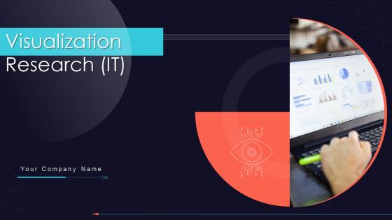
Slide 1: This slide introduces Visualization Research (IT). State Your Company Name and begin.
Slide 2: This is an Agenda slide. State your agendas here.
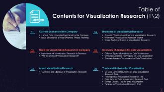
Slide 3: This slide presents Table of Content for the presentation.
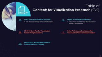
Slide 4: This is another slide continuing Table of Content for the presentation.
Slide 5: This slide shows title for topics that are to be covered next in the template.
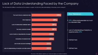
Slide 6: This slide depicts the different issues faced by the company in a project.
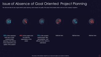
Slide 7: This slide displays Issue of Absence of Goal Oriented Project Planning.
Slide 8: This slide shows title for topics that are to be covered next in the template.
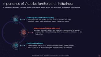
Slide 9: This slide represents Importance of Visualization Research in Business.
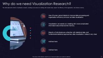
Slide 10: This slide depicts the need for visualization research, including assist in dealing with complex data.
Slide 11: This slide shows title for topics that are to be covered next in the template.
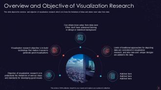
Slide 12: This slide represents Overview and Objective of Visualization Research.
Slide 13: This slide shows title for topics that are to be covered next in the template.
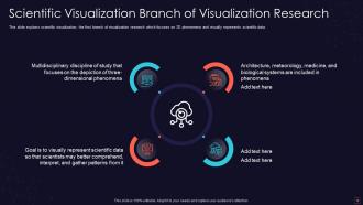
Slide 14: This slide showcases Scientific Visualization Branch of Visualization Research.
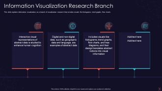
Slide 15: This slide explains information visualization as a branch of visualization research.
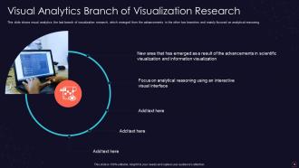
Slide 16: This slide shows visual analytics, the last branch of visualization research, which emerged from the advancements in the other two branches.
Slide 17: This slide shows title for topics that are to be covered next in the template.
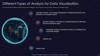
Slide 18: This slide presents Different Types of Analysis for Data Visualization.
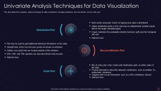
Slide 19: This slide depicts the univariate analysis technique for data visualization.
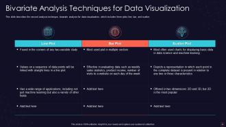
Slide 20: This slide describes the second analysis technique, bivariate analysis for data visualization.
Slide 21: This slide shows title for topics that are to be covered next in the template.
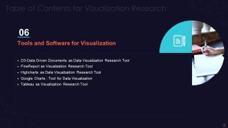
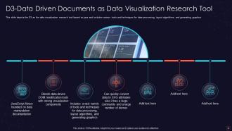
Slide 22: This slide depicts the D3 as the data visualization research tool based on java.
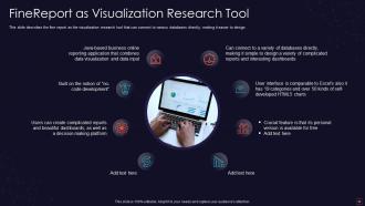
Slide 23: This slide describes the fine report as the visualization research tool that can connect to various databases.
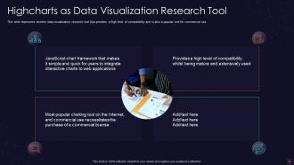
Slide 24: This slide showcases Highcharts as Data Visualization Research Tool.
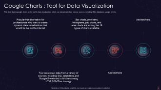
Slide 25: This slide depicts google charts as the tool for data visualization, which can extract data from various sources.
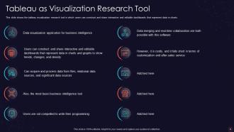
Slide 26: This slide shows the tableau visualization research tool in which users can construct and share interactive and editable dashboards.
Slide 27: This slide shows title for topics that are to be covered next in the template.
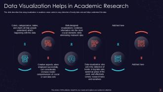
Slide 28: This slide represents Data Visualization Helps in Academic Research.
Slide 29: This slide shows title for topics that are to be covered next in the template.
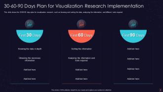
Slide 30: This slide displays 30-60-90 Days Plan for Visualization Research Implementation.
Slide 31: This slide shows title for topics that are to be covered next in the template.
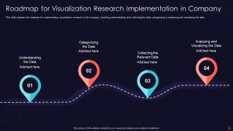
Slide 32: This slide presents Roadmap for Visualization Research Implementation in Company.
Slide 33: This slide shows title for topics that are to be covered next in the template.
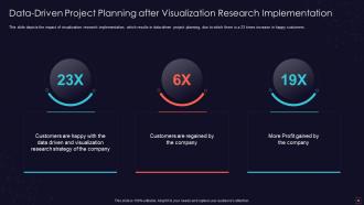
Slide 34: This slide showcases Data-Driven Project Planning after Visualization Research Implementation.
Slide 35: This slide shows title for topics that are to be covered next in the template.
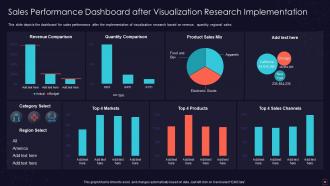
Slide 36: This slide presents Sales Performance Dashboard after Visualization Research Implementation.
Slide 37: This slide displays Icons for Visualization Research(IT).
Slide 38: This slide is titled as Additional Slides for moving forward.
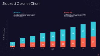
Slide 39: This slide represents Stacked column chart with two products comparison.
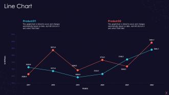
Slide 40: This slide describes Line chart with two products comparison.
Slide 41: This slide contains Puzzle with related icons and text.
Slide 42: This slide shows Post It Notes. Post your important notes here.
Slide 43: This slide shows Circular Diagram with additional textboxes.
Slide 44: This is an Idea Generation slide to state a new idea or highlight information, specifications etc.
Slide 45: This slide depicts Venn diagram with text boxes.
Slide 46: This slide displays Mind Map with related imagery.
Slide 47: This is a Timeline slide. Show data related to time intervals here.
Slide 48: This is a Thank You slide with address, contact numbers and email address.
Visualization research it powerpoint presentation slides with all 53 slides:
Use our Visualization Research IT Powerpoint Presentation Slides to effectively help you save your valuable time. They are readymade to fit into any presentation structure.








FAQs for Visualization research it
Latest trends in visualization research include interactive narratives, augmented analytics, immersive VR/AR experiences, AI-driven automated insights, and personalized dashboard generation. These technologies enhance data storytelling by enabling dynamic user engagement, contextual data exploration, and seamless narrative flow, with organizations in finance, healthcare, and retail finding that immersive visualizations significantly improve stakeholder comprehension and decision-making speed.
Interactive visualizations significantly enhance user engagement by enabling exploration, personalization, and real-time data manipulation, allowing users to drill down into specific datasets, filter information, and discover insights through direct interaction. These dynamic approaches deliver higher retention rates, deeper comprehension, and increased time-on-task compared to static charts, with many organizations finding that interactive dashboards and exploratory interfaces ultimately drive better decision-making and strategic outcomes.
Cognitive psychology informs visual data communication by understanding how humans process visual information, recognize patterns, and retain data through memory systems. These principles guide effective chart selection, color usage, and layout design, with researchers finding that visualizations aligned with cognitive processing—such as using pre-attentive attributes and reducing cognitive load—significantly enhance comprehension and decision-making across organizations.
Machine learning algorithms integrate into visualization tools through embedded predictive models, real-time data processing pipelines, automated pattern recognition, and interactive forecasting dashboards. These integrations enable organizations to visualize future trends, identify anomalies instantly, and make data-driven predictions directly within their analytics platforms, with many financial services and retail companies finding that predictive visualizations significantly enhance strategic decision-making speed.
Best practices for designing inclusive visualizations include using progressive disclosure, clear hierarchical information architecture, intuitive color schemes, consistent visual language, and multiple representation formats. These approaches streamline comprehension by providing entry points for novices while enabling deeper exploration for experts, with organizations across healthcare, finance, and education finding that layered designs ultimately enhance decision-making accessibility and engagement.
Color and design elements significantly influence data interpretation by affecting perception, emphasis, and cognitive processing, with poor choices potentially misleading audiences while strategic selections enhance comprehension and accuracy. Through consistent color schemes, appropriate contrast, and intuitive design patterns, organizations across sectors like healthcare, finance, and marketing create clearer insights, reduce misinterpretation, and ultimately deliver more effective data-driven decision making.
Ethical considerations include ensuring data privacy and anonymization, avoiding misleading representations, obtaining proper consent, maintaining cultural sensitivity, and preventing discrimination. These practices enhance trust and credibility by protecting vulnerable populations, respecting stakeholder perspectives, and delivering transparent insights, with many organizations finding that ethical visualization standards ultimately strengthen their research integrity and public accountability.
Visualization research contributes to better business decision-making by transforming complex data into intuitive visual formats, enabling pattern recognition, and reducing cognitive load during analysis. Through advanced dashboards and interactive charts, organizations across sectors like retail, healthcare, and finance accelerate decision speed, minimize interpretation errors, and enhance stakeholder alignment, ultimately delivering competitive advantage in data-driven environments.
Successful visualization case studies in public health include COVID-19 dashboards by Johns Hopkins and WHO, smoking cessation infographics, vaccination coverage heat maps, disease outbreak tracking systems, and nutrition label redesigns. These visualizations streamline complex health data by enhancing public understanding, accelerating policy responses, and improving behavioral outcomes, with many health organizations finding that strategic visual communication ultimately delivers faster crisis response and increased community engagement.
VR and AR technologies revolutionize traditional data visualization by enabling immersive three-dimensional environments, interactive manipulation of complex datasets, spatial context mapping, real-time collaborative analysis, and multi-sensory data exploration. These immersive approaches streamline pattern recognition and decision-making across industries like healthcare, finance, and manufacturing, with organizations finding that spatial visualization ultimately delivers faster insights and enhanced analytical precision.
Open-source tools democratize advanced visualization by eliminating cost barriers, providing customizable frameworks, and fostering collaborative development across diverse communities. Through platforms like D3.js, Python libraries, and R packages, researchers, startups, and educational institutions access sophisticated visualization capabilities previously limited to well-funded organizations, ultimately accelerating innovation and enabling data-driven insights across sectors.
Accessibility techniques include color-blind friendly palettes, high contrast ratios, alternative text descriptions, keyboard navigation support, and screen reader compatibility. These approaches streamline data interpretation by providing multiple sensory pathways, semantic markup, and interactive features, with many organizations finding that accessible visualizations ultimately deliver broader audience engagement and regulatory compliance advantages.
Data complexity significantly influences visualization selection by determining whether simple charts, interactive dashboards, or advanced analytical tools are most appropriate, with factors like data volume, dimensionality, and relationship types guiding these decisions. Complex datasets in sectors like financial services or healthcare often require sophisticated tools enabling drill-down capabilities, real-time filtering, and multi-dimensional analysis, ultimately delivering clearer insights and faster decision-making across organizations.
Researchers face challenges including inconsistent metrics across studies, subjective interpretation of visual effectiveness, varying user contexts and cognitive abilities, and lack of standardized benchmarking datasets. These measurement complexities stem from visualization's inherently subjective nature, diverse application domains like healthcare and finance, and varying task objectives, with many research institutions finding that establishing universal evaluation frameworks requires balancing quantitative precision with qualitative user experience insights.
Collaboration between domain experts and visualization researchers enhances outputs by combining deep subject knowledge with technical visualization expertise, ensuring accuracy, relevance, and user-centered design. Through iterative feedback processes, these partnerships deliver more intuitive dashboards, actionable insights, and contextually appropriate visual solutions, with many organizations in healthcare, finance, and manufacturing finding that such collaboration ultimately reduces interpretation errors while accelerating decision-making capabilities.
-
Great product with effective design. Helped a lot in our corporate presentations. Easy to edit and stunning visuals.
-
Out of the box and creative design.
-
Use of different colors is good. It's simple and attractive.
-
Really like the color and design of the presentation.
-
Excellent work done on template design and graphics.