


Financial Accounting Process Flow Chart For Manufacturing Firms




Try Before you Buy Download Free Sample Product
 Impress Your
 Audience
 100%
100% Editable
 Save Hours
 of Time


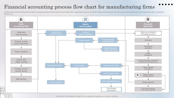
Mentioned slide demonstrates flow chart for managing business financial accounts to determine organisation revenue. It includes steps such as prepare income source document, journal and ledger preparation, posting trial balance, etc.
People who downloaded this PowerPoint presentation also viewed the following :
Financial Accounting Process Flow Chart For Manufacturing Firms with all 6 slides:
Use our Financial Accounting Process Flow Chart For Manufacturing Firms to effectively help you save your valuable time. They are readymade to fit into any presentation structure.





FAQs for Financial Accounting Process Flow Chart
So the main stuff you'll see in most accounting flowcharts: transaction recording, journal entries, posting to general ledger, trial balance, adjusting entries, then your final statements (income statement, balance sheet, cash flow). It sounds way scarier than it actually is - honestly once you do it a few times the pattern clicks. Your transactions just flow from that initial capture straight through to the reports your boss actually looks at. I'd totally sketch out your own version using whatever weird processes your company does. Really helps you spot where things get stuck or take forever.
Think of it as your GPS for money stuff - shows how transactions flow from beginning to end. You'll see where journal entries pop up, how they feed into ledgers, then become your financial statements. Way better than drowning in all those debits and credits! Honestly, the visual part is a game changer for spotting where things get stuck and training new people. Start by mapping what you're doing now first. I bet you'll find weird inefficiencies hiding in there that'll make you go "why are we even doing this step?"
You'll mostly use ovals for start/end points and rectangles for processes like "record journal entry." Diamonds show decisions - think "does this balance?" Arrows connect everything to show the flow. Parallelograms are for inputs and outputs, like reports or source documents. Circles pop up as connectors in messier, complex processes. Honestly, the symbols aren't rocket science once you've made a few charts. Just pick whatever works and stick with it across your team. Nothing's more annoying than trying to decode someone else's random symbol choices when you're already drowning in spreadsheets.
So basically, flow charts map out every single step in your financial reporting, right? That way you can actually see where stuff gets backed up. Like that monthly reconciliation that drags on forever - you'll spot it immediately. The visual thing is key because bottlenecks become super obvious when you see multiple processes all dumping into one poor person's desk. Honestly, it's like seeing a traffic jam from above. Once you know where the problems are, you can shift work around, maybe automate some steps, or just throw more people at the worst spots.
Honestly, tech has completely changed how accounting workflows work now. Data entry gets automated, systems talk to each other instantly, and cloud platforms update your processes without you lifting a finger. The AI stuff is wild too - it actually spots bottlenecks before they screw you over. Remember those flowcharts we'd print out and stick everywhere? Now you can make them interactive and dynamic, which is so much better. Oh, and here's what I'd do first: find the most annoying manual steps you're doing and automate those. That's where you'll save the most time right off the bat.
Ugh, regulatory stuff makes flow charts such a headache. You can't just map the basic process anymore - now you've got to show exactly where SOX controls happen, when duties get separated, and where audit trails pop up. Your simple diagram turns into this crazy detailed map with compliance checkpoints everywhere. The auditors love it though, makes their job easier when they can trace through everything. Just make sure those regulatory spots really stand out visually. Trust me, you'll thank yourself later when audit season rolls around and you're not scrambling to explain where controls live.
Honestly, just make them dead simple. Use the same symbols throughout and label everything clearly - top to bottom flow works best. I swear, half the flowcharts I see look like someone threw spaghetti at a wall. Stick with standard shapes, don't cram everything together, and maybe use colors for different departments if that helps. But here's the real test: show it to someone fresh. If they're squinting or asking "what does this mean?" then you've overcomplicated it. White space is your friend - use tons of it.
Dude, flowcharts are seriously a game-changer for new hires. Instead of handing them those massive procedure binders (ugh), you can map out stuff like AP workflows or month-end closing in simple visual steps. New people won't feel so lost when they can literally follow along box by box. What's really helpful is showing those "if this, then that" decision points - like when they should bug their supervisor or which approval route to take. I'd honestly laminate some copies for their desks because they'll probably reference them constantly at first. Makes the whole onboarding thing way less painful for everyone.
Start with cycle times - they're usually where the biggest issues hide. Processing time for each step, error rates, bottleneck spots, and how well you're using resources are the main things to track. Approval delays and document handoff times matter too. Honestly, compliance checkpoints can be a real pain but you've gotta measure those durations. The best part? Finding where stuff gets stuck or needs to be redone. Map out your current timing first, then compare it to what others in your industry are doing. That's where you'll see you're losing time and money.
Dude, flow charts are a game changer for explaining accounting stuff. Instead of boring everyone with paragraphs of procedures, you just show them the visual. People can actually see how transactions move through to final reports. Each person can zero in on their part without getting confused by everything else. When issues pop up, you point to the exact spot on the chart instead of trying to explain some vague concept - way less painful for everyone. I learned this the hard way after watching too many eyes glaze over in meetings. Trust me, start with the visual next time.
At minimum, do it yearly. But quarterly reviews are way better if you can manage it. Regulations change constantly - SOX updates, GAAP tweaks, internal control stuff - and outdated charts are basically worthless. Your team's probably tweaking processes more often than you think anyway, finding shortcuts and better ways to do things. Set a calendar reminder for every three months. Do a full overhaul whenever major regulatory changes hit. Oh, and don't overcomplicate it - I've seen people spend weeks perfecting charts that'll be outdated in six months anyway.
Honestly, the worst thing you can do is overcomplicate it - I've seen flowcharts that look like spaghetti diagrams. Nobody wants to deal with that mess. But then people swing too far the other way and miss crucial decision points that auditors actually care about. Also, talk to the people who actually DO the work when you're mapping this stuff out. They catch things you'd never think of. Oh, and update it when processes change! I can't tell you how many outdated flowcharts I've seen floating around. Start basic, get your team's input, then set up regular reviews so it doesn't become useless.
QuickBooks and Xero both have workflow tools built right in now - pretty handy actually. You can map your whole process from invoices to payments without leaving your main system. NetSuite does this too if you're using that. Some of them will even auto-generate flowcharts based on how you actually work, which honestly blew my mind the first time I saw it. Lucidchart and Visio are solid if you need something fancier. But I'd check what your current software already has first - you might not need anything else. The audit trail integration is where it gets really useful though.
Flow charts are honestly a game-changer for audits. They show auditors exactly how your financial data moves through the system - from initial transaction all the way to final reports. You can map every control point and approval step, which makes demonstrating compliance way easier. When auditors are breathing down your neck (and trust me, they will), having that visual breakdown saves your butt. They'll quickly spot your internal controls and any potential gaps. I'd start with your riskiest processes first - revenue recognition, expense approvals, stuff like that. Those always get picked apart the most.
Yeah, so basically globalization has forced companies to standardize their accounting flow charts way more than before. IFRS and other international standards mean you're seeing pretty similar chart structures whether it's a German company or one in Singapore - which is actually kind of convenient once you wrap your head around it. The tricky part now is your flow charts have to handle multi-currency stuff, different reporting deadlines, and tons of regulatory requirements all mixed together. Oh, and consolidated reporting timelines are a whole thing too. I'd definitely compare your current processes against IFRS requirements to see where you might be missing something.
-
Excellent work done on template design and graphics.
-
Thank you for showering me with discounts every time I was reluctant to make the purchase.