


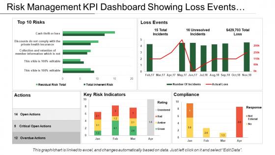
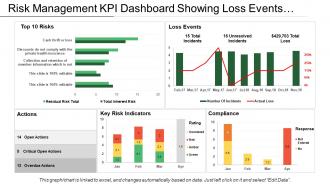
Risk management kpi dashboard showing loss events actions and compliance





Try Before you Buy Download Free Sample Product
 Impress Your
 Audience
 100%
100% Editable
 Save Hours
 of Time


Ensure a good ambience with our Risk Management Kpi Dashboard Showing Loss Events Actions And Compliance. Achieve the conducive conditions you had imagined.
People who downloaded this PowerPoint presentation also viewed the following :
Risk management kpi dashboard showing loss events actions and compliance with all 6 slides:
Channelize your faculties with our Risk Management Kpi Dashboard Showing Loss Events Actions And Compliance. They enable great commercial gain.
FAQs for Risk management kpi dashboard showing loss events
So for your risk dashboard, start with heat maps - they show severity vs likelihood really well. Real-time alerts for your key risk indicators are crucial too. I'd put executive summary widgets right at the top because honestly, most people just want the highlights without scrolling forever. Trend analysis helps you see patterns over time, and you need mitigation status updates so everyone knows what's actually being done about issues. Oh, and drill-down features are a must when alerts go off. Pick your top 5-10 critical risks first and build around those.
Honestly, heat maps and risk charts are game changers compared to drowning in Excel hell. Those bright red spots? You'll know instantly where things are sketchy without doing math. Traffic light systems work great for beginners - green, yellow, red keeps it simple. Then you can get fancy with trend charts later. Your executives will actually pay attention instead of glazing over during presentations (trust me on this one). Risk matrices help too, but I'd start basic and build from there. Way easier to spot patterns when everything's visual.
So you want the real game-changers for risk tracking? Start with risk heat maps - they show probability vs impact super clearly. Your top 10 risk register is clutch too, especially tracking mitigation status. Trend analysis tells you if things are getting worse or better over time. The big one though? Compare your risk appetite against actual exposure. That gap is where you'll spot trouble early. Oh and definitely set up automated alerts for when high-priority stuff changes - way better than staring at dashboards all day.
Look, real-time data is a game changer because you catch problems while they're happening, not days later when everything's already on fire. Your team gets instant alerts the moment key metrics go sideways. No more making decisions based on yesterday's stale reports - honestly, that's like trying to drive using only your rearview mirror. You can actually respond to what's going down right now instead of playing catch-up. Start with automated alerts for your biggest risk indicators first. Trust me, it'll save you so many headaches down the road.
KPIs are like your business's smoke detectors - they catch problems while you can still do something about them. If customer satisfaction starts dropping or your website's loading super slow, you'll know before it becomes a disaster. Think of it as having a heads-up instead of being blindsided later. The trick is choosing ones that actually matter to what you're doing (not just random metrics that look impressive). Check them regularly, but don't obsess. When they start going sideways, that's when you jump in and fix whatever's breaking before it gets expensive.
Honestly, dashboards are a game changer for this stuff. You get everything laid out visually instead of drowning in spreadsheets - which, let's be real, nobody wants to do. High, medium, low priority risks are right there color-coded. Sort by whatever matters most: how likely something is to happen, business impact, timing. I usually go straight for the red alerts first. The cool thing is it updates automatically so your whole team sees the same picture. Way better than playing email tag about what's actually urgent. Start with the scary red stuff and work down from there.
Put your biggest risks right at the top where people can't ignore them. Color coding helps - red/yellow/green is classic for a reason. Real-time updates are clutch, but honestly, speed matters more than anything. Slow dashboards just get abandoned. Who's actually using this thing? Executives want the big picture trends, while analysts need to dig into details. I'd test it with actual users pretty early - you'll catch weird usability stuff you never thought of. Oh, and don't go crazy with colors or it'll look like a casino.
Honestly, start by mapping out where your data comes from - you'll be surprised how messy it probably is. Get automated checks running for obvious stuff like negative numbers where they shouldn't be or weird dates. But here's the thing: don't just set it and forget it. Someone needs to actually eyeball the data regularly because automation misses things. Also set up clear rules about who can input what data. Your dashboard users are goldmines for catching weird stuff, so make it easy for them to flag issues. Oh, and definitely use reliable sources - sounds obvious but you'd be amazed how often that gets overlooked.
Don't try tracking every single risk right off the bat - you'll create this overwhelming mess nobody wants to touch. Pick maybe 5-10 critical ones first. Keep the visuals super simple too, because stakeholders need to actually understand what they're looking at (learned this the hard way). Make sure someone owns the updates or your data goes stale in like two weeks. Honestly? Just build something basic first. Get people using it, see what they hate, then fix it. Way smarter than perfectionist mode for three months only to realize you built the wrong thing entirely.
Risk dashboards are honestly game-changers because everyone can see what's happening without wading through boring reports. Your stakeholders get the full picture – trends, priorities, current status – all right there. When you're in meetings, you can actually point to real data instead of people just guessing or going with their gut feeling. The automated alerts are clutch too (seriously saves you from constantly following up with people). Oh, and set up different views for different roles so everyone sees what matters to them. You'll be surprised how much better your risk conversations get.
Yeah, definitely go with all three. Financial risks are the obvious ones - market crashes, credit issues, cash flow problems. Then you've got operational stuff like systems going down or supply chains breaking (ugh, we've all seen enough of that lately). Reputational risks are harder to measure but can absolutely wreck you - data breaches, bad press, regulatory penalties. Some risks will overlap categories, which is fine. The main thing is not getting caught off guard by something major. Start with these three and then add whatever's specific to your industry.
Oh man, these things are lifesavers. Your risk dashboard basically pulls all that compliance stuff into one spot - audit findings, policy violations, remediation timelines, whatever. No more digging through endless spreadsheets (seriously, who has time?). You'll get real-time updates on where you stand with regulators, plus it cranks out those automated reports they love. The audit trails are clutch too - shows you're actually on top of things. Set up some alerts for the critical stuff and schedule regular check-ins. Trust me, staying ahead beats scrambling later.
Honestly, I'd go with Tableau or Power BI if you can swing it - both handle messy risk data pretty well. Google Data Studio is actually decent if money's an issue. Excel works but ugh, it gets ugly real quick with real-time stuff. Oh, and check if you already have ServiceNow or some GRC platform - they usually come with dashboard tools built in. My advice? Start with whatever you've already got licenses for and build something basic first. You might realize you don't need all the fancy features anyway. Way better than dropping cash on new software right away.
So you'll want to pick metrics that actually make sense for your industry. Healthcare companies obsess over patient safety incidents and HIPAA stuff. Financial services? Credit risk and capital ratios are their bread and butter. Manufacturing tracks equipment breakdowns and supply chain headaches - you get the idea. Honestly, half the battle is just figuring out what keeps your executives up at night. List your top 5 risks first, then set up widgets and alerts around those KPIs. Don't overthink it initially - you can always tweak the dashboard later once you see what's actually useful versus what looked good on paper.
Honestly, the real-time access thing is a game changer - you can check everything from your phone if something blows up on a weekend. No more bugging IT for updates or backups since it all happens automatically. Your team can actually collaborate instead of emailing Excel files back and forth (thank god). Scaling up is pretty painless when you need more users or storage. Oh, and integration usually isn't as scary as it sounds. I'd definitely test it with something small first though - learned that one the hard way.
-
I discovered this website through a google search, the services matched my needs perfectly and the pricing was very reasonable. I was thrilled with the product and the customer service. I will definitely use their slides again for my presentations and recommend them to other colleagues.
-
Amazing product with appealing content and design.