


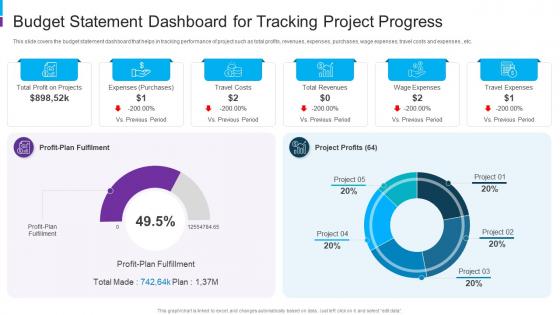
Budget Statement Dashboard For Tracking Project Progress




Try Before you Buy Download Free Sample Product
 Impress Your
 Audience
 100%
100% Editable
 Save Hours
 of Time


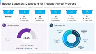
This slide covers the budget statement dashboard that helps in tracking performance of project such as total profits, revenues, expenses, purchases, wage expenses, travel costs and expenses , etc.
People who downloaded this PowerPoint presentation also viewed the following :
Budget Statement Dashboard For Tracking Project Progress with all 7 slides:
Use our Budget Statement Dashboard For Tracking Project Progress to effectively help you save your valuable time. They are readymade to fit into any presentation structure.





FAQs for Budget Statement Dashboard For
For your dashboard, focus on actual vs budgeted numbers first - that's where the real insights live. Add variance analysis and trend charts so you can spot patterns over time. Cash flow projections are crucial too, plus whatever key metrics matter for your business (revenue per customer, acquisition costs, etc). Make sure it updates daily at minimum - stale data drives me crazy and it's basically worthless. You'll want drill-down features when numbers look weird. Keep the design super clean with color coding for quick wins/losses. Honestly, start simple with these basics then build out more fancy stuff once your team actually uses it regularly.
Honestly, data visualization is a game changer for budgets. Your brain processes those colorful charts way faster than scanning endless spreadsheet rows. Bar charts work great for comparing spending categories. Trend lines show you patterns over time that you'd probably miss otherwise. I swear stakeholders actually stay awake during budget meetings when there are visuals – nobody wants to stare at raw numbers for an hour. You'll spot overspending instantly instead of hunting through data. Start simple though, don't go crazy with fancy stuff right away.
Honestly, start with the basics - revenue vs budget, expenses by category, and cash flow. Those profit margins matter too. The accounts receivable aging report saved my ass once when I realized how much money was just sitting out there uncollected. If you're burning through cash or growing fast, definitely track your burn rate. Cost of goods sold percentage is clutch for understanding your margins. Month-over-month and year-over-year comparisons will show you trends you'd miss otherwise. Don't overthink it at first - you can always add more specific stuff once you figure out what actually moves the needle for your business.
Monthly updates are the bare minimum, but weekly is way better if you can manage it. You get enough time to spot actual trends without obsessing over daily fluctuations that'll just stress you out. Weekly makes more sense for tight budgets or fast projects though – catches problems before they blow up. Set a recurring reminder or you'll forget completely (I've been there). Someone needs to own this or it won't happen. Trust me, three-month-old budget data is basically worthless. Find whatever rhythm works and actually stick to it.
Dude, there's tons of good options for budget dashboards. Google Sheets and Excel are actually pretty amazing - I know it sounds basic but I've seen some crazy impressive stuff built with just pivot tables. Power BI and Tableau are the fancy ones if you want something that looks super professional. Oh, and Looker Studio is free which is clutch. Streamlit's cool too if you're into Python at all. My buddy at work swears by it. Honestly though? Just start with whatever you already have access to. You can always upgrade later when you get annoyed with the limitations.
Dude, you seriously need one. Real-time visibility into where your money's actually going is a game changer - no more guessing if you can afford something. The visual breakdowns make it super obvious when you're blowing too much on takeout (guilty) or whatever your weakness is. Plus you'll catch seasonal patterns before they wreck your budget. I swear it's like having GPS for your finances instead of wandering around lost. Set up alerts at 80% of each category so you don't accidentally go overboard. Trust me, spotting trends early beats scrambling to fix things later.
Don't cram everything onto one screen - seriously, it's like information vomit. Users get overwhelmed and can't find anything useful. Start with the big stuff: actual vs budget and your variance percentages. Oh, and dates! Can't tell you how many times I've stared at numbers wondering if they're monthly or YTD. Make that super obvious, not buried in some corner. Your filters should feel natural - test them with real people before you launch. I always think something's intuitive until someone else tries it and breaks everything. Build simple first, then add based on what users actually ask for.
Honestly, just ask each group what decisions they're actually trying to make first - then work backwards from there. Executives want the big picture stuff: KPIs, trend summaries, major variances. They'll hate you if you make them scroll through line items. Department managers need their specific budget vs. actual breakdowns plus some forecasting. Finance obviously wants to drill down into everything (typical, right?). Also think about timing - C-suite probably only checks monthly dashboards, but ops people need real-time updates. The key is matching the data depth to what each person actually uses it for.
Look, KPIs are what make your budget dashboard actually useful instead of just a pretty spreadsheet. You'll want to track things like expense ratios, budget variance, monthly burn rate - the metrics that actually tell you if you're screwing up or doing okay. I always go for the red/green indicators because honestly, who has time to analyze every number? Pick maybe 3-5 KPIs that match your goals and put them right up front. Without them, you're basically flying blind with a bunch of random data that doesn't mean anything.
Honestly, dashboards are game-changers because they show you stuff you'd never catch just staring at spreadsheet rows. Like, you'll actually see patterns - maybe you always overspend in March or certain categories are consistently under budget. The visual trends make it so much easier to predict what's coming next financially. I'd definitely set up alerts when things hit certain variance levels (saves you from constantly checking). That way you're not just analyzing what already happened - you're actually using the info to tweak your forecasts and make better calls going forward. Way more useful than I expected when I first tried it.
Start with visual hierarchy - readable fonts, consistent colors, logical groupings. Interactive filters are clutch so people can dig into specific stuff without getting overwhelmed right away. Key metrics should live at the top. Simple charts beat complex ones every time (seriously, I've seen dashboards that look like a data explosion). Tooltips help with context. Oh, and group related things together - sounds obvious but you'd be surprised how many people skip this. Test with real users though. They'll roast anything confusing pretty quickly, which honestly saves you tons of time later.
Set up API connections to pull data straight from your accounting software, bank feeds, whatever you're using for expenses. Tableau and Power BI have connectors that make this pretty easy, honestly. Real-time sounds cool but it'll cost you - most people are totally fine with updates every few hours or daily. Way cheaper that way. I'd start with whatever data changes the most often first, then work your way down. Oh, and don't overthink the "real-time" thing unless you're day trading or something crazy like that.
Honestly, templates are a lifesaver for budget dashboards. You get all the charts and layouts already built by people who actually know what they're doing - way better than staring at a blank screen wondering where to start. No weird color choices or cramming too much stuff everywhere like I always do when I build from scratch lol. The cool thing is you can still make it your own while keeping that clean, professional look. Just find one that fits your data and boom, you're already halfway there. Saves so much time it's not even funny.
Honestly, budget dashboards are game-changers because you can see right away where your money's actually going vs. your plan. Overspending jumps out fast - like when marketing blows their quarterly budget again or somehow office supplies cost more than coffee (which is wild, btw). The charts make it super easy to compare departments and spot who's consistently over budget. You'll also see if you're spending way more than other companies in your space. Just check it monthly and hunt for those red zones - that's where you can cut costs without much pain.
Keep it simple - bar charts work great for comparing spending categories, and line graphs show trends over time nicely. Pie charts are okay for proportions but honestly get pretty ugly once you have like 7+ categories. I'd stick with the same colors throughout so it doesn't look like a rainbow exploded. Label everything clearly because there's nothing worse than a confusing chart. Put your most important stuff at the top of the dashboard. The whole point is someone should be able to look at it and instantly get what's going on with your money. Definitely have a coworker check it first - they'll spot weird things you missed.
-
Informative presentations that are easily editable.
-
Visually stunning presentation, love the content.