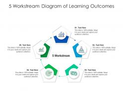
5 workstream diagram of learning outcomes infographic template
Try Before you Buy Download Free Sample Product
Audience
Editable
of Time
Our 5 Workstream Diagram Of Learning Outcomes Infographic Template are topically designed to provide an attractive backdrop to any subject. Use them to look like a presentation pro.
People who downloaded this PowerPoint presentation also viewed the following :
5 workstream diagram of learning outcomes infographic template with all 2 slides:
Use our 5 Workstream Diagram Of Learning Outcomes Infographic Template to effectively help you save your valuable time. They are readymade to fit into any presentation structure.
FAQs for 5 workstream diagram of learning
Key components include clear learning objectives, visual progress indicators, assessment criteria, skill development pathways, and measurable achievement metrics. These elements work together by creating transparent expectations, tracking student progress, and demonstrating competency development, with many educational institutions finding that well-structured infographics enhance learner engagement and improve academic outcomes significantly.
Visuals enhance learning outcome comprehension by simplifying complex information, accommodating diverse learning styles, and creating memorable associations through charts, icons, and infographics. Through strategic visual design, educators and corporate trainers streamline knowledge transfer, improve retention rates, and engage multiple audience segments simultaneously, with many educational institutions finding that visual presentations increase comprehension by making abstract concepts tangible and accessible.
Effective educational infographics should prioritize visual hierarchy, logical flow, and cognitive load management through clear typography, consistent color schemes, and strategic white space. These design principles enhance comprehension by guiding learners through information systematically, with many educational institutions finding that well-structured infographics improve retention rates and engagement significantly.
Assessment strategies significantly shape infographic design by determining which outcomes receive visual emphasis, how progress is measured and displayed, and what data points are highlighted to demonstrate achievement. Different assessment approaches, whether formative evaluations or comprehensive testing, influence color coding, progress indicators, and visual hierarchies, with many educational institutions finding that aligning infographic elements with their assessment methods enhances student engagement and improves learning outcome transparency.
Common mistakes include overcrowding with excessive text, using inconsistent visual hierarchies, selecting poor color schemes that reduce readability, neglecting mobile responsiveness, and failing to align design elements with learning objectives. Educational institutions and corporate training departments find that cluttered layouts, mismatched fonts, and weak data visualization significantly reduce learner engagement and comprehension, ultimately undermining the infographic's educational effectiveness.
Data visualization techniques improve learning outcomes clarity by transforming complex educational objectives into digestible visual formats through charts, infographics, flowcharts, and interactive dashboards. These approaches enable educators and students to quickly identify key competencies, track progress milestones, and understand skill relationships, with many educational institutions finding that visual learning maps significantly enhance comprehension and retention rates.
Color theory enhances learning outcomes infographics by improving comprehension, retention, and visual hierarchy through strategic use of contrast, complementary palettes, and psychological associations. Educational institutions and corporate training programs find that purposeful color choices streamline information processing, reduce cognitive load, and increase engagement rates, ultimately delivering more effective knowledge transfer and measurable learning improvements.
Infographics can be tailored through visual complexity, content depth, vocabulary sophistication, and interactive elements appropriate for each educational level. K-12 designs typically feature bright colors, simple icons, and basic concepts, while higher education infographics incorporate detailed data visualizations, academic terminology, and complex analytical frameworks, with many educational institutions finding that level-appropriate customization significantly enhances student comprehension and engagement across diverse learning environments.
Infographics facilitate communication between educators and stakeholders by transforming complex learning data into visually digestible formats, creating shared understanding through clear metrics, timelines, and progress indicators. These visual tools enable parents, administrators, and board members to quickly grasp student achievement patterns, curriculum effectiveness, and educational outcomes, ultimately delivering enhanced transparency and more informed decision-making across educational institutions.
**INPUT**: How can one measure the effectiveness of a learning outcomes infographic in conveying information? **OUTPUT**: Effectiveness can be measured through comprehension assessments, engagement metrics like time spent viewing, knowledge retention tests, and feedback surveys from learners. Educational institutions and corporate training departments increasingly use analytics tools, pre-and-post learning evaluations, and click-through rates to gauge understanding, with many finding that well-designed infographics significantly enhance information retention and learning outcomes. *[Word count: 58 words]*
PowerPoint, Canva, Adobe Illustrator, Visme, and Piktochart are ideal for creating engaging learning outcomes infographics, each offering templates, icons, and educational design elements. These tools streamline visual communication by providing drag-and-drop functionality, data visualization features, and collaborative capabilities, with many educational institutions finding that PowerPoint's familiarity and Canva's intuitive interface deliver professional results efficiently.
Storytelling elements can be incorporated through narrative flow, character personas, problem-solution arcs, and visual metaphors that guide viewers through the learning journey. Educational institutions and corporate training programs enhance engagement by creating relatable scenarios, using progressive disclosure techniques, and connecting outcomes to real-world applications, ultimately delivering more memorable and impactful learning experiences.
Infographics deliver superior retention rates, faster comprehension, enhanced visual appeal, streamlined information processing, and broader accessibility compared to traditional text formats. Educational institutions and corporate training programs find that visual learning outcome presentations reduce cognitive load, increase engagement across diverse learning styles, and enable quicker stakeholder understanding, ultimately delivering more effective knowledge transfer and improved educational ROI.
Infographics align learning outcomes with curricular goals by visually mapping competencies, standards, and assessment criteria in clear, hierarchical formats that demonstrate progression pathways. Educational institutions use these visual tools to streamline curriculum planning, enhance stakeholder communication, and ensure compliance with accreditation standards, ultimately delivering improved program coherence and student success tracking.
Successful learning outcomes infographics include visual competency maps in healthcare training, skills progression charts in corporate development programs, assessment rubrics for K-12 STEM subjects, professional certification pathways in technology fields, and outcome tracking dashboards in higher education. These infographics streamline communication by simplifying complex curricula, enhancing student engagement, and providing clear progress indicators, with many educational institutions finding that visual learning frameworks significantly improve comprehension and goal achievement.
-
Innovative and attractive designs.
-
Great experience, I would definitely use your services further.
-
I discovered this website through a google search, the services matched my needs perfectly and the pricing was very reasonable. I was thrilled with the product and the customer service. I will definitely use their slides again for my presentations and recommend them to other colleagues.
-
Design layout is very impressive.