


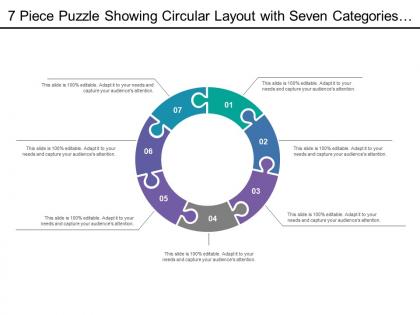
7 piece puzzle showing circular layout with seven categories of icon option7
You must be logged in to download this presentation.




Try Before you Buy Download Free Sample Product
 Impress Your
 Audience
 100%
100% Editable
 Save Hours
 of Time


Download our 7 Piece puzzle showing circular layout with seven categories of icon option7 PowerPoint presentation slide to represent a continuing sequence of seven stages, tasks, or events. This presentation slide of seven piece puzzle template has been created by our professional team members and useful for representing different information cycles and the results. This colorful interconnected circular diagram allows you add or remove information to match your needs and this template can be used for business purposes, process flow, to show learning cycles, and commercial purposes. Use this layout for interrelated connections to show complete explanation and suitable for showing a concept where there are interdependencies. Use this Jigsaw design slides to show business ideas like comprehensive strategy, synergy, growth in one picture and factors that work together to help you visualizing concepts in presentations. Utilize this eye-catching slideshow that will create an impact on your audience and help you create extraordinary presentations. Function with complete ease with our 7 Piece Puzzle Showing Circular Layout With Seven Categories Of Icon Option7. They are designed for your comfort.
People who downloaded this PowerPoint presentation also viewed the following :
7 piece puzzle showing circular layout with seven categories of icon option7 with all 5 slides:
Capture the moment with our 7 Piece Puzzle Showing Circular Layout With Seven Categories Of Icon Option7. Your thoughts will leave an indelible image.
FAQs for 7 piece puzzle showing circular layout with seven categories
Honestly, circular layouts with 7 pieces work so well because your eye naturally flows around the whole thing. Nothing looks more important than anything else, you know? It's perfect for processes or showing how different parts of a strategy connect. Way better than just listing stuff out - that always looks boring to me. Each element feels connected to the bigger picture, and people actually stay focused instead of zoning out halfway through. I'd definitely use it when you've got concepts that depend on each other but don't really have a hierarchy.
You know those boring slide presentations where everything's laid out from the start? Try a 7-piece circular puzzle instead. Seriously, it's genius - you reveal one piece at a time while you're talking, so people actually stay engaged wondering what's coming next. The circular shape works because our eyes naturally follow it around. Build up to piece 6, then pause for dramatic effect (okay maybe I'm being dramatic, but it works). That final piece completing the puzzle? Chef's kiss. Perfect for strategy presentations where you need people paying attention instead of checking their phones.
You'll want content that flows in a loop rather than just straight lines. Processes work great - like customer journeys, product development cycles, or marketing funnels. Each puzzle piece should connect naturally to the next one. Skip anything that's purely step-by-step instructions (those are way better as timelines anyway). Instead, go for topics where the relationships between parts actually matter. Problem-solving frameworks are solid choices too. Here's what I do: sketch your content as bubbles first, then see if connecting them in a circle makes sense. If it feels forced, it probably won't work well as a circular puzzle.
So circles are actually perfect for this kind of thing - your eye naturally follows the curve instead of jumping around randomly like with grids. I'd put your main point in the center, then let the outer pieces tell the story around it. Works amazing for timelines or step-by-step processes since it flows like chapters that connect back to the start. Honestly, it's way more engaging than those boring rectangular layouts everyone defaults to. Start with your key message in the middle, then build outward with your supporting stuff. Pretty straightforward once you get the hang of it.
So for 7-piece circular puzzles, I'd definitely go with vector software since you need those precise angles. Adobe Illustrator is probably your best bet - divides circles into seven segments perfectly (about 51.43° each) and the radial tools are solid. Inkscape's free and does the same thing if you don't want to pay for Adobe. I actually know someone who sketched theirs in PowerPoint first just to see how it'd look, which isn't terrible for brainstorming. Create your base template in either Illustrator or Inkscape first. If you're doing fancy interlocking pieces later, you might need something like Fusion 360, but start simple.
Yeah totally! PowerPoint has some circular SmartArt layouts you can mess with - though honestly their default colors are kinda hideous. Canva or Figma work too if you want something cleaner. Just make seven wedge sections like pizza slices but more professional looking, you know? The cool part is animating each piece to pop up one by one. Really helps when you're walking through different points. Oh and keep your text short in each section - I learned that the hard way because circular layouts get super cramped fast and then everything looks messy.
Ugh, don't cram a wall of text into each section - people will literally stop paying attention. Small pieces are hard to read too, and I swear some people pick colors that basically disappear into each other. The worst though? When you can't tell how the pieces actually connect. It just looks like random chunks floating around for no reason. Oh, and skip those fancy animations where everything flies in dramatically - takes forever and nobody cares. Use colors that pop against each other. Keep your text short. Walk through how it all fits together so people get the big picture instantly.
So with 7 pieces, start with the color wheel and put complementary colors opposite each other - blue/orange, red/green, that kind of thing. Since you've got an odd number, one color won't have a match, which is actually perfect. Use that leftover piece as your neutral anchor - maybe white or gray. Then arrange the other six as three complementary pairs around the circle. Honestly, sketching it first with colored pencils saves so much headache later. The contrast will pop but it'll still look balanced instead of chaotic.
Oh man, 7 pieces is actually pretty tough! Since 7's a prime number, you can't do that clean bilateral symmetry thing like with 6 or 8 pieces. But here's what works - focus on rotational symmetry instead. Make it so when you spin the whole thing around the center, it still looks balanced. Honestly, I think odd numbers can look more dynamic anyway. Try flowing your pieces in one direction around the circle, keeping similar spacing between elements. The trick is distributing visual weight evenly even though you don't have that perfect mirror effect to work with.
So basically it's like making a pie chart for your presentation timing - you divide it into 7 sections and assign time to each part. Super helpful for catching when you're spending way too long on your intro (guilty lol) or flying through the important stuff. I started sketching these out before big presentations and wow, it really shows you where your pacing is off. Each piece gets a realistic time chunk. You'll spot the problems right away - like when your opening somehow needs 15 minutes but you only planned for 3. Game changer once you actually try it.
Don't use those 7-piece circles when your stuff doesn't actually connect. Like if you're just listing random topics or walking through steps that need to go A→B→C. Circles work for interconnected ideas, but they're honestly pretty confusing for anything sequential. Also skip it if you don't have exactly 7 points - cramming 12 things into a circle just looks weird. I learned that the hard way once. Go with timelines or regular lists instead when people need to follow a clear order or when some points matter more than others. Way cleaner that way.
Start by sketching it on paper first - saves you headaches later. Make sure each puzzle piece has contrasting colors or patterns so you're not squinting trying to tell them apart. Keep your font consistent throughout and don't cram too much text in there. White space is your friend here, honestly. Since it's circular, put your most important stuff at the top and let people's eyes flow clockwise naturally. The spacing between pieces matters more than you'd think - cramped designs just look messy. Oh, and definitely test the visual balance before you commit to anything digital.
Your 7-piece puzzle thing? Yeah, audience totally matters. Gen Z and millennials will actually mess around with it - they're into that interactive stuff. But honestly, older folks might just bounce if it feels like work. Content-wise, executives want the big picture strategy pieces while your tech people need the nitty-gritty details. Oh, and definitely test it small first. I learned that the hard way with something similar last year. Match what each group actually gives a damn about, and you'll be good. Skip that step and you're basically throwing content into the void.
Honestly, animations are a game-changer for circular puzzles. Users instantly get what's clickable when pieces rotate or light up on hover. Smooth transitions between states just feel right - jarring jumps are the worst. I'd go with subtle entrance effects and rotation easing that matches your circular vibe. Keep it snappy though, under 300ms or people will notice the lag. Oh, and definitely test on mobile first since touch needs that immediate visual response. The whole thing becomes way more intuitive when users can see how their actions affect the layout.
Oh that's a cool idea! I'd totally add some kind of lighting system where pieces glow when they connect right. Maybe start with cheap LED strips to test it out? The center piece could be like a hub that shows your overall progress too. Sound effects when things snap together would be satisfying as hell - I'm thinking subtle clicks or chimes, not annoying beeps. Actually saw something kinda similar at this design thing last month and people were obsessed with it. Just make sure the timing feels natural, you know? Each little connection should feel like a mini win.
-
Appreciate the research and its presentable format.
-
Good research work and creative work done on every template.