Digitalising Customer Onboarding Identified In App Features For Mobile Banking Application
Try Before you Buy Download Free Sample Product
Audience
Editable
of Time
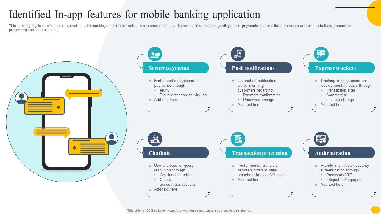
This slide highlights core features required in mobile banking application to enhance customer experience. It provides information regarding secure payments, push notifications, expense trackers, chatbots, transaction processing and authentication.
People who downloaded this PowerPoint presentation also viewed the following :
Digitalising Customer Onboarding Identified In App Features For Mobile Banking Application with all 9 slides:
Use our Digitalising Customer Onboarding Identified In App Features For Mobile Banking Application to effectively help you save your valuable time. They are readymade to fit into any presentation structure.
FAQs for Digitalising Customer Onboarding Identified In App Features For
You'll want to nail four main things: identity verification, account setup, product walkthrough, and getting them engaged early. Make verification smooth - mobile ID scanning beats filling out a million forms any day. Guide them through features with interactive tutorials, but don't dump everything at once. Nobody wants to see 20 buttons on their first login, trust me. Quick wins are huge - let them feel accomplished right away. Oh, and definitely map their whole journey from signup to that first "aha" moment. That's where you'll catch the annoying friction that makes people give up.
So basically, use whatever info people give you at signup to customize their whole experience. Ask about goals, company size, that stuff - then show them features that actually matter instead of boring generic tours. Don't dump everything on them day one though, that's just annoying. Progressive profiling is clutch here. Different user types need different paths, and targeted emails based on their progress work really well. Honestly, I'd start with maybe 2-3 customer segments and build specific flows for each. Way more effective than one-size-fits-all.
So basically, tech handles most of the grunt work now. Document verification happens automatically, identity checks are instant, and customers get walked through everything without needing actual humans. AI catches fraud in real-time, APIs grab credit scores immediately, plus chatbots field questions around the clock. Way better than the old paper nightmare, honestly. Customers get approved in minutes instead of waiting days, and your team can tackle the tricky stuff that actually needs human brains. I'd start by mapping what you're doing now and finding where things get stuck first.
Track completion rates and where people drop off - that's your bread and butter. Time-to-first-value matters too. But honestly? The soft stuff is huge. Survey feedback, support tickets during onboarding, whether users actually stick around after week one. Those tell you if people truly understand your product or if they're just clicking through mindlessly. Oh, and whatever counts as "activation" for you - first purchase, using a core feature, whatever. Pick maybe 3-4 metrics that actually matter to your business and watch those religiously. Don't go crazy with dashboards.
Don't ask for a million details upfront - people bail immediately. Keep forms short initially. Skip the generic "welcome to our platform!" nonsense and actually reference what they signed up for. Progress bars are clutch so users know they're not stuck in some endless loop. Oh, and don't cut corners on email verification just because it seems like extra work. Trust me, you'll regret that later when dealing with fake accounts. Test your own onboarding flow regularly. If it annoys you clicking through it, imagine how your customers feel.
Honestly, just build the feedback stuff right into your onboarding - don't make it an afterthought. Stick micro-surveys after important steps. Exit intent popups work great when people bail. And always put a quick widget on your completion screens. Teams that email for feedback later? Total waste of time - response rates suck. Better to grab users while they're actually using your product and the frustrating bits are still fresh in their minds. Keep it super short though - like 2-3 questions tops. Oh, and show people how you actually used their suggestions. Pick one spot to start this week.
Don't hit users with everything right away - that's like showing someone your entire house when they just walked through the front door. Get them to one quick win in their first session instead. Feature tours are honestly pretty useless since most people skip through them anyway. Contextual tooltips work way better because they pop up exactly when someone needs help. Set up different email flows for different user types, and definitely watch where people are dropping off. Oh, and track how fast users actually get value from your product - that matters more than whether they finished some arbitrary checklist.
Banking's super strict with all the identity checks and compliance stuff - they have to be. E-commerce is the opposite, they want you buying ASAP so onboarding's lightning fast. Healthcare companies are paranoid about data (HIPAA reasons), which honestly makes sense given what they're handling. SaaS is interesting - they skip the heavy upfront forms and just ask for more info as you use their product. Insurance falls somewhere between banking and retail. Really depends on your industry's rules and what customers expect. Don't go overboard if you're selling t-shirts, but financial services? Yeah, you better verify everything.
Honestly, gamification is a game-changer for onboarding. Instead of boring checklists, throw in some progress bars and achievement badges - suddenly people actually want to finish stuff. Remember LinkedIn's profile completion bar? Everyone's obsessed with hitting that 100%. You'll see way better completion rates when users feel like they're earning something, not just trudging through steps. Each milestone should feel like a small win. Oh, and don't go crazy at first - start with a simple progress tracker, then add more bells and whistles later. Trust me, it works way better than plain old forms.
Dude, you gotta automate the boring stuff first - document collection, ID checks, account setup, all those follow-up emails that make you want to scream. Set up triggers so when someone finishes step one, step two just happens automatically. No more playing phone tag with new customers (seriously, that's the worst part). Map out what you're doing now and spot the purely admin tasks - that's where you'll save the most time. You can still make it feel personal, but you're not stuck manually babysitting every single person through the same basic steps.
Honestly, if your mobile onboarding sucks, people will just bounce to a competitor. Most folks expect to do everything on their phone now. Your forms need to actually work on small screens - responsive design isn't optional anymore. Fast loading is huge too. Make buttons big enough for thumbs (learned this the hard way), let people snap photos of documents instead of scanning, and keep each step short since we all have zero attention span on mobile. Oh, and test on real phones, not just your laptop browser made smaller. That's basically cheating.
Look, just be straight with people from day one about what you're grabbing and why. Skip the legal nonsense - write your privacy stuff like you're actually talking to humans. Let them pick and choose what they want to share instead of making it all-or-nothing. And honestly? Don't hit them with a million form fields right off the bat - that's just annoying. Ask for stuff as you go. Oh, and make sure they can actually find their privacy settings later without needing a treasure map. People really dig having that control.
Honestly, onboarding is everything. People will never forget if they struggled in those first few minutes - it's like a bad first date, you know? Get it right though, and customers immediately trust your product. That confidence translates to way better retention later. Companies with solid onboarding see 2-3x better long-term numbers, which is pretty wild. When users actually understand your platform from the start, they'll dig into advanced features instead of just bailing. Remove friction in those early interactions and you'll see results for months.
So basically you want different onboarding paths based on who's signing up. Big enterprise clients need all those compliance boxes and approval steps, but small businesses just want to get in fast. I'd use your signup form to grab key details, then automatically route people down the right path. Honestly, I've watched so many companies completely overthink this and make it way too complex. Show SaaS examples to tech people, retail stuff to e-commerce folks - you get the idea. Start simple though. Map out your 2-3 biggest customer segments first and build those flows before you get fancy with it.
Honestly, you'll want to keep an eye on AI document verification - it's gotten scary good at catching fake IDs instantly. Biometric stuff is huge too. Face/fingerprint login beats those annoying text codes every time. Companies are also getting way better at customizing the whole signup process based on who you are - like, different flows for business vs personal accounts, which actually makes sense. Oh and chatbots are everywhere now guiding people through steps. SMS verification feels so 2019 at this point. I'd probably look at your current setup and see what feels outdated compared to this stuff.
-
Awesome use of colors and designs in product templates.
-
Visually stunning presentation, love the content.
-
World-class PowerPoint designs that are fully customizable!
-
The best collection of PPT templates!! Totally worth the money.Â