


Driver diagram basic plan example of ppt


Try Before you Buy Download Free Sample Product
 Impress Your
 Audience
Editable
of Time


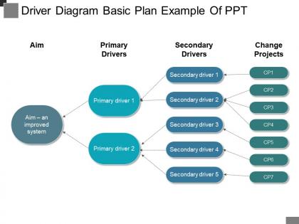
Monitor and improve business performance through the means of our, driver diagram basic plan example of PPT layout. An engaging and simplified helps the viewer to gain the key aspects of a business process at ease. We have shown the concept of business drivers and significance through the following PPT design. Four stags are shown here as, aim to deliver an improved system, primary drivers, which are further divided into two categories, secondary drivers and change projects which are both displayed with seven stages. A liner format is shown with visuals of arrows are shown here to direct the design to its motive. Monitor various strategies you apply on your business and keep a track of your sales values, financial aspects and carrying a wider range of inventory. State their insight with our driver diagram basic plan example of PPT design and enable viewers to anticipate events. Our Driver Diagram Basic Plan Example Of Ppt bring a lot to the table. Their alluring flavours will make your audience salivate.
People who downloaded this PowerPoint presentation also viewed the following :
Driver diagram basic plan example of ppt with all 5 slides:
Cushion the effect with our Driver Diagram Basic Plan Example Of Ppt. They make it easier to digest.

FAQs for Driver diagram basic plan
So a driver diagram basically maps out how you'll actually reach your goal - like connecting the dots between your big strategic moves and all the smaller stuff you need to do. I think of it as a project roadmap that shows everyone how their piece fits into the whole thing. What's nice is it helps you catch any gaps in your thinking before you get too far along. Oh, and it's surprisingly good at keeping teams aligned since people can see why their work matters. Start with your end goal and work backwards - that's usually the easiest way to build one out.
So driver diagrams are basically like a project family tree - you put your main goal at the top, then map out the big drivers underneath, and finally all the specific tasks. Honestly, they're a lifesaver when your boss keeps asking "wait, why are we doing this?" because you can literally point to how everything connects. Start with your end goal and work backwards to figure out what actually needs to happen. You'll spot weird gaps in your plan pretty quickly this way. Plus it stops you from doing redundant stuff that doesn't really move the needle.
You need three main pieces: aim statement up top (what you're trying to hit), primary drivers (big factors that'll move the needle), and secondary drivers (stuff you can actually test). Picture it like a logic tree flowing left to right. Here's where people mess up - they forget the "how much by when" in their aim. Primary drivers tackle the broad question of "what areas need work?" Secondary ones get into the weeds with testable changes. Each level should connect logically, obviously. Keep it simple enough that anyone glancing at it gets the flow immediately.
Primary drivers are basically your big-picture goals - the main stuff you need to change. Secondary drivers? Those are the actual steps you can take to make it happen. Like if your primary driver is "improve patient flow," then your secondary ones might be "cut down discharge delays" or "make admissions smoother." I think of it as primary = what you want, secondary = how you'll get there. Here's what helps me figure it out: can you actually DO this thing right now? If not, it's probably a primary driver and you need to break it down into smaller, actionable pieces. The whole thing works like nesting dolls, honestly.
Don't overcomplicate it - that's the main thing that trips people up. I've watched teams throw like 20 drivers on one diagram and it's just chaos at that point. Stick to maybe 3-5 max. Your language can't be super vague either. "Improve quality" means nothing to anyone actually doing the work. Make your primary drivers connect directly to what you're trying to achieve. Secondary ones need to be specific enough that teams know their next steps. Here's my test: hand it to someone random and see if they get what success looks like and how to reach it.
Driver diagrams are basically like having a map everyone can actually see and point to during meetings. No more talking past each other about fuzzy goals. The visual hierarchy shows how small daily tasks connect up to your big outcomes - so people get why their specific work matters. When you update it, wins and problems become obvious to everyone at once. Honestly, I think they're kind of underrated compared to other project tools. Build one together as a team right at kickoff. It's like having subtitles for all your strategy conversations afterward.
Get your stakeholders involved from day one when you're building that driver diagram. They know what's actually happening in the trenches, so bring them into working sessions to identify your primary and secondary drivers together. Don't just build the whole thing yourself and then ask for their blessing - that's backwards. The people dealing with performance issues daily will catch stuff you'd never think of. Let them challenge your assumptions too. I've seen too many diagrams that look pretty but miss the real problems because someone built it in isolation. Make it collaborative from the start and you'll end up with something that actually reflects reality.
Honestly, you can't just wing it when building a driver diagram. Historical data shows you which factors actually move the needle on your outcomes - not just what seems logical. I've watched teams build entire diagrams on gut feelings that were completely off base! Your current performance data tells you where you're starting from too. Use that info to confirm your primary drivers aren't just wishful thinking. Even messy, imperfect data beats guessing every time. Otherwise you're basically creating an expensive flowchart that won't help anyone.
Think of a driver diagram like your improvement GPS - honestly, it's saved me so much spinning my wheels on random fixes. Pick your main goal, then map out 3-4 key drivers (the big things that actually impact it). Under each driver, brainstorm specific changes you could test. What's cool is you can try stuff small-scale first instead of going all-in on ideas that might flop. I'd start with whatever's bugging you most right now. Create the visual map, test a few changes, see what works, then expand from there. Way better than just throwing solutions at the wall.
Honestly, affinity mapping is your best friend here - just grab a bunch of sticky notes and dump every idea you have, then start grouping the similar ones. Yeah it looks chaotic but that's kinda the whole point! Get some different people involved too since they'll catch stuff you totally missed. I always use the "5 Whys" method to really dig into what's causing problems, and those "How might we..." questions are great for turning roadblocks into actual opportunities. Don't stress about making everything perfect during the brainstorm phase - you can clean it up later. Go for quantity first, then be brutal about picking what'll actually make a difference.
Oh absolutely, you'll want to update that thing as you go! Start with whatever makes sense now, but don't get married to it. I've watched teams cling to their first version way too long - big mistake. New data will show you which drivers actually matter and which ones... don't. Plus you'll stumble across stuff you never thought of initially. Maybe check back on it monthly? Or after you run some big tests. The whole idea is it gets better as you learn more, so let it evolve with your project instead of treating it like it's set in stone.
For driver diagrams, I'd go with Visio first - it's got templates already built in and linking stuff is pretty straightforward. Lucidchart and Miro are solid web options if you need multiple people working on it. Actually, Miro's interface just feels more natural to me than most of these tools. You could use PowerPoint for simple stuff but honestly it gets messy quick once things get complicated. Some quality teams go for specialized software like Minitab, or there's always Draw.io which is free. My advice? Start with whatever your team already pays for, then switch later if you're missing features you actually need.
Yeah driver diagrams work for pretty much anything - just change the drivers and measures to fit your field. Healthcare focuses on patient safety, care quality, that stuff. Education? More about student outcomes and teaching effectiveness. Structure's the same though. Honestly, the trick is getting your actual frontline people involved when you map it out. They know what really works, not just what looks good on paper. Start with your main outcomes first, then figure out the 3-5 big things that actually influence those results. Work backwards from there.
Driver diagrams are basically the missing link between your big strategic plans and what people actually do day-to-day. Your balanced scorecards show the "what" - driver diagrams break down the "how." They map out specific changes and actions needed to hit those goals. Honestly, they're perfect for turning those massive strategic objectives into actual projects teams can tackle. They play really well with logic models too since both focus on cause-and-effect chains. I'd definitely use them when you need to bridge that gap - you know how strategies can feel super abstract otherwise.
Honestly, you just need to track the stuff that actually matters for each driver in your diagram. Pick 2-3 solid metrics per driver - don't get caught up measuring everything just because you can. The real trick is focusing on what moves the needle, not what's easiest to track (learned that one the hard way). Set up check-ins monthly or quarterly depending on your timeline. Each secondary driver needs its own KPIs so you can see if your initiatives are working. Build your measurement plan around those key metrics and you'll be good.
-
Illustrative design with editable content. Exceptional value for money. Highly pleased with the product.
-
I discovered this website through a google search, the services matched my needs perfectly and the pricing was very reasonable. I was thrilled with the product and the customer service. I will definitely use their slides again for my presentations and recommend them to other colleagues.