


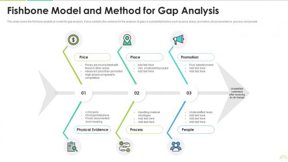
Fishbone model and method for gap analysis


Try Before you Buy Download Free Sample Product
 Impress Your
 Audience
Editable
of Time


This slide covers the fishbone analytical model for gap analysis. It also contains the sections for the analysis of gaps in substantial factors such as price, place, promotion, physical evidence, process and people.
People who downloaded this PowerPoint presentation also viewed the following :
Fishbone model and method for gap analysis with all 2 slides:
Use our Fishbone Model And Method For Gap Analysis to effectively help you save your valuable time. They are readymade to fit into any presentation structure.
FAQs for Fishbone model and method
So basically the "fish head" on the right is your problem statement. From there, you draw this backbone line going left. Then you've got all these "bones" branching off - those are your main cause categories like people, process, materials, equipment, environment, methods. Each branch is where you dump specific potential causes. I always think it looks more like a dead fish than a helpful diagram, but whatever works! You want to be thorough with each category though. Start with a clear problem statement, then just work through each branch systematically to brainstorm every possible root cause you can think of.
So fishbone analysis is basically this visual thing where you map out ALL the possible reasons behind a problem - not just the obvious ones we always jump to. You draw categories like people, processes, materials, environment, then brainstorm what could go wrong in each area. Honestly, it's pretty eye-opening because problems that seem simple usually have like 5 different things feeding into them. The whole team can throw ideas at it together too. Just put your main issue as the "head" of the fish and work backwards through each bone. You'll catch stuff you totally missed before.
Honestly, manufacturing and healthcare use fishbone diagrams all the time - they're always dealing with quality issues or safety problems. Automotive and aerospace companies love them too since defects can get expensive fast. Food processing is another big one (obviously nobody wants contaminated stuff). But really, any industry with complex processes can use them. I've seen tech companies use them for debugging, and they work great for everything from assembly line jams to crazy long patient wait times. Oh, and if you're ever stuck on some recurring problem at work, just sketch one out with your team - it's actually pretty helpful for organizing everyone's ideas.
Honestly, fishbone diagrams are great because they stop those meetings where everyone's talking in circles. You get this visual map that sorts ideas into categories - equipment, people, processes, environment, whatever fits. Each person can focus on leading one section, so nobody gets left out of the discussion. When someone throws out an idea, you just stick it in the right spot on the diagram. It's weirdly satisfying to fill out - like organizing your thoughts visually. The structure keeps things moving but doesn't shut down creativity. Everyone's perspective gets heard and placed somewhere logical. Give each team member their own "bone" to own and you'll get way better participation.
So first thing - draw your problem as the "fish head" on the right side. The main "bones" are usually the 6 Ms: Machine, Method, Material, Manpower, Measurement, and Mother Nature (environment). Honestly, don't stress if some categories don't fit your situation - just skip 'em. Then brainstorm specific causes under each category, adding them as smaller bones. Here's the key part: keep asking "why does this happen?" It'll help you dig way deeper. Once everything's mapped out, you'll want to prioritize which causes to tackle first. Focus on impact and what's actually doable.
Yeah, fishbone analysis works great with other tools! You can pair it with 5 Whys to really drill down once you've mapped everything out. Pareto charts are perfect too - helps you figure out which causes to hit first. Teams I've worked with love combining it with FMEA, though that gets pretty detailed. Basically start with fishbone for brainstorming, then use other tools to analyze what you found. It's honestly one of the more flexible methods out there. Just don't overthink it.
Honestly, the biggest screwup I see is teams jumping right into brainstorming causes without nailing down what problem they're actually solving. You'll just go in circles. Don't let that one loud person take over either - you need everyone's input or you're missing half the picture. Dig deeper too, like keep asking "why" until you hit the real root cause, not just what's obvious on the surface. Oh, and actually use those fishbone categories to organize your thoughts instead of just throwing ideas everywhere. Spend way more time upfront defining the problem. Trust me on this one.
Oh totally doable! Miro's my go-to for this stuff - way better than PowerPoint honestly. Bump your font sizes way up since people will be squinting at screens. High contrast colors are clutch too. The cool thing about Miro is everyone can drop sticky notes during your presentation, which actually gets people participating instead of zoning out. You can animate it to show one "bone" at a time rather than this overwhelming mess all at once. Just don't cram everything together - white space is your friend, especially when half your team's probably watching on laptops.
Dude, fishbone analysis is actually pretty solid for getting to the real problem instead of just slapping band-aids on stuff. Basically you map out everything that could be causing issues - your people, processes, materials, equipment, all that. It sounds boring but it's weirdly effective once you try it. Gets your whole team thinking instead of just you banging your head against the wall. The visual layout makes brainstorming way easier too. Next time something keeps breaking or going wrong, just draw it out and see what actual root causes pop up. Way better than constantly firefighting the same crap over and over.
Oh yeah, fishbone diagrams are super useful! Toyota basically perfected this - they'd map out equipment issues, materials, methods, all that stuff to find what was actually causing defects. Hospitals do it constantly for patient safety things, like tracking down why meds keep getting mixed up. Software teams are great with these too, honestly - they'll diagram everything from buggy code to team communication problems. My advice? Get everyone involved in the brainstorming session. You'll spot way more root causes than trying to figure it out alone.
Pick categories that actually make sense for your problem. The "6 M's" thing works fine for manufacturing, but honestly it feels pretty awkward when you're dealing with other stuff. For service issues, I'd go with People, Process, Policy, Place, Technology instead - way more relevant. You want maybe 4-6 categories max that cover all the main areas where things could go wrong. Don't overthink it though. Start with whatever standard framework feels closest to your situation, then just tweak it. The whole point is making sure you're not missing obvious causes.
Look, you absolutely need different people involved when you're doing fishbone analysis. Each person knows their piece of the puzzle - someone from operations will spot things finance won't, and vice versa. I've watched teams completely whiff on obvious causes because they kept it too insular. Get people in during brainstorming when you're mapping out all the potential causes. Ask open questions about what they actually deal with day-to-day. Honestly, the frontline folks usually have the best insights since they're living with the problems. Don't just grab the usual suspects either - think about who touches different parts of the process.
So fishbone diagrams are actually perfect for this - way better than those basic risk lists everyone uses. Take "equipment failure" and branch it out to see what's really causing it. Maintenance problems? Bad training? Weather damage? Design issues? You get the picture. Working backwards from your worst-case scenarios gives you way more to work with. Then you can fix the actual problems instead of just slapping band-aids on everything. I'd start with whatever keeps you up at night and map those out first. Makes your whole mitigation plan actually mean something.
So basically, whatever root causes you found in that fishbone thing - that's what you measure. Equipment problems? Track downtime. People issues? Monitor training rates or how often mistakes happen. Don't go broad with something like "customer satisfaction" when you know the real problem is communication. Been there, done that - it's useless. Pick maybe 2-3 metrics that actually connect to your specific causes. Process stuff could be cycle times or defect rates. Then just check the data regularly to see if things are getting better. Way too many teams measure random stuff that looks good but doesn't tell them anything real.
Oh man, cultural stuff definitely changes how fishbone analysis goes down. Some cultures are super hierarchical about identifying causes, others want everyone collaborating. People from high-context backgrounds often won't call out root causes if it means pointing fingers - they'll dance around it. Low-context folks? They jump straight into naming problems. Power distance is huge too - affects whether anyone feels okay challenging bigger systemic issues. Honestly the same diagram looks totally different depending on your team makeup. You gotta build that psychological safety first, then maybe adjust how you run the session based on who's there.
-
Colors used are bright and distinctive.
-
Great product with effective design. Helped a lot in our corporate presentations. Easy to edit and stunning visuals.