

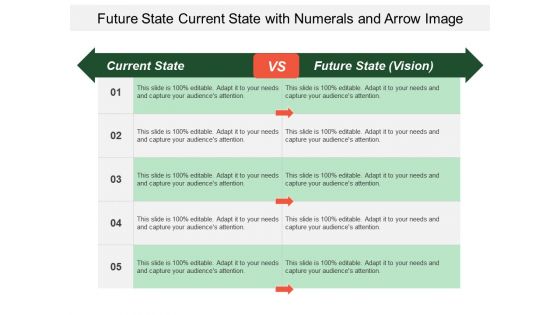
Future state current state with numerals and arrow image





Try Before you Buy Download Free Sample Product
 Impress Your
 Audience
 100%
100% Editable
 Save Hours
 of Time


Are you in search of a pre-designed slide which can represent the state of your business processes in an eye pleasing manner? Use our future state current state with numerals and arrow image PowerPoint template and create a high-class presentation slideshow. With our current and future state with numerals and arrow PPT graphic you can compare your business performance in an easy and understandable way. Any business firm needs to have a direction and a goal in mind before starting its operations. You have to understand that where your business is at the present and where do you see yourself in the future. With our current future state comparison PPT template, you can represent a clear picture of where you want your business to be in the future with the available resources, efforts and time given to your team members. You can make a list of the advantages and disadvantages of each method and then take necessary actions in the future. You can also modify the content of your future and current state presentation design as per your need and then share it with your team members so that they can make informed decisions. Go beyond conventional approaches with our Future State Current State With Numerals And Arrow Image. They enable you to break out of the box.
People who downloaded this PowerPoint presentation also viewed the following :
Future state current state with numerals and arrow image with all 5 slides:
Our Future State Current State With Numerals And Arrow Image bring great cheer. Everyone in the hall will feel elated.

FAQs for Future state current state with numerals
Okay so you basically need four main things: where you're at now, where you want to end up, the big milestones in between, and what gaps you need to fill. It's literally just a roadmap when you think about it. Don't forget to nail down who's involved, how you'll measure success, and what might trip you up along the way. Timeline's huge too - keeps everyone on the same page. Oh, and make your vision super specific. Like, specific enough that if you read it months later you'd actually know what winning looks like. I always work backwards from the end goal, way easier that way.
So vision mapping is basically like creating a visual roadmap for your strategy instead of burying everything in boring spreadsheets. You connect your big goals to actual initiatives people can see and understand. Honestly, it's kind of like GPS for business planning - way better than those endless PowerPoint decks nobody remembers. Teams can actually spot where things don't line up or where you're missing pieces. Makes quarterly meetings less of a nightmare too. Try sketching out what you're already doing visually and I bet you'll catch stuff that doesn't make sense right away.
So for making your core values stand out on that vision map - icons are your best friend. Like lightbulbs for innovation, puzzle pieces for teamwork, that kind of thing. Bold colors help too, give each value its own color and stick with it throughout. Honestly, don't sleep on fonts either. Bold ones hit harder for important stuff, script fonts work well for creative values. Shapes can be cool - circles for unity, arrows for moving forward, stars for excellence. Just pick stuff that actually makes sense to your team, not whatever looks trendy on Pinterest right now.
Honestly, vision mapping is a game changer because everyone's literally looking at the same diagram instead of having those weird abstract conversations where you're all talking about different things. You know how sometimes you think you're aligned but you're totally not? This fixes that. It's like having a GPS for your project - way easier to catch gaps or spot when people are working against each other. Plus you can actually see the stupid overlaps that would've stayed buried in email threads forever. I'm telling you, next time your team feels scattered, just grab a whiteboard and sketch it out together. Works every time.
Miro's probably your best bet - their free version is perfect for testing it out. Mural's great too, both have solid templates for vision mapping. If your team already knows Figma, that could work since the real-time stuff is pretty seamless. Honestly? I've seen people make incredible vision maps in basic tools like Canva or PowerPoint (though you'll miss the fancy interactive bits). The real trick is choosing something everyone can jump into without needing a tutorial. Oh, and don't overthink it - sometimes the simpler tools actually get better results because people aren't intimidated. Start with Miro's free tier and see how it feels!
Yeah, vision mapping is actually perfect for this stuff! I usually start with where I want to be in like 5-10 years, then work backwards to figure out the steps. It's basically GPS for life goals - sounds cheesy but it works. What helps me is making a simple flowchart with my end goal at the top, then branching out all the paths underneath. You'll spot gaps in your planning super quick this way. Plus the visual thing makes it way easier to see if your timeline is totally unrealistic (guilty of that one). Trust me, your next steps become so much clearer once you map it out.
Oh man, don't make it too vague or crazy ambitious without actual steps. That's the worst trap. Also, never create this thing alone - I've watched teams burn months on gorgeous maps that flopped because no one else was part of building it. Treating it like some finished masterpiece is another mistake. It should change over time. Honestly, forget about making it look perfect. The discussions you have while creating it matter way more than fancy graphics. Just sketch stuff out first, get your important people involved early, and circle back every few months to update it.
Definitely get stakeholder feedback early - like, before you even start mapping. Interview them about what they actually care about and what's driving them crazy right now. Run workshops where they can jump in and help build the vision with you. Those collaborative sessions are honestly where the magic happens most of the time. Once you've got a draft, go back to them for validation rounds. Actually use their feedback though - don't just nod and ignore it. I'd document what you changed based on their input so they know you weren't just going through the motions. It makes a huge difference.
Colors totally make a difference in vision boards - they mess with your emotions more than you'd think. Orange and yellow get you pumped up and create that go-getter energy. Blues and greens are chill and steady, though sometimes blue feels too cold for big dreams (just me?). Match your colors to what you want to feel about each goal. Energizing shades work great for ambitious stuff. Use calming colors for your foundation goals. I'd make a quick color key first so you're not just randomly picking pretty colors that don't actually serve your vision.
Don't treat your vision map like it's carved in marble - update that thing regularly! I'd check it quarterly or whenever big changes hit your company. Most teams totally skip this part, then can't figure out why everything feels outdated. Add new branches when goals shift, dump the old stuff that doesn't matter anymore. Sometimes you might even need to restructure whole sections if your org pivots hard. Keep your core vision intact but let the paths change as needed. Oh, and actually schedule these reviews with your team - otherwise it'll never happen.
Honestly, less is more with vision maps. Stick to 3-4 colors max and use plenty of white space - nobody wants to stare at a cluttered mess. Break big ideas into smaller chunks, with your main themes in larger text and details smaller. Icons work way better than paragraphs of text (trust me on this one). If it's getting too dense, try interactive sections people can click through. But here's the thing - test it first! Show it to a few teammates. If they're squinting or look lost after 30 seconds, you've got too much going on and need to dial it back.
Dude, vision mapping is perfect for this stuff. When marketing, engineering, and product all work on the same map together, they actually start seeing how everything connects instead of just doing their own thing. Those awful meetings where everyone's talking past each other? This fixes that weirdness. Different teams can finally speak the same language even though they know completely different things. Start with getting everyone in a room to build the map together - each team throws in their perspective. Then you've got something to actually guide decisions with. Honestly beats trying to coordinate through endless Slack threads.
Tesla's probably your best example - Musk literally wrote out their roadmap from fancy sports car to affordable EVs and somehow actually stuck to it. Southwest Airlines did something similar early on, just focused on being cheap and fun. Every decision tied back to that. Patagonia's another good one, though they're smaller. Their whole environmental thing isn't just marketing - it drives their actual business decisions. The real trick is watching how they break down those big visions into like, quarterly goals. That's where most companies mess up honestly.
Oh man, you're gonna see some wild differences in how people tackle vision mapping! Some teammates love diving into detailed processes, others just want the big picture and relationship stuff. Your hierarchical culture folks might sit back waiting for the boss to speak up, while others dive straight into brainstorming mode. Time's another thing - some want results yesterday, others need to think it through properly. Honestly feels like herding cats sometimes, but the mix actually makes your vision way stronger. Just ask everyone upfront how they like to communicate and give them different ways to jump in - visuals, writing, talking, whatever works.
So first thing - survey your stakeholders to see if everyone's actually aligned now. Check how fast teams are making decisions and if they're consistent about it. Obviously you want to track progress on your big strategic goals too. But here's what really matters: are people actually using the damn thing? If nobody's referencing it in planning meetings or bothering to update it, then it's just pretty wall art. I'd also watch whether new projects actually match what you mapped out. Quarterly reviews work well for checking these metrics and tweaking your approach.
-
Great quality slides in rapid time.
-
Amazing product with appealing content and design.