


Insurance key metric and claim channel dashboard


Try Before you Buy Download Free Sample Product
 Impress Your
 Audience
Editable
of Time


For remaining in a profitable zone, insurance companies constantly need to keep track of their claims. Keeping this fact in mind Slide Team has designed for you insurance key metric and claim channel dashboard. The provided insurance claims dashboard PPT PowerPoint template helps the insurance companies to adjust the premium of respective policies in a way to reduce premium claim ratio and also the new policy premiums. The use of variety of PPT graphics users that the users of the presentations can point their data on these graphs more perfectly. Also the use of graphs helps the presenter to present the summary of the entire story in a more easy to comprehend manner thereby ensuring proper delivery of presentation. The insurance claim metrics PPT presentation slide design graphic can also be used by non-insurance professionals for projecting sales, profit, shares, etc. Our Insurance Key Metric And Claim Channel Dashboard help make it easy. They ensure they get the difficult aspects.
People who downloaded this PowerPoint presentation also viewed the following :
Content of this Powerpoint Presentation
Description:
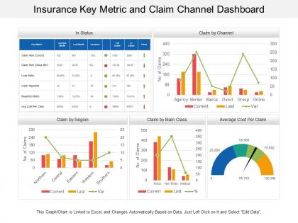
The image showcases a PowerPoint slide titled "Insurance Key Metric and Claim Channel Dashboard," which is a comprehensive dashboard used for analyzing various insurance claim metrics. This dashboard provides a snapshot of key performance indicators (KPIs) relevant to an insurance company.
The dashboard is divided into several sections:
1. In Status:
This table lists different metrics such as the number of claims paid (count and value), loss ratio, claims rejected, rejection ratio, and the average cost per claim. It shows current month data, the last month's data, the variance between them, the year-to-date actual, and the trend, which is indicated by green or red arrows depicting positive or negative changes.
2. Claim by Channel:
A combined bar and line graph show the number of claims made through different channels such as agency, broker, banca, direct, group, and online for the current and last periods, along with the variance.
3. Claim by Region:
This section illustrates the number of claims from different regions (Northern, Central, Eastern, Western, Southern) with bars representing current and last period claims and a line indicating the variance.
4. Claim by Main Class:
Another combined bar and line graph shows the number of claims categorized by the type of insurance, such as motor, non-motor, and medical, comparing current and last period data and percentage change.
5. Average Cost Per Claim:
A gauge chart or speedometer graph displays the average cost per claim, with different color bands indicating ranges of cost values.
Use Cases:
This detailed dashboard is an excellent tool for any data-driven industry that requires tracking and analysis of performance metrics for decision-making and strategy development.
1. Insurance:
Use: Monitoring claims processing and financial metrics
Presenter: Claims Manager
Audience: Insurers, Underwriters
2. Healthcare:
Use: Analyzing patient care costs and treatment efficiency
Presenter: Healthcare Administrator
Audience: Department Heads, Medical Staff
3. Banking:
Use: Tracking loan disbursement and default rates
Presenter: Risk Analyst
Audience: Bank Executives, Financial Analysts
4. Retail:
Use: Assessing sales performance and customer service metrics
Presenter: Sales Manager
Audience: Retail Analysts, Store Managers
5. Automotive:
Use: Overseeing warranty claims and service costs
Presenter: Service Department Head
Audience: Dealership Owners, Warranty Managers
6. Telecommunications:
Use: Evaluating service issue resolutions and customer satisfaction
Presenter: Customer Service Director
Audience: Support Teams, Management
7. Real Estate:
Use: Gauging property management efficiency and tenant relations
Presenter: Property Manager
Audience: Investors, Real Estate Executives
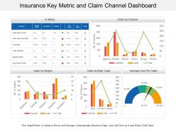
Insurance key metric and claim channel dashboard with all 6 slides:
Control the dialogue with our Insurance Key Metric And Claim Channel Dashboard. They allow you to handle any conversation.

FAQs for Insurance key metric and
Look, start with the basics - loss ratios, combined ratios, and premium growth. Those tell you if you're actually making money. Claims processing time matters too because nobody wants to wait forever for payouts. Customer acquisition costs vs retention rates are huge since it's way easier to keep people than chase new ones. Oh, and if you're dealing with heavy regulation, you can't ignore solvency ratios. Honestly though? Don't go crazy with like 20 different metrics. Pick maybe 6-8 that your team actually checks regularly. Test a few with your stakeholders first and see what they respond to.
Honestly, data viz is a game changer for insurance dashboards. You'll stop drowning in spreadsheet hell and actually see what's happening. Bar charts make claims spikes obvious - way better than hunting through endless rows of numbers. Heat maps show you which regions are tanking, and trend lines reveal seasonal patterns you'd totally miss otherwise. Your boss will love it too since they won't need to decode tables anymore. I'd start simple though. Basic charts first, then get fancy later. Trust me, once you visualize that data, you can't go back to the old way.
Dude, customer satisfaction is basically your canary in the coal mine for insurance stuff. When those scores tank, you're gonna see it way before your other metrics catch up - like claims taking forever or customers getting pissed about communication. Honestly, I think it's one of the best predictors we've got. You can track patterns across different products or regions, plus it ties directly to whether people stick around and refer others. Set up some alerts when satisfaction hits certain low points so you're not scrambling later. Trust me on this one.
So predictive analytics is pretty cool - it's like having a crystal ball instead of just looking backwards at what went wrong. You'll spot which policies might lapse and catch claim patterns before they blow up. Honestly, the visual dashboards beat the hell out of endless Excel files. It helps with pricing tweaks and finding fraud early too. Just make sure you set up alerts for whatever matters most in your portfolio. Way better than constantly scrambling to fix problems after they happen. Oh, and resource planning gets way easier when you can actually see what's coming.
For claims, you definitely want to track cycle time - basically how long each claim takes from start to finish. First-call resolution rate is huge too, plus your accuracy percentage. Backlog volume will save you headaches if you stay on top of it. Staff productivity matters - like claims per adjuster daily. Reopened claims rate is sneaky important because nobody thinks about it until it's screwing you over. Customer satisfaction scores are what the bosses actually care about at the end of the day. Honestly, I'd set up automated alerts for when these drift off target. Way better than playing catch-up later.
Honestly, dashboards are a game-changer for compliance stuff. Instead of scrambling to pull reports manually (which takes forever), everything updates in real-time - solvency ratios, reserve adequacy, claims processing times, all that. During audit season it's literally a lifesaver. You'll get alerts before you hit regulatory thresholds, so no more surprise violations. The reports come out formatted exactly how regulators want them too. I mean, who has time to double-check formatting anymore? Set up automated alerts and you won't miss deadlines again.
APIs are your friend here - grab real-time data straight from your insurance systems and claims databases. For those ancient legacy systems (why do they still exist?), RPA tools like UiPath can scrape what you need. ETL tools like Informatica handle the heavy lifting when you're transforming massive datasets. Webhooks are clutch for instant notifications. Honestly though, start by checking which systems actually have APIs first. That's gonna save you the most headache. Map out your data sources and you'll see what combo makes sense for your setup.
Dude, you've gotta tailor each dashboard to what people actually need to see. Executives just want the big picture - loss ratios, premium growth, profit trends. Keep it clean and visual for them. Underwriters need the nitty-gritty: risk metrics, policy performance, loss breakdowns to do their jobs right. Claims teams? They care about settlement times, fraud flags, reserve stuff. Biggest rookie mistake is shoving everything into one dashboard - total disaster. I learned this the hard way at my last job. Build separate views for each role so people aren't drowning in irrelevant data.
Set up daily or weekly data refreshes - depends on how often you actually need fresh reports. But seriously, validate everything against your source systems first. I got burned when our claims data was wrong for two weeks and nobody caught it! Document your formula changes too. Keep a change log so your team isn't constantly asking "wait, what changed?" Block out 30 minutes weekly for data quality checks - trust me, it beats spending hours fixing stuff later. Monthly stakeholder reviews help too, just to make sure the KPIs still make sense for everyone.
Look at your age breakdowns first - that'll show you which generations bring in the most money and when claims tend to spike. Millennials love digital stuff while boomers still want to actually talk to someone, you know? Geographic data is huge too because it shows risk patterns by region plus any markets you're totally missing. Income and job info helps you nail your pricing better and spot chances to sell more products. Oh, and gender splits can reveal coverage gaps. Honestly though, I'd just filter your best segments first and figure out what they have in common - that's where you'll find the good stuff.
Just grab your industry benchmark data and throw it on your charts as reference lines or bands. A.M. Best and ISO feeds work great for this - most carriers already have subscriptions anyway. The annoying part is matching company sizes and business lines so you're not comparing tiny mutuals to mega carriers or whatever. I'd add toggle switches so people can flip between different benchmark sets. Combined ratios are probably your best starting point since everyone obsesses over those. Then just expand to loss ratios and expense ratios once that's working smoothly.
Ugh, data silos are brutal - your claims stuff is in one system, policies somewhere else, customer info probably scattered everywhere. Different departments all want their own dashboards too which gets messy fast. Plus you've got compliance rules that change depending on where you operate. Honestly, I'd pick one department and nail that first before trying to connect everything. Way easier to show some wins and then get buy-in for the bigger picture. Trust me, don't go crazy trying to fix it all at once.
Honestly, mobile insurance dashboards are all about keeping it simple. Stack everything vertically - side-by-side widgets look terrible on phones. Your most important stuff like claims ratios and renewal rates should be right at the top since that's what people actually check while they're out and about. Make those buttons big enough that you don't need eagle eyes to tap them. Oh, and if you've got field agents, definitely think about offline mode because cell service can be garbage in some areas. Start with maybe 3-5 key metrics that your users really need quick access to. Don't try to cram everything onto one screen.
Honestly, real-time data transforms your insurance dashboard from eye candy into something you'll actually use. You can catch policy lapses before they bite you and jump on claims spikes right when they happen. Way better than finding out about problems weeks later through some boring monthly report. I mean, operating without live feeds is like trying to drive while only checking your rearview mirror - kinda ridiculous when you think about it. The trick is setting up automated alerts for your biggest KPIs. That way you're not glued to your screen all day like some kind of data zombie.
So basically these dashboards fix that whole mess where departments can't see what each other are doing. Everyone gets the same real-time numbers, which is actually pretty game-changing. Like, claims can spot problems before they blow up customer service's phone lines. Sales notices patterns that help underwriting make better calls. Your renewal rates suddenly make sense when you see how underwriting decisions connect to everything else - who knew, right? The trick is giving people dashboards that match their actual job, not some generic thing. Then they show up to meetings with real data instead of just random hunches.
No Reviews