


Mining Powerpoint Ppt Template Bundles


Try Before you Buy Download Free Sample Product
 Impress Your
 Audience
Editable
of Time


Our Mining Powerpoint Ppt Template Bundles are topically designed to provide an attractive backdrop to any subject. Use them to look like a presentation pro.
People who downloaded this PowerPoint presentation also viewed the following :
Mining Powerpoint Ppt Template Bundles with all 20 slides:
Use our Mining Powerpoint Ppt Template Bundles to effectively help you save your valuable time. They are readymade to fit into any presentation structure.


FAQs for Mining Powerpoint
So for mining presentations, definitely go with darker colors - blues, grays, oranges that match the whole underground vibe. Include mining equipment icons and geological charts so people know what industry you're in right away. Safety symbols are massive in this field, trust me. Data viz templates are clutch since you'll be drowning in production numbers and cost breakdowns. Oh, and don't forget process flow diagrams for project timelines. I'd honestly start with a template that already has incident reporting slides built in because compliance stuff is unavoidable. Then just swap in your specific data.
Honestly, visuals are game-changers for mining presentations. Complex geological stuff becomes way easier to understand when you show cross-sections and 3D models instead of just talking about rock layers. Nobody wants to sit through walls of text about sedimentary deposits - it's brutal. Process flowcharts work great for explaining extraction methods too. Your audience will actually remember what you're saying when they can see drilling patterns and ore distribution mapped out. I'd start with whatever concept seems most confusing and find a template that breaks it down visually. Way more effective than the traditional lecture approach.
Honestly, you'll save so much time and look way more professional than starting from scratch. Mining templates come with actual relevant charts and industry visuals - none of those weird stock photos of random people in hardhats, you know? You can still customize everything to match your company colors and specific data. The layouts actually make sense for technical stuff since they're built by people who get mining workflows. Way better for stakeholder meetings or when you're presenting to executives. Definitely try one next time instead of building slides from zero.
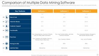
Stick to charts that actually tell your story - production trends, cost breakdowns, safety numbers, resource maps. Bar charts are solid for comparing output between sites. Line graphs show production changes over time really well. Honestly, skip the 3D effects - they just make everything confusing. Keep your colors consistent with company branding and always label your data sources clearly. The whole point is making mining data simple for people who aren't buried in spreadsheets all day like we are. Lead with your biggest impact metrics first.
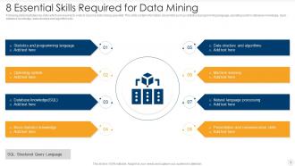
Definitely grab the obvious stuff first - excavators, dump trucks, drill rigs, conveyor belts. Rock samples and geological cross-sections are clutch too. Safety gear icons are absolutely essential since mining companies are obsessed with that (rightfully so). Process flow graphics work really well for showing extraction through transportation stages. Oh, and throw in environmental symbols - reclamation, sustainability stuff. Clients eat that up these days. Charts designed specifically for production metrics are solid gold. Just make sure everything's crisp and scales nicely in presentations. Nothing worse than pixelated icons during a big pitch.
Dude, get a proper mining template - investors will actually focus on your numbers instead of cringing at ugly slides. It makes you look like you know the industry, not some random person who Googled "mining PowerPoint." These templates come with sections for all the stuff they want to see anyway: reserves, production forecasts, safety records. Trust me, good design is like half the battle with these people. Look for one with map layouts and charts built in - I've seen investors literally sit up straighter when they see a clean geological visualization. Way better than winging it with generic templates.
Honestly, the specialized mining templates are way better because they actually have the stuff you need - equipment diagrams, safety icons, geological charts. Plus they use colors that make sense, like earth tones and industrial blues instead of those bright startup colors. Generic ones just make your presentation look weird when you're talking to mining people who expect it to look professional. The good templates already have slides set up for timelines, site maps, safety protocols - all that boring but necessary stuff. Trust me, it's worth spending a bit more to not look like you're pitching some random tech app.
Dude, those mining PowerPoint templates are actually a game-changer for geology classes. Way better than those crusty textbook diagrams nobody pays attention to. They've got all these editable charts and cross-sections already built in - saves you tons of time honestly. You can show ore formation, different extraction methods, all that complex stuff but it actually looks professional. The process flow ones are my favorite, perfect for breaking down mining techniques step by step. Oh and you can tweak them for whatever level you're teaching, which is clutch.
Automation and AI stuff should be front and center in your templates - that's where all the money is right now. Show off remote operations, predictive maintenance dashboards, autonomous equipment. ESG metrics are mandatory now too, so add slides for sustainability goals and community impact. Safety tech with wearable sensors needs to be prominent since investors love that. Renewable energy at mine sites isn't just trendy anymore, it's becoming the norm. Make your design modern and tech-forward instead of that old industrial look. Oh, and honestly? The color scheme matters more than people think.
So basically, animations help you tell a story with your mining data instead of just throwing numbers at people. Progressive reveals work great for building up to your big findings. Animated charts show trends over time way better than static ones. Honestly, I'm kind of obsessed with animated flowcharts for mining processes – they just click for people. Callout boxes are clutch for highlighting the stuff that actually matters. Don't go crazy with effects though. Map out your story first, then pick animations that actually support each point you're making.
Honestly, I'd go with super neutral colors and skip anything too culturally specific. Hard hats and mining equipment work way better than people or landscapes. Simple fonts are your friend - some languages get crazy long when translated (German's like 30% longer, no joke). Leave tons of white space too. Oh, and make sure it works for right-to-left languages if you're going global. I learned this one the hard way, but don't put any idioms in your sample text. Also test with really long text blocks because some translations will totally break your layout if you're not careful.
Yeah, color schemes totally make a difference! Dark colors like navy and charcoal scream authority - perfect for safety talks or financial stuff. Orange and yellow give off that high-vis energy, which works great for operational updates. Earth tones? They make you look environmentally responsible, which honestly everyone cares about now. Blues hit that sweet spot of professional but not intimidating for stakeholder meetings. Just don't go crazy mixing colors that'll make people focus on your slides instead of your actual data. Pick something that fits your vibe and stick with it.
Honestly, case studies are what make mining presentations actually work - they prove your stuff isn't just theory. Templates are clutch here because they've got layouts already set up for the before/after shots and all those data comparisons you need. Way better than trying to cram geological charts into random slides. Look for templates with dedicated case study sections that have spots for site photos and performance metrics. Oh, and start with your best success stories first - like the ones that actually impressed people, not just the okay ones. The template will basically walk you through organizing everything else.
Clean templates are everything - consistent layouts with good visual hierarchy will save your butt. I'd create separate slides for exec summaries and technical deep-dives so you can pivot based on who's in the room. Charts and infographics beat text walls every time, especially for the non-tech folks. Mining presentations are notorious for looking ancient and confusing everyone. Your engineers won't feel patronized if the design is sharp, and executives will actually pay attention. Go with modular templates you can mix around - way more flexible than starting from scratch each time.
Don't dump a ton of technical jargon on people - you'll lose half the room instantly. Balance is key, especially with non-mining folks there. Those cheesy stock photos of hard hats? Skip them completely. They look so amateur and don't show what modern mining actually looks like. Simple data viz works better since mining metrics get crazy overwhelming. Oh, and test your colors in crappy lighting because conference rooms are usually terrible. Honestly, grab a decent template bundle first, then customize it for your company. Way easier than starting from scratch and looks more professional.
-
Great templates that you can use in your next keynote or conference. They are perfect for quick and visually-engaging delivery.
-
Great designs, Easily Editable.