Operation Management Flow Chart Powerpoint Ppt Template Bundles

Rating:
90%
Operation Management Flow Chart Powerpoint Ppt Template Bundles
Slide 1 of 19
Favourites Favourites

Try Before you Buy Download Free Sample Product

Audience Impress Your
Audience
Editable 100%
Editable
Time Save Hours
of Time
The Biggest Sale is ending soon in
0
0
:
0
0
:
0
0
Rating:
90%
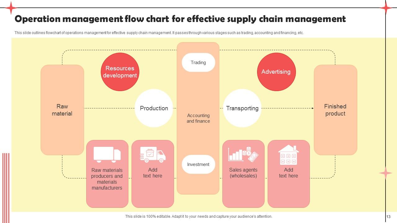
Deliver a credible and compelling presentation by deploying this Operation Management Flow Chart Powerpoint Ppt Template Bundles. Intensify your message with the right graphics, images, icons, etc. presented in this complete deck. This PPT template is a great starting point to convey your messages and build a good collaboration. The forteen slides added to this PowerPoint slideshow helps you present a thorough explanation of the topic. You can use it to study and present various kinds of information in the form of stats, figures, data charts, and many more. This Operation Management Flow Chart Powerpoint Ppt Template Bundles PPT slideshow is available for use in standard and widescreen aspects ratios. So, you can use it as per your convenience. Apart from this, it can be downloaded in PNG, JPG, and PDF formats, all completely editable and modifiable. The most profound feature of this PPT design is that it is fully compatible with Google Slides making it suitable for every industry and business domain.

FAQs for Operation Management Flow Chart Powerpoint

For your flow chart, start with clear beginning/end points and use diamonds for yes/no decisions. Process boxes show the actual steps. Arrows guide the flow - pretty standard stuff. Don't forget feedback loops though, seriously everyone misses those and they're crucial. If different departments are involved, throw in swim lanes to keep things organized. Time estimates help too. The goal is making it visual enough that someone can follow along without you hovering over their shoulder explaining everything. I'd map what you're currently doing first, then figure out how to make it better.

Honestly, flow charts are a game changer for messy processes. Instead of reading through those awful procedure manuals (ugh), you can actually *see* how everything connects. Makes it super easy to catch bottlenecks or redundant steps you'd totally miss otherwise. When we got new people on my team, these visual maps saved so much training time - way better than just throwing documents at them. You can spot exactly where things break down and test fixes before rolling them out. Oh, and they're perfect for those "wait, why do we do it this way?" moments. Seriously worth the time to map stuff out visually first.

Okay so for flowcharts that don't look like garbage - stick with the basic shapes everyone knows. Rectangles for processes, diamonds for decisions, ovals for start/end. Don't go crazy with colors (2-3 max). Make your text big enough to actually read! I swear people always use fonts that are way too small. Go top-to-bottom or left-to-right, whatever feels natural. Leave some breathing room between elements. Lucidchart's pretty solid, but honestly PowerPoint works fine too. Here's the real test though - show it to someone fresh and see if they get confused. That'll tell you everything.

Honestly, flow charts are like X-rays for your processes - they show exactly where things get stuck. You map out each step and suddenly those bottlenecks just jump out at you. Usually it's obvious stuff like one person approving everything or some ancient system that takes forever. The visual part is key though. You can literally see where work piles up, like when three different streams feed into one slow step. It's kinda satisfying actually, spotting those traffic jams on paper. Then you just tackle the worst ones first.

Honestly, just use something like Lucidchart or Visio - they'll save you tons of time. You can drag and drop stuff around, and they automatically line everything up so it doesn't look like garbage. The cool part is they actually analyze your workflow and point out where things get stuck. Your team can all jump in and edit at once too, which beats emailing versions back and forth forever. I started with Draw.io since it's free (why not?), then upgraded when I needed fancier features. Some tools even pull live data from your systems so the charts update themselves.

So basically, every industry tweaks flow charts to fit what they actually do. Manufacturing loads theirs with safety checks and quality stuff. Healthcare has to follow all those patient care rules - super strict. Tech companies? Their charts are honestly a mess sometimes, but they work because they're built for constant changes and feedback. Financial places add like 10 approval steps for everything (risk management, you know). Don't just grab some random template though. Look at what your industry cares about most - regulations, safety, whatever - then build around that. Map what you're really doing, not what some generic chart says you should do.

Honestly, you can't make a decent flow chart without talking to the actual people doing the work first. They know where things get stuck or weird - stuff that's totally invisible from the outside. I've watched so many managers create these perfect-looking charts that miss half the real steps because they didn't ask anyone. Get the process owners and end users in a room early on. Maybe grab some coffee with them or whatever works. Their day-to-day knowledge will prevent you from building something that's technically correct but useless in practice. Trust me on this one.

Dude, flow charts are seriously clutch for training new ops people. When trainees can see the "why" behind each step instead of just memorizing tasks, they actually get it. I've watched new hires figure out complex stuff in days rather than weeks with visual maps. Plus they can reference them later without bugging you every five minutes with "now what?" questions. Here's what works: have them trace through common processes on paper first - sounds old school but it sticks better. Then they're ready for the real deal.

Track your cycle times and throughput rates first - those are non-negotiable. Quality metrics matter too, like defect rates at each step. Honestly, capacity utilization is where most people mess up because it shows you the real bottlenecks, not the ones you assumed were problems. Don't forget wait times between processes and how you're actually allocating resources. Cost per unit at major stages? That's where you'll catch the money drain. Keep it visual though. I've seen dashboards that track like 15 KPIs and they're completely useless. Pick maybe 4-6 metrics that actually help you make decisions and update them regularly so issues don't blindside you.

Dude, flow charts are game-changers for getting departments to actually talk to each other. Think of it like giving everyone the same map instead of playing that broken telephone game where everything gets twisted. Sales finally sees what happens after they hand stuff off, operations knows when to expect things, finance gets the full timeline - it's honestly like putting subtitles on your whole business. Plus teams start spotting problems way earlier because they can see how their mess-ups ripple through everything else. Seriously, just make one flow chart for your next big project and watch the magic happen.

Honestly, the biggest thing is don't overcomplicate it. I see people try to map out every tiny detail and it just becomes this confusing mess. Also - and this is huge - actually talk to the people doing the work! Can't tell you how many times I've seen gorgeous flowcharts that are completely useless because nobody bothered asking frontline staff how things really happen. Your decision points need to be clear yes/no questions, not some wishy-washy maybe situation. Skip the vague labels too. "Process data" tells me nothing - be specific about what's actually happening. Start simple, show it to your team, then fix whatever they point out is wrong.

Honestly? I'd say every 3 months minimum, but it really depends on your situation. Fast-paced environment with constant changes? Maybe monthly - I know some teams that basically live in theirs during crunch time. More stable ops can probably get away with twice a year. Here's what I do: set up triggers for when processes change, new software gets added, or teams get reshuffled. That's when you know it's time. Don't let them go stale for more than 6 months though - they become totally pointless. Oh, and definitely put a recurring reminder on your calendar or you'll forget (trust me on this one).

Check out Toyota's lean manufacturing - they mapped every single step in car production and cut tons of waste. McDonald's did something similar with their kitchen processes, which is why your Big Mac tastes the same everywhere (kinda wild when you think about it). Amazon uses flow charts for their warehouse picking routes, and UPS plans delivery routes the same way - saves them crazy money on fuel. These companies are worth studying if you want to see how process mapping actually works in the real world.

Honestly, get your team involved - they're the ones actually doing this stuff every day. They'll catch things you totally missed, like weird bottlenecks or steps that don't make sense. Plus people are way more likely to follow a process they helped create, you know? Ask them where the chart doesn't match what really happens. There's probably some unofficial shortcuts everyone uses because the "official" way is annoying. I'd do feedback sessions maybe every few months? Just walk through it together and see what's broken. Trust me, they'll have opinions.

Honestly, just go with Lucidchart or Visio. Lucidchart's way easier to use and everyone can collaborate on it without drama. Visio's got more bells and whistles if you're doing complex stuff. Draw.io works too if you don't want to spend money - it's actually pretty decent for being free. I mean, you could even use PowerPoint but... yeah, let's not go there lol. Try Lucidchart's free version first. See how it feels, then decide if you need the fancy features later.

Ratings and Reviews

90% of 100
Review Form
Write a review
Most Relevant Reviews
  1. 80%

    by James Lee

    I faced no difficulty while searching for the slide I wanted. Honestly, the website’s interface is easy to use and can be navigated easily!
  2. 100%

    by Derrick Rice

    A big thanks to SlideTeam! An incredible and diverse library of templates helped me with my business project presentation.

2 Item(s)

per page: