


Our Historical Timeline Sap Company Profile Ppt Graphics CP SS




Try Before you Buy Download Free Sample Product
 Impress Your
 Audience
 100%
100% Editable
 Save Hours
 of Time


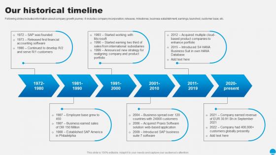
Following slides includes information about company growth journey. It includes company incorporation, releases, milestones, business establishment, earnings, launched, customer base, etc.
People who downloaded this PowerPoint presentation also viewed the following :
Our Historical Timeline Sap Company Profile Ppt Graphics CP SS with all 9 slides:
Use our Our Historical Timeline Sap Company Profile Ppt Graphics CP SS to effectively help you save your valuable time. They are readymade to fit into any presentation structure.








FAQs for Our Historical Timeline Sap Company Profile Ppt
Focus on stuff that actually flipped society upside down - revolutions, big wars, game-changing inventions. I'd probably go overboard covering the Renaissance because it's fascinating, but you need variety. Pick your time frame and region first, then grab like 8-12 events that really mattered. Don't just do political stuff either. Religious shifts changed everything too. Industrial revolutions, empires collapsing, finding new continents - that's the meat of it. Oh and throw in some social movements because people always forget how much those shaped things. Scientific breakthroughs are huge too.
Honestly, visuals are a game-changer for timelines. People's brains just process images way faster than walls of text - like using red for wars or green for economic stuff makes it instantly clear what you're looking at. Photos of key people create this emotional hook that plain dates never will. I mean, who wants to stare at a boring list of years? Short sentences work great too. Then you can mix in longer explanations that flow naturally when you need to explain the connections between events. Just keep your color coding consistent throughout so people can spot patterns easily. Trust me, it makes such a difference.
Pick one date format and stick with it - MM/DD/YYYY or just years, whatever works for your project. I can't stress this enough: double-check those dates because one mistake screws up everything (trust me on this one). Color-code different event types or use icons. Makes a huge difference. Don't stuff paragraphs into each entry either - nobody wants to read a novel on your timeline. White space is your friend here. Oh, and actually explain why stuff matters! Connect the dots between events. That's what separates good timelines from boring chronological lists that put people to sleep.
Honestly, timelines are perfect for this. Just plot everything chronologically, then use arrows or colors to connect related events. The visual spacing really helps - put immediate effects right next to their causes, but space out long-term consequences further down the line. Like, you'll notice patterns you missed before, especially how economic crashes usually trigger political chaos a few years later. Way better than just memorizing random dates. Add little notes explaining the connections too. Makes it click for people instead of everything feeling like isolated facts floating around.
Timeline JS is probably your best bet - totally free and connects to Google Sheets so updating is painless. Tiki-Toki's another good one but costs money (though it looks way prettier). If your timeline has map stuff, StoryMap JS works well too. Honestly? I've seen people do cool things with just Prezi or PowerPoint when they get creative. But Timeline JS is where I'd start since it won't cost you anything. You can mess around with it first, then maybe upgrade to something fancier if you need more bells and whistles later.
Oh totally! History is so biased depending on who's writing it. Like, one country's "exploration" is literally another's "invasion" - same event, completely different spin. The dates they choose to highlight, the language they use, even what gets left out entirely... it all shows whose perspective you're getting. I learned this the hard way in college when we compared different textbooks about the same war. Wild stuff. So whenever you're looking at timelines, just think about whose voice is dominating the story and who might be getting silenced.
Oh man, this is such a pain. Different cultures used totally different calendar systems - lunar vs solar, different starting points for "year zero," the whole mess. You'll be constantly converting dates and second-guessing yourself. Plus some civilizations kept amazing records (Egypt was obsessed with documentation) while others barely left anything behind. What one culture thought was earth-shattering might not even show up in neighboring regions' histories. Honestly? Just pick one dating system as your main reference point and flag whenever you're doing conversions or making educated guesses.
Honestly, timelines are a total game changer in history class. Kids actually start seeing how events connect instead of just cramming random dates. The visual aspect helps so much with retention too. Digital ones are even better - students can click around, add videos or whatever. I've had classes build collaborative timelines for different eras and they get way more into it than reading another boring textbook chapter. Plus it shows cause-and-effect relationships naturally. Actually, my students surprised me last year by adding memes to their WWII timeline (appropriately, don't worry). But it worked! They remembered everything.
Okay so primary sources are basically gold when you're trying to nail down accurate timelines. You know - diaries, official records, letters, photos from back then. Not some historian writing about it 50 years later. Those secondary sources? They mess up dates way more than you'd think. Primary sources let you double-check everything straight from people who lived through it. Cross-reference a bunch of them though, because even eyewitnesses disagree sometimes. But honestly, it's your best shot at getting the chronology right instead of just guessing.
Dude, interactive timelines are a game changer for history stuff. You can actually see how events connect instead of just memorizing random dates. Like, click on Franz Ferdinand's assassination and watch how it literally triggers WWI - it's wild. I spent way too much time last week just zooming in and out of different eras. You can layer multiple perspectives too, which is cool because you'll spot patterns that textbooks totally miss. Honestly? Try making one for your next project. Way better than reading boring chapters.
Honestly, just pick 5-7 major turning points and skip the rest. People zone out if you throw too much at them. I'd group similar stuff together by themes instead of going chronologically through every single thing. Work backwards from your endpoint - like, what actually caused this outcome? That's what matters. The random battles or whatever that didn't change anything can go. Color-coding helps if you're tracking different storylines (learned that the hard way). And always explain why each event matters to the bigger story, even briefly. Consistent time gaps between events make it way easier to follow too.
Honestly, it's all about knowing your crowd. Kids need simple words and big visuals - call them "brave explorers" instead of talking about economic expansion, you know? Adults can handle the messy, complicated stuff with multiple angles. Interactive elements are clutch for both but differently. Kids want games and fun animations. Adults prefer being able to click around and compare data (though let's be real, adult content gets boring fast if you're not careful). Pick 3-4 must-know concepts first, then build everything else around those. That's been my go-to approach.
Try using colored boxes or callout bubbles to make those lesser-known people pop. Mini-bios work great too - just drop them right next to the major events. You could do parallel tracks, like famous people on top and unsung heroes below. Honestly, adding portraits makes a huge difference since faces stick with people way better than just names. Oh, and those "did you know?" snippets are gold. The trick is giving these figures the same visual weight as the big names. Don't let them feel like footnotes - they shaped history too.
So it really depends what angle you're going for. Historians are all about cause-and-effect stuff and big political moments. Sociologists look at how society changed - demographics, social movements, that kind of thing. Art historians get super picky about time periods (they'll argue about whether something's "late Renaissance" or "early Baroque" for hours). Anthropologists care more about cultural practices and belief systems. Economists focus on market trends and tech disruptions. Just figure out what story you're trying to tell first, then pick whichever approach fits best. Different disciplines will make totally different events seem important.
Timelines are seriously underrated for interdisciplinary projects. You can stack all your different evidence types - political events, cultural stuff, economic data, scientific breakthroughs - right on the same framework. Makes spotting connections way easier than when everything's scattered across different documents or whatever. Plus your team can actually see how one field influenced another instead of just guessing. I'd suggest making it digital so everyone can contribute their piece. Honestly, the patterns that show up are pretty wild sometimes. It's basically like having everything click together on one master view where cause-and-effect relationships become super obvious.
-
The design is very attractive, informative, and eye-catching, with bold colors that stand out against all the basic presentation templates.
-
Their templates are super easy to edit and use even for the one like me who is not familiar with PowerPoint. Great customer support.