


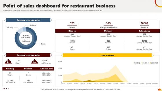
Point Of Sales Dashboard For Restaurant Business




Try Before you Buy Download Free Sample Product
 Impress Your
 Audience
 100%
100% Editable
 Save Hours
 of Time


The following slide showcases point of sales designed for small restaurant businesses. It presents information related to orders, revenue, din in, etc.
People who downloaded this PowerPoint presentation also viewed the following :
Point Of Sales Dashboard For Restaurant Business with all 7 slides:
Use our Point Of Sales Dashboard For Restaurant Business to effectively help you save your valuable time. They are readymade to fit into any presentation structure.





FAQs for Point Of Sales Dashboard
Start with your daily sales patterns and average transaction amounts - that's your bread and butter right there. Conversion rates matter way more than most people think since they show if customers actually buy or just browse around. Track your best-selling products too, plus how your staff performs if you've got employees. Honestly, inventory turnover saved my butt so many times - nothing worse than telling customers you're sold out of popular stuff. Payment breakdowns help with cash flow planning. Don't overthink it though, these basics will get you started and you can always add fancier metrics later.
So instead of waiting around for yesterday's numbers, you'll see what's happening right now in your store. Like if something's selling crazy fast or your checkout's backing up. Honestly wish more places did this - you can actually do something about problems while they're happening. Adjust your staff, reorder stuff, switch up promotions on the fly. I'd check it every hour or so rather than once a day. The patterns show up way clearer when you're not looking at stale data. Makes timing your decisions so much easier.
Line charts are your best bet for tracking sales trends over time. I'd set up different views - daily, weekly, monthly - so you can catch both quick spikes and bigger patterns. Filter by product or location too, that's super helpful. Oh and definitely add year-over-year comparisons for context. Keep your colors consistent though, nothing worse than a confusing dashboard that makes managers squint at the screen. Way too many companies overcomplicate this stuff. You want something clean where problems jump out immediately without anyone having to hunt through tons of data.
Dude, connecting your POS to inventory management is a total lifesaver. You'll see stock levels right next to sales data - no more jumping between apps like some kind of digital ping pong ball. The best part? You can actually spot patterns, like what's selling fast vs what's just taking up space. Low-stock alerts are clutch too (seriously, set those up ASAP). Nothing worse than promising something to a customer then realizing you're completely out. Oh, and it'll flag weird inventory stuff before it becomes a real problem. Game changer for sure.
Honestly, demographic data is what makes your POS dashboard actually useful instead of just a bunch of random numbers. You'll start seeing patterns like college kids grabbing energy drinks before 10am or how older folks still love paying cash on weekends. Pretty wild how specific it gets. Filter by one demographic first - age is usually a good starting point. Then you can adjust when you schedule staff, what inventory to stock up on, and who to target with promotions. I spent way too much time analyzing this stuff at my last job, but it really does work.
Your POS dashboard is honestly a lifesaver for spotting seasonal trends. It shows historical sales data through charts that make patterns super clear - like ice cream sales jumping in summer or holiday stuff peaking in December. Way better than digging through endless spreadsheets, trust me. You can filter by product categories, time periods, whatever you need. I love how granular you can get with the data. Use these insights to plan inventory orders and staffing ahead of time. Marketing campaigns too. Never get caught with empty shelves during busy seasons again!
So cloud-based means you just log into a website from any computer, while on-premise stuff sits on servers at your actual store. Honestly, cloud is probably your best bet - way cheaper since you don't have to buy all that server equipment, plus it updates itself. The cool part is you can check your numbers from literally anywhere (I'm always peeking at sales from my couch lol). On-premise gives you more control, but that's overkill for most small shops. I'd say go cloud unless you're paranoid about security or have some weird compliance thing going on.
Oh man, POS dashboards are a game changer for this stuff. Instead of those weird "um, I think you're doing okay?" reviews, you'll actually have numbers to work with. Track each person's sales, how fast they process transactions, upselling rates - all that good stuff. Honestly, it makes those review meetings so much less awkward when you can point to actual data. You can spot who's crushing it, who needs help, and who's been flying under the radar but actually killing it. I'd pull reports monthly so you're not scrambling last minute trying to remember what happened six months ago.
Yeah, most POS systems are pretty flexible with their dashboards. You can drag widgets around, pick which metrics to highlight, and customize layouts based on what you actually need. Role-based views are clutch - your cashiers don't need the same data your managers do, you know? Some let you add custom fields or connect third-party apps, which is handy. Color schemes depend on your provider though. Honestly, I'd just start with whatever default setup matches your industry type, then mess around with it once you figure out what numbers you're actually checking every day. Way easier than overthinking it upfront.
Look, if your POS dashboard is actually user-friendly, your team won't hate using it. Makes sense, right? Clean interface means staff can find stuff without getting frustrated - especially during crazy rush hours. I've seen people struggle with terrible systems and it's painful to watch. Short learning curve, readable text, logical buttons... all that leads to faster adoption. Your employees might even discover those advanced features that could help your business (instead of just doing the bare minimum). Honestly, half the battle is just making software that doesn't suck. Simple wins every time.
Dude, biggest trap is shoving everything onto one screen - users just shut down when there's too much going on. Stick to maybe 5-7 metrics that actually matter for decisions. Real-time updates seem awesome but they'll tank your performance if you're hitting multiple databases constantly. Load speed is huge, especially on mobile since everyone's checking dashboards on their phone now. Oh, and definitely test with real users first! What seems obvious to you might be total gibberish to them. I learned that one the hard way. Keep it simple at first - you can always add more bells and whistles later.
Your POS dashboard basically tracks everything - every sale, what people buy together, busy times, all that stuff. I got obsessed with this data when I first started looking at it, no joke. You can see customer patterns like how often they shop and what their average order is. Peak hours become super obvious, plus seasonal trends. Promotions? You'll know exactly which ones actually work. Use it to stock better inventory and figure out when you need more staff. The customer segmentation thing is really helpful too - shows you who your regulars are versus one-time buyers.
Start with role-based permissions - cashiers only need transaction stuff, managers get everything else. Set up automatic timeouts too because those systems just sit there all day in crazy busy stores. Hide sensitive data like full card numbers unless someone actually needs to see them for what they're doing. The screen should lock when people walk away, obviously. Oh and definitely set up audit logs tracking who looked at what and when. Sounds boring but it'll save your butt later for compliance stuff. Screen timeouts are honestly your best friend here - can't tell you how many places I've seen with POS systems just sitting open.
Dude, you absolutely need mobile compatibility for your POS dashboard. Your managers can't be tied to a desktop when they're walking around checking on things. Staff need quick data access during rush periods too. Accessibility features matter because frustrated employees make slower decisions - and who has time for that? Short sentences work. Longer ones help with flow when you're explaining the reasoning behind mobile-first design being basically mandatory now. Test it on real phones first though, not just the fancy simulator stuff. Trust me, there's always some weird formatting issue that only shows up on actual devices.
So basically you're turning your POS from just showing what already happened into predicting what's next - which is honestly pretty cool. You can forecast inventory needs, spot customer patterns, see where sales are heading. But here's the thing - your data needs to be super clean or the predictions will be garbage. Also someone on your team better actually understand how to read these models, otherwise you're flying blind. Oh and don't forget training everyone on the new stuff. I'd say pick one thing first, maybe demand forecasting? Get that working smoothly then add more features later.
-
Fantastic collection. Loved how we can personalize these templates as per the requirements.
-
Very well designed and informative templates.