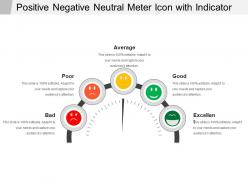
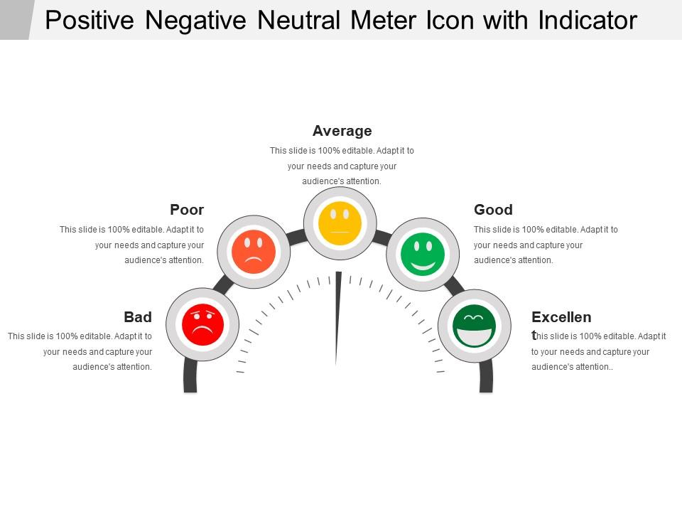
Positive negative neutral meter icon with indicator
Try Before you Buy Download Free Sample Product
Audience
Editable
of Time
Our Positive Negative Neutral Meter Icon With Indicator will get your efforts to bear fruit. You will harvest an excellent crop.
People who downloaded this PowerPoint presentation also viewed the following :
Positive negative neutral meter icon with indicator with all 5 slides:
Get accepted by exclusive clubs due to our Positive Negative Neutral Meter Icon With Indicator. Build the impression of being among the best.
FAQs for Positive negative neutral meter
The primary function of a meter icon indicator in presentations is to visually communicate progress, performance levels, completion rates, or measurement data through intuitive graphical displays. These indicators streamline complex numerical information by transforming statistics into easily digestible visual formats, enabling audiences to quickly grasp key metrics, track project milestones, and assess performance benchmarks across departments or initiatives.
Meter icon indicators enhance visual appeal by transforming static numbers into dynamic, instantly recognizable graphics that guide audience attention, create visual hierarchy, and simplify complex data interpretation. These visual elements streamline comprehension through color-coded progress bars, gauge displays, and status indicators, while delivering professional aesthetics and improved audience engagement, ultimately making presentations more memorable and impactful.
Effective meter icon indicators should prioritize visual clarity, intuitive color coding, appropriate scaling, and consistent design language that aligns with your brand guidelines. These principles enhance user comprehension by ensuring readable typography, logical progression patterns, and accessible contrast ratios, with many organizations finding that well-designed indicators significantly improve dashboard usability and decision-making speed.
Meter icon indicators provide real-time, at-a-glance visual feedback through curved gauges and needle movements, while traditional bar graphs display static comparative data across categories or time periods. These dynamic meters excel in dashboards for monitoring KPIs, system performance, and operational metrics in manufacturing, healthcare, and financial services, ultimately delivering immediate awareness of critical thresholds and enabling faster decision-making than static charts.
Industries commonly utilizing meter icon indicators include manufacturing, energy and utilities, healthcare, financial services, and automotive sectors. These visual tools enhance operational dashboards by displaying performance metrics, system health, and KPI progress in real-time, with many organizations finding that meter indicators streamline decision-making and improve monitoring efficiency across complex operations.
Popular software tools for designing meter icon indicators include Adobe Illustrator, Figma, Sketch, Adobe XD, and Canva, each offering vector-based design capabilities and customization options. These platforms streamline the design process by providing pre-built templates, scalable graphics, and collaborative features, with many designers finding that vector-based tools ultimately deliver crisp, professional indicators suitable for dashboards, applications, and presentations.
Meter icon indicators can effectively communicate complex data at a glance by providing immediate visual context, progress tracking, clear performance benchmarks, and intuitive status updates through color coding and graduated scales. These visual tools streamline data interpretation across dashboards and reports, with many organizations finding that well-designed meter indicators enhance decision-making speed and reduce cognitive load for users.
Best practices for choosing color schemes for meter icon indicators include using intuitive color associations like red for critical levels and green for optimal performance, ensuring sufficient contrast for accessibility compliance, maintaining consistency across all dashboard elements, and limiting the palette to avoid visual confusion. These approaches streamline user comprehension by creating immediate visual recognition, reducing cognitive load, and enabling faster decision-making, with many organizations finding that standardized color coding ultimately enhances operational efficiency and user experience.
Animations can be integrated with meter icon indicators through progress transitions, color changes, pulsing effects, and loading sequences that capture attention and communicate status dynamically. These animated elements enhance user engagement by providing visual feedback, reducing perceived wait times, and creating interactive experiences, with many digital platforms finding that animated indicators improve user retention and comprehension significantly.
Meter icon indicators can overwhelm audiences with excessive data visualization, create confusion when multiple metrics compete for attention, and lose effectiveness in small presentation formats where details become illegible. While these visual elements enhance data comprehension, they require careful design consideration and strategic placement, with many presenters finding that simplified alternatives often deliver clearer communication and stronger audience engagement.
Meter icon indicators can be tailored for accessibility by incorporating high contrast colors, clear numerical labels, alternative text descriptions, scalable font sizes, and distinct visual patterns that don't rely solely on color differentiation. These accessibility features enable presenters to reach diverse audiences including those with visual impairments, color blindness, or reading difficulties, while ensuring universal comprehension across corporate training sessions, educational workshops, and client presentations, ultimately delivering more inclusive communication and broader audience engagement.
Meter icon indicators serve as visual dashboards that translate complex performance data into instantly recognizable formats, displaying metrics like completion rates, efficiency levels, resource utilization, and goal achievement through intuitive gauges and progress bars. These visual elements enable managers and teams to quickly assess operational health, identify performance gaps, and make data-driven decisions, ultimately streamlining monitoring processes and enhancing organizational responsiveness.
Measuring meter icon indicator effectiveness involves analyzing user comprehension rates, task completion speeds, error frequencies, and user satisfaction scores through A/B testing and usability studies. Through eye-tracking analytics and feedback surveys, organizations in healthcare, finance, and software development find that well-designed indicators reduce cognitive load, accelerate decision-making processes, and ultimately enhance user experience while minimizing interpretation errors.
Meter icon indicators reduce cognitive load, enhance visual processing speed, create emotional engagement through color psychology, and improve information retention compared to text-based data. These visual elements enable users to process complex metrics more intuitively, especially in dashboards and analytics platforms, with many organizations finding that meter displays significantly accelerate decision-making and increase user engagement rates.
**INPUT**: How can one ensure consistency in the use of meter icon indicators across different slides? **OUTPUT**: Consistency in meter icon indicators is achieved through establishing standardized design templates, maintaining uniform color schemes and sizing, and creating style guides with clear usage parameters. These approaches streamline visual communication by ensuring identical scaling, positioning, and labeling across presentations, ultimately delivering cohesive brand messaging and enhanced audience comprehension, with many organizations finding that systematic icon management significantly improves presentation professionalism. [Word count: 58 words]
-
Professional and unique presentations.
-
Easily Understandable slides.