

Process documentation and mapping powerpoint templates




Try Before you Buy Download Free Sample Product
 Impress Your
 Audience
 100%
100% Editable
 Save Hours
 of Time


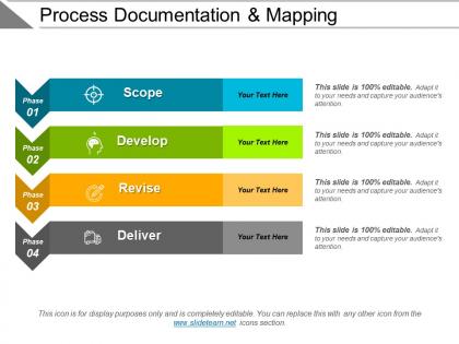
Create a clear picture of how a process and its parallel processes work with our process documentation and mapping PowerPoint templates. This presentation layout of process mapping has been created by our professional team members and offers a great way to understand all the steps needed to complete a workflow. With the help of this process map PPT layout, you can outline a series of end result produced by a workflow and how those steps can be improved. This process documentation PowerPoint slide can be used by employees or the managers as a reference point for repeatable processes to their successful operations. With this business process documentation template, you can visualize what people are doing at every level as documented processes facilitate formal training which allows for a smooth onboarding. This slideshow can be used for keeping track of a process, to showcase a reduction in time spent on tasks, improved efficiency, and Increase in customer and employee satisfaction. Check out this business process flow diagram. Our Process Documentation And Mapping Powerpoint Templates bring out the bare facts. They help filter out the available data.
People who downloaded this PowerPoint presentation also viewed the following :
Process documentation and mapping powerpoint templates with all 5 slides:
Add to the investigations with our Process Documentation And Mapping Powerpoint Templates. Assist folks in finding good clues.
FAQs for Process documentation and
Honestly, process mapping templates are a game changer. No more staring at blank pages trying to figure out where to start. The basic structure's already there - you just drop in your actual steps and decisions. Your team will thank you too since everyone's docs will look similar and make sense. Oh, and here's the cool part: seeing everything laid out visually makes those annoying bottlenecks super obvious. Like, stuff you'd miss in a paragraph jumps right out in a flowchart. Grab a simple template next time you're documenting something. You'll wonder why you didn't do it sooner.
Honestly, process mapping templates are kind of a game-changer for getting everyone on the same page. No more of those awkward meetings where nobody knows whose job it is to do whatever. You can actually see where things get stuck or where handoffs go wrong - which happens way more than you'd think. When Sarah went on maternity leave last year, we weren't totally lost because everything was already mapped out. The cool part is using them in team meetings to spot where you're doing duplicate work. Just pick one workflow that's been driving everyone crazy and start there.
So basically you need process steps, decision points, inputs/outputs, roles and timelines in there. Swimlanes are clutch for showing who's responsible for what - I literally always forget those but they're game changers. Mark your start/end points clearly, plus any systems you're using. Oh and leave space for noting risks or where things might get stuck. Keep it visual though, don't jam too much text in there or people's eyes will glaze over. Honestly, I'd start simple and then tweak it based on how complex your actual process is.
Honestly, process mapping is like giving everyone the same dictionary. No more of that telephone game nonsense where info gets totally mangled between departments. Marketing finally sees why IT takes forever - oh look, seven approval steps! Sales gets the full picture beyond just closing deals. The visual stuff makes bottlenecks super obvious to everyone. I'd start with whatever process touches the most teams first - that's where you'll see the biggest "aha" moments. It's pretty satisfying when people stop pointing fingers and actually understand each other's workflows for once.
Honestly, these templates are lifesavers for finding bottlenecks. Map out your whole process first - I always start there. You'll instantly see where stuff gets stuck or piles up. Handoffs between people? Total mess spots usually. Long approval chains always jump out too. Way easier than digging through boring documentation, trust me. Look for patterns - like that one step where everything always goes to die. Short sentences help you spot the obvious delays. Longer flows show you the subtle stuff that's harder to catch otherwise. Mark the pain points you already suspect so you can confirm if you're right.
So flowcharts are great for mapping out basic steps and decision points - pretty straightforward stuff. Swimlane diagrams basically take that and show who's responsible for what across different teams or departments. Honestly, they're lifesavers when you're dealing with those annoying handoff problems between groups. Value stream maps are where things get interesting though. They dig into timing, waste, and what actually adds value for customers throughout your whole process. Way more detailed than the other two. Here's how I'd think about it: flowcharts work for simple documentation, swimlanes when you need to clarify who does what, and value stream maps when you're really trying to optimize efficiency. Just figure out what problem you're solving first.
Honestly, just grab a basic template and start messing with it. Change the symbols, toss in your own decision points - whatever matches how your team actually does things. Templates are super generic (which can be annoying), so you'll definitely need to add your specific roles and approval steps. Delete boxes that don't make sense, throw in new swimlanes for different departments. I always end up completely rearranging them anyway. The whole point is making it match reality instead of cramming your process into some random framework. Start simple and just tweak as you go through each step.
Honestly, I'd go with Lucidchart first - their templates are solid and the interface just makes sense. Visio's got more bells and whistles for complicated stuff, but man, it's expensive and kinda clunky to learn. I always end up tweaking my flowcharts way more than I should in Lucidchart because it's so easy to use. Draw.io is totally free if you want something basic though. Start with Lucidchart's free trial and see if their template library has what you're looking for. No point dropping serious cash until you know it'll work for your needs.
Honestly, these templates are lifesavers for compliance stuff. When auditors come knocking, you can just show them exactly how everything flows - who does what, where the controls are, all that jazz. New people love them too because they can actually *see* the whole process instead of hunting through old emails or bugging everyone with questions. The consistency thing is huge - no more starting from scratch every time someone needs to document something. I'd definitely tackle your most critical compliance processes first, then work your way down. Way less headache than trying to do everything at once.
So process mapping templates are basically like taking a "before" photo of how things work right now. They help you document everything in a consistent way so you can actually spot where stuff gets stuck or wasted. Honestly, it's kind of eye-opening when you see it all laid out visually. Once you've mapped your current mess, you can use the same template format for your improved version - makes comparing the two way easier. Your team will stay focused on what matters since everyone's looking at the same format and talking about changes in the same way.
So process mapping basically lets you see where everything's going wrong with your timelines. You map out each step visually and boom - suddenly it's obvious where things get stuck or where team handoffs fall apart. Honestly, it's kind of crazy how much redundant stuff you'll find that nobody even knew was happening. The visual part is huge because then everyone can actually see what's really going on vs what they think is going on. My advice? Start with whatever process is driving you the most insane right now - that's where you'll get quick wins.
Honestly, these templates are everywhere - manufacturing uses them for production lines, healthcare for patient workflows, finance teams are totally obsessed with compliance mapping. Software dev teams love them too for tracking bugs and development processes. Pretty much any industry with repetitive processes benefits from them. The trick is finding ones made for your specific field instead of those boring generic templates. Healthcare ones are way different from manufacturing ones, you know? I'd definitely search for "[your industry] process mapping templates" first - you'll get way better results that actually make sense for what you're doing.
Ugh, the worst thing you can do is jam a messy process into some clean template that doesn't fit. I've seen people do this so many times - it looks organized but totally misses how things actually work. Don't go crazy with details right away either. Keep it high-level first or you'll confuse everyone. And definitely talk to the people who actually DO the work before finalizing anything. They always spot stuff you missed. Oh, and resist the urge to make it all fancy-looking before the content's even right. Just map what really happens (not what's supposed to happen) and clean it up later.
Honestly? Just bake the review process in from the start. Do quarterly check-ins where you actually sit with the people using these templates daily - trust me, they'll spot the outdated stuff way before management does. We had an onboarding doc that mentioned software we'd ditched months ago... super embarrassing. Set up some kind of system so people can report issues when they happen, not just wait for official review time. Oh, and make the updates feel normal, not like some giant project everyone wants to avoid. Small tweaks beat massive overhauls every time.
Track whatever problems your process mapping actually found - that's your starting point. Time stuff is key: cycle time, how long things take, lead time. Error rates and rework too. Cost per transaction will blow your mind honestly, tiny changes make huge differences. Don't forget employee happiness and customer scores since you're messing with their world. Stick to 3-5 metrics max or you'll drown in data. Get your baseline numbers first, then track for 90 days minimum. Seriously, start measuring now so you've got solid before/after proof.
-
Best Representation of topics, really appreciable.
-
Enough space for editing and adding your own content.