

Quarterly sales review powerpoint presentation with slides





Try Before you Buy Download Free Sample Product
 Impress Your
 Audience
 100%
100% Editable
 Save Hours
 of Time


Do you have a tight deadline to meet? Are you looking for a quick way to complete your quarterly sales review PPT presentation? We can help you out. For this we have conceptualized a complete PPT sample file to present sales performance review data in an appealing manner. With this PowerPoint slide deck sales executives can discuss their selling results as well as can also put emphasis on sales plans to hit the targets in next quarter. Apart from this, our PowerPoint show helps sales managers to cast spotlight on current market position of the company and ongoing market trends. In short, this PPT model proves handy for sales managers to maximize the performance of their team. Best part is that PPT slides of sales cycle, quarter track record, opportunity timeline, product wise pipeline analysis and many more like these support professionals to aptly illustrate their sales performance.
People who downloaded this PowerPoint presentation also viewed the following :
Content of this Powerpoint Presentation
The sales department is considered to be one of the most diligent departments across businesses. Especially, if the employees are paid predominantly in sales commissions, you’ll find them hustling, practically every second of the day. This is meant to ensure that they can get their numbers up on the chart and therefore confirm their wages (at least 80% of their take home is commission). This dedicated team gets their performance evaluated with a sales review. Be it for the overall team or the individual sales representatives, the results of the sale review are often determined by the number of successful transactions made from the new, existing, and returning customers. This department is functionally a fusion of three sub-sections namely: Lead generation, account executives, and the customer success. The respective functions being: spot potential customers, finalize purchase, and do everything in their power to retain customers.
A sales review evaluates performance in these areas and recognizes key performers/teams to attribute this success to them. When such a review is conducted for three business months (calendar or fiscal-wise) the evaluation is titled as a Quarterly sales review. It is, thus, an important assessment marking sales achievements during this time.
Explore this colorful take on quarterly sales review presentation rich in diagrams and graphs.
Every organization will have its unique mode of evaluating and awarding best sales performances for a quarterly review. Organizations can set specific sales goals that vary quarterly. Whether it is acquiring new leads, retaining customers, establishing presence in new markets, or as specific as crossing certain numbers in transactions or overall revenue, the objectives will be specific to organizations at specific moments. However, underneath the goals setting, the basic framework will be the same. Data will be collected for three months, compared against a standard, performances tallied, and the company’s revenue charts plotted. Such a sales review will also form the basis for business strategies. SlideTeam, the top resident for professional PPT Templates has designated this complete deck presentation for the sales team to evaluate how they fared in a particular quarter. Not only can you report progress, you can establish criteria for assessment of each quarter, define evaluating teams, and devise commissions for individual members with it. Hurry, let’s explore the details of this complete deck PPT Presentation.
Template 1: Quarterly Pipeline Summary
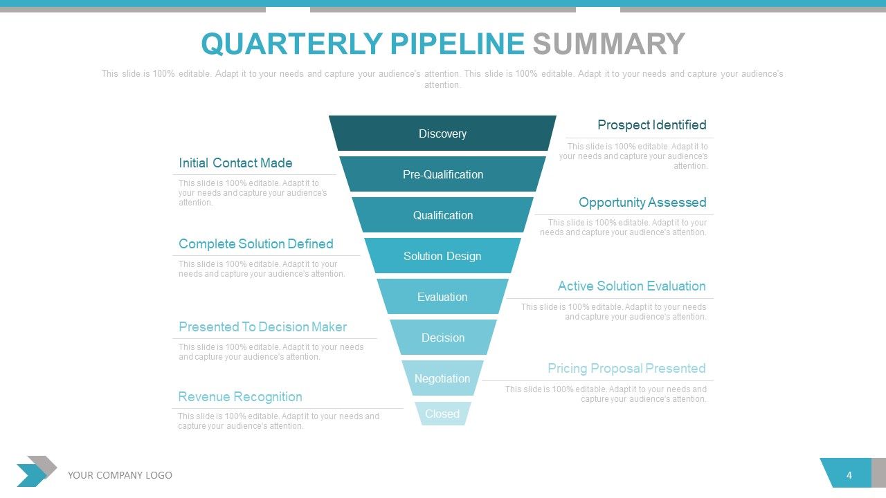
Use this pipeline diagram to outline steps involved in the sales process that were followed in the business quarter. Identify intermediate steps in closing deals right from the first step of prospect identification. Use the color gradience to structure and provide a direction for the flow of these steps. List the eight steps, as shown, till the process culminates in revenue collection.
Template 2: Sales Cycle

Share a snapshot of the sales cycle that was followed during the quarter. Use this PPT Diagram to identify steps like awareness, consideration, purchase,service, and loyalty as you inform and onboard new prospects into your sales cycle during that quarter.
Template 3: Key Sales Performance Metrics
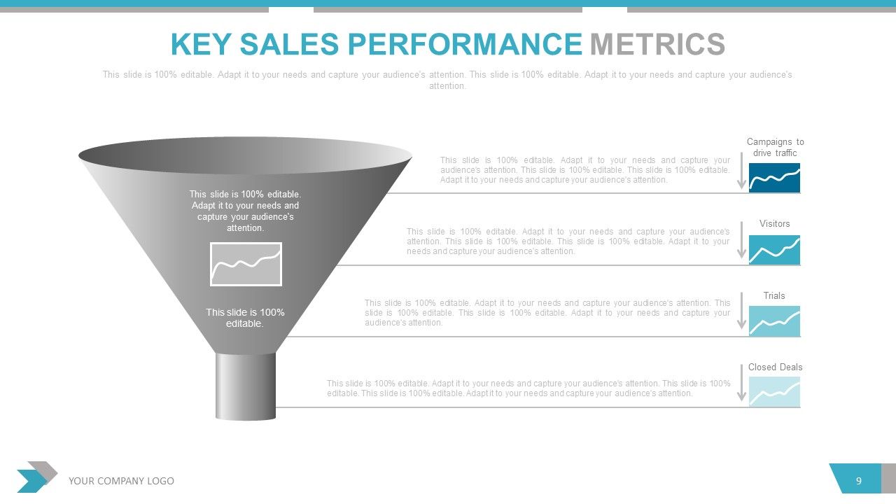
Use this funnel-structure PPT Layout to enlist metrics you want to use to measure success in your sales activities. Identify sets of parameters that leads are subjected to, before these qualify as potential customers or for audiences to fall under the category of prospective leads. Identify the qualification metrics along with their alignment in this process using this 100% editable and customizable PPT Diagram.
Template 4: Opportunity Score
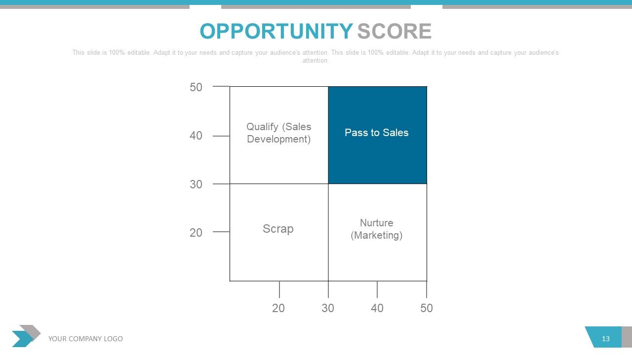
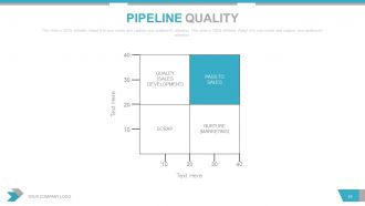
Use this matrix diagram to identify lead opportunities and parameters that qualify them as one. Determine the two variables to further distinguish prospects into quantifiable leads, scraps, those to be nurtured, and the ones to be passed onto sales for more steps.
Template 5: Win-Loss Review
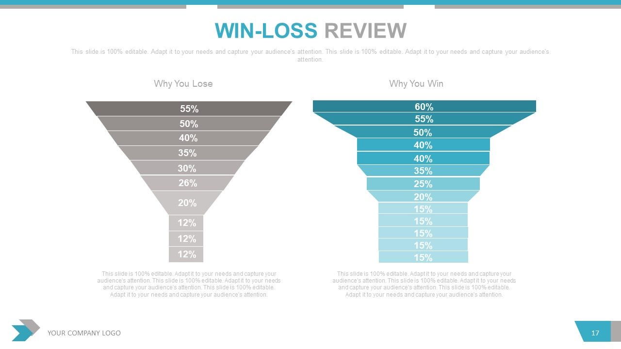
In your quarterly sales review, this win-loss analysis template will be essential to identify factors that resulted in success in your sales operations. Identify their contribution to success or failure using this funnel diagram and depict the same with a percentage value as shown. Use color coding to distinguish successful techniques from the ones that made you lose.
Template 6: Key Sales Initiatives
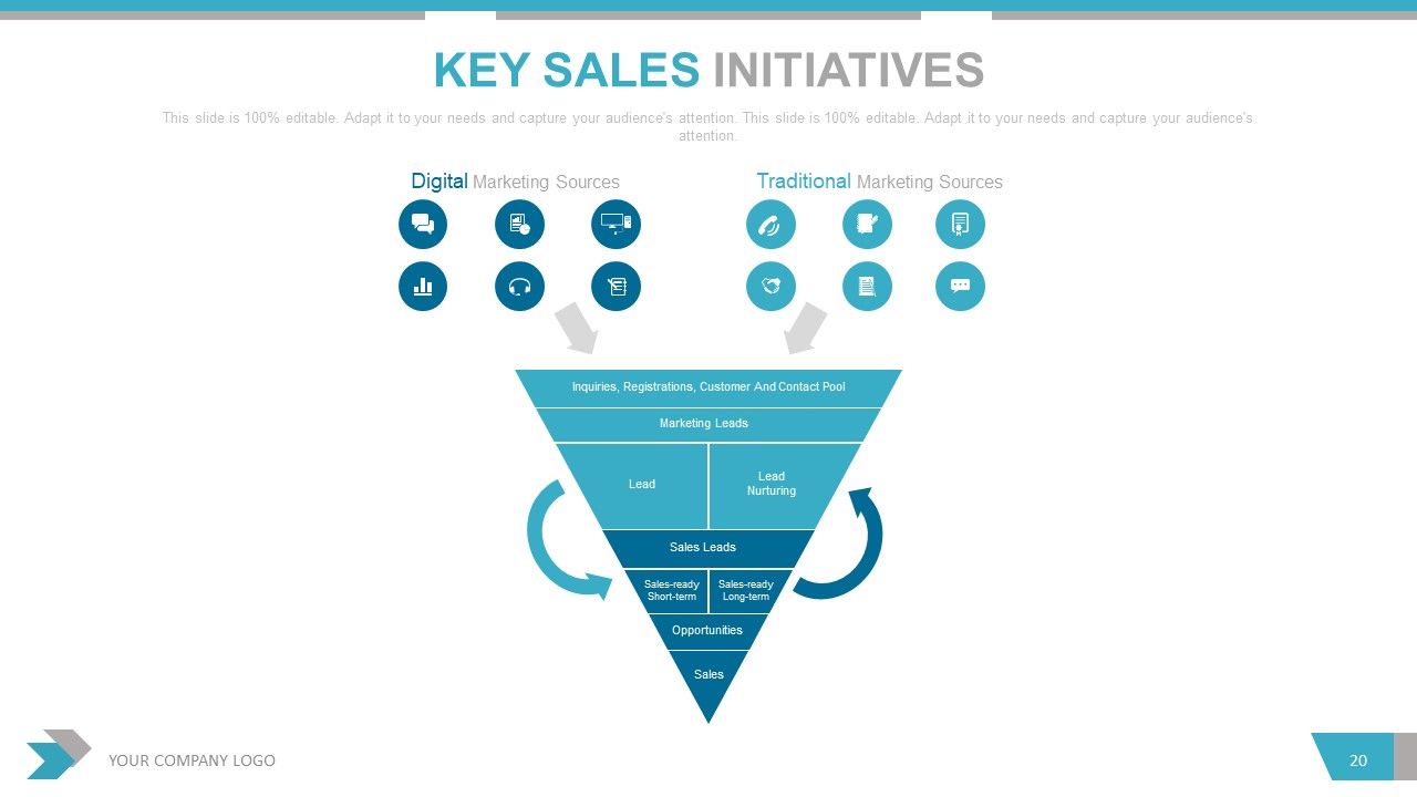
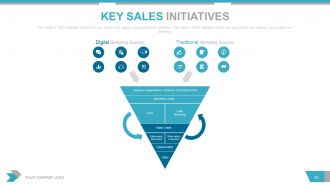
List the key initiatives taken during the quarter with this PPT Template. Mention the digital and traditional sources employed and their importance in the sales funnel. Demonstrate the interlink between each step of the sales funnel. Deploy icons and graphics of this PPT Layout to add a visual appeal to your demonstration.
Template 7: Sales Rep KPI Tracker

Once you have shared your strategies and techniques, provide a snapshot of your performance, especially that of your sales reps. Mention their success rates in cold calling, acquiring leads, converting leads, and creating loyal customer base. Mention the success rates in terms of numbers as shown.
Template 8: Partner Sales

Highlight specific sales partners that your business has explored in the last quarter using this PPT Layout. Mention those channels, mediums, and agencies with the cloud-design as shown. Further, you can discuss the nature of those partnerships like incentive programs, promotions, deal registrations, etc to also justify the expenses and audience reach.
Template 9: Sales Process Map

Summarize the main idea of a sales funnel and the specific techniques that were employed in the last quarter with this PPT Slide. Focus on the percentage of lead conversion into purchasing customers by sharing its details and also visually representing it with the diagram, as depicted. State the effectiveness of your sales funnel with this visually-appealing PPT Layout.
Template 10: BCG Matrix
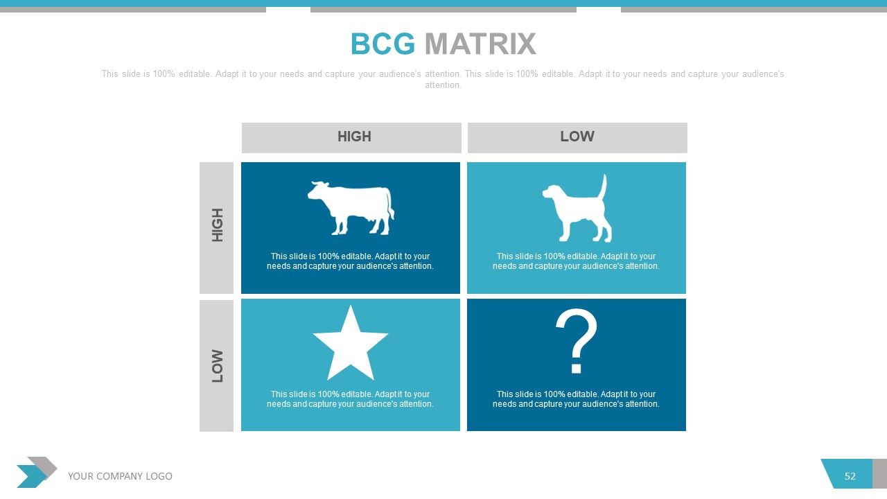
A BCG matrix in your sales review will help you evaluate customers, leads, and target audience to differentiate them into the four regions important for any business. Are these factors dead-ends (dog), resource-exhausting(star), profitable(cash cow), or unprecedented reservoir (question mark)? Determine their nature and the percentage under each of these sections using this PPT Diagram.
INSIGHTS MATTER!
And that’s how you prepare and submit an insightful sales review by including more than just numbers and statistics. It will help your audience not only evaluate success trends, but also understand the background processes and methods of assessment. Your evaluation report will be more clear and easy to follow.
PS: Looking for a more graphical PPT Presentation to share aspects of your sales review? Here’s our best bet.
Quarterly sales review powerpoint presentation with slides with all 67 slides:
Our Quarterly Sales Review Complete Powerpoint Deck With Slides ensure you don't ever lose heart. They give you the courage to continue fighting.
-

Quarterly Sales Review
-
Agenda Slide
-
Our Team
-
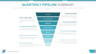
Quarterly Pipeline Summary
-
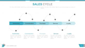
Sales Cycle
-
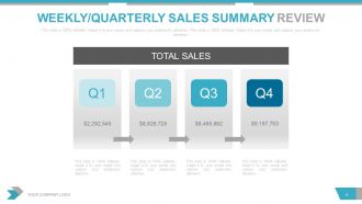
Weekly Quarterly Sales Summary Review
-
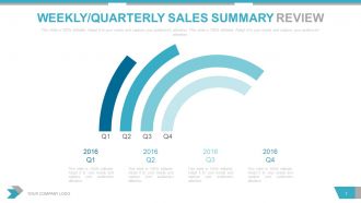
Weekly Quarterly Sales Summary Review
-
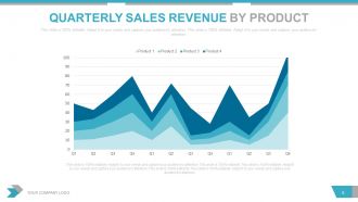
Quarterly Sales Revenue by Product
-
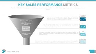
Key Sales Performance Metrics
-
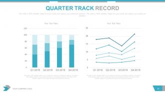
Quarter Track Record
-
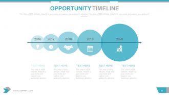
Opportunity Timeline
-
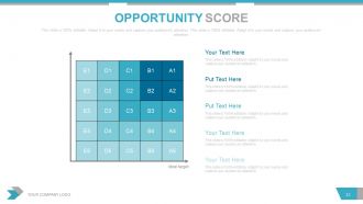
Opportunity Score
-
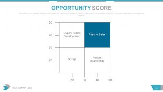
Opportunity Score
-
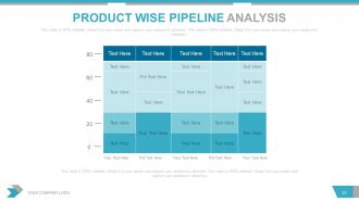
Product Wise Pipeline Analysis
-
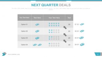
Next Quarter Deals
-
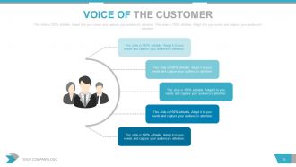
Voice of the Customer
-
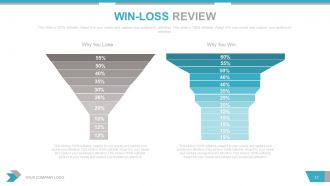
Win Loss Review
-
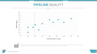
Pipeline Quality
-
Pipeline Quality
-
Key Sales Initiatives
-

Key Sales Initiatives
-
Forecast Accuracy
-
Forecast Accuracy
-

Current Quarter Portfolio
-
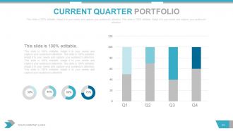
Current Quarter Portfolio
-
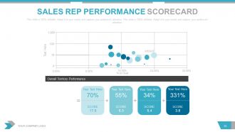
Sales Rep Performance Scorecard
-
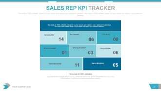
Sales Rep KPI Tracker
-
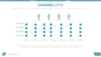
CHANNEL KPIS
-
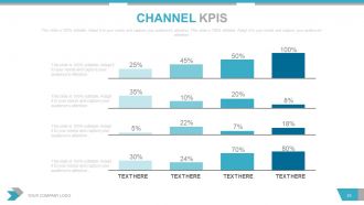
CHANNEL KPIS
-
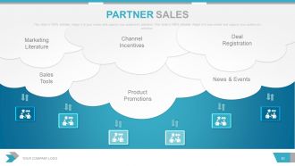
Partner Sales
-
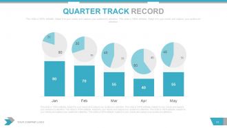
Quarter Track Record
-
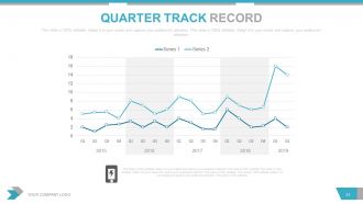
Quarter Track Record
-
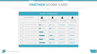
Partner Score Card
-
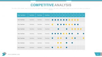
Competitive Analysis
-
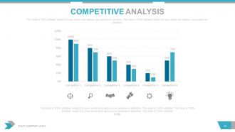
Competitive Analysis
-
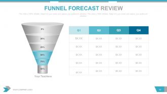
Funnel Forecast Review
-
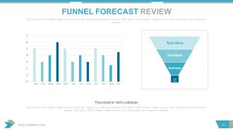
Funnel Forecast Review
-
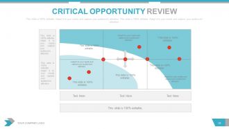
Critical Opportunity Review
-
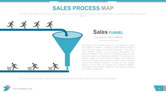
Sales Process Map
-

Sales Process Map
-
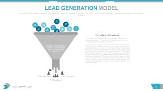
Lead Generation Model
-
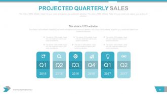
Projected Quarterly Sales
-

Projected Quarterly Sales
-
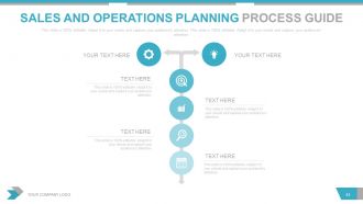
Sales and Operations Planning Process Guide
-
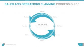
Sales and Operations Planning Process Guide
-
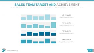
Sales Team Target and Achievement
-
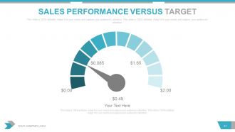
Sales Performance Versus Target
-
Critical Notes
-

Quarterly Sales Review Complete with
-
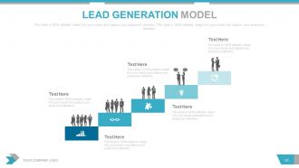
Lead Generation Model
-
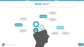
Mind Map
-

BCG Matrix
-
BUSINESS PEOPLE WITH WORLD MAP
-
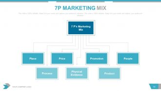
7P Marketing Mix
-
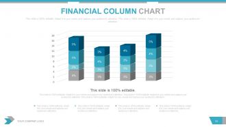
Financial Column Chart
-
Business Infographic
-
Gear with Magnify
-
Target with Arrow
-
Segmentation
-
New Market Location
-
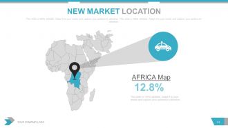
New Market Location
-
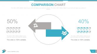
Comparison Chart
-
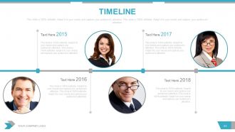
Timeline
-
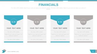
Financials
-

About US
-

Quarterly Sales Review Complete with
-

Thank You
FAQs for Quarterly sales review powerpoint
Start with the big stuff - total revenue, units sold, how you're tracking against quarterly goals. Conversion rates are gold because execs eat that funnel data up. Always include year-over-year comparisons and your top performing products or regions. Any huge deals that really made a difference? Mention those. If you're subscription-based, churn rates matter. Oh, and pipeline health for next quarter is pretty much mandatory. Honestly, the biggest thing is weaving it all into a story rather than just rattling off numbers. Practice connecting everything beforehand so you don't sound like you're reading a grocery list.
Honestly, turning your sales data into charts and graphs is a game changer. Those endless spreadsheet rows? Total nightmare to make sense of. But with visuals, you'll spot trends and seasonal patterns instantly - like which products are tanking or which regions are crushing it. Way easier to present to your boss too (they love pretty charts, trust me). Bar graphs and line charts are your best friends here. I used to waste hours staring at numbers trying to find patterns. Now dashboards do the heavy lifting and you can actually focus on fixing problems instead of just finding them.
Honestly, start by comparing your actual numbers to what you were targeting. Break it down by territory, product line, and how each rep is doing individually. Conversion rates and average deal size will tell you a lot - plus how long your sales cycles are running. Lost deals are gold mines for insights, trust me on that one. I'd also compare this quarter to the same time last year to catch any trends. Talk to your reps directly about what's blocking them. Oh, and set up a simple dashboard with these metrics so you can quickly spot patterns next quarter without digging through spreadsheets again.
Start by digging through your numbers to find exactly where things went wrong - which products flopped, what customer segments you whiffed on, pipeline bottlenecks. Honestly the data dive is kind of a pain but you'll thank yourself later. Then build specific goals around those problem areas. Don't just say "sell more enterprise stuff." Instead try something like "15 enterprise discovery calls per month with 25% conversion." I learned this the hard way - vague goals are basically useless. Each target should connect directly to whatever your review uncovered, with metrics you can actually track.
Look, competitive analysis is basically your quarterly reality check - shows you where you actually stand vs where you think you do. Compare your pricing, win rates, and market share against the big players. Sometimes it's brutal honestly, but you'll spot which competitors are stealing your deals and what messaging actually works with prospects. The data's only useful if you act on it though - adjust your positioning and sales approach for next quarter. Don't just file it away and pretend everything's fine. It's one of those exercises that can totally shift your strategy if you let it.
Start with where you totally missed vs. crushed your targets - that's where the real insights are hiding. I'm a total data nerd about this stuff, but honestly it's the only way to figure out what went wrong with your assumptions. Maybe you were way too optimistic about conversion rates, or that new competitor hit harder than expected. Don't just tweak random numbers though. Update the actual assumptions behind your model - like if seasonal trends were different than you thought, or customer behavior shifted. That way your future forecasts won't keep making the same mistakes.
Focus on revenue growth, pipeline health, and how you're hitting goals - that's what everyone actually cares about. Make it a story, not just random numbers thrown at a wall. Charts help a ton, and always show how this quarter stacks up against last quarter and your targets. One point per slide or people tune out completely. Oh, and definitely have solid explanations ready for both your wins and the stuff that didn't go great, plus what you're doing next quarter to fix it.
Grab your survey data, support tickets, and sales convos to spot patterns that mess with revenue. NPS scores are gold - sometimes they completely contradict what your sales numbers show, which is honestly fascinating. Break down feedback by customer type or product so you can see where happy customers actually buy more. Build a simple dashboard that puts feedback themes right next to your sales metrics. Make it visual because nobody wants to dig through spreadsheets. Your team needs to quickly see how customer mood affects deals and whether people stick around.
Ugh, the data collection is absolutely brutal - you're pulling stuff from like 5 different systems that never talk to each other. Plus your reps suddenly remember they haven't updated their pipeline in forever (classic). Managing time gets crazy because you're analyzing last quarter while trying not to tank this month's numbers. Leadership wants everything to sound amazing, but you gotta be honest about what actually bombed. Oh, and the pressure to make pretty charts when your CRM looks like a dumpster fire? Fun times. Start collecting data way early though - seriously, like two weeks before. Makes everything way less painful.
Dude, get yourself a decent CRM like Salesforce or HubSpot - they'll pull all your pipeline data without you lifting a finger. BI tools are game-changers too for dashboards that don't look like garbage. I'm telling you, I used to waste entire weekends drowning in Excel before we figured this out. Automated reports track your KPIs constantly, so no more panic mode right before reviews. Figure out what manual stuff kills your time first. Then hunt down tools that handle those exact headaches. Worth every penny, trust me.
Honestly, you should loop in other teams for your sales reviews. Marketing knows which campaigns actually brought in those Q3 leads. Product can tell you why features hit or completely bombed. Customer success? They'll warn you which deals might bail next quarter. Finance spots the patterns in deal sizes too. Instead of staring at spreadsheets alone, you get the real story. I'd start small - maybe grab one person from marketing and someone from product for your next review. Trust me, the context they bring is pretty eye-opening. Way better than guessing what happened behind the numbers.
The biggest mistakes? First, cramming every single metric onto your slides - seriously, your audience will check out immediately. Pick maybe 3-5 numbers that actually matter. Second thing is forgetting to tell a story. Don't just show data, explain what happened and why. Oh, and this one drives me crazy - people forget the "so what" piece. Always connect your numbers to what it means for the business or what you're doing next. Like, cool, your conversion rate went up 12%... now what? Practice out loud beforehand too. You'll catch weird parts that sound fine in your head but confusing when spoken.
Honestly, just look at what actually worked last quarter vs what you *thought* would work. Those big wins? Figure out how to do more of that - same tactics, channels, whatever. The stuff that flopped is just as useful though, shows you where to cut your losses. I get it, new shiny strategies are tempting, but your own data beats everything else. Put your money behind scaling what worked and maybe test some fixes for the weak spots. Oh, and track the same stuff so you can actually compare progress - sounds obvious but you'd be surprised how many people mess that up.
Honestly, I'd focus on customer lifetime value velocity and how fast you're compressing sales cycles - way more telling than basic revenue numbers. Pipeline velocity is huge too since it shows deal momentum through each stage. Win/loss ratios broken down by competitor? That's where you find the real gold, trust me. Oh, and track your team's activity-to-outcome ratios plus deal size trends quarter-over-quarter. Those old quota metrics are fine but they're backwards-looking. These actually help you see what's coming. Just pick 2-3 to start though - don't go crazy with your dashboard.
Okay so here's what works - turn your quarterly presentation into an actual story. Open with "This quarter we set out to..." instead of jumping straight into boring charts. Walk them through the challenge you faced, then how you dealt with obstacles and wins. Customer examples are gold here, way better than just throwing numbers at people. I swear, nobody remembers raw data anyway. Frame your metrics like plot points in the story. Short punchy sections work better than endless slides. End with where you landed and what's coming next quarter.
-
Awesome use of colors and designs in product templates.
-
Illustrative design with editable content. Exceptional value for money. Highly pleased with the product.