


Safety Key Performance Indicator Dashboard Snapshot With Hazard Ratings




Try Before you Buy Download Free Sample Product
 Impress Your
 Audience
 100%
100% Editable
 Save Hours
 of Time


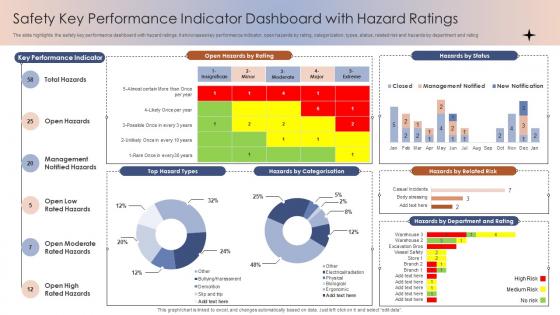
The slide highlights the safety key performance dashboard snapshot with hazard ratings. It showcases key performance indicator, open hazards by rating, categorization, types, status, related risk and hazards by department and rating
People who downloaded this PowerPoint presentation also viewed the following :
Safety Key Performance Indicator Dashboard Snapshot With Hazard Ratings with all 7 slides:
Use our Safety Key Performance Indicator Dashboard Snapshot With Hazard Ratings to effectively help you save your valuable time. They are readymade to fit into any presentation structure.





FAQs for Safety Key Performance Indicator Dashboard Snapshot
Definitely start with TRIR and DART - those are your bread and butter metrics. TRIR shows your total recordable incidents, DART tracks days away/restricted duty stuff. Near-miss reporting frequency is huge too, probably more than people realize. Lost Time Injury Frequency will literally stress you out when it spikes, but you gotta watch it. Oh, and don't ignore the leading indicators like training completion rates and how many hazards people are actually identifying. Those help you spot trouble before someone ends up in the ER. Focus on TRIR and DART first though if you're just starting out.
Set up different dashboards for each type. Leading stuff like safety training and near-miss reports should be tracked weekly or monthly since they predict what's coming. Lagging indicators (injury rates, lost-time accidents) work fine quarterly or annually. Here's the thing though - make sure your leading metrics actually matter. I've seen companies track random nonsense just to fill spreadsheets. Pick 3-4 leading indicators your team can actually control and review them in safety meetings. Honestly, correlation is everything here. Start small, don't overthink it, then expand once you've got the rhythm down.
Honestly, training your people well is huge for safety numbers. When they actually get the procedures and care about outcomes, incidents drop but near-miss reports go up - which is weird but good since they're catching stuff early. I've watched engaged employees turn into total safety advocates on the floor, it's pretty cool to see. Don't just do generic compliance training though, that's useless. Ask your team what they're actually struggling with day-to-day first. Then build training around those real problems they face.
So IoT sensors and wearables can track everything from air quality to how workers move around - gives you real-time data instead of guessing. Mobile apps let people report incidents right away rather than dealing with paperwork later (honestly such a game changer). AI analytics will catch patterns you'd totally miss and actually predict hazards before they happen. Digital dashboards put all your metrics in one place so teams can actually see what's going on. I'd start by figuring out where your data collection sucks the most, then just pilot one solution. You'll notice better accuracy and faster response times pretty much immediately.
Oh man, the classic mistake? Companies obsess over injury rates and stuff that already happened - total waste. Pick like 3-5 metrics max, seriously. More than that and people tune out completely. Mix some forward-looking things (training completion rates) with your usual backwards stuff. But here's the key part - your actual workers need to understand how they affect these numbers. If Jim on the factory floor can't connect his daily tasks to your fancy dashboard, you've already lost. I've seen places with 20+ safety KPIs and honestly? Nobody cares about any of them at that point.
Yeah, safety KPIs totally depend on what kind of work you're doing. Construction sites worry about falls and equipment breaking down - makes sense since that's what kills people there. Manufacturing is all about machine injuries and chemical stuff. Healthcare? Completely different world. They track needle sticks and weirdly enough, workplace violence (which honestly shouldn't be a thing but here we are). Everyone uses OSHA recordables as their starting point though. Just pick metrics that match whatever could actually hurt your workers, not some random template you found online.
Look, when you track safety metrics the right way, people actually start caring more about looking out for each other. They see you're not just talking - you actually give a damn about keeping them safe. But here's the thing that drives me crazy: some companies only look at injuries after they happen, or worse, they punish teams for reporting stuff. That just makes everyone clam up. Nobody wants to be the one who breaks the "zero incidents" streak, right? Focus on near-misses instead. Celebrate the wins publicly and turn close calls into learning opportunities rather than pointing fingers.
Here's what I'd do - first, tie your safety KPIs straight to whatever your company's big goals are. Like if you're cutting incidents by 20%, spell out how that helps operational excellence. Get the higher-ups on board early because they're the ones with the money and people you need. I've watched so many safety metrics turn into total garbage when they don't connect to what executives actually give a damn about. Oh, and review them every quarter since business priorities change constantly. Bottom line: your safety numbers need to tell a story about company success, not just checking compliance boxes.
Check out industry trade groups first - they usually publish safety stats annually, though some are way better at keeping things updated than others. OSHA's databases are solid for injury data too. Compare your TRIR and DART rates against similar-sized companies in your space. Here's the thing though - don't just trust the numbers at face value. Definitely hit up your network and ask how they're actually calculating these metrics. I've seen organizations define "near miss" in completely different ways, which makes comparisons pretty useless. Specialized benchmarking services exist too if you want to get fancy about it.
Near-miss reporting is your early warning system for safety stuff. You get to spot potential accidents before they actually happen, which is way better than waiting around for the real thing. Here's the deal - for every serious accident, there's probably dozens of near-misses that happened first. So tracking these gives you a much bigger picture of what's going wrong. You can catch hazard patterns and fix problems before someone gets hurt. The tricky part? Your team has to feel safe reporting near-misses without getting blamed. Otherwise nobody's gonna tell you anything useful and your whole system falls apart.
Dashboards are a total game-changer for safety metrics. Charts and heat maps beat staring at endless spreadsheet rows any day. You'll spot trends super fast - like when one department's incidents start climbing or injury rates shift. Leadership meetings become way smoother too since everyone gets the story instantly from visuals. Honestly, I've sat through way too many meetings where people squint at data tables trying to figure out what's happening. Bar charts for incident counts work great as a starting point. Trend lines are solid for tracking changes over time. Even basic graphs make everything clearer than raw numbers.
Don't just look at the big picture numbers - break your KPI data down by department, shift, whatever makes sense. When incidents jump 15%, that's useless without context. What you really need is to spot the patterns: maybe spikes happen after missed training or things improve when you upgrade equipment. Get your frontline supervisors involved in regular data reviews since they actually know what's happening on the ground. Honestly, the best insights come from mixing your data trends with real feedback from the team. Oh, and set up alerts for when things go sideways so you're not always playing catch-up.
Quarterly reviews are the bare minimum, but monthly's way better if you can manage it. The whole idea is spotting trends early - wait too long and you're just playing catch-up. I'd throw in an annual deep-dive too where you actually question if you're tracking the right stuff. Sometimes last year's "critical" metrics turn out to be pretty useless. Focus on leading indicators especially since lagging ones like incident rates just tell you what already happened (which, duh). Oh and set those calendar reminders now because you'll totally forget otherwise.
Look, leadership commitment will make or break your safety KPIs - I've watched this play out so many times. Your leaders need to actually show up and put money behind these programs, not just talk a good game. Otherwise people see right through it and stop caring about the numbers entirely. The difference is huge when executives genuinely participate in safety reviews and ask hard questions about what the data means. Like, actually dig into why incident rates went up last quarter instead of just nodding along. Programs crash and burn when leadership treats safety metrics like some HR checkbox thing. Make sure your bosses understand these numbers should drive real business decisions, you know?
Honestly, just ask your people directly what they think matters. Run surveys and focus groups - they're dealing with the actual hazards every day, so they'll know what's worth tracking. Get them involved in safety meetings where they can flag near-misses and tell you what's stopping them from reporting stuff. I'd also have them review your current metrics because half of them are probably just box-checking nonsense anyway. The trick is actually listening and following up, not just collecting their input and vanishing. Oh, and ask what safety changes would actually help them - that's where the good ideas come from.
-
“You have the structure in place that are easy to explore new opportunities.I will be recommending your services to other people.”
-
Content of slide is easy to understand and edit.