


Tax powerpoint ppt template bundles


Try Before you Buy Download Free Sample Product
 Impress Your
 Audience
Editable
of Time


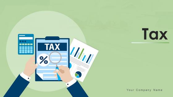
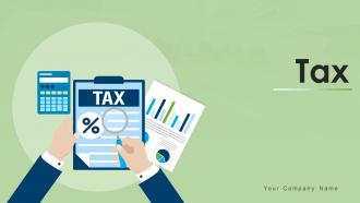
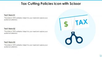
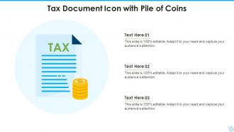
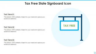
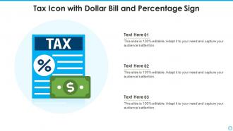
Our Tax Powerpoint Ppt Template Bundles are topically designed to provide an attractive backdrop to any subject. Use them to look like a presentation pro.
People who downloaded this PowerPoint presentation also viewed the following :
Tax powerpoint ppt template bundles with all 17 slides:
Use our Tax Powerpoint Ppt Template Bundles to effectively help you save your valuable time. They are readymade to fit into any presentation structure.


FAQs for Tax powerpoint
Start with an exec summary, then break everything into buckets - income, deductions, credits, estimated payments. Charts are your friend here because spreadsheets make people's eyes glaze over. Don't forget action items with actual deadlines. I always add a methodology section so people can follow my thinking (covers your ass too). End each part with "here's what this means for you" - trust me on this. Oh, and build in some blank Q&A slides. You'll get the same three questions every single time.
Honestly, I just make two different templates and tweak from there. Individual clients get simple language and visual stuff like tax bracket charts - focus on deductions they actually use. Corporate ones need way more technical details, industry examples, and all those tax code references they love. Here's what works: test your regular client template on family first. If your spouse looks confused, it's too complicated. I keep separate slide libraries for each type because rebuilding every time is such a pain. The corporate crowd wants numbers and data, while individuals just want to know what affects their wallet. Makes the whole process way faster once you get the system down.
Honestly, flowcharts are lifesavers for tax stuff - people actually get the step-by-step process instead of getting lost. Side-by-side comparisons work really well too, like showing before/after tax scenarios. Way better than just rattling off numbers, you know? Charts for tax brackets make everything click. I've seen people's eyes glaze over until you throw up a simple visual comparison. Infographics can even make compliance topics somewhat interesting (shocking, I know). Just don't cram everything onto one slide - that's where people mess up. Clean visuals win every time. Start with one strong chart per main point and you'll be golden.
Templates are total lifesavers - they build in all the compliance stuff you need for different places right from the get-go. Pre-load them with mandatory disclosures, required calcs, local formatting rules. That way you're not panicking later trying to remember every single regulation. Your whole team stays consistent too, which honestly saves so much headache. When rules change, just update the template once and boom - everyone's automatically using the new requirements. I'd make separate ones for each major jurisdiction you work with regularly. Way easier than starting from scratch every time.
Honestly, infographics are perfect for tax stuff because nobody wants to look at boring spreadsheets all day. Your audience will actually pay attention when you turn those numbers into charts and visual comparisons instead. Like, I'd way rather see a pie chart than rows of deduction percentages – wouldn't you? Pick your three biggest points first and make those visual. Bar charts work great for this. You can still keep the detailed stuff in regular format, but lead with the visuals. People just absorb information better that way. Trust me, they'll be way more engaged.
Honestly, just go with Power BI or Tableau - they'll connect straight to your tax software's API. Set up your templates to pull live data so you're not copying numbers by hand like some kind of caveman. Build in validation checks too, and maybe keep some backup snapshots around because technology always fails at the worst possible moment. Oh and definitely create a refresh schedule so people know when they're looking at current vs old data. I'd start with just one template first though - don't go crazy rolling this out everywhere until you know it works.
Honestly, you'll want something with clear sections - overview, key changes, deadlines, that sort of thing. I always look for templates with comparison charts because showing before/after scenarios is way easier than just talking through everything. Timeline sections are clutch too for implementation dates. The visual stuff actually matters more than you'd think - people zone out fast with tax jargon otherwise. Oh, and make sure it highlights what's actually new versus what didn't change. Trust me, that formatting consistency will save you tons of time when you're presenting the latest IRS mess to clients.
Okay so here's what works for me - pick a real client story and build your whole presentation around it. Like "Meet Sarah, she owns a bakery and here's the mess she was in..." Way more engaging than jumping into boring deduction lists right away. Walk them through her actual timeline - what went wrong, how you fixed it, the before/after numbers. People remember stories, not bullet points. I mean, tax stuff is already dry enough as it is! Frame those complicated regulations as plot points in their journey. Trust me, your audience will actually stay awake when there's a relatable character going through the same problems they face.
Honestly, less is more with tax presentations - people's brains shut off the second they see walls of text. Use tons of white space and stick to maybe 2 fonts max. Put your most important stuff right at the top where they'll actually see it. Charts beat paragraphs every single time, trust me on this. Bold headers help people scan through without wanting to cry. Pick colors that won't fight with your graphs either. Oh and definitely run it by someone else first - you'll miss obvious layout problems when you've been staring at it too long. Makes such a difference.
Honestly, those templates are a lifesaver for tax training. Complex compliance stuff gets broken down into actual digestible chunks instead of making everyone's brain melt. Your prep time basically disappears since the structure's already done for you. Everyone gets the same info whether they're in accounting or wherever. The best part? When tax rules inevitably change (ugh), you just update the template. I'd definitely throw in some company-specific examples though - makes it way more relatable than generic scenarios. Trust me, good visuals are the only thing standing between you and a room full of glazed-over faces.
Get templates with modular pieces you can swap out when tax laws shift. Consistent formatting is key, plus placeholder text boxes and version control - seriously, presenting outdated rates is embarrassing. The good ones have linked data tables so updating one number cascades everywhere automatically. Check they work with your team's software first. Clear labeling for different scenarios helps too, though honestly most templates are terrible at this. Test how fast you can update a sample with current year changes before committing to anything.
Honestly, templates are a game changer for team presentations. Your whole crew stays on the same page format-wise, so nobody's scrambling to figure out weird layouts. Makes dividing up sections super easy too - like, Sarah can handle depreciation while you work on deductions, and everything still looks cohesive. Clients won't get distracted by mismatched slides when different people present. We learned this the hard way last year (what a mess that was). Pick one template and stick with it. Trust me, your prep meetings will fly by way faster, and you'll actually have time to grab coffee before the client shows up.
Hey! So first thing - make sure there's good contrast between your text and background colors. Don't rely just on color to show important stuff since some people can't tell reds from greens apart. Sans-serif fonts work best, at least 12pt. Charts need alt text descriptions - tax stuff is super visual so this matters. Your templates should play nice with screen readers too, which means using proper headings and decent link descriptions. The IRS has some guidelines that aren't terrible if you want specifics. Honestly though? Just run your template through a screen reader yourself and you'll catch most problems.
Honestly, case studies are a game changer for tax stuff. People actually *get* it when you show them how a real small business dealt with depreciation instead of just explaining the rules. Those boring regulation lectures? Ugh, nobody remembers that crap. But tell a story about navigating tricky deductions, and suddenly they're picturing their own situation. The stories stick in your brain way better - like mental bookmarks you can find later when you're drowning in tax forms. I'd throw in maybe 2-3 quick examples for each big concept you cover.
Dude, interactive stuff is a game changer for tax presentations. People actually stay awake! Clickable charts and hover definitions let them dig into data without getting overwhelmed by everything at once. I always throw in polls and Q&A sections - tax material is boring enough as it is, right? Your clients can play around with different scenarios and watch the numbers change in real time, which honestly helps them "get it" way more than just talking at them. Even just 2-3 interactive features will make a huge difference. Trust me on this one.
-
Qualitative and comprehensive slides.
-
Very unique, user-friendly presentation interface.