


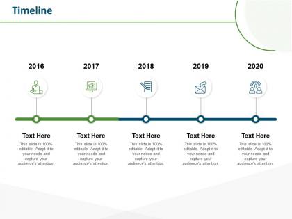
Timeline 2016 to 2020 m70 ppt powerpoint presentation gallery smartart


Try Before you Buy Download Free Sample Product
 Impress Your
 Audience
Editable
of Time


Our Timeline 2016 To 2020 M70 Ppt Powerpoint Presentation Gallery Smartart are explicit and effective. They combine clarity and concise expression.
People who downloaded this PowerPoint presentation also viewed the following :
Timeline 2016 to 2020 m70 ppt powerpoint presentation gallery smartart with all 2 slides:
Give your audience a fulfilling experience. They will find our Timeline 2016 To 2020 M70 Ppt Powerpoint Presentation Gallery Smartart elevating.

FAQs for Timeline 2016 to 2020 m70 ppt powerpoint
You'll want clear dates, major events, and everything flowing left to right (or top to bottom works too). Space your dates evenly - seriously, wonky spacing makes timelines look amateur. Brief descriptions for each milestone are crucial so people aren't left guessing what actually happened. Keep text short but detailed enough to tell the story. Oh, and consistent colors/fonts make a huge difference in looking professional. One thing I always do? Step back and check if you can read it from across the room before calling it done.
Honestly, timelines are a game-changer for presentations. They turn your content into an actual story instead of just throwing random info at people. Your audience gets a clear roadmap to follow from start to finish. You can build suspense by revealing things chronologically, and it's so much easier to show how one thing led to another. I've seen too many presentations where people just zone out completely. But with timelines? They actually remember the key points. Works great for showing project evolution, company milestones, problem-solving steps - whatever. The visual flow keeps everyone engaged and makes complex stuff way more digestible.
Honestly depends what you're going for. If you already know diagramming tools, Lucidchart and Visio give you tons of control. Timeline JS is my favorite for web stuff - the media integration looks super clean. PowerPoint works fine too if you just need something quick. Aeon Timeline's solid for complex project planning, though I haven't used it in forever. Start with whatever you know best first, then switch if you hit limitations. Even Google Slides can look decent with the right template.
Honestly, it depends totally on what field you're in. Education moves slow - they plan stuff out by semesters or whole school years. Marketing? That's the opposite. Campaigns happen in weeks, social posts get planned day by day, and you're constantly switching things up based on what's working. Healthcare follows patient schedules, construction projects drag on forever (my cousin's been working on the same office building for like two years). The trick is figuring out how your industry actually works instead of trying to force some cookie-cutter approach that doesn't fit.
Honestly, icons and color coding make such a huge difference - way better than those boring text-only timelines nobody wants to read. Try mixing up the layout too, like zigzag patterns instead of straight lines. Photos work if they actually relate to your content (not just random stock images lol). Different font sizes help create visual hierarchy, and background shapes add some nice depth. Oh, and maybe throw in subtle animations if you're feeling fancy? Just don't go overboard - stick to 2-3 elements max or it'll look like a mess.
Don't cram everything onto one timeline - nobody can read that mess! Inconsistent spacing between events really screws up the time relationships too. And seriously, resist making the font microscopic just to squeeze more stuff in. Mark where you are now and any big milestone dates clearly. Honestly, less is way more here. Pick your 5-7 most important events and ditch the rest. Keep formatting consistent throughout. Oh, and definitely test it by standing at the back of the room first - if you can't read it from there, neither can your audience.
Try pairing your timeline with other visuals - charts, maps, photos, whatever makes sense. Like if you're showing company growth, throw in a bar chart at major milestones. Photos from different phases work great too. Maps are perfect if there's any geographic stuff happening. I've gotten a bit obsessed with this lately - people do some seriously creative combinations! Just make sure your timeline stays the main focus. Then drop supporting visuals at the right spots to back up your story. Don't let everything compete for attention though.
So timelines really became a thing during WWII when projects got crazy complex. Henry Gantt invented those chart things back in the early 1900s - honestly they're kind of annoying to keep updating but they work. Construction companies started using them first because coordinating all those different phases is a nightmare otherwise. Your timeline basically forces you to map out what depends on what and actually think through realistic deadlines. I'd start building yours now and just bite the bullet on updating it constantly. Trust me, it'll save your butt later when everything starts overlapping.
Honestly, timelines are game-changers for breaking down big scary projects into bite-sized pieces you can actually handle. When everything has a deadline, you won't sit there paralyzed wondering what to do first. I swear, there's something weirdly addictive about checking things off as you finish them. Plus you can glance at it and immediately know if you're on track or falling behind. The milestone dates keep you honest too - can't just keep pushing stuff off indefinitely. Next time you've got a project, try mapping it out with dates. Even if you adjust things later (which you probably will), having that roadmap makes everything feel way more doable.
Honestly, timelines are like magic for complicated stuff. Your brain just processes things way better when they're in order instead of random chunks thrown around. I use them all the time for project updates or explaining how we got to whatever mess we're dealing with - works every time. They show cause and effect super clearly, plus people can actually follow along without getting lost. Historical events, processes, project phases... anything where sequence matters. Oh, and here's the thing - even if your info isn't naturally chronological, try organizing it that way first. You'd be shocked how much clearer everything gets.
So the trick is matching your timeline to whoever's looking at it. Executives want the big picture stuff - major milestones, key dates. They'll get annoyed if you dump every tiny task on them. Your dev team though? They need all the nitty-gritty details and how everything connects. I've watched so many people try to make one timeline work for everyone and it just ends up being a mess. Better to create different versions or use filters if your project tool has them. Honestly, half the battle is just figuring out what level of detail each person actually needs to do their job.
Honestly, less is more with timelines - stick to the big stuff or people zone out. Walk through it left to right, but don't just read dates like a robot. Use colors or little icons because gray boxes are brutal to look at. Point at each milestone while you talk and actually explain why those dates mattered. What changed? Why should anyone care about that turning point? Oh, and if you can build it step by step instead of dumping everything on screen at once, do that. Way better flow. Practice it a few times so you're not awkwardly pointing at the wrong thing mid-sentence.
Dude, animated timelines are so much better than static ones. They literally walk people through your story instead of just throwing everything at them at once. You control when they see what, which is huge. Static timelines? People's eyes just bounce around randomly - it's like showing someone a pile of photos vs actually telling them a story. The movement naturally breaks things up too, so it's way easier to follow. Honestly, even basic transitions make a massive difference. Try it on your next presentation and you'll see people actually stick around instead of zoning out after 10 seconds.
Honestly, you don't have to stick with that boring left-to-right format! Spiral timelines are perfect for cyclical stuff or themes that repeat. I'm a big fan of circular ones too - they show how events loop back and connect to each other in really cool ways. Layered timelines let you compare different perspectives side by side, which is clutch when you've got simultaneous events happening. Oh, and vertical works way better on mobile anyway. There's even timeline maps that plot things geographically if that fits your story. Just go with whatever feels natural for your content instead of forcing everything into a straight line.
For accessible timelines, start with high contrast colors - your text needs to actually pop off the background. Font size should be 12pt minimum, though honestly bigger helps everyone read easier. Don't forget alt text for images and graphics. Here's the thing though - screen readers hate complex visual layouts, so you'll want a basic text version too. Test everything with just keyboard navigation (no mouse). Oh, and maybe I'm overthinking this, but having multiple ways to access the same info is what really matters. Short version: make it readable, navigable, and offer backup formats.
No Reviews