

Two Charts Pros And Cons Indication Flat Powerpoint Design





Try Before you Buy Download Free Sample Product
 Impress Your
Audience
 100%
Editable
 Save Hours
of Time


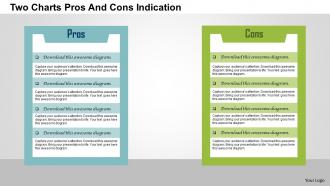
This two charts pros and cons indication flat PPT slide will help you weigh the advantages and disadvantages, positives and negatives, pluses and minuses of different ideas. There are lots of things you can do to grow your business; you can choose to stay in business, expand your audience or target customers, sell your business, etc. Weigh each strategy with our two charts pros and cons indication flat PowerPoint design. This presentation theme of pros and cons of starting a business is a visual representation to reinforce the key points to ask yourself whether you’re ready for a complete commitment to the success of your business. This PPT slide of advantages and disadvantages of owning a business will help you visualize pros of having a business such as making more money, being your own boss, put your ideas into action and work in the area of your interest. Two charts based PPT slide of advantages and disadvantages can be utilized to display variety of information like starting a business from scratch layout, cons of owning your business template, advantages of owning a small business PPT slide or benefits of starting a business PowerPoint diagram. Powerful design at your fingertips. Thousands of Two Charts Pros And Cons Indication Flat Powerpoint Design for every project.
People who downloaded this PowerPoint presentation also viewed the following :
Two Charts Pros And Cons Indication Flat Powerpoint Design with all 5 slides:
Move heaven and earth with our Two Charts Pros And Cons Indication Flat Powerpoint Design. They allow you to do everything feasible
FAQs for Two Charts Pros And Cons Indication
Key principles of flat design for PowerPoint include minimalist layouts, bold typography, simple geometric shapes, limited color palettes, and elimination of shadows or gradients. These elements streamline visual communication by reducing cognitive load, enhancing readability, and creating professional consistency, with many organizations finding that flat design principles ultimately deliver clearer messaging and stronger audience engagement across presentations.
Effective color schemes for flat PowerPoint design rely on limited palettes with high contrast, monochromatic variations, and complementary combinations that maintain visual hierarchy without gradients or shadows. These approaches streamline content readability by emphasizing key information through strategic color placement, consistent backgrounds, and purposeful accent colors, with many designers finding that 3-4 coordinated colors ultimately deliver maximum impact and professional cohesion.
Common pitfalls include overusing bright colors that clash, neglecting sufficient contrast for readability, cramming too much content onto slides, and inconsistent spacing between elements. These design mistakes can undermine your presentation's professional impact, with many organizations finding that maintaining visual hierarchy, using adequate whitespace, and establishing consistent color schemes ultimately delivers clearer communication and stronger audience engagement.
Flat PowerPoint design enhances audience engagement by eliminating visual clutter, using clean typography, and focusing attention on core content, while traditional styles often overwhelm with shadows, gradients, and complex animations. Through streamlined layouts and strategic color choices, flat designs enable faster information processing, reduce cognitive load, and improve message retention, with many organizations finding that audiences stay more focused and engaged throughout presentations.
Typography serves as the primary visual hierarchy tool in flat PowerPoint designs, with clean sans-serif fonts, consistent sizing, strategic weight variations, and ample whitespace creating clarity and focus. Through careful font selection and spacing, organizations across sectors like consulting, healthcare, and technology enhance readability, maintain audience engagement, and deliver professional presentations that communicate complex information effectively while reinforcing brand consistency.
Icons and illustrations integrate seamlessly into flat presentations through strategic placement, consistent visual hierarchy, and purposeful white space management. By selecting cohesive icon families, limiting color palettes to 2-3 hues, and using illustrations as focal points rather than decorative elements, presenters create clean, professional slides that enhance comprehension while maintaining visual clarity and audience engagement.
Maintaining visual consistency in flat PowerPoint design involves establishing unified color palettes, consistent typography hierarchies, standardized spacing grids, repeated geometric shapes, and cohesive iconography styles. These techniques streamline presentations by creating professional coherence, reducing cognitive load for audiences, and enhancing brand recognition, with many organizations finding that systematic design frameworks ultimately deliver stronger messaging impact and improved stakeholder engagement.
**INPUT**: How can I use white space effectively in a flat PowerPoint presentation? **OUTPUT**: Effective white space in flat PowerPoint presentations involves strategic padding around elements, generous margins between sections, and breathing room around text blocks and graphics. This approach enhances visual hierarchy, reduces cognitive load, and creates professional clarity that helps audiences focus on key messages, ultimately delivering more impactful presentations and better information retention.
Best practices for structuring content in flat design include using clear visual hierarchy, consistent spacing, strategic color blocking, minimal typography variations, and simplified iconography. These approaches enhance readability by eliminating visual clutter, organizing information through purposeful white space, and guiding audience attention seamlessly, with many presenters finding that flat design ultimately delivers cleaner communication and stronger audience engagement.
Animations in flat PowerPoint designs work best when they're subtle, purposeful, and complement the minimalist aesthetic through simple fade-ins, gentle slides, or clean morphing transitions between elements. These understated movements enhance content flow and guide viewer attention without competing with the clean design philosophy, with many presenters finding that limiting animations to 2-3 consistent types throughout maintains visual cohesion while adding professional polish.
Accessibility significantly impacts flat PowerPoint design by requiring careful color contrast ratios, strategic use of patterns and textures alongside color coding, and readable typography choices. Designers must incorporate alternative visual cues like icons, shapes, and varied fonts to convey information, with many organizations finding that accessible flat designs ultimately deliver broader audience engagement and enhanced professional credibility.
Industries that could benefit from flat design presentations include technology, healthcare, finance, education, and retail sectors. These organizations find that flat design's clean aesthetics and simplified visual hierarchy enhance audience comprehension during stakeholder meetings, client pitches, and training sessions, ultimately delivering more impactful communication and professional credibility.
Balancing creativity and professionalism in flat PowerPoint design involves using strategic color palettes, consistent typography, meaningful icons, and purposeful white space while maintaining brand alignment. Through thoughtful visual hierarchy and selective creative elements, organizations enhance audience engagement, improve information retention, and deliver memorable presentations, with many corporate teams finding that subtle animations and strategic accent colors ultimately strengthen their professional credibility.
Grid layouts in flat PowerPoint presentations offer structured alignment, visual consistency, balanced content distribution, enhanced readability, and professional aesthetics. These organizational frameworks streamline information hierarchy by creating clear content zones, reducing visual clutter, and enabling seamless navigation, with many presenters finding that grid-based designs ultimately deliver stronger audience engagement and more memorable presentations.
You can source flat design elements through free platforms like Flaticon, Freepik, and Unsplash, or premium services like Shutterstock and Adobe Stock, incorporating them via PowerPoint's Insert tab for images and icons. These resources streamline slide creation by providing professionally designed graphics, color palettes, and templates, ultimately delivering consistent visual branding and enhanced audience engagement across presentations.
-
Great product with highly impressive and engaging designs.
-
Use of icon with content is very relateable, informative and appealing.