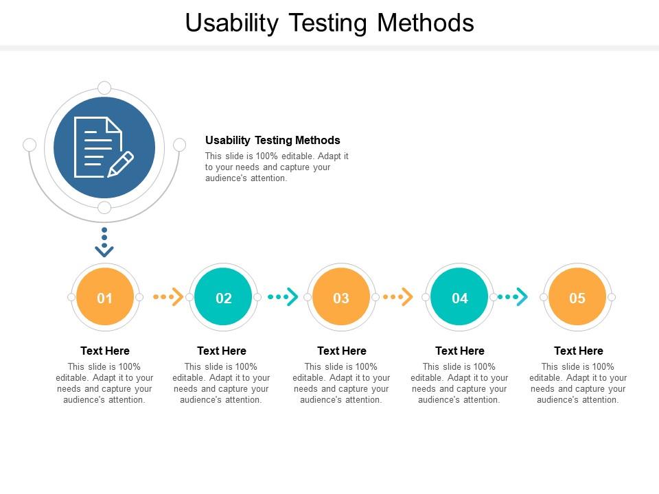
Usability testing methods ppt powerpoint presentation slides pictures cpb
Try Before you Buy Download Free Sample Product
Audience
Editable
of Time
Our Usability Testing Methods Ppt Powerpoint Presentation Slides Pictures Cpb are topically designed to provide an attractive backdrop to any subject. Use them to look like a presentation pro.
People who downloaded this PowerPoint presentation also viewed the following :
Usability testing methods ppt powerpoint presentation slides pictures cpb with all 2 slides:
Use our Usability Testing Methods Ppt Powerpoint Presentation Slides Pictures Cpb to effectively help you save your valuable time. They are readymade to fit into any presentation structure.
FAQs for Usability testing methods ppt powerpoint presentation
So basically you want to watch real people use your product and see where they get confused or stuck. Testing whether your design actually makes sense to normal humans - not just you and your team who've been staring at it for months. You'll track stuff like completion rates and errors, plus how frustrated people get. Honestly, catching problems early saves you so much headache later. Start small though - like 5-6 users max per round. You don't need tons of people to spot the big issues that'll make users rage quit.
Honestly, the testing method you pick totally changes what problems you'll spot. Remote testing shows how people actually behave at home, but you can't see when someone's face says "this is confusing as hell" while they're being polite on camera. With in-person sessions you can ask follow-ups when things get weird. Unmoderated gives you way more data points but less depth. A/B testing works for metrics but tells you nothing about the why behind user choices. I usually mix a few methods depending on what I'm trying to figure out - don't just go with whatever's convenient.
Honestly, user feedback is everything in usability testing. You're not just watching people navigate your site - you need to understand their thought process. When someone pauses or gets frustrated, that's your cue to dig deeper. Think-alouds are clutch because they reveal confusion you'd never catch from behavior alone. Post-test interviews help you figure out what actually bugs users vs. what just bothers you as the designer. I always probe when users hesitate - usually leads to the most useful insights. Sometimes I feel like a detective, but it's worth it.
Honestly, prep work is everything - test your tech setup and think through realistic scenarios beforehand. I'd go with Zoom or whatever platform lets you record both screen sharing and their facial reactions. Don't over-explain the tasks though, just give clear instructions then let them work. Remote sessions can feel awkward at first, so chat a bit to get them comfortable. You'll miss some body language cues you'd normally catch in person. Long pauses usually mean they're stuck or confused about something. Record it all - trust me, you'll notice things later you missed live. Oh and definitely email them afterward! People often share their most honest thoughts once the formal session pressure is off.
So moderated testing is great when you need to ask follow-up questions - like if someone gets stuck, you can dig into why. Takes forever though and costs more since you need someone facilitating. Unmoderated is the opposite - cheaper, faster, and honestly people act more natural when nobody's watching them. You just can't pivot if something weird happens. For complex stuff or early designs, definitely go moderated. You'll want that back-and-forth. Simple tasks or quick validation? Unmoderated works fine. I usually just think about whether I need to ask "wait, why did you click that?" - if yes, get a moderator.
Find people who actually match your real users - that's honestly the most important thing. I'd start by figuring out demographics, tech skills, all that basic stuff about who uses your product. Getting the *perfect* participant is kinda impossible though, so don't overthink it. Screen 5-8 people with some quick questions upfront. Just make sure they haven't worked on building whatever you're testing (learned that one the hard way). The whole point is finding folks who'll hit the same roadblocks your actual users would hit.
Honestly, there are so many good options for usability testing these days. Loom and Hotjar are perfect for recording user sessions without much hassle. Eye-tracking software is super cool and shows exactly where people look, but yeah... it'll cost you. Remote testing platforms like UserTesting and Maze handle the recruiting and analysis, which saves tons of time. But here's the thing - sometimes the simple stuff works best. I've done plenty of great sessions just using Zoom's screen share feature. Really depends on what you're trying to learn and how much you want to spend. Skip the fancy tools if basic ones do the job.
Track your completion rates and how long tasks take - that's the basic stuff. But honestly? The real gold is watching people get frustrated or confused during those think-aloud sessions. Sometimes you learn more from someone muttering "what the hell" than from perfect completion stats. Don't forget satisfaction surveys after testing either. Compare everything against whatever baseline you've got. Oh, and figure out what "success" actually means for YOUR test before you start - sounds obvious but people skip this step all the time. Mix the hard numbers with the messy human reactions.
Ugh, don't lead people with your questions - that's the worst one. Like asking "How would you find reviews?" instead of "Would you click the reviews tab?" Also, test with actual users, not just whoever's around the office. I've literally watched teams grab random designers and call it research (eye roll). Keep scenarios realistic too. Oh, and here's the hardest part - when users start struggling, don't jump in to help! I know it feels awkward just sitting there, but that's where you'll learn the most. Match your participants to real users and you'll be golden.
You've gotta test where people will actually use your stuff. Testing a restaurant POS system in our quiet office? Terrible idea - learned that one the hard way. The chaos of a real kitchen completely changes everything. Mobile apps need mobile testing, not desk setups. Enterprise software should get tested at actual workplaces with all their weird interruptions. Even consumer apps work differently at home vs some sterile lab. Honestly, half the bugs we miss come from not thinking about context. Just ask yourself where this thing will live in the wild, then go test it there instead.
Write neutral tasks that don't push users toward answers you want. Skip stuff like "How easy was..." - that assumes it WAS easy, you know? Go with open questions instead: "How would you describe that process?" The hardest part? Staying quiet while they test. Seriously, bite your tongue even when they're struggling. That's where you'll spot the real issues. Get someone to review your script first - they'll catch leading language you totally missed.
First, dump all your user feedback into themes - I just use a basic spreadsheet for this stuff. Group the similar complaints and behaviors together. You'll want to look for patterns across multiple users, not just one person having a bad day. Tag everything systematically like "navigation issues" or "confusing content." Here's the thing though - don't get caught up in counting how often something happened. Focus on WHY users struggled instead. Make a priority matrix based on how serious and frequent each problem is. Then write up recommendations that your team can actually do something with, not just vague suggestions.
Make your scenarios realistic - like what people would genuinely try to do on your site. Don't lead them toward answers though. Keep the language neutral and avoid mentioning specific buttons or menus. I totally screwed this up once by literally telling someone which link to click! Give enough context so they get it, but don't overwhelm with details. Two to three sentences usually works best. Honestly, running scenarios past a coworker first saves you from awkward wording later. They'll catch hints you didn't even realize you were dropping.
Start with whatever's blocking people from actually getting stuff done - that's your bread and butter right there. After that, hit the things making users confused or annoyed during important flows. Honestly, I skip the tiny visual fixes unless they're genuinely messing with people (sorry designers lol). Focus on patterns you see across multiple users, not random one-off gripes. Business impact matters too - a small checkout hiccup beats some major issue buried in account settings. Just throw together a quick spreadsheet ranking severity, how often it happens, and business impact. Makes the whole decision process way easier.
Get your UX designers into those live testing sessions - seriously, watching users struggle beats reading reports any day. Shared docs work great so both teams can dump insights as they happen. Regular syncs help too, obviously. What I've seen work really well is pairing designers with testers during planning. Designers know exactly which flows they're stressed about, so they can guide the focus. Oh, and those collaborative analysis workshops where you watch footage together? Gold mine for spotting patterns. Bottom line: designers need to see the pain firsthand instead of getting watered-down feedback through the telephone game.
-
Awesomely designed templates, Easy to understand.
-
Great designs, Easily Editable.
-
I discovered this website through a google search, the services matched my needs perfectly and the pricing was very reasonable. I was thrilled with the product and the customer service. I will definitely use their slides again for my presentations and recommend them to other colleagues.
-
Much better than the original! Thanks for the quick turnaround.